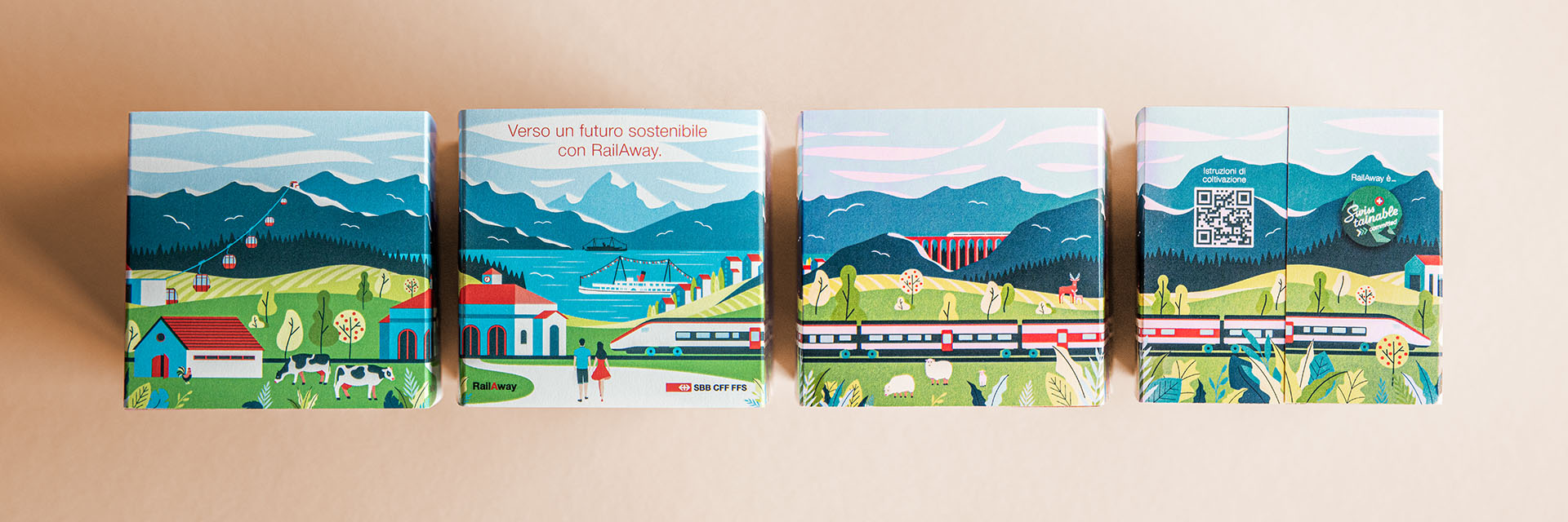
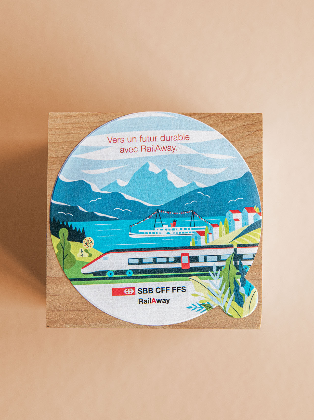
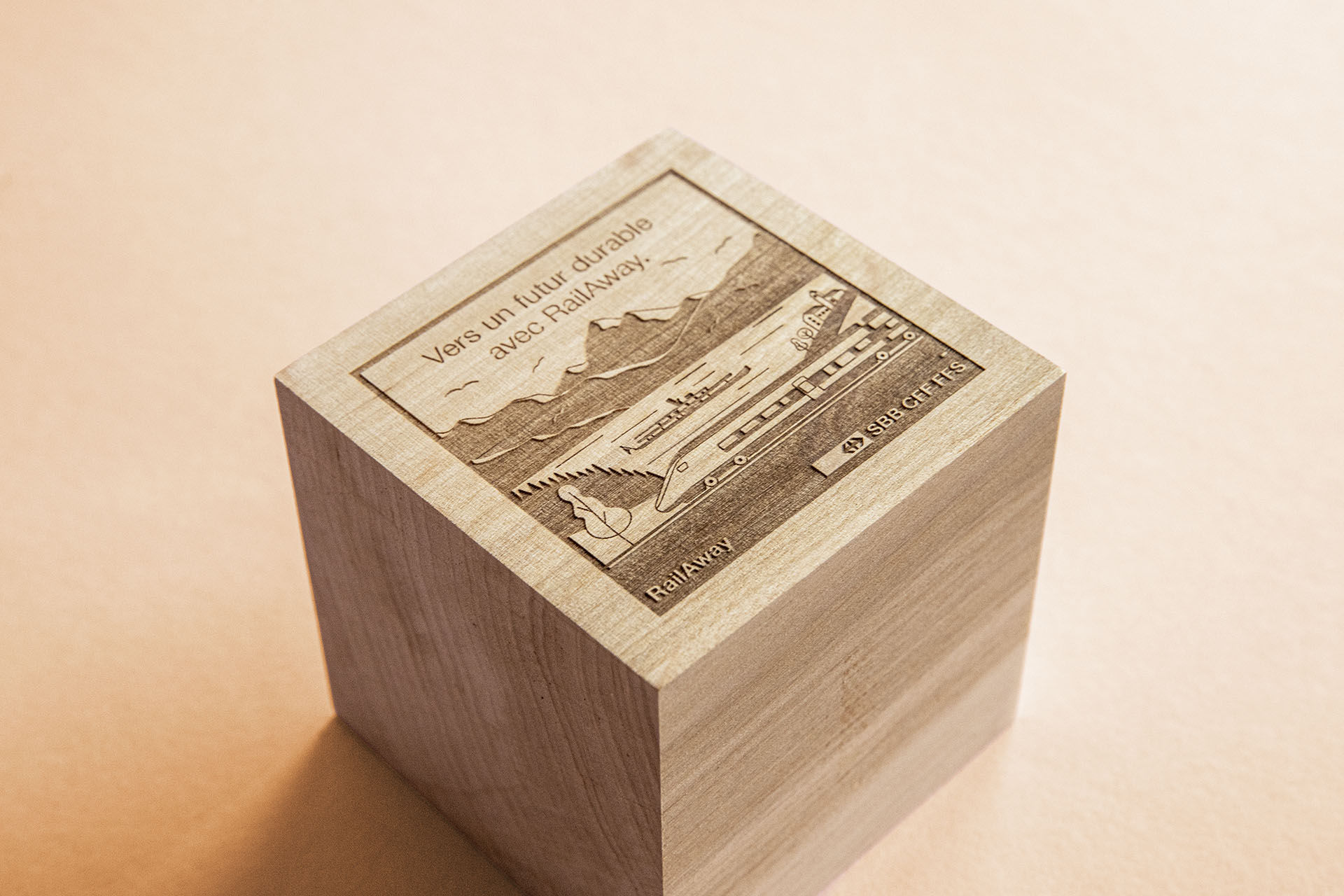
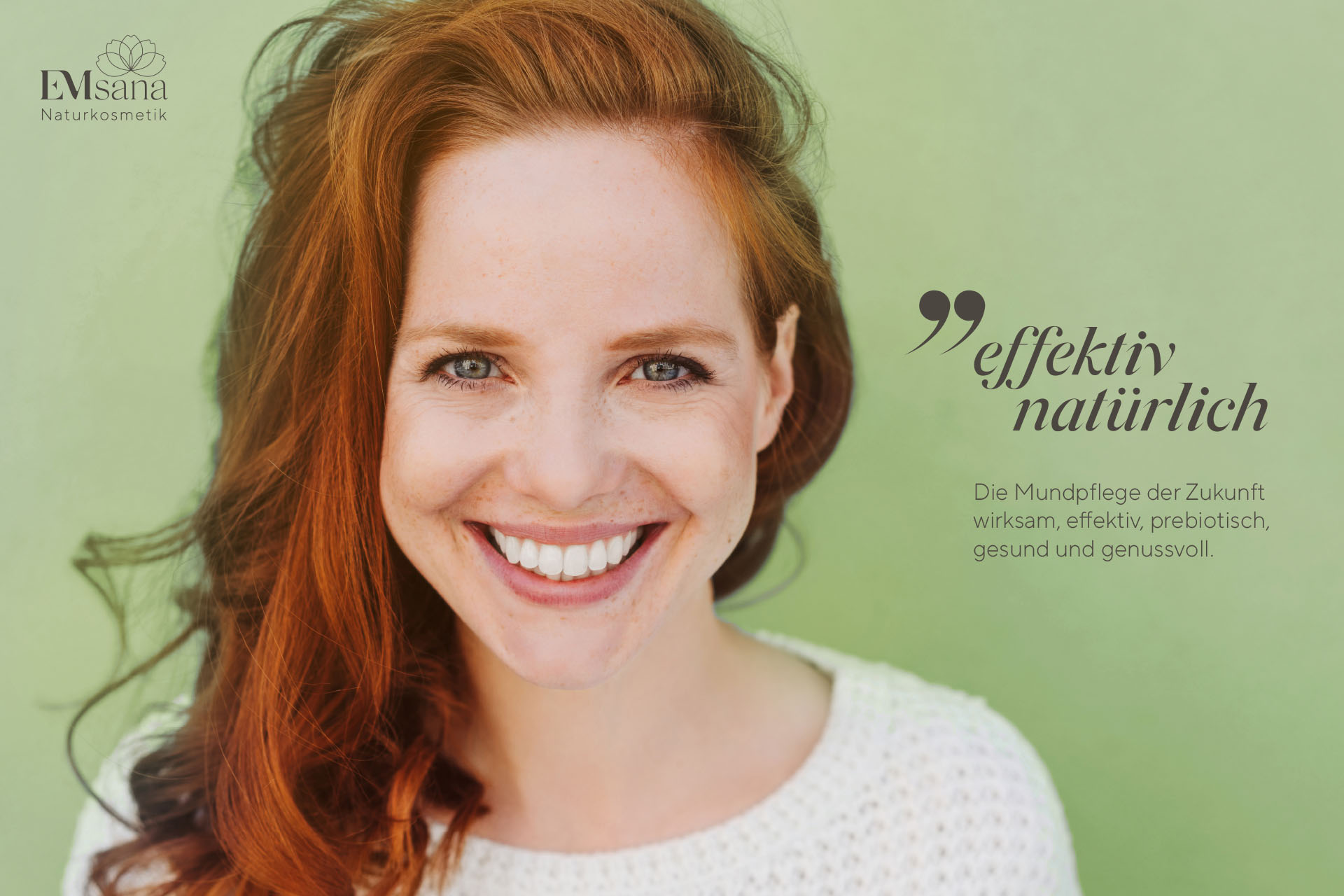
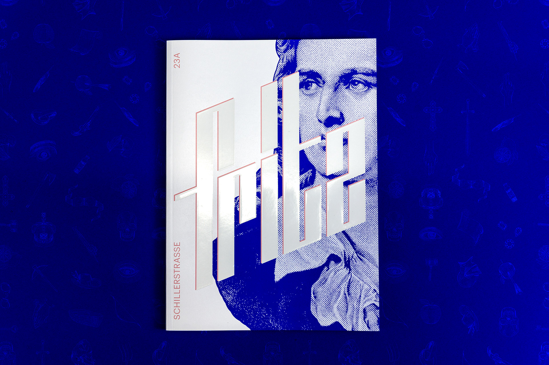
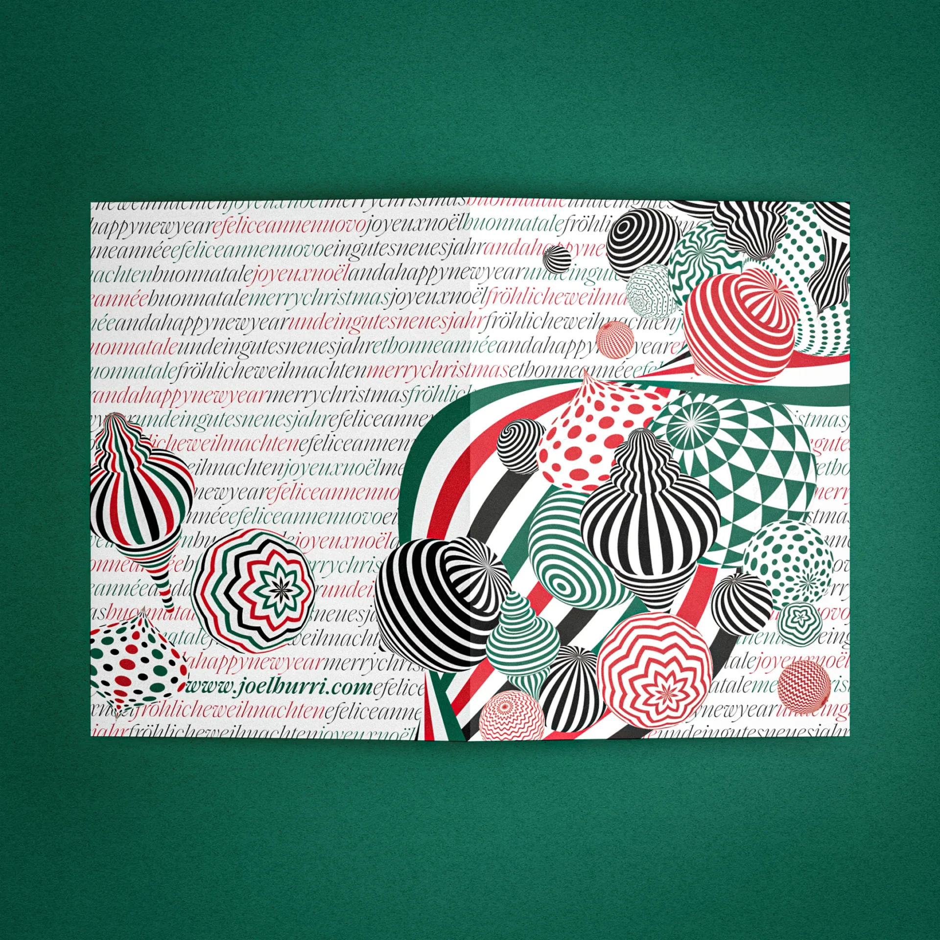
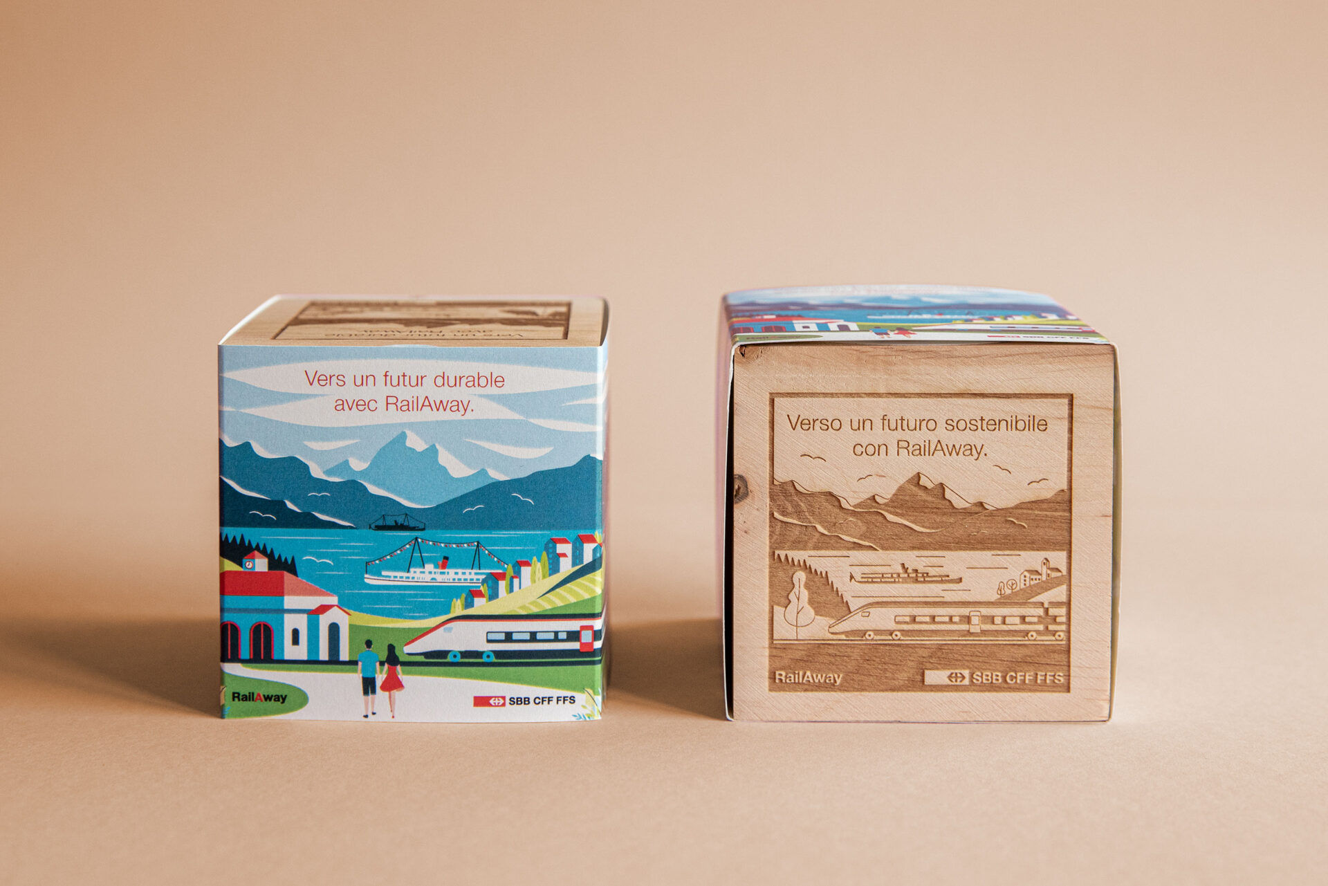
Schweizerische Post
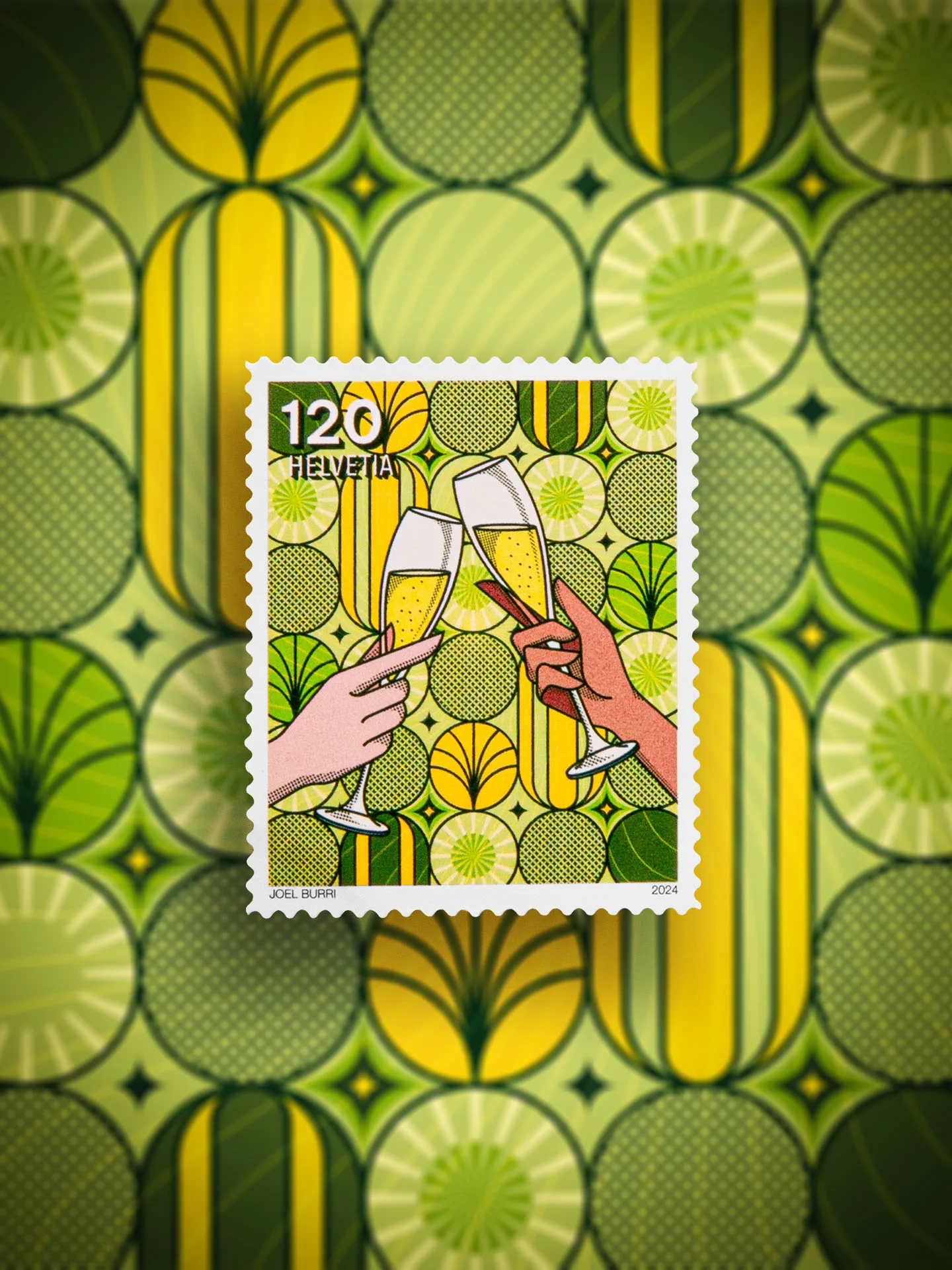
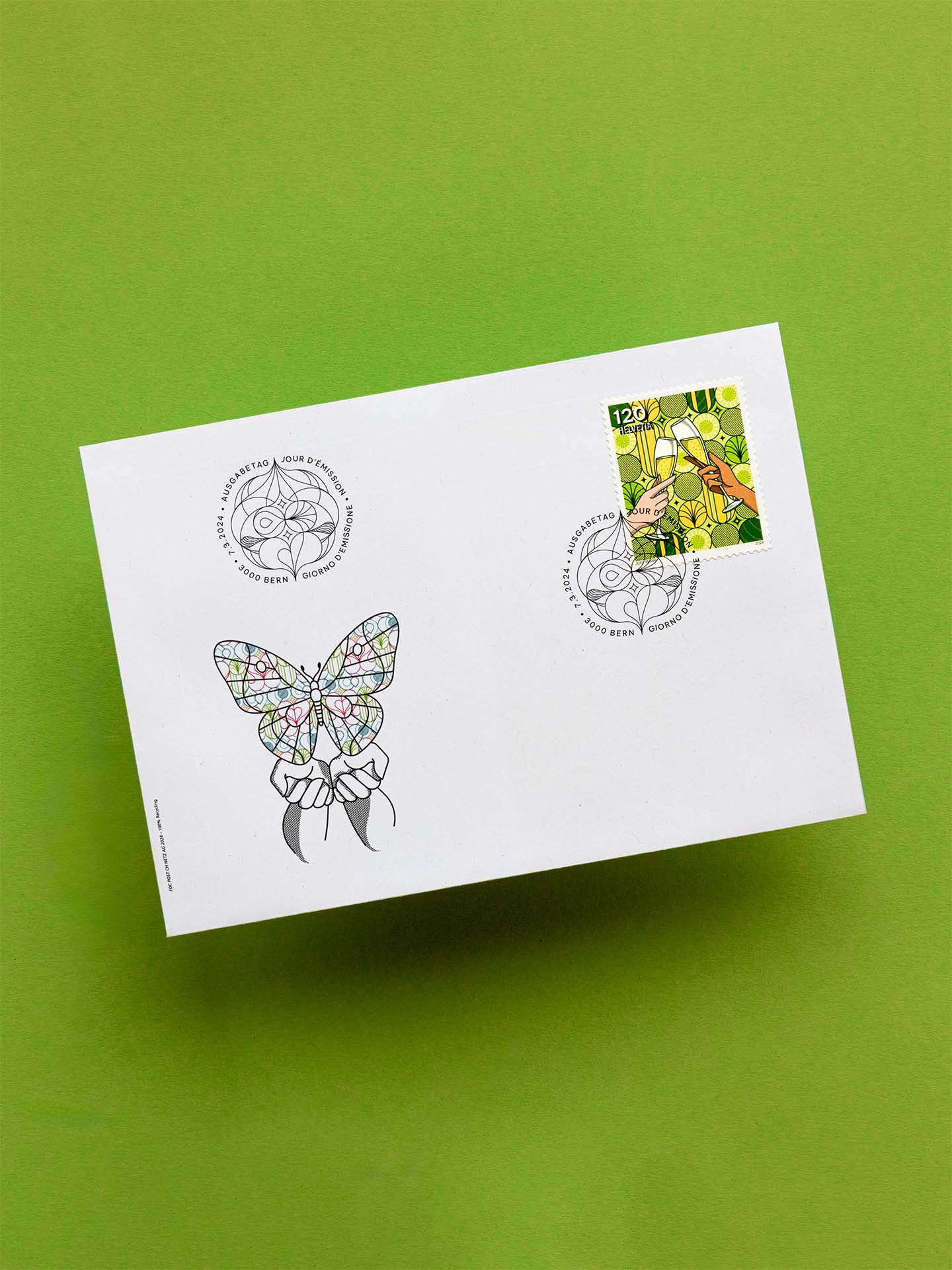
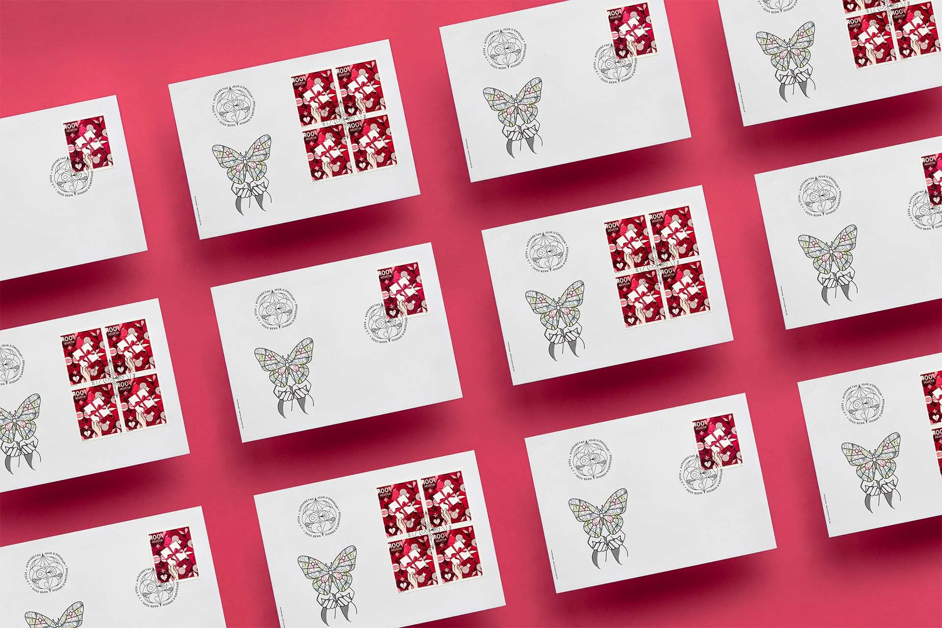
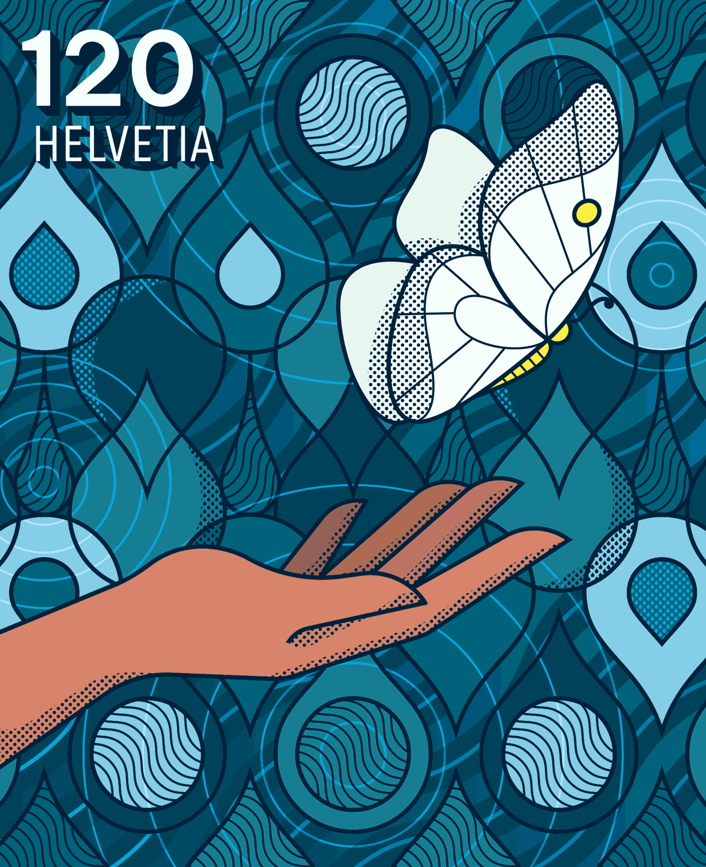
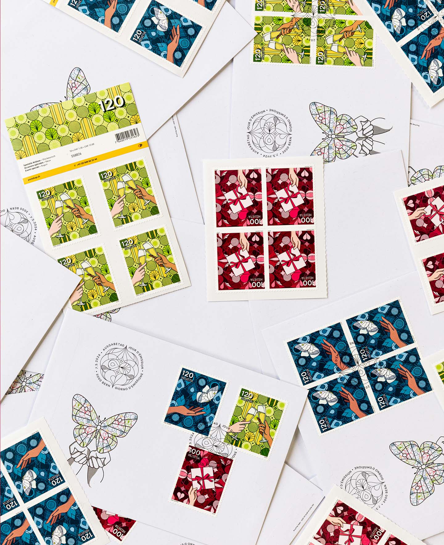
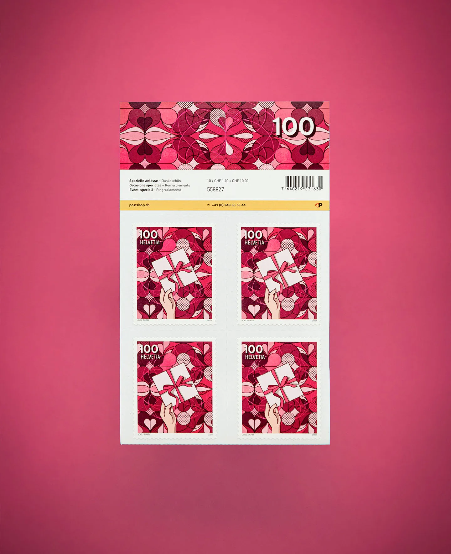
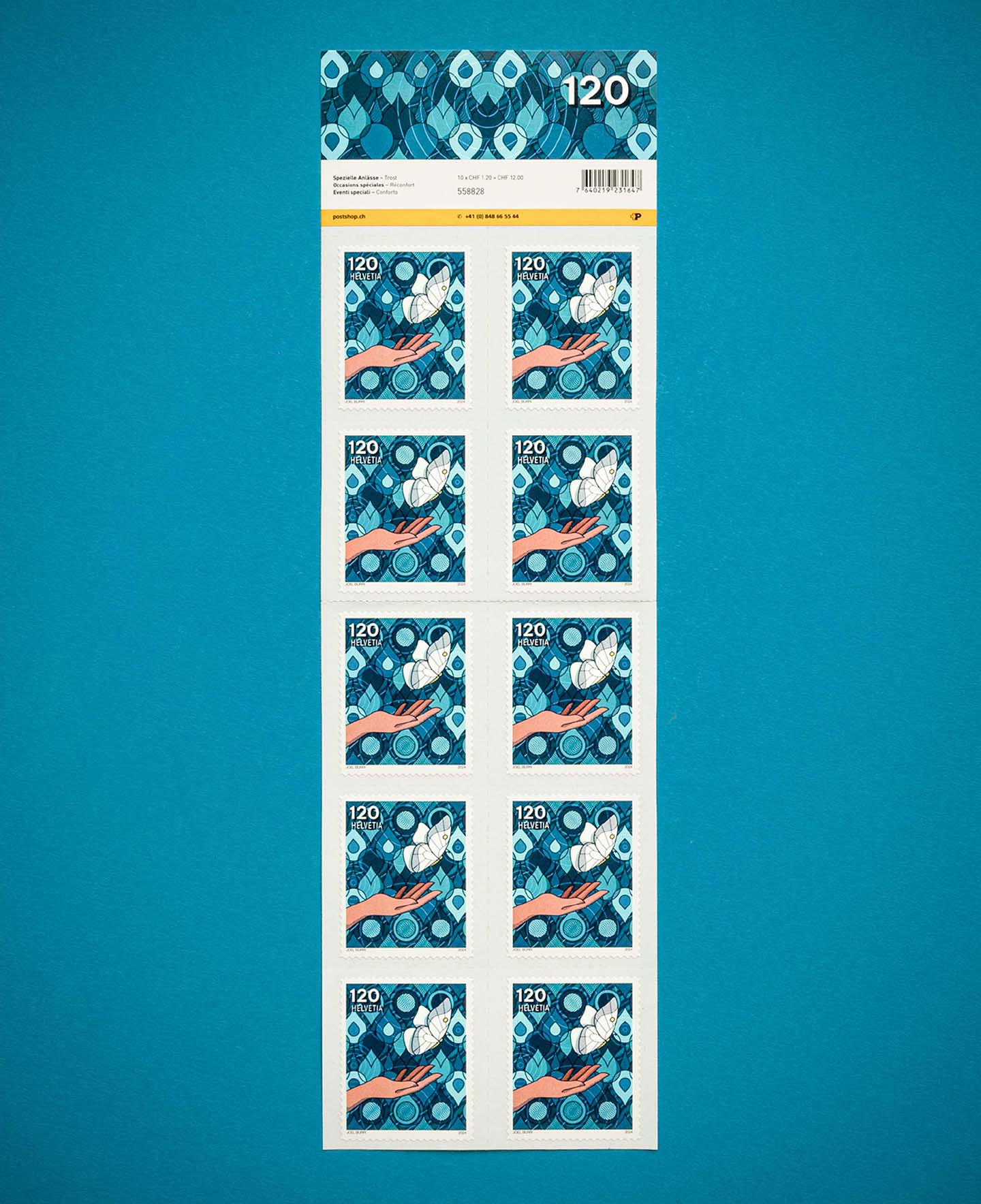
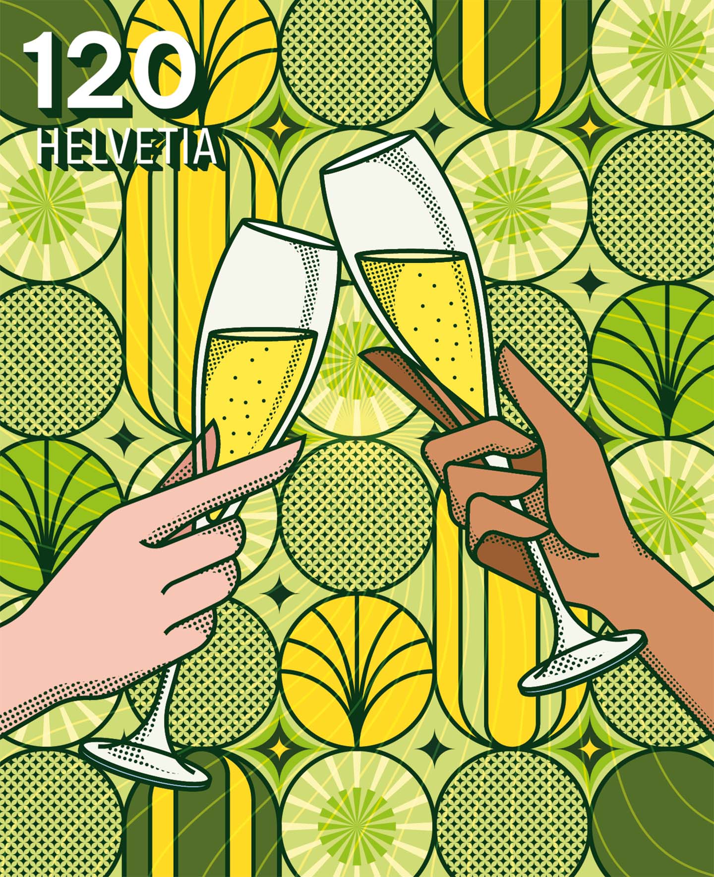
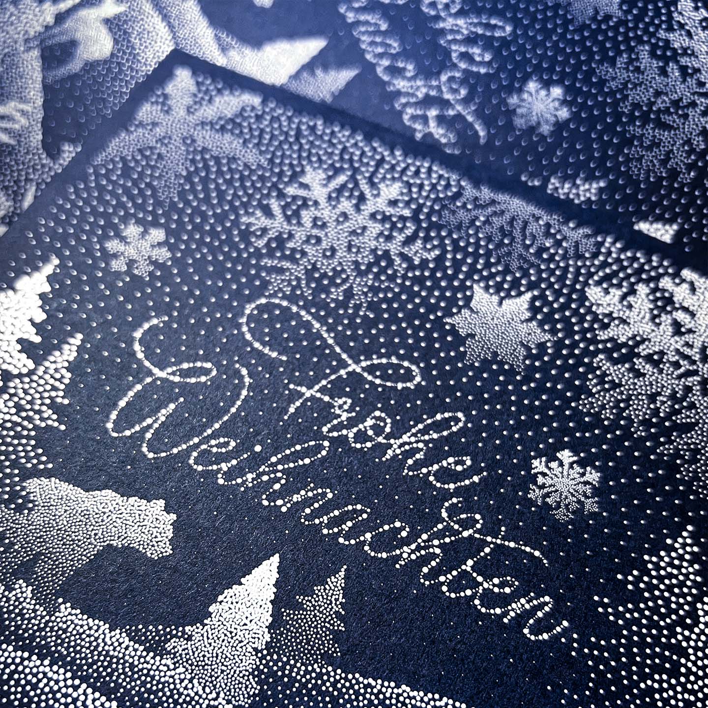
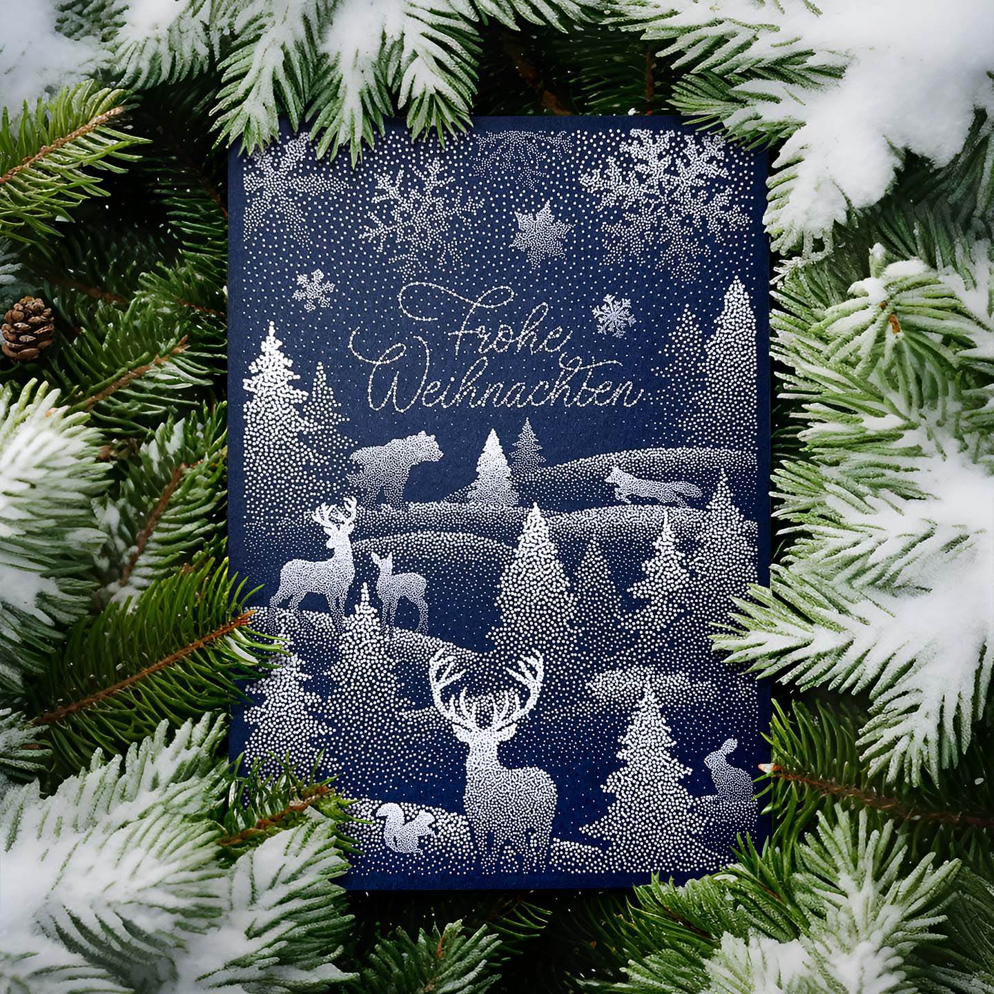
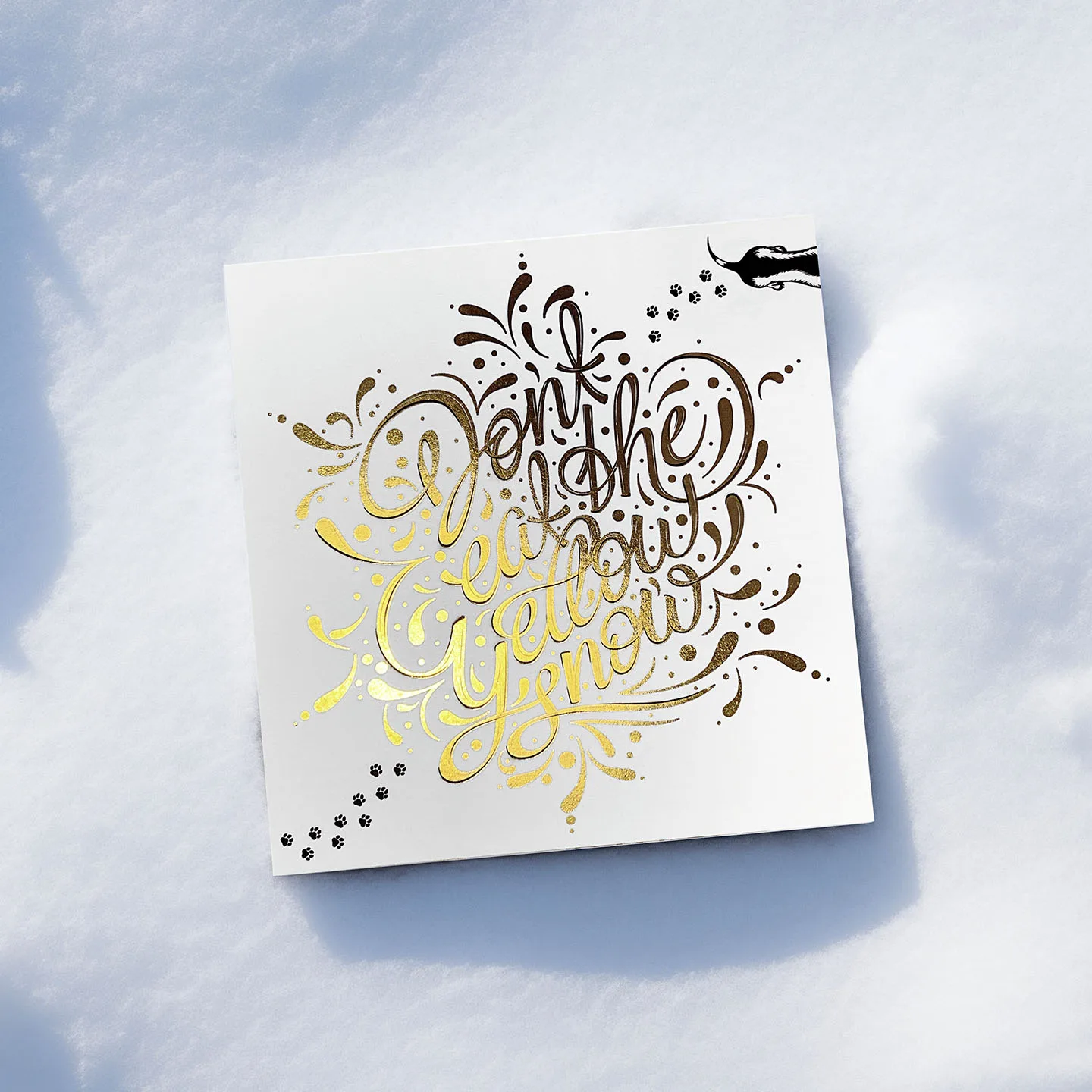
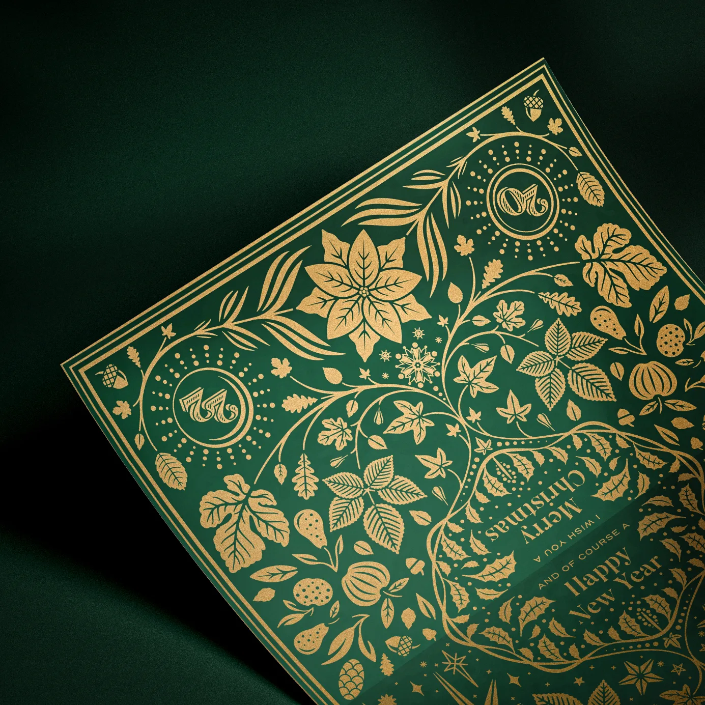
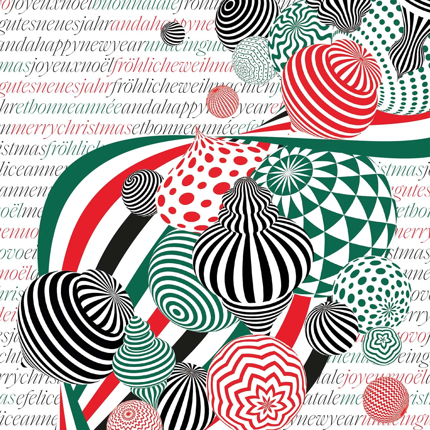
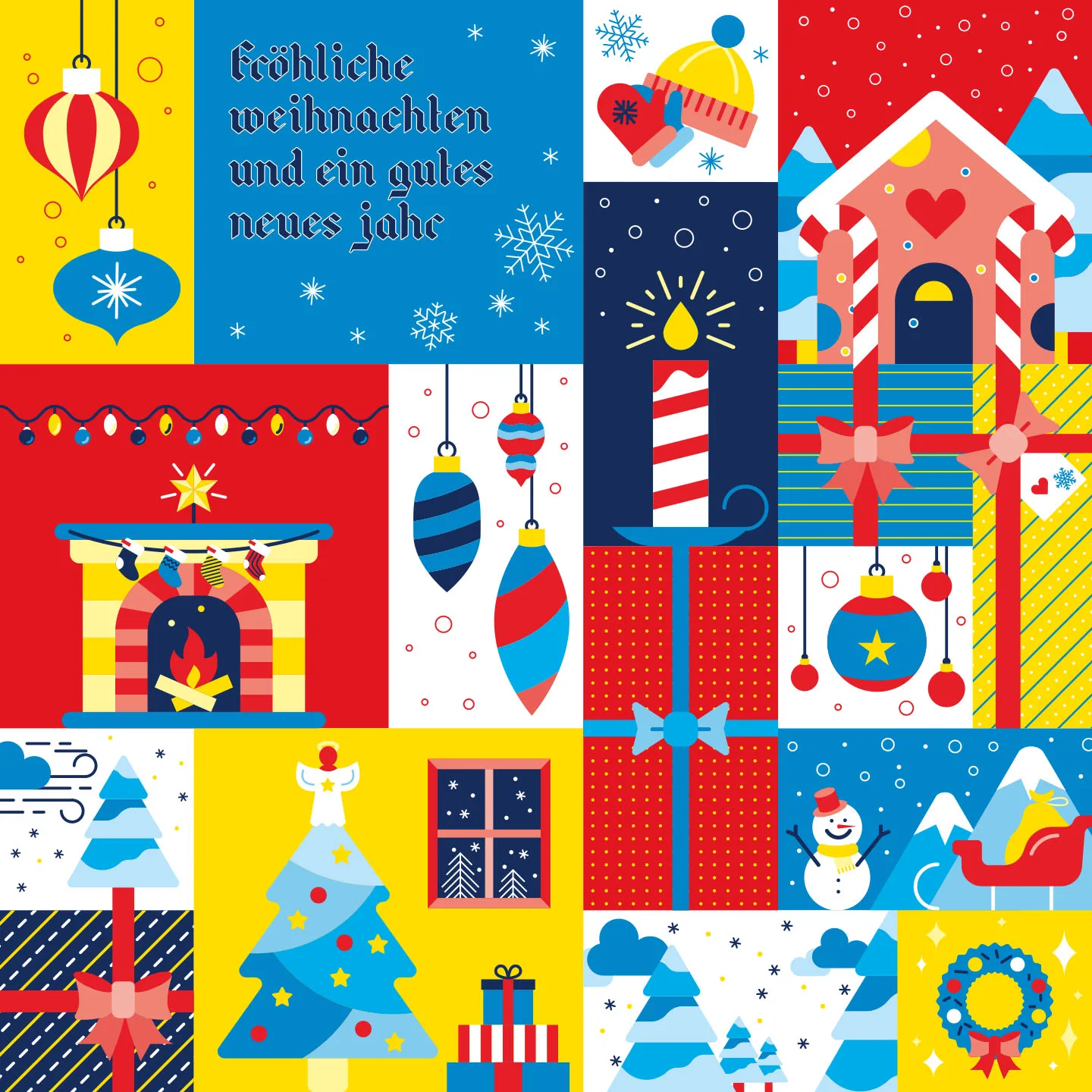
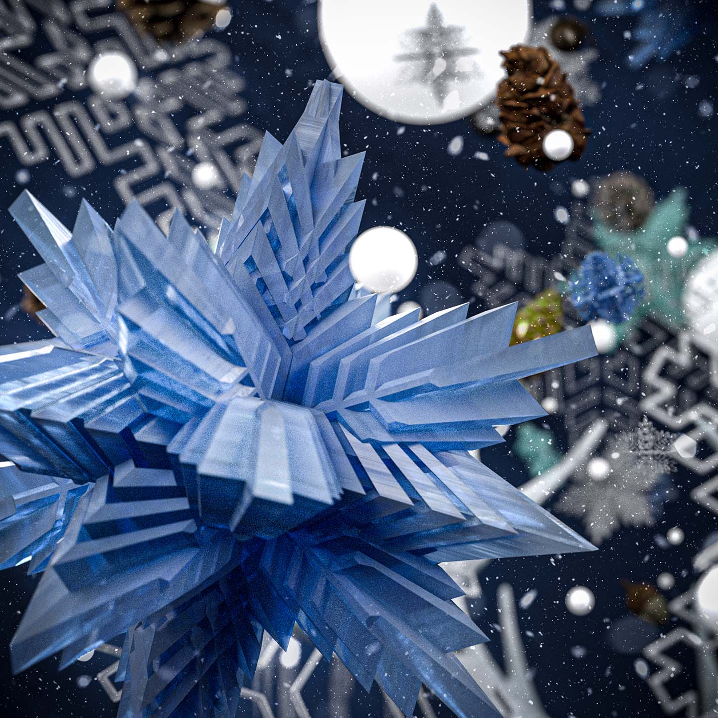
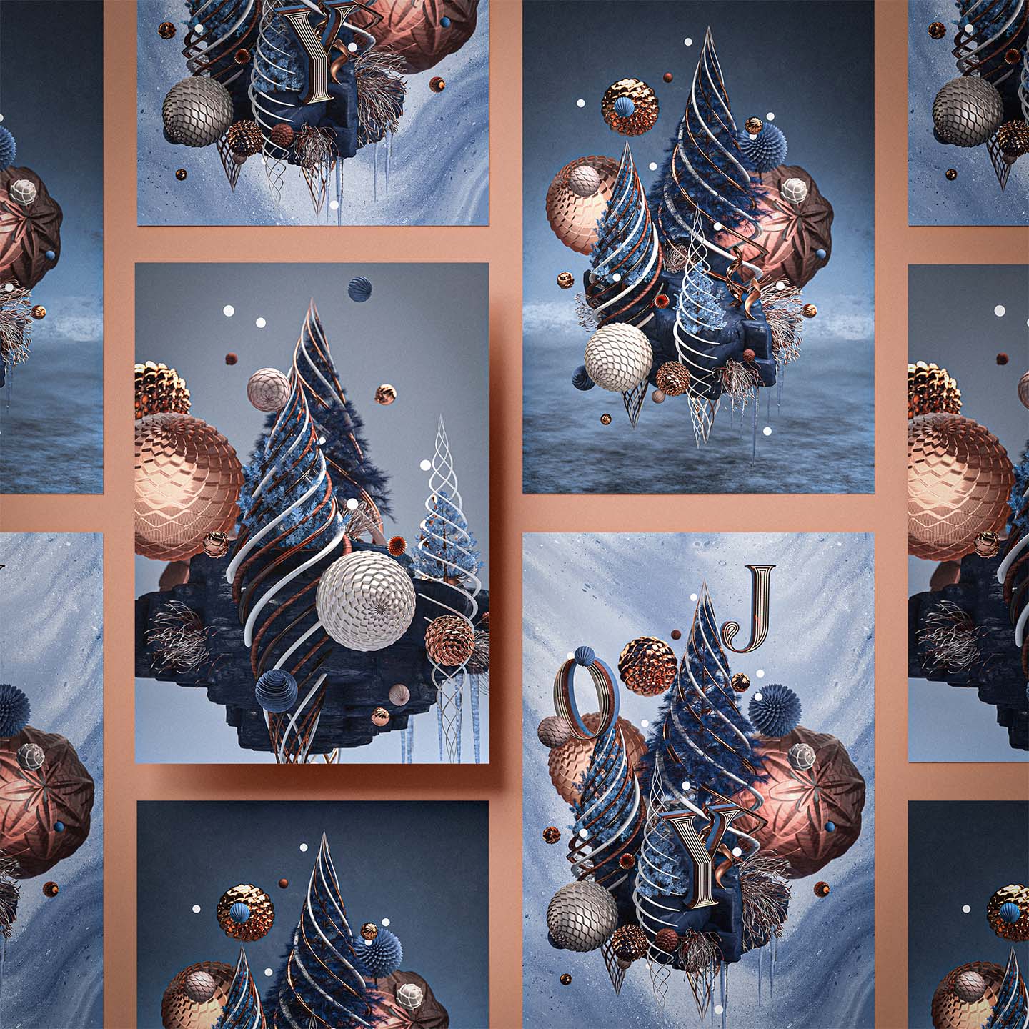
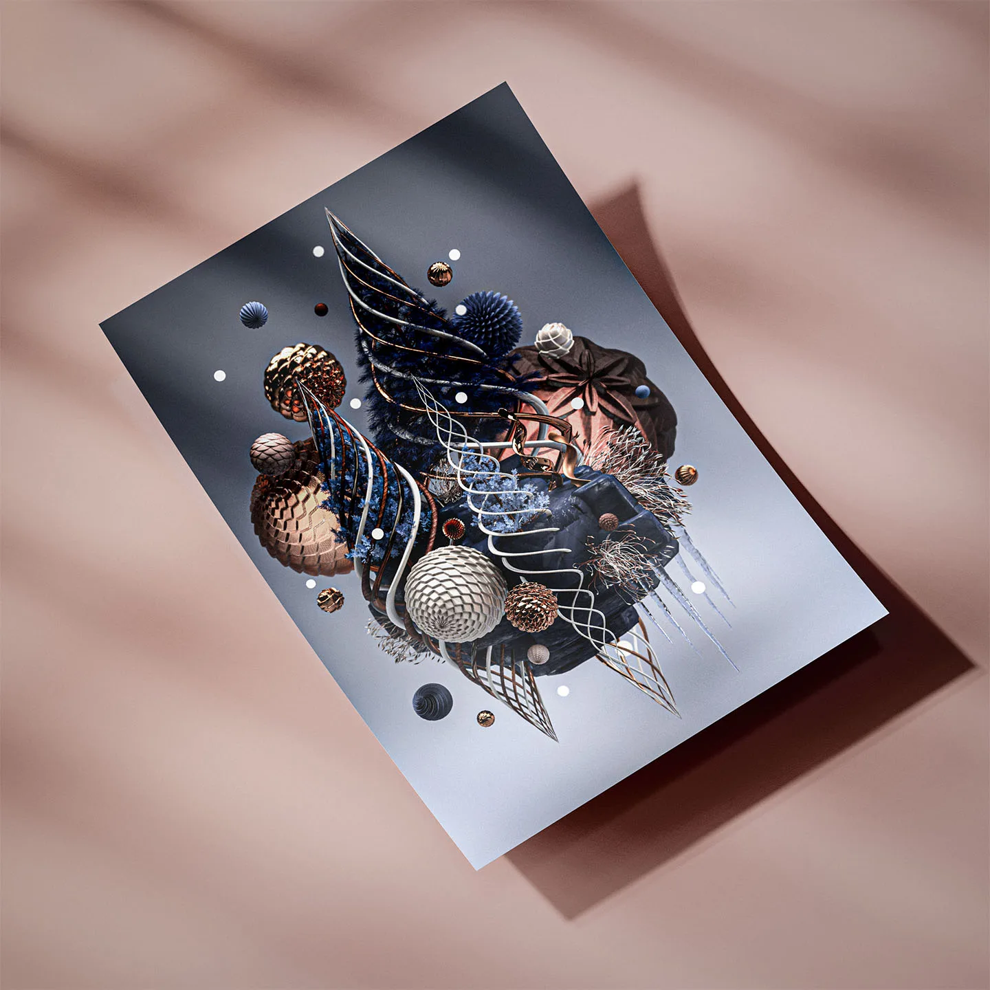
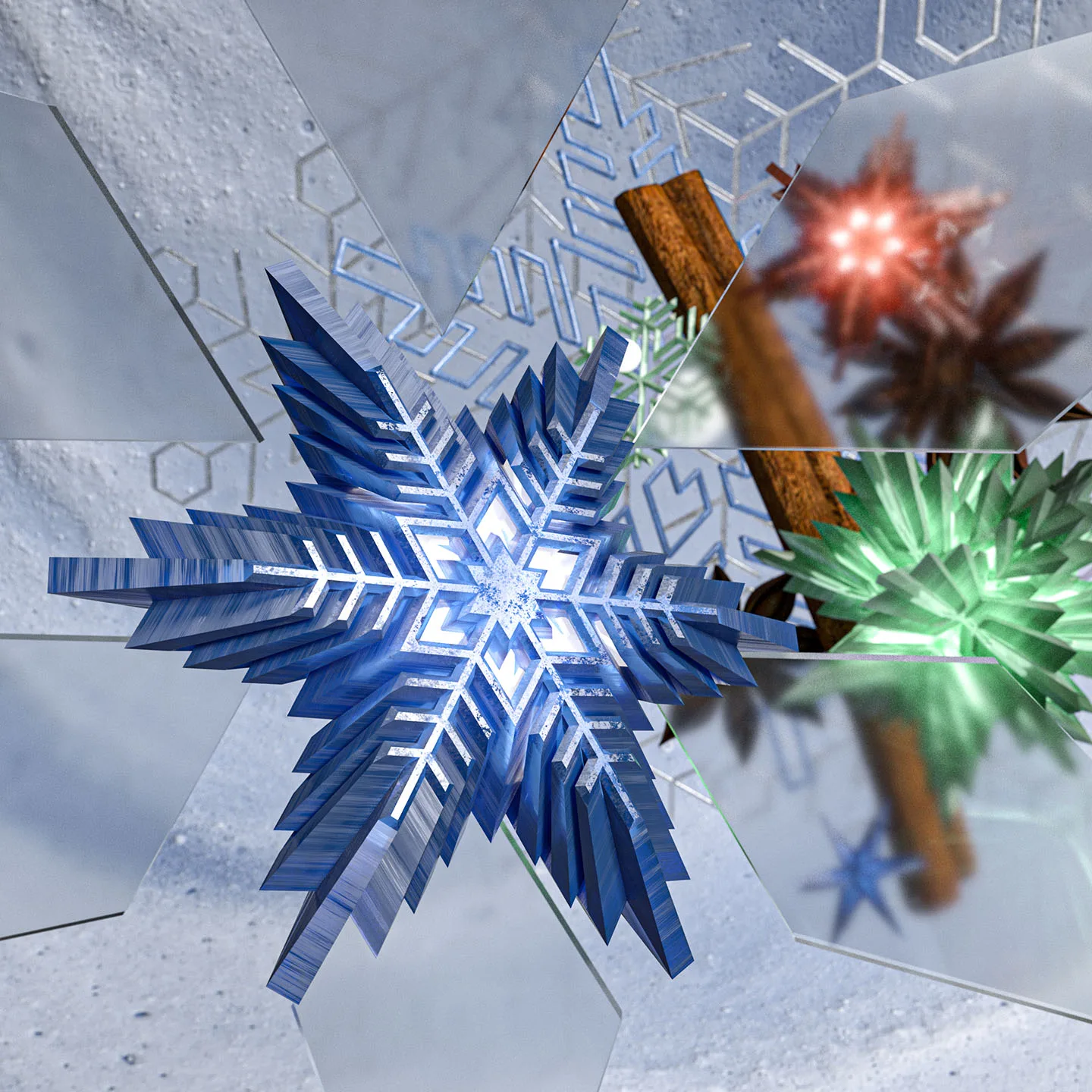
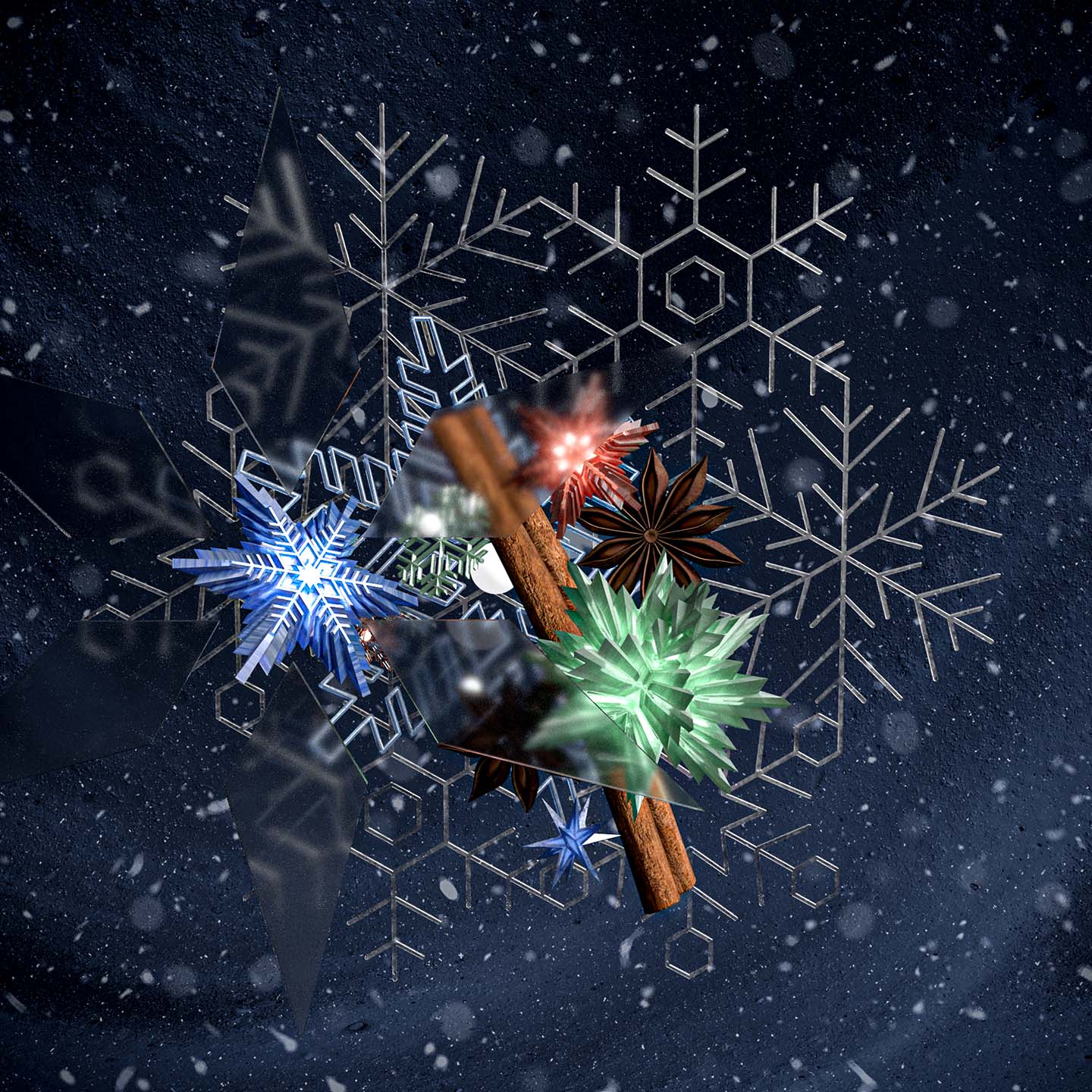
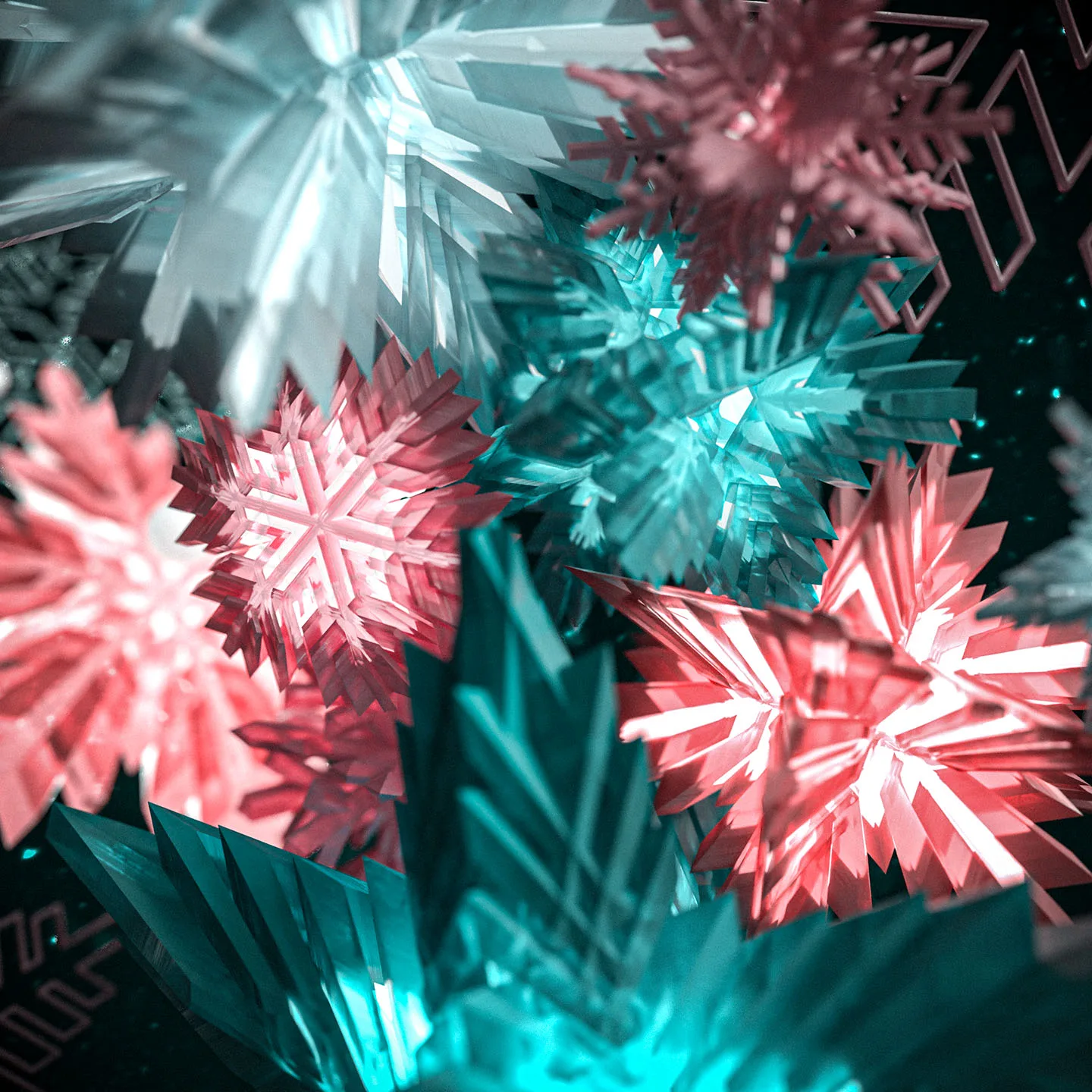
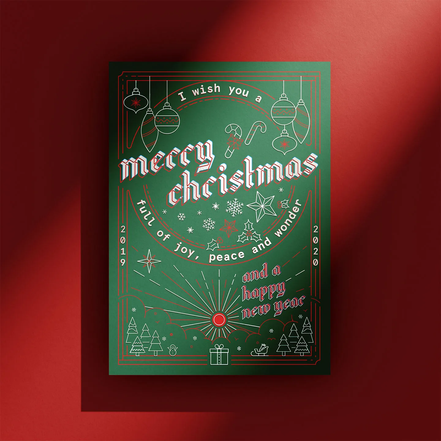
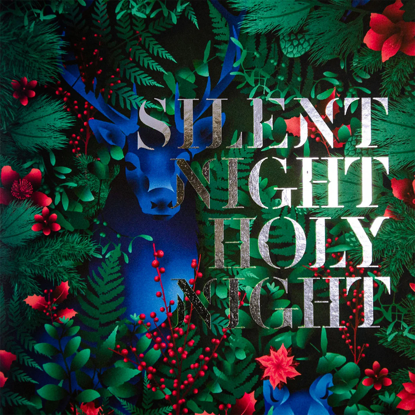
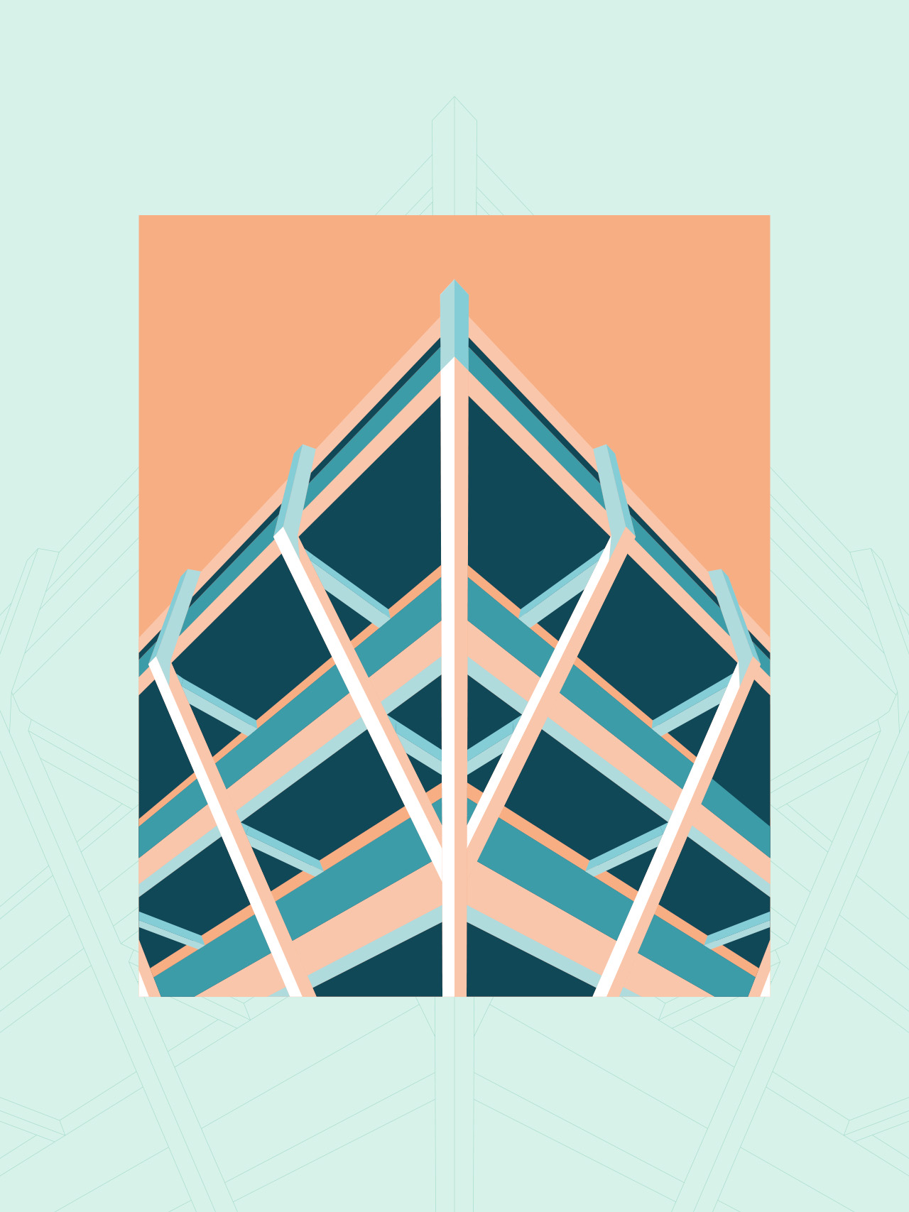
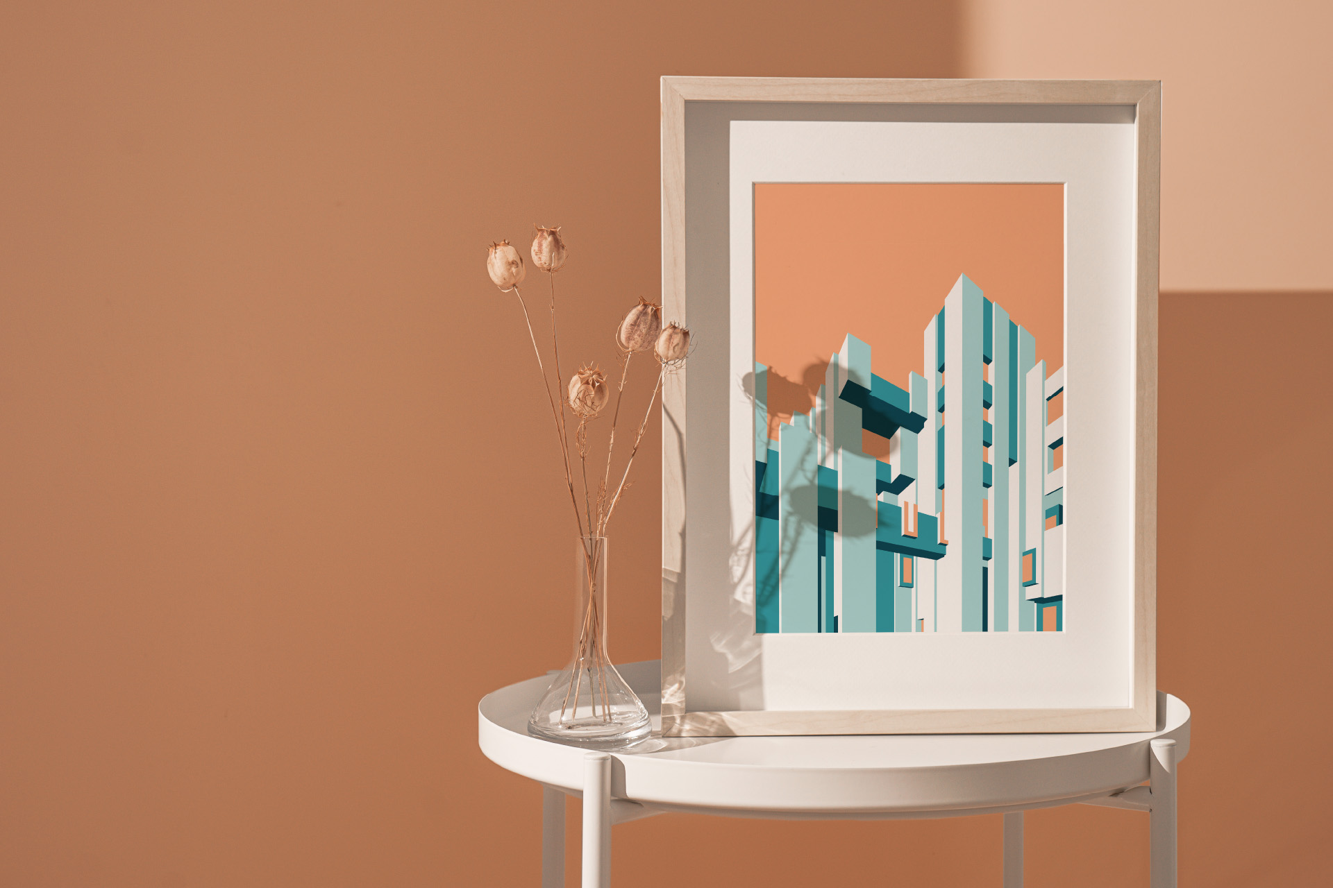
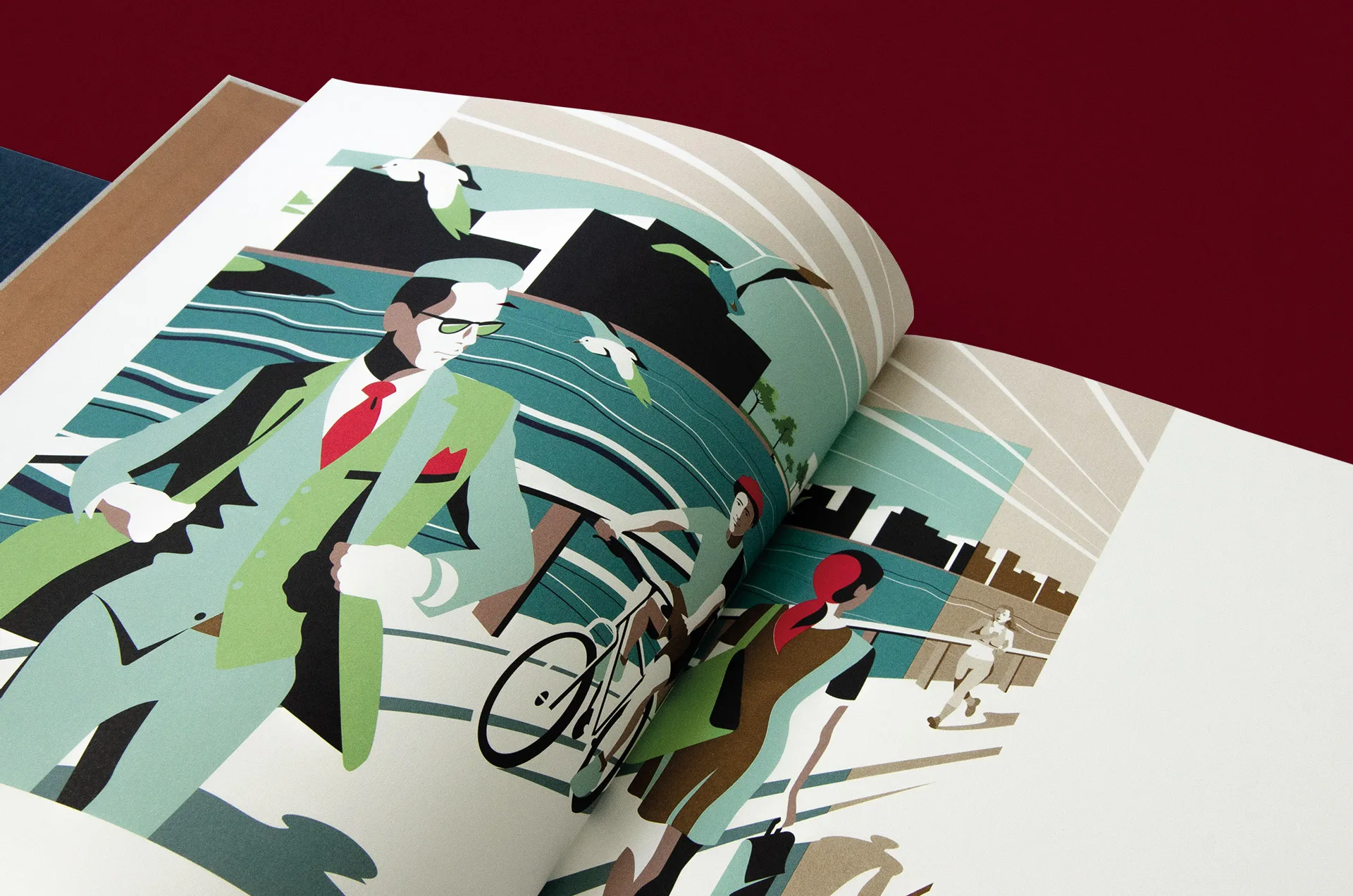
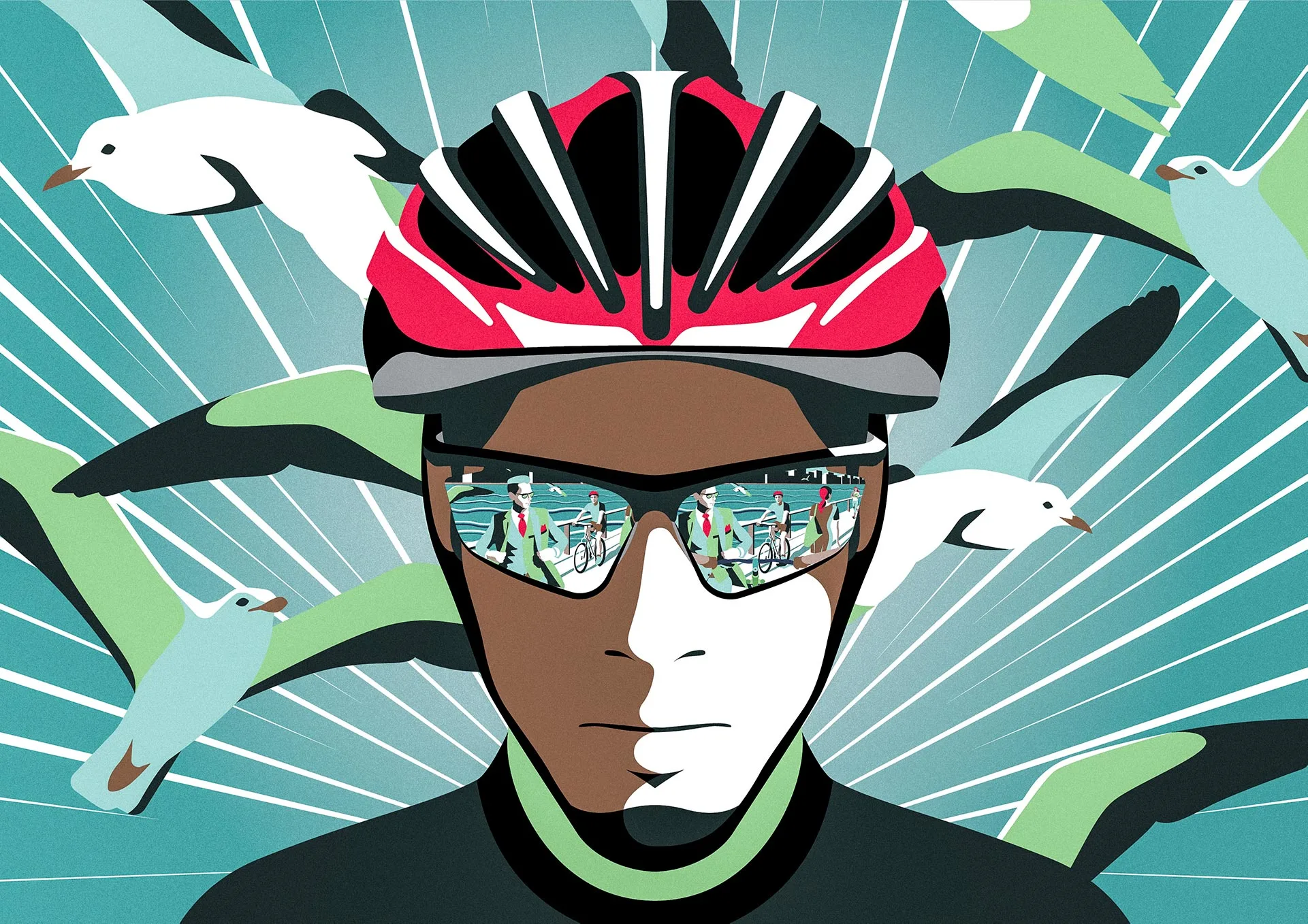
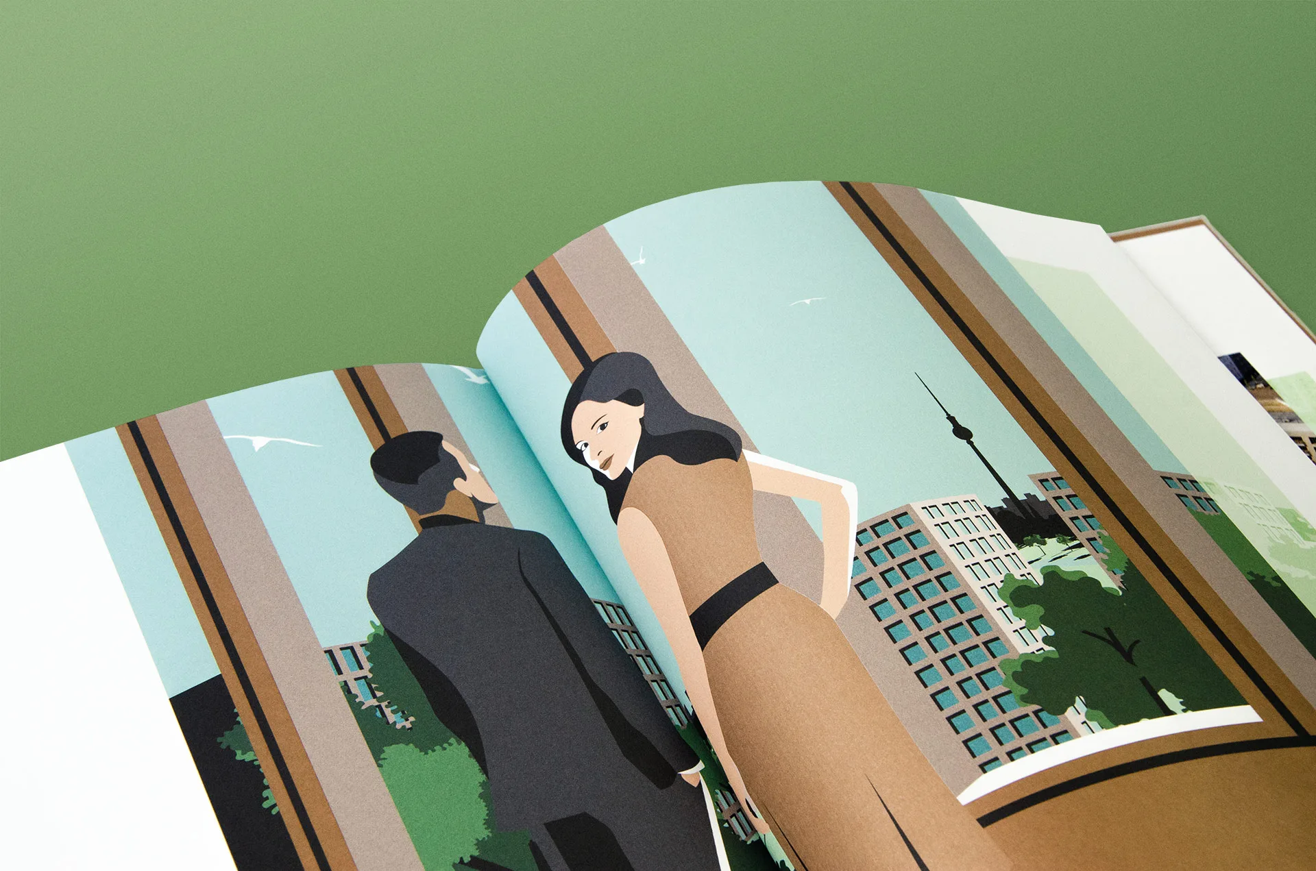
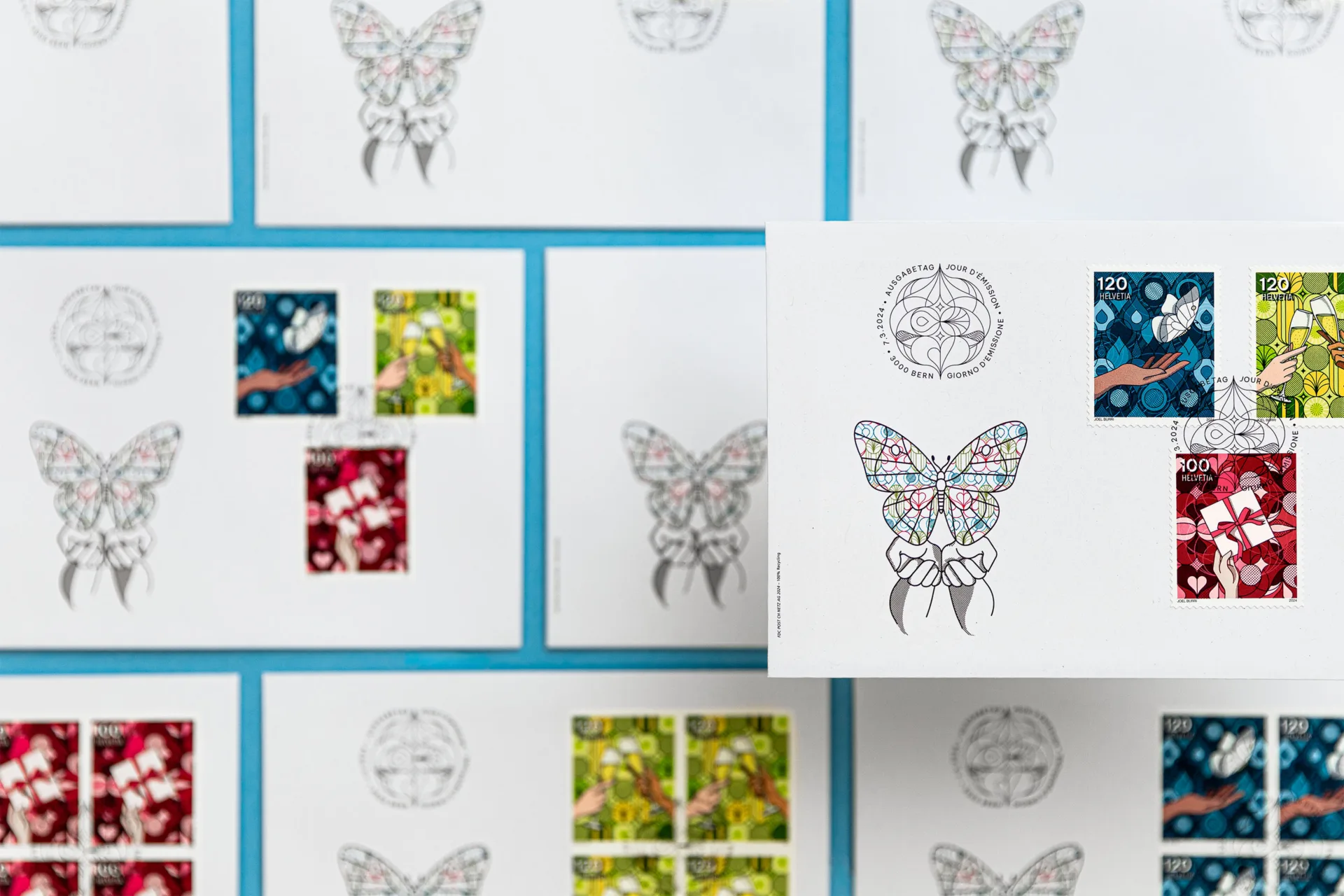
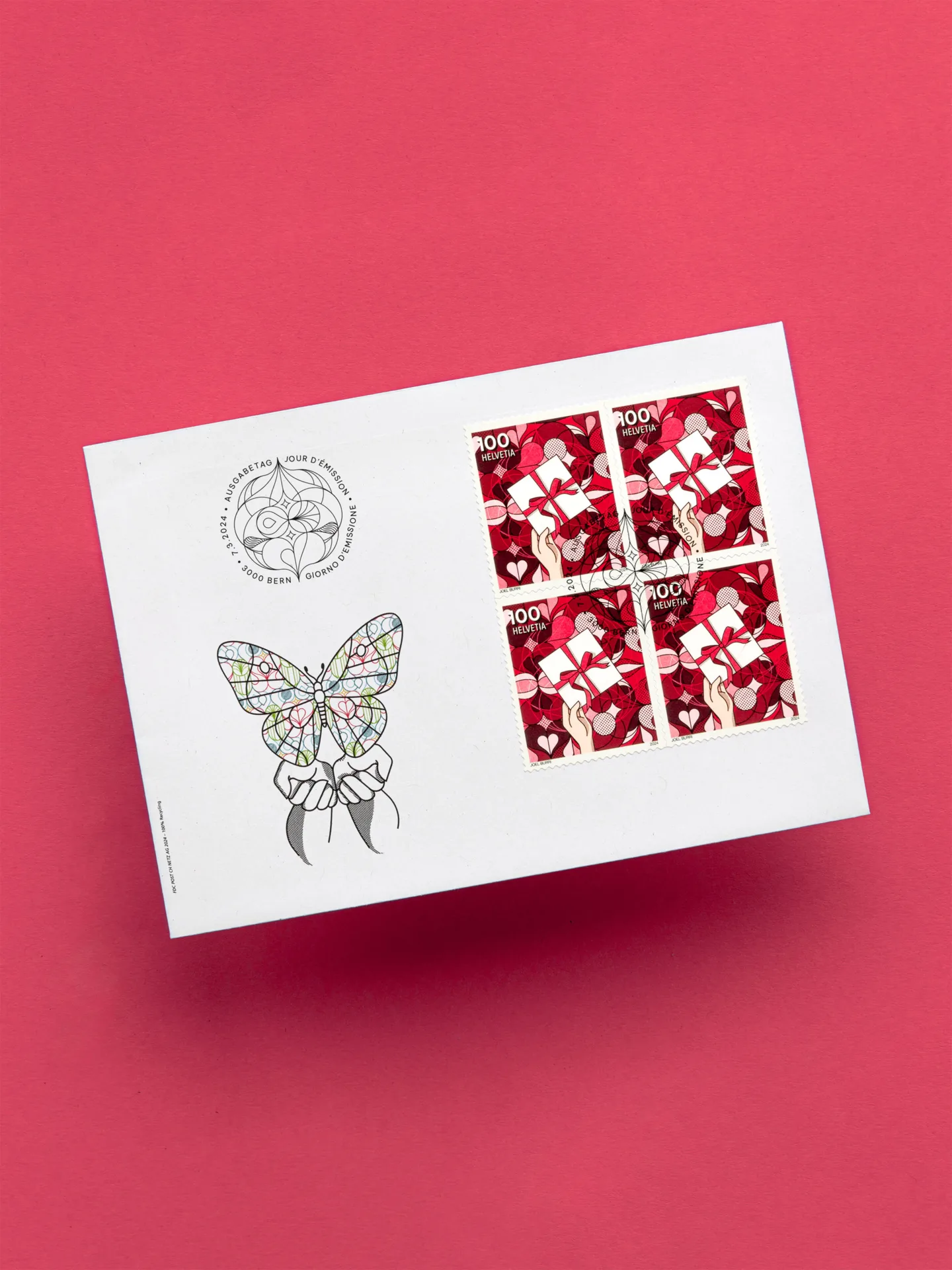
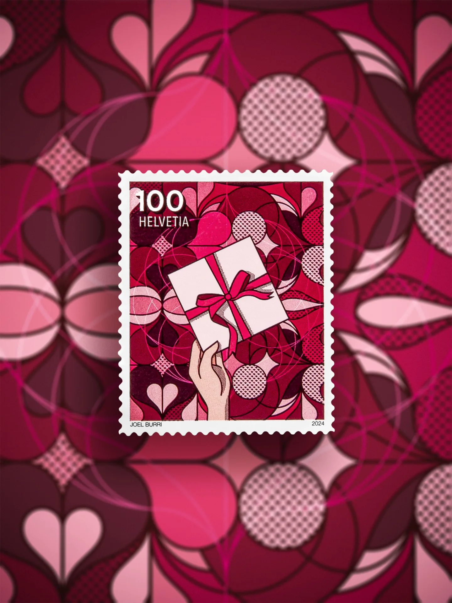
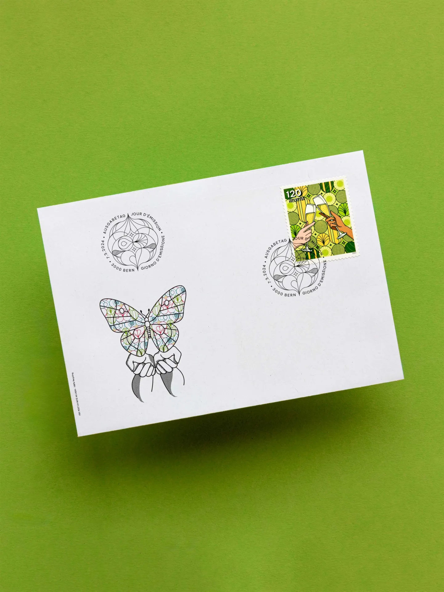
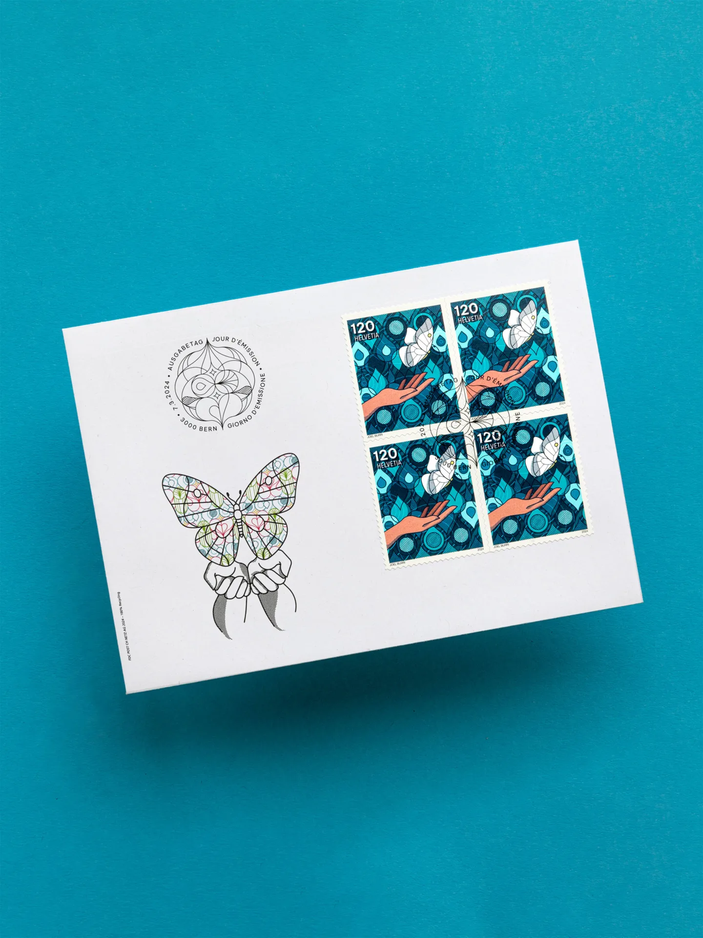
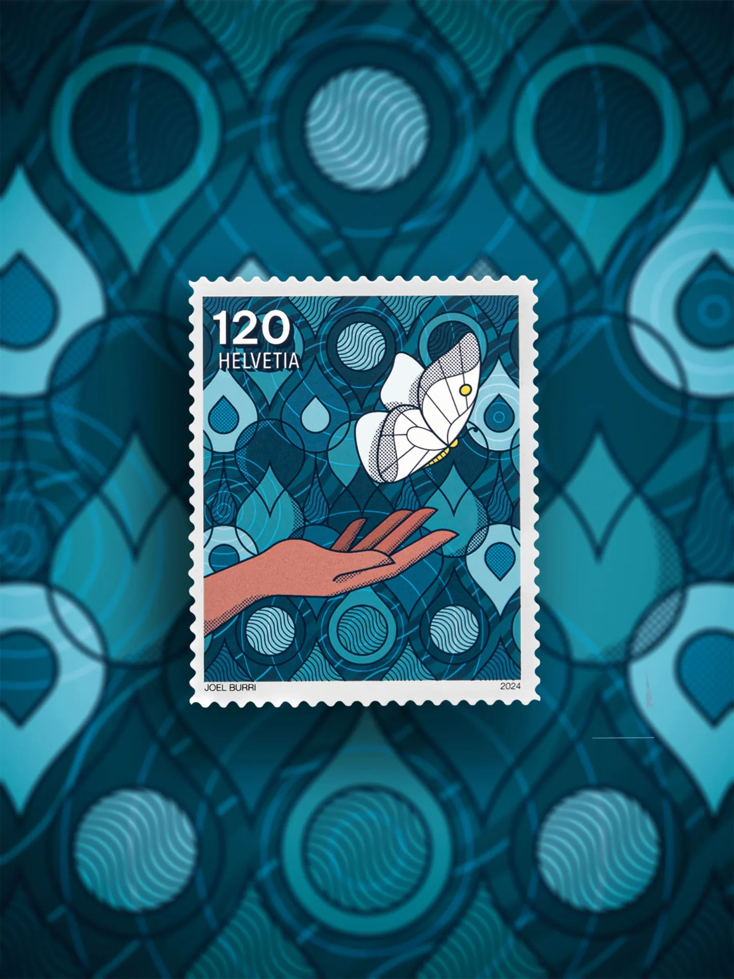
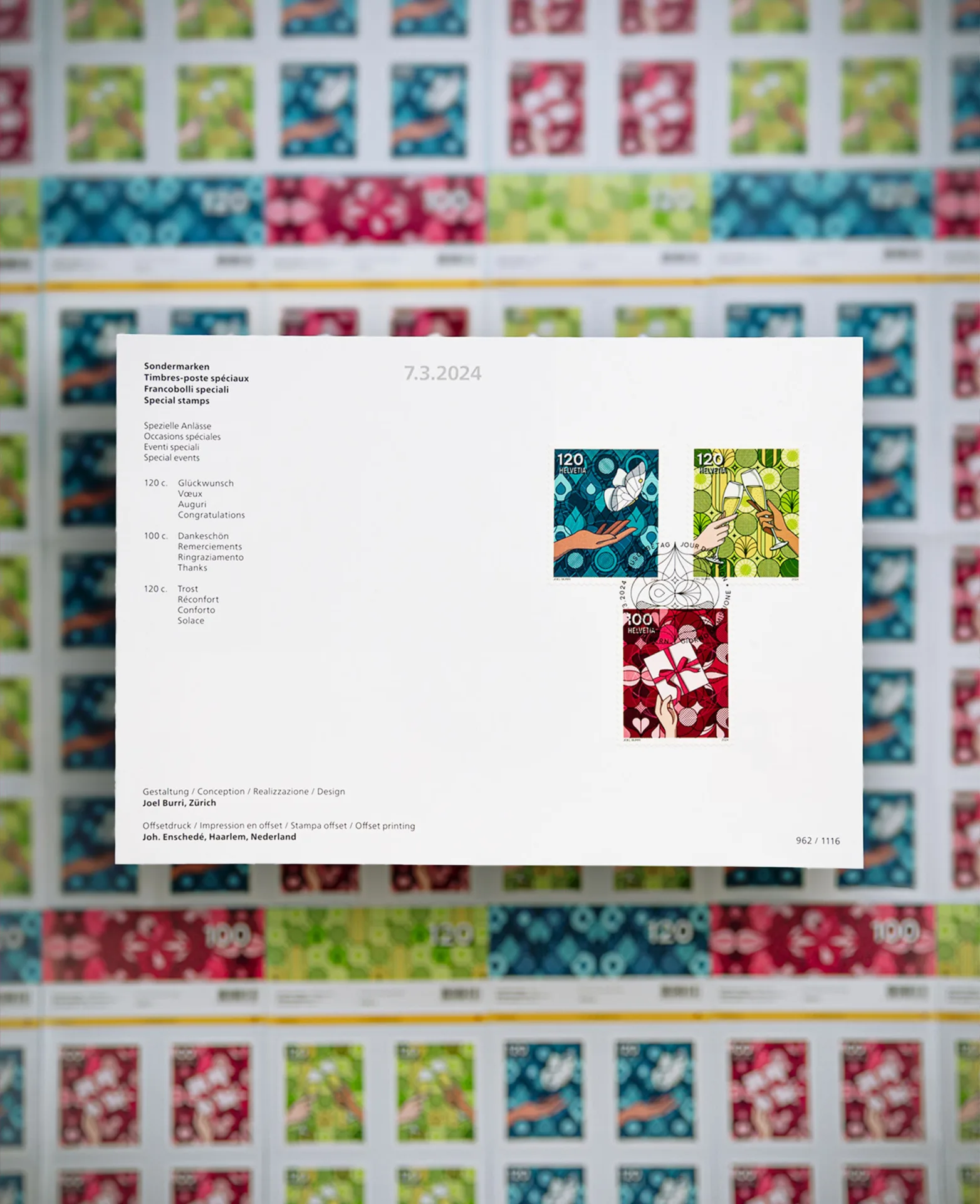
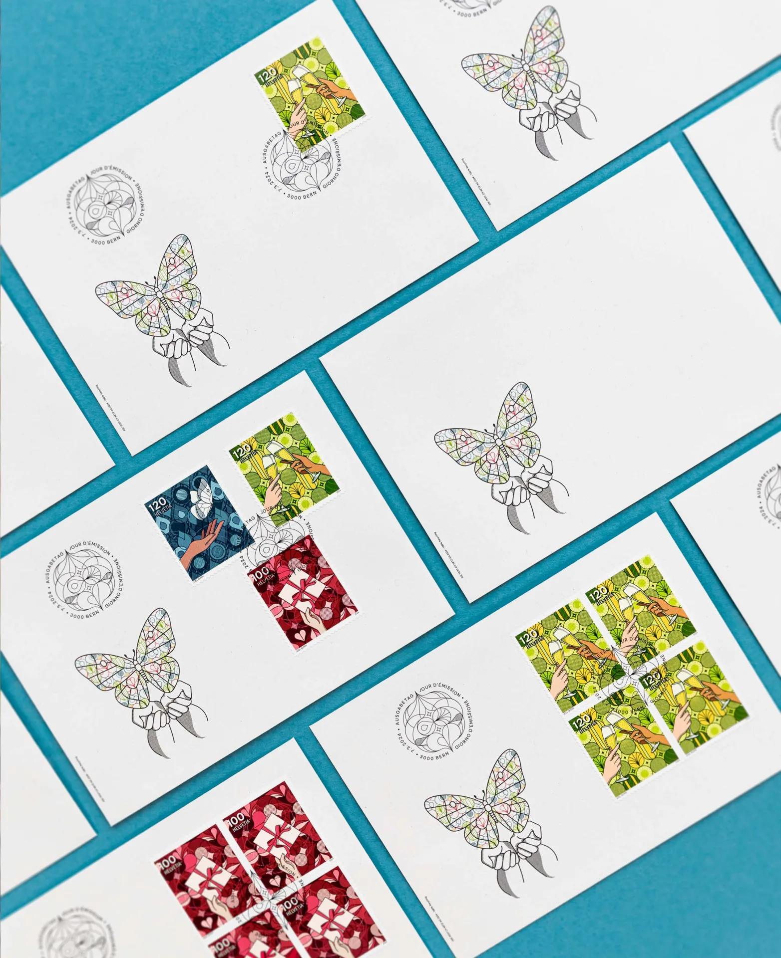
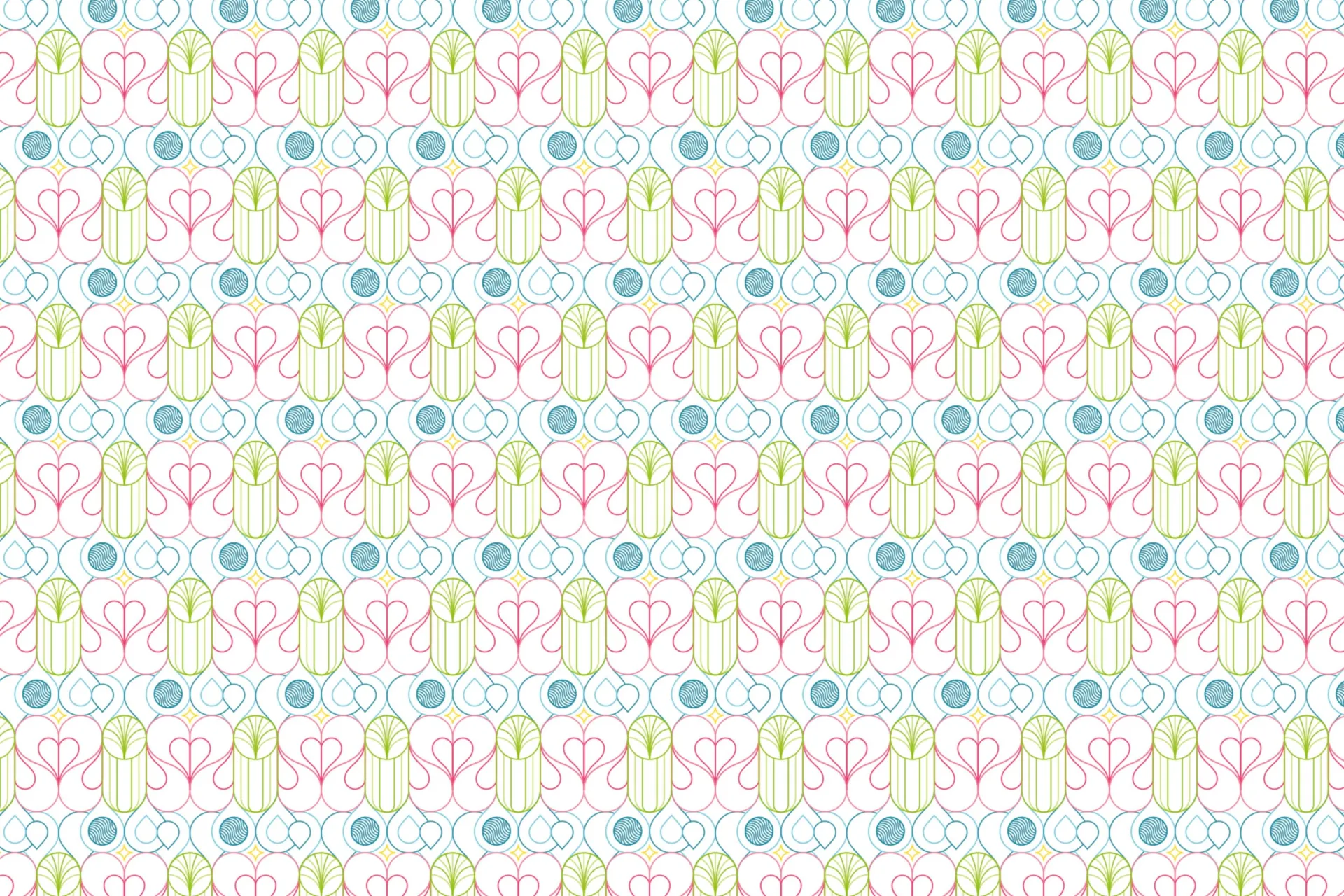
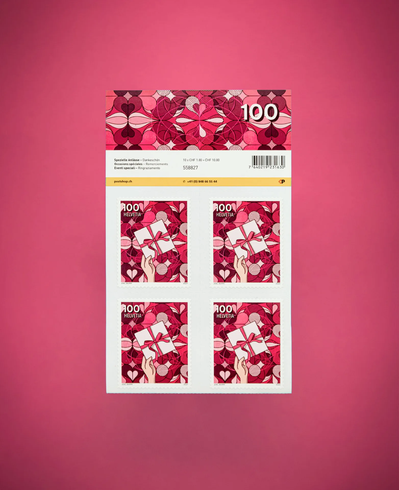
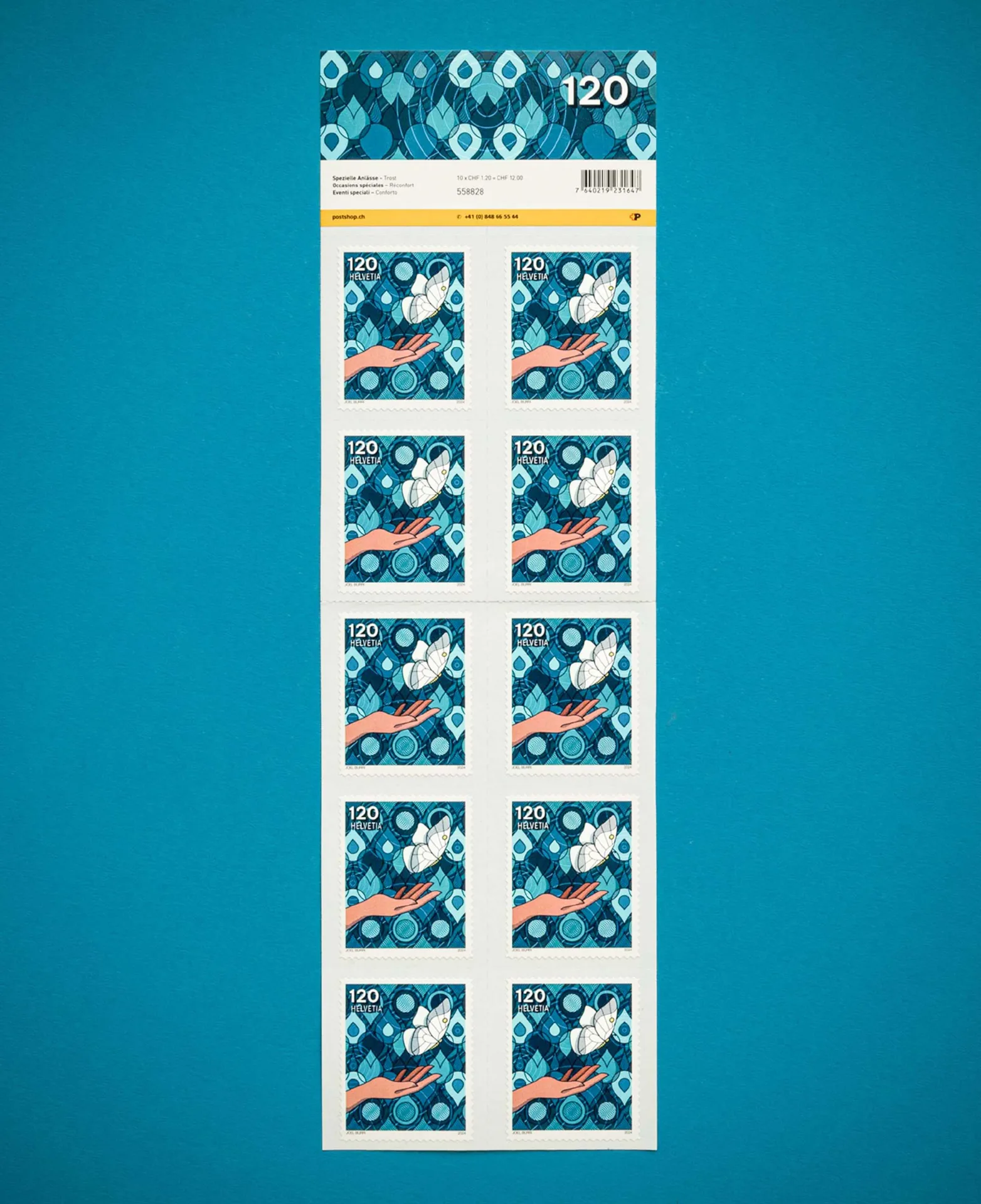
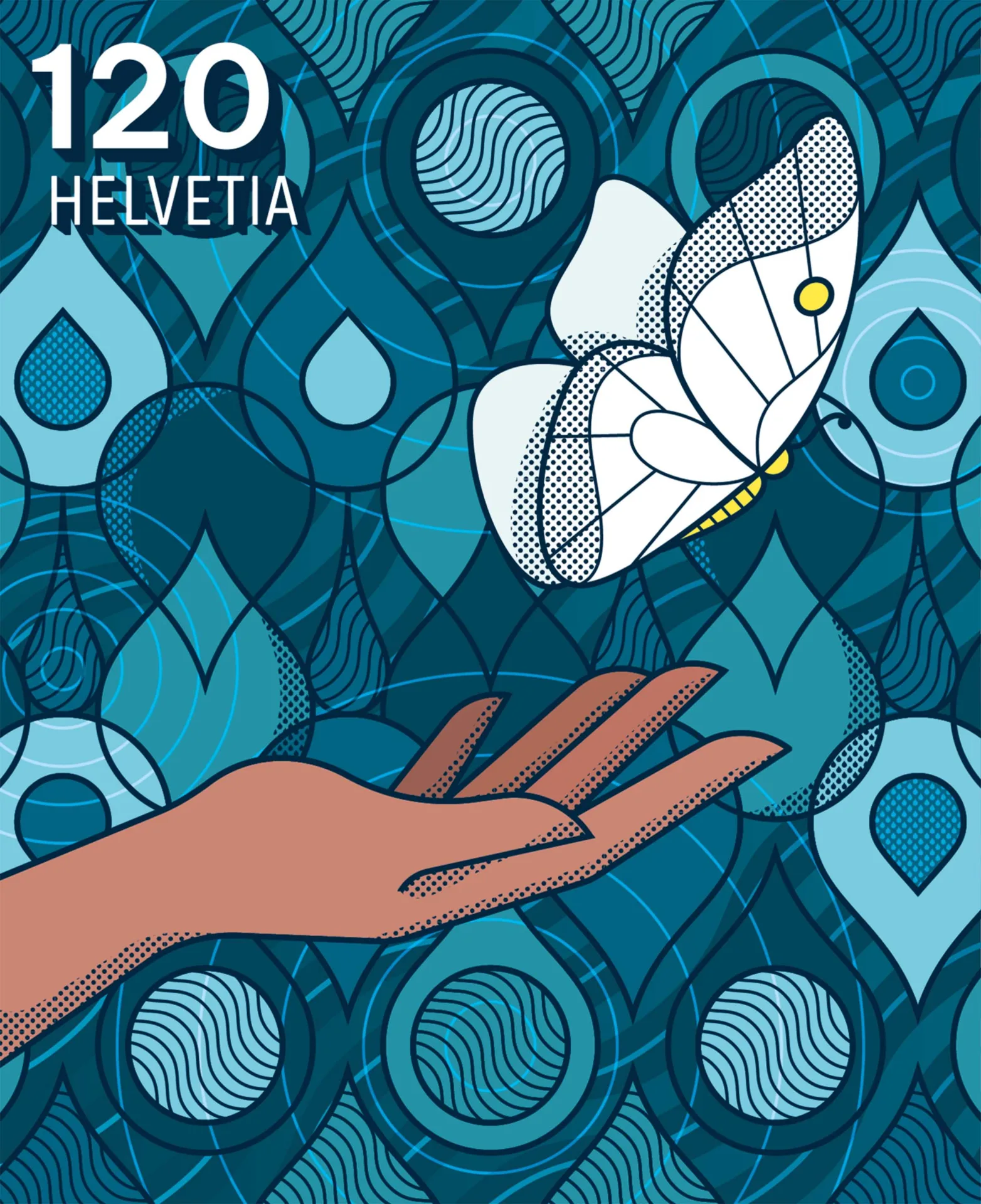
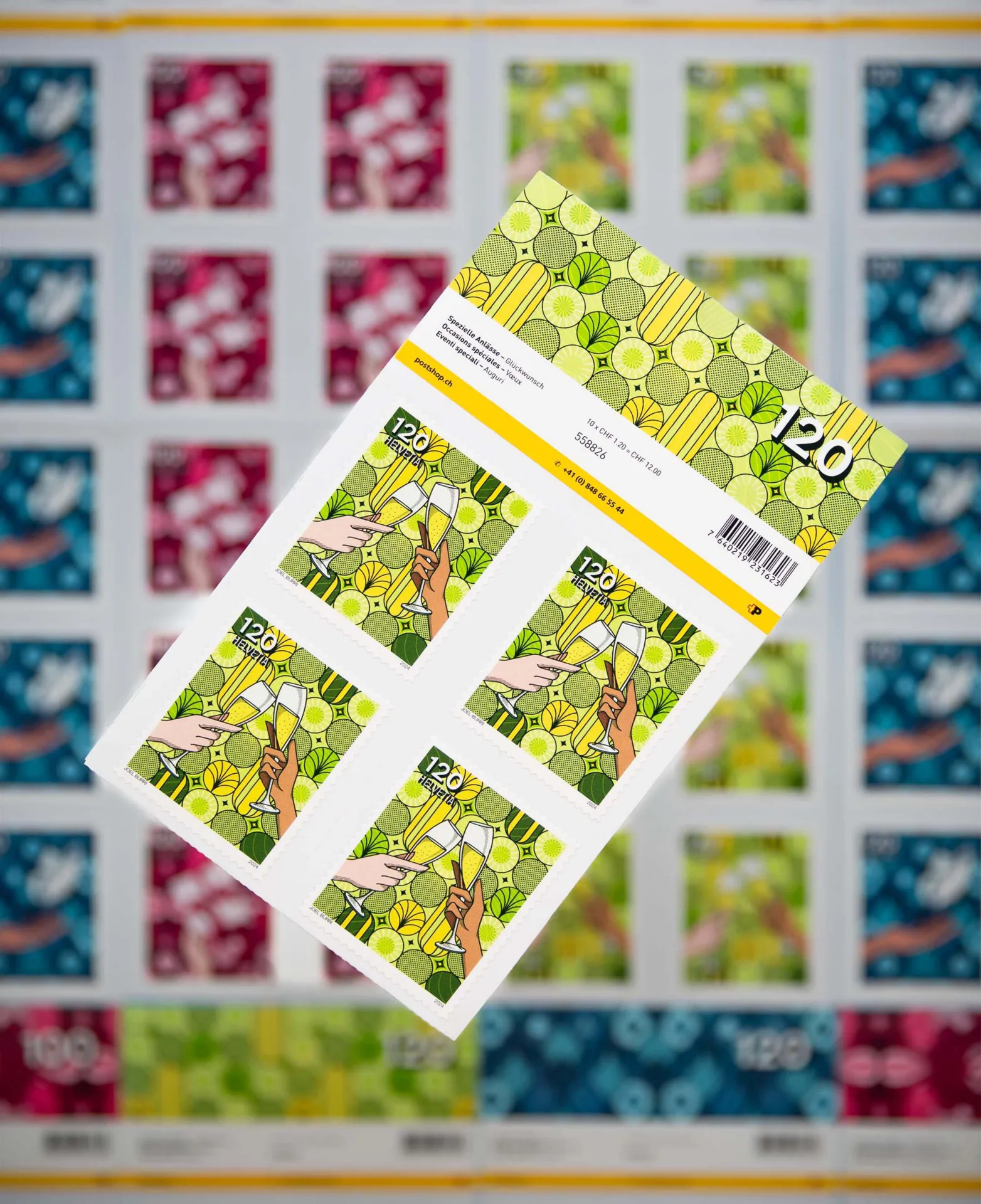
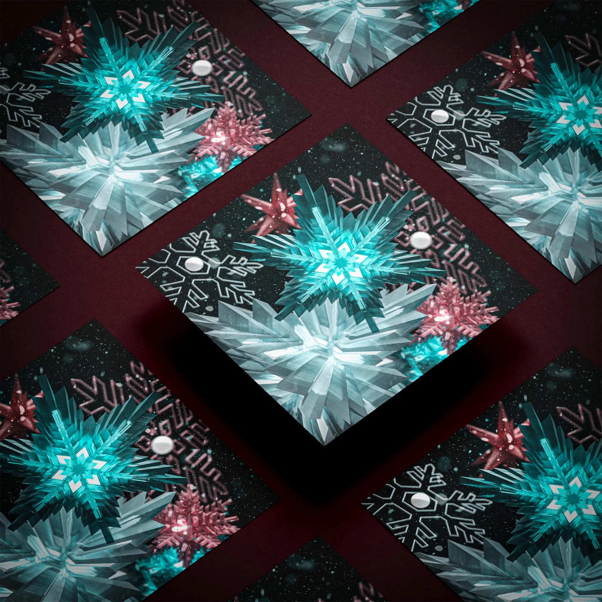
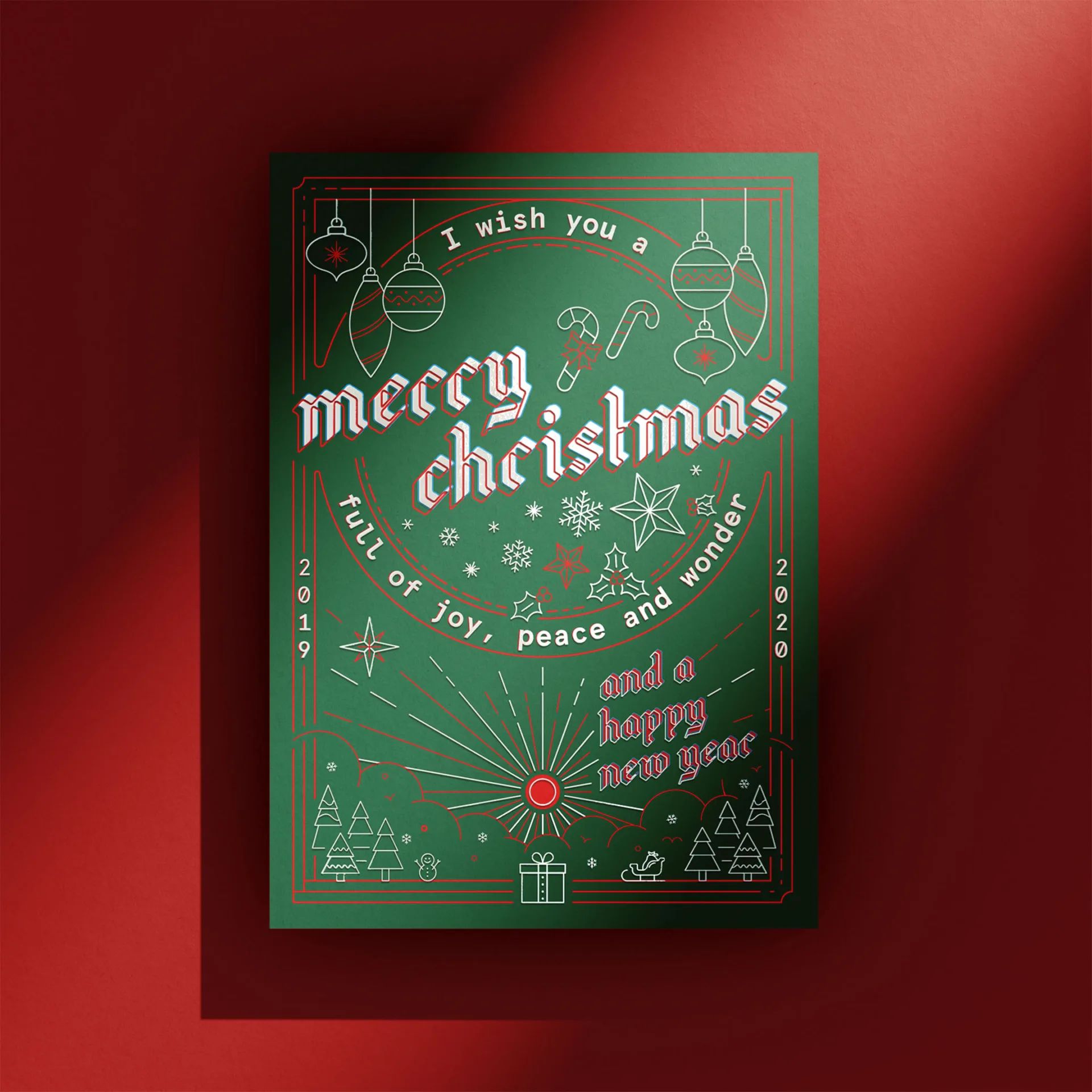
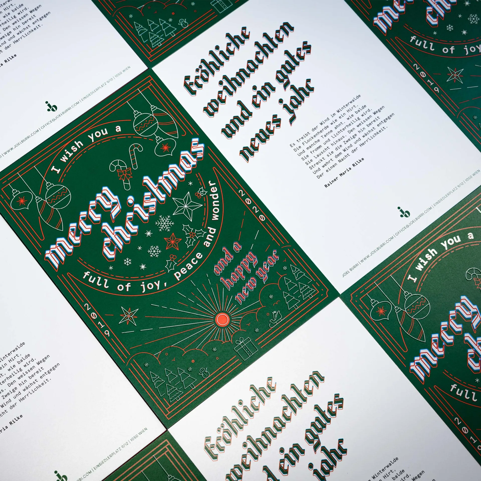
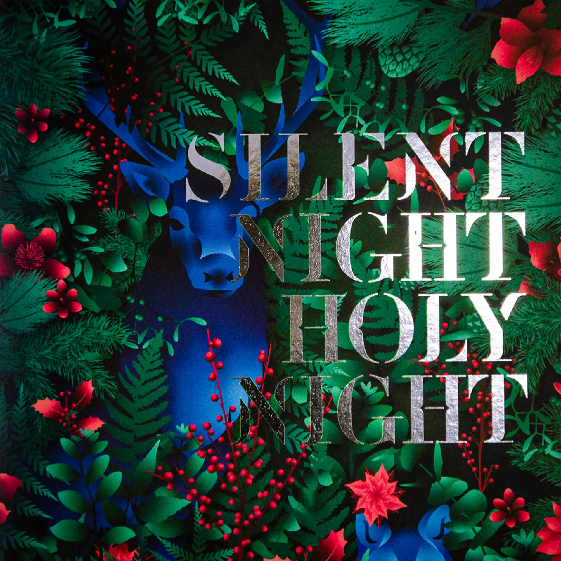
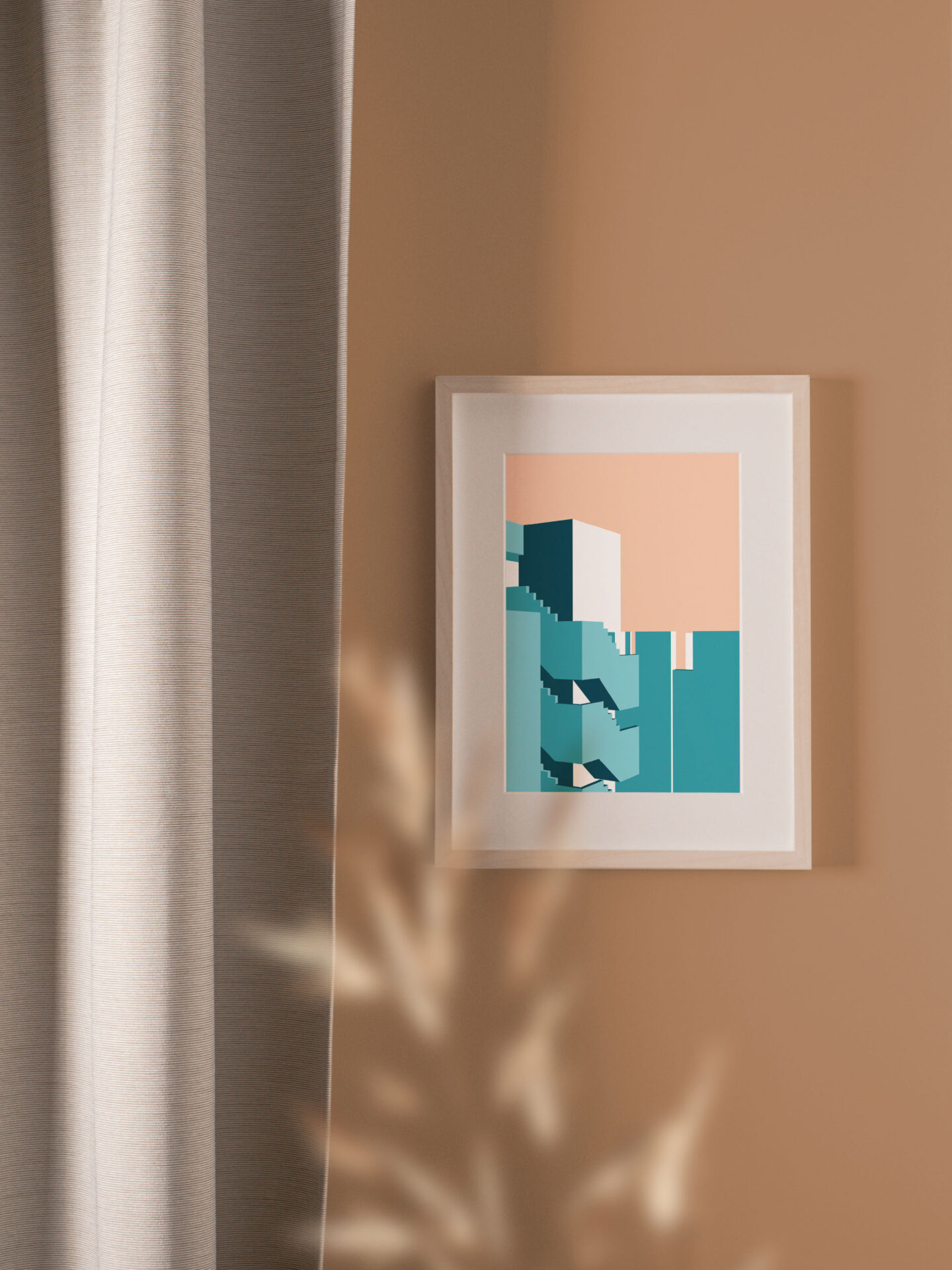
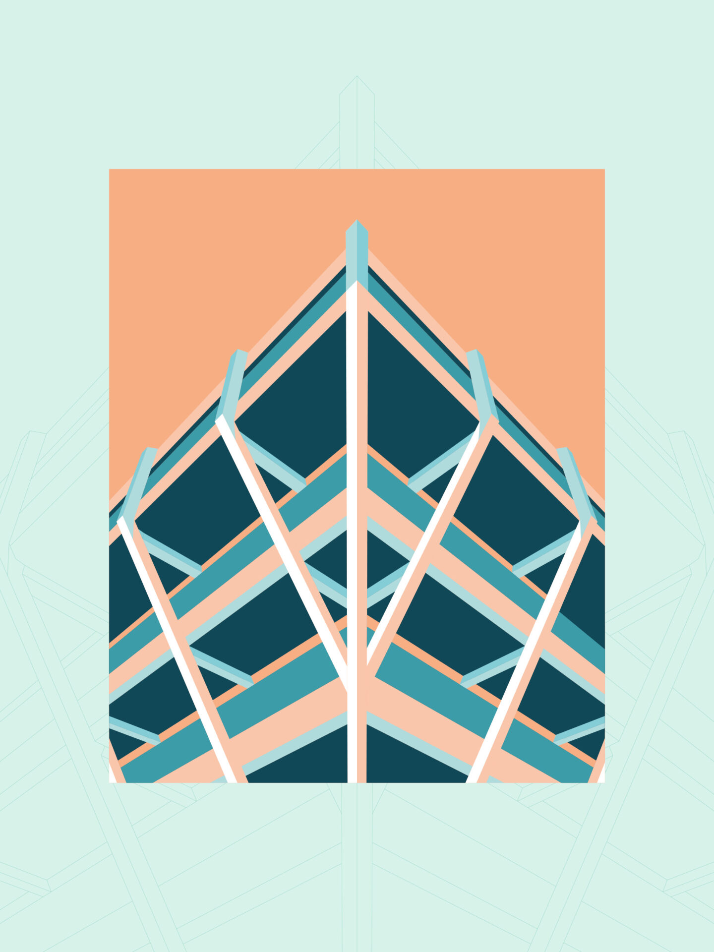
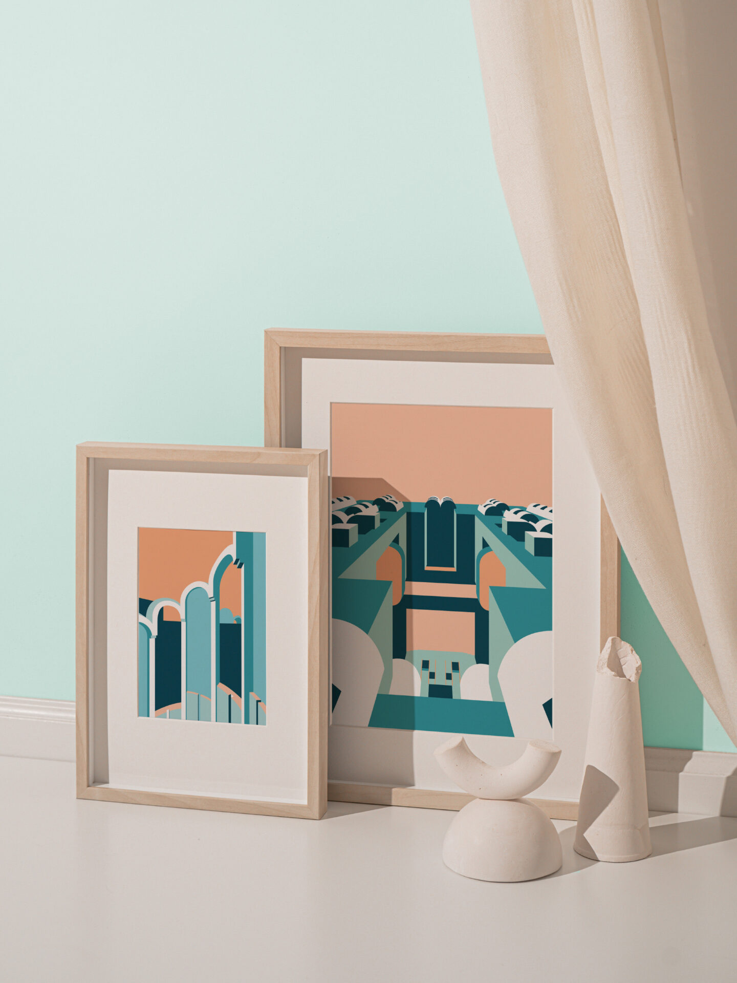
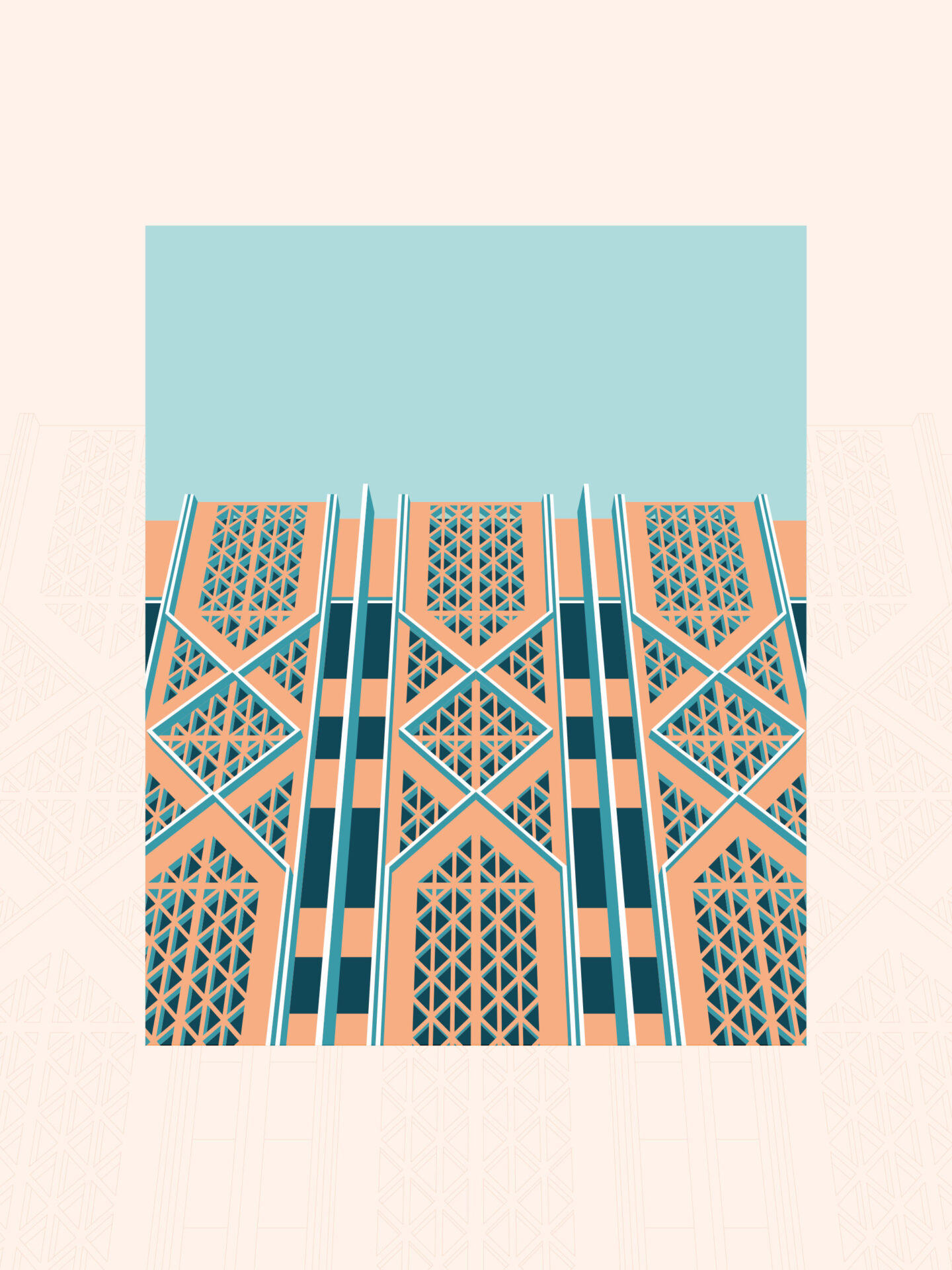
Schweizerische Post – Mailing emotions At regular intervals, the Swiss Post releases a new series of stamps for special occasions, created through a curated competition. This series provides fitting stamps, imbuing the envelope with emotional resonance from the moment it’s sealed – and thus showcasing how even the smallest stamp can achieve profound impact.
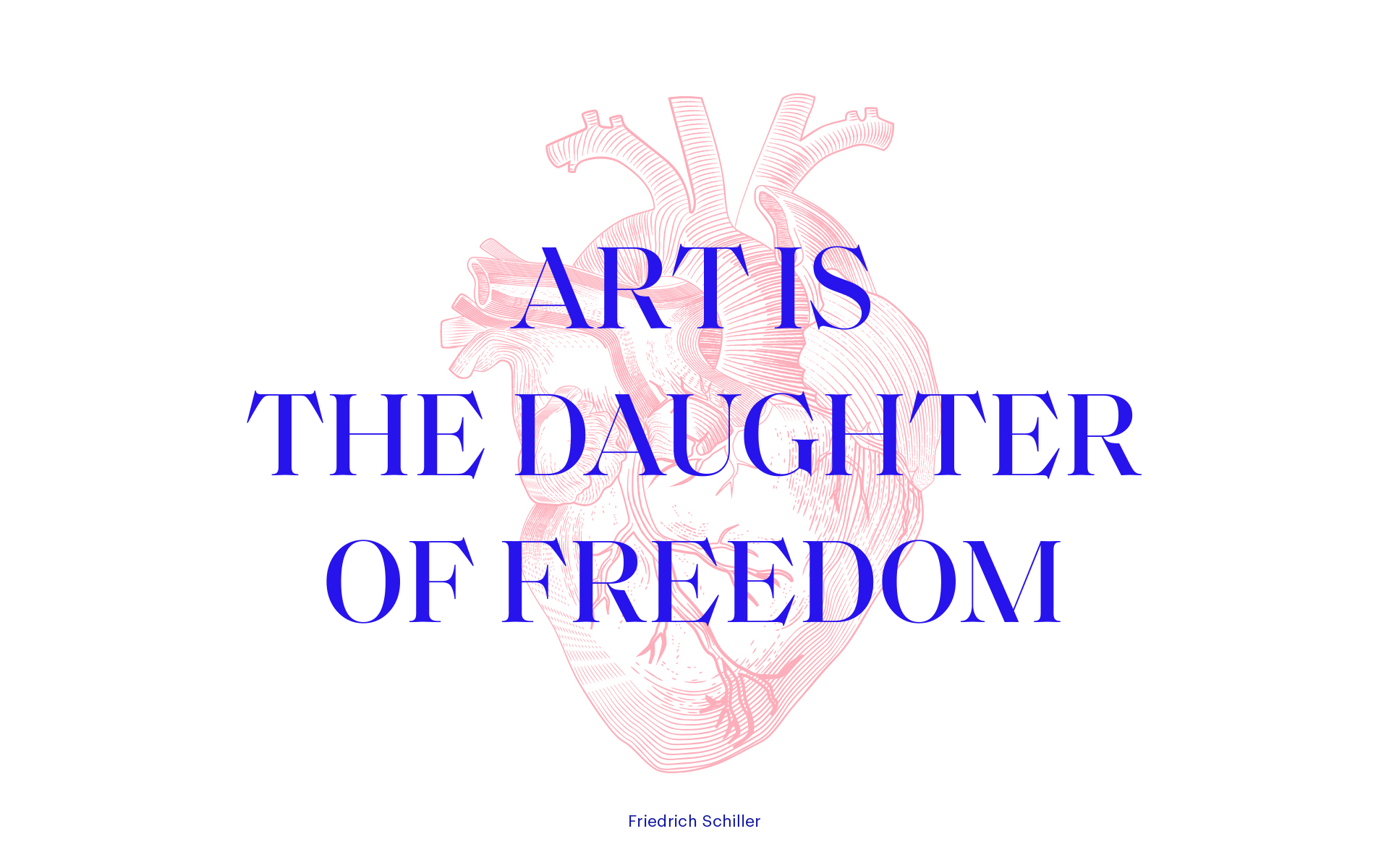
In an age of increasing digitalization, artificial intelligence, and anonymity, a letter symbolizes the personal and handmade. Even if the content isn’t handwritten or the stamp isn’t affixed by hand, every letter is still connected to the actions of one or more individuals, their hands leaving their mark. Whether it’s the writer composing the letter by hand or keyboard, the postal worker delivering it, or the recipient opening and reading it.
Within this stamp series, the hand emerges as the central figure, offering solace, encouragement, or love – a winning motif from the competition, now proudly adorning stamps and letters alike.


CLIENT
YEAR
2023/24
RESPONSABILITY
Concept, design and implementation
SERVICES
Illustration


