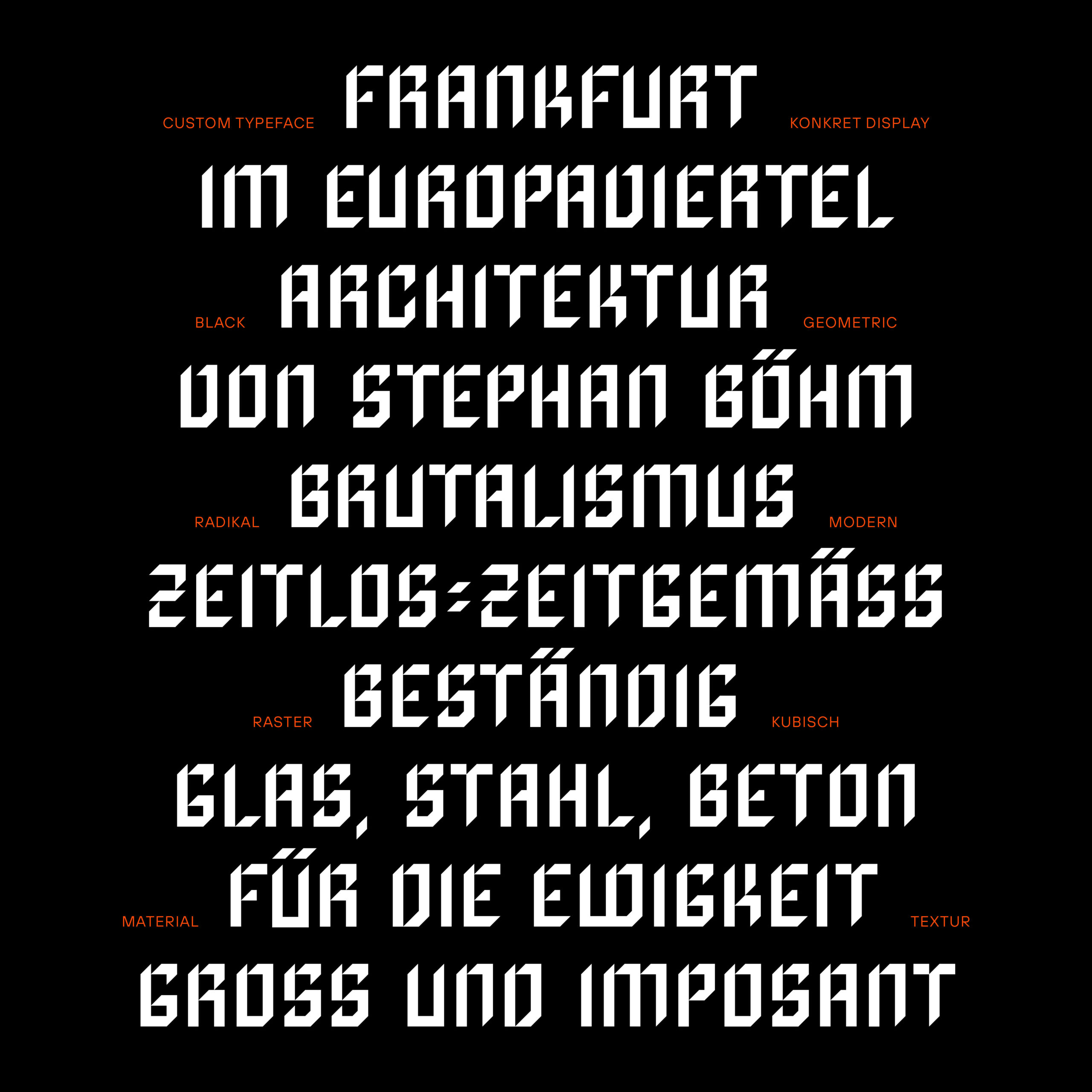
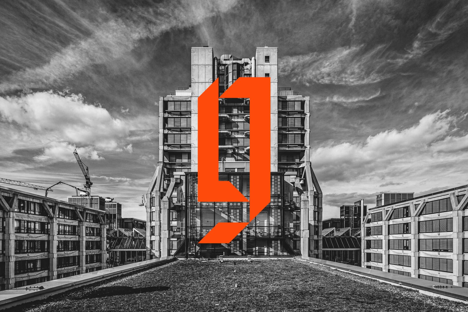
RAW – Frankfurt. Brutalism as a Statement: Buildings like RAW shine as “Like-Stars” on Instagram, Pinterest & Co. In an era of transformation, they symbolize longevity and a style that defies the alluring mainstream: bold, geometric, and radically modern.
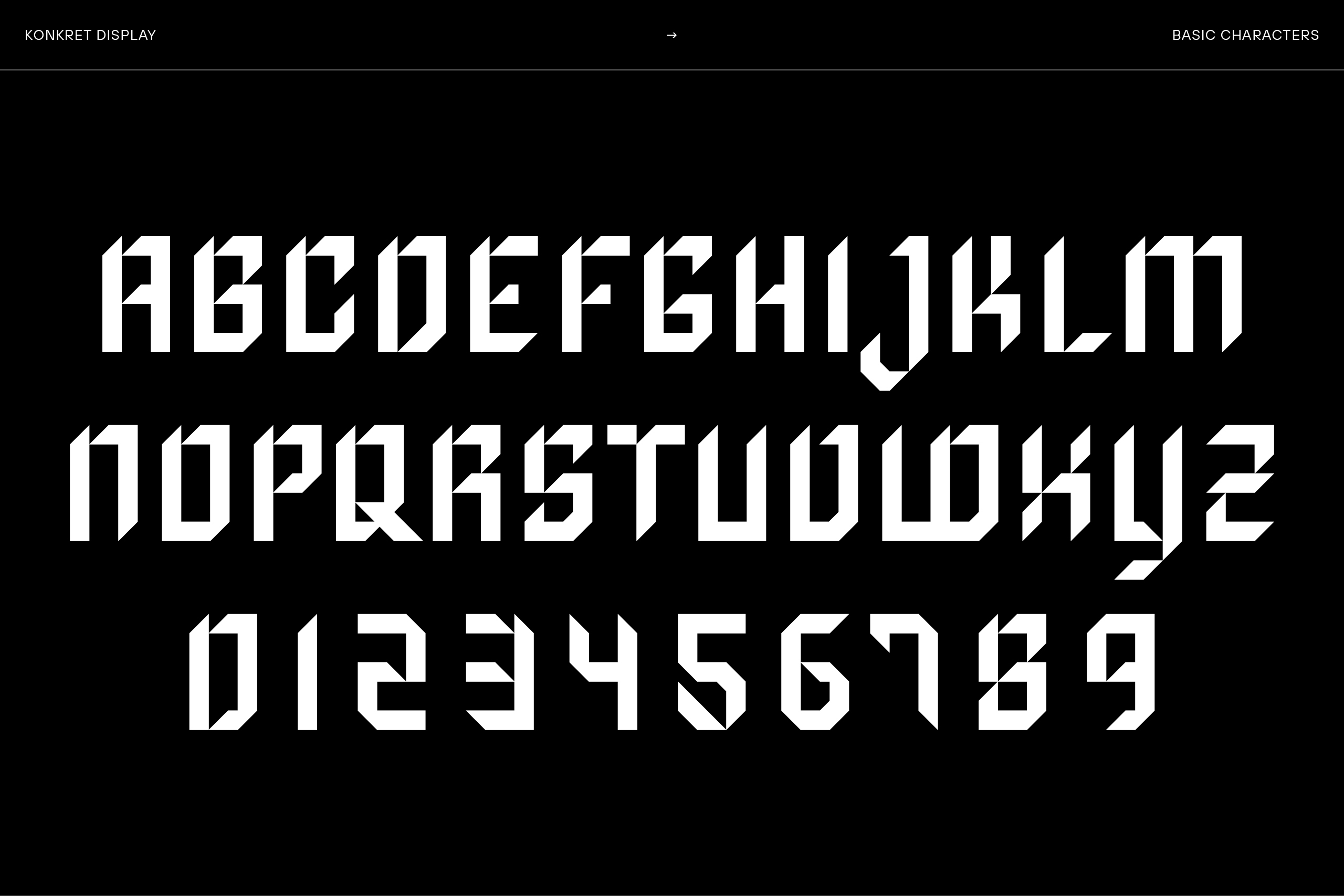
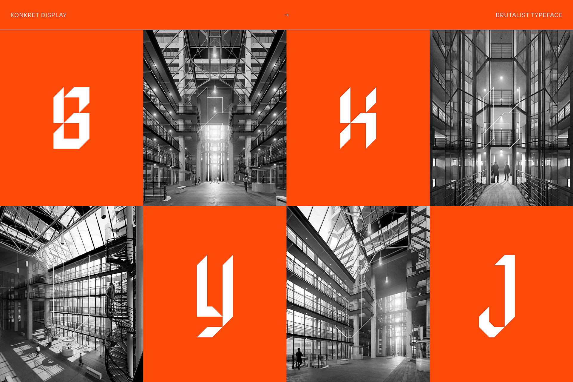
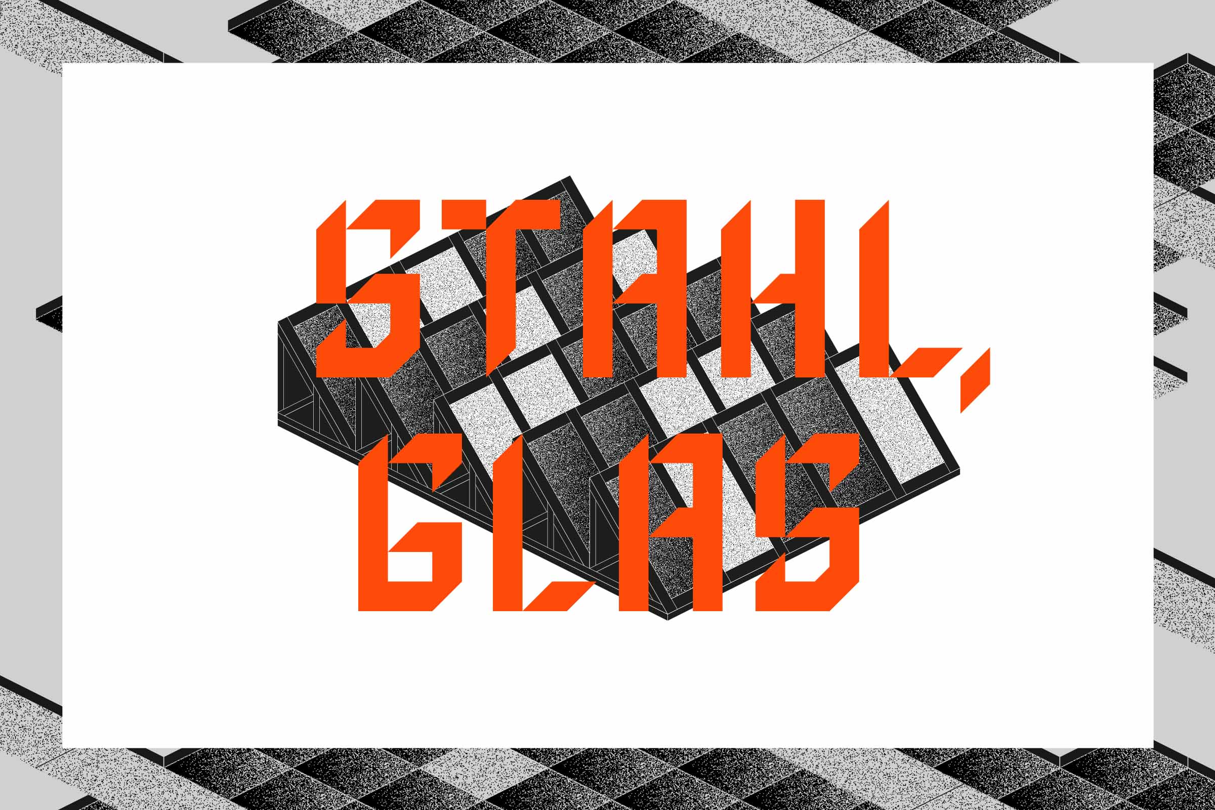
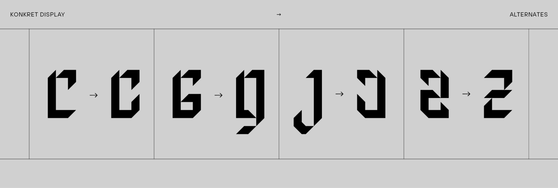
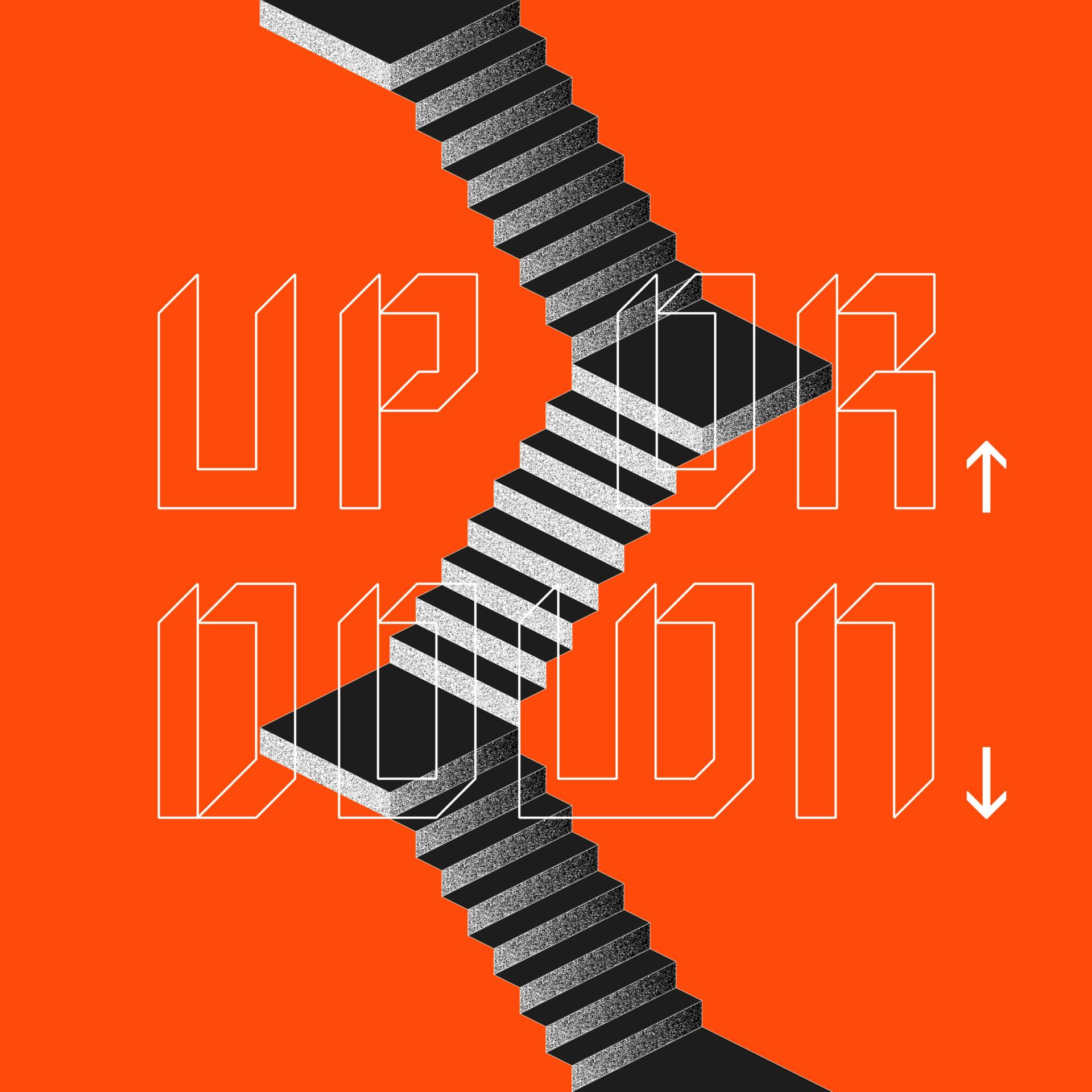
In this same spirit, RAW’s corporate design emerges with clarity and distinction. The custom font is crafted from geometric elements that can be artfully combined, resulting in the creation of singular symbols. The illustration world reflects the essence of straight lines and textures reminiscent of concrete.


YEAR
2019
RESPONSABILITY
Concept, design, illustration and implementation (brand, printed matter), font-design
PARTNER
Agency: Room meets Freiland | 3D-Visualization: beyond | Photography: Ruediger Glatz
CLIENT
SERVICES
Branding, Editorial Design, Marketing, Video, Webdesign
FONT IN USE