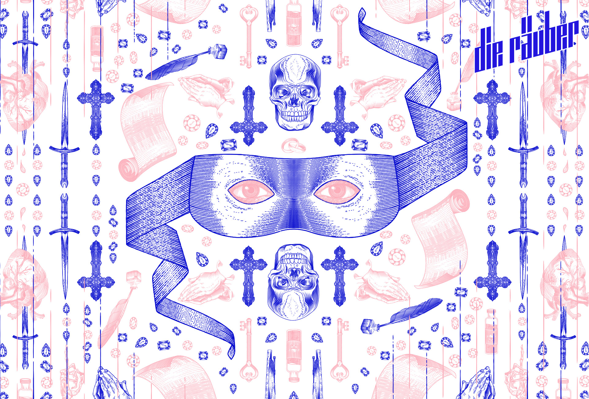
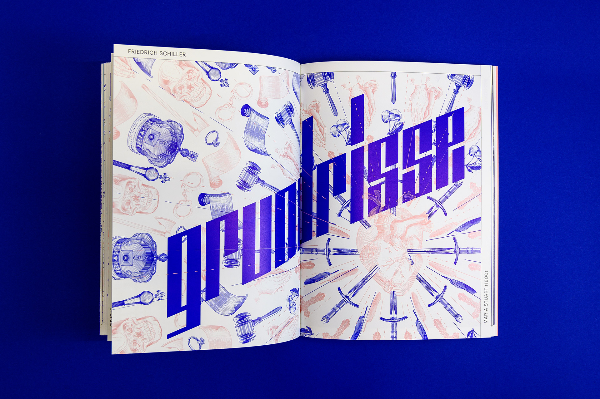
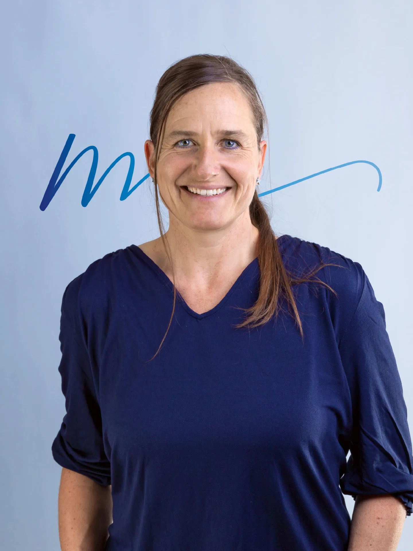
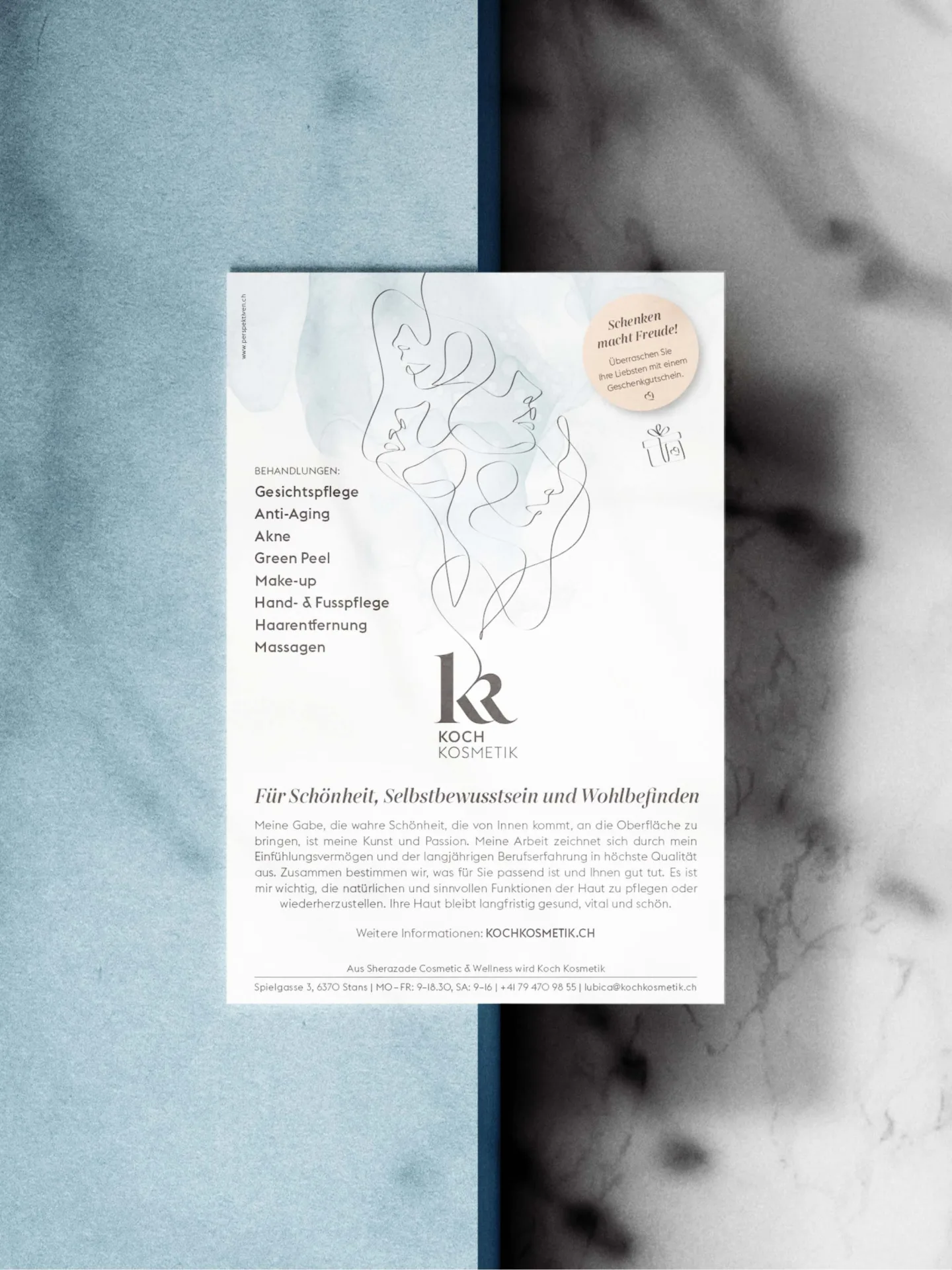
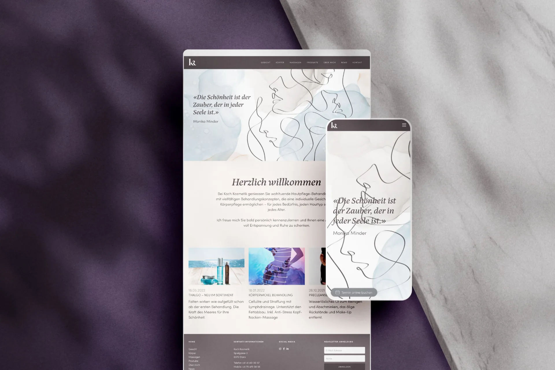
Nicole Mathis
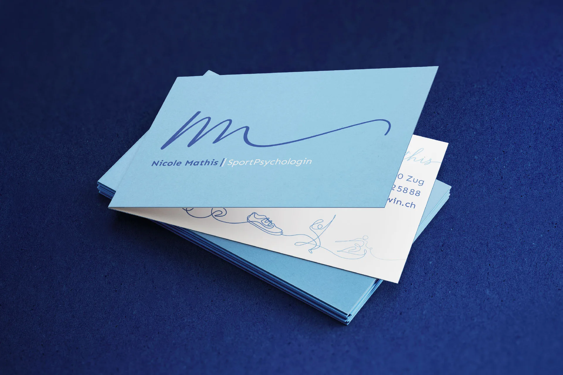
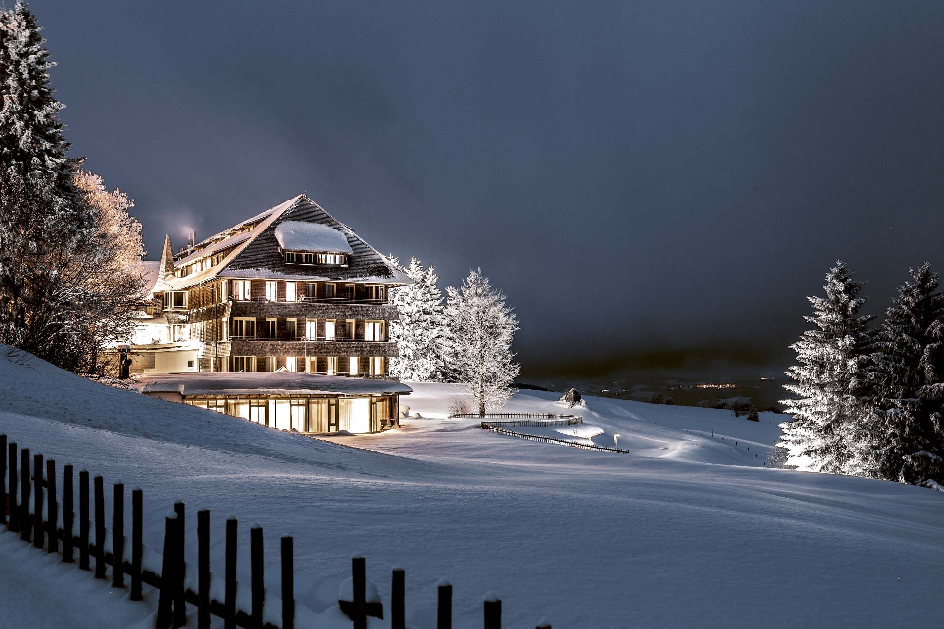
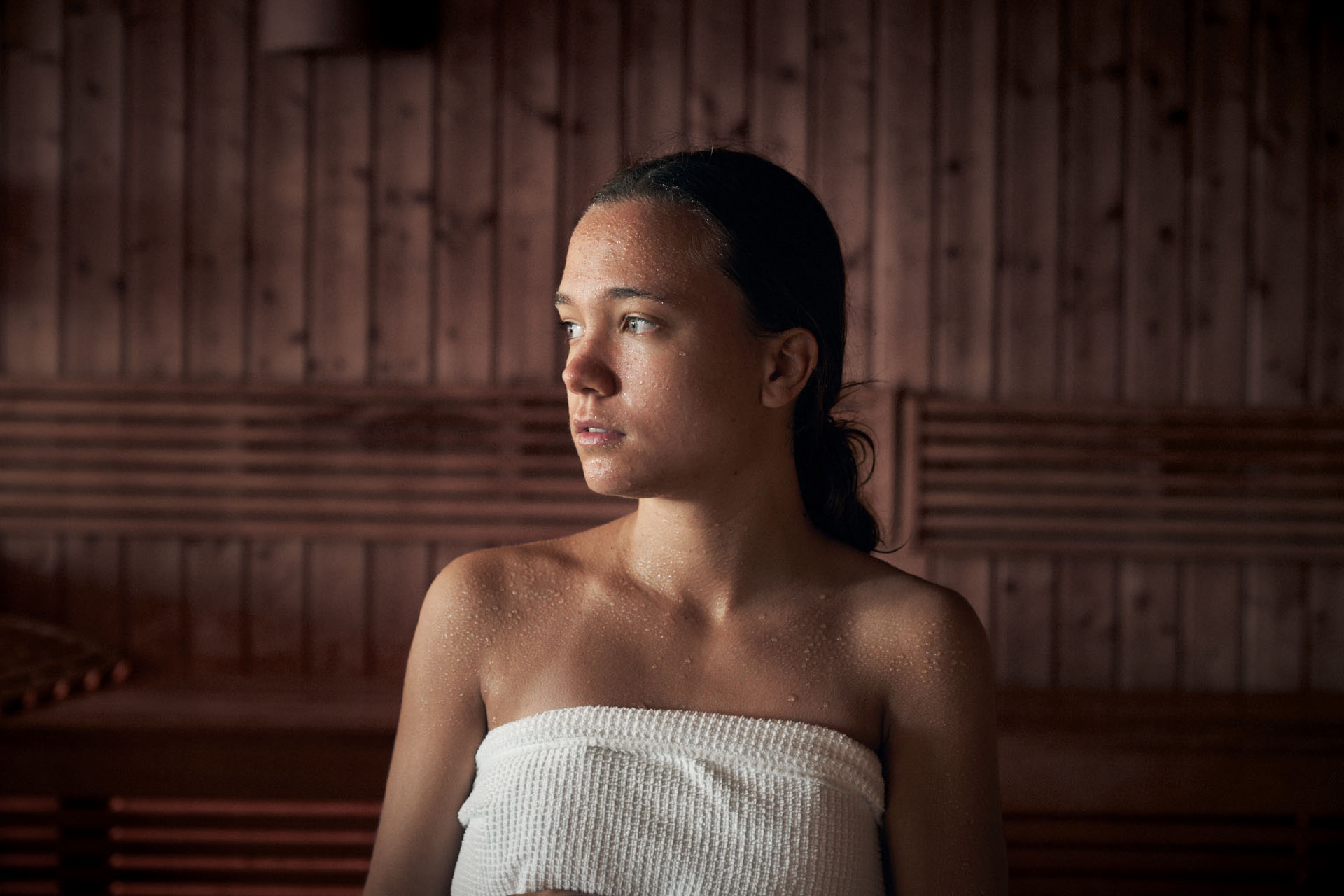
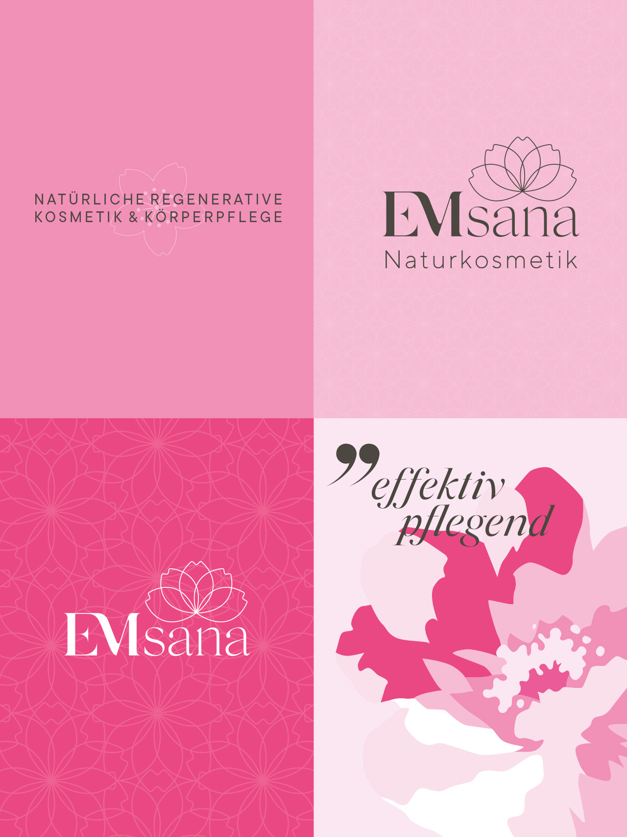
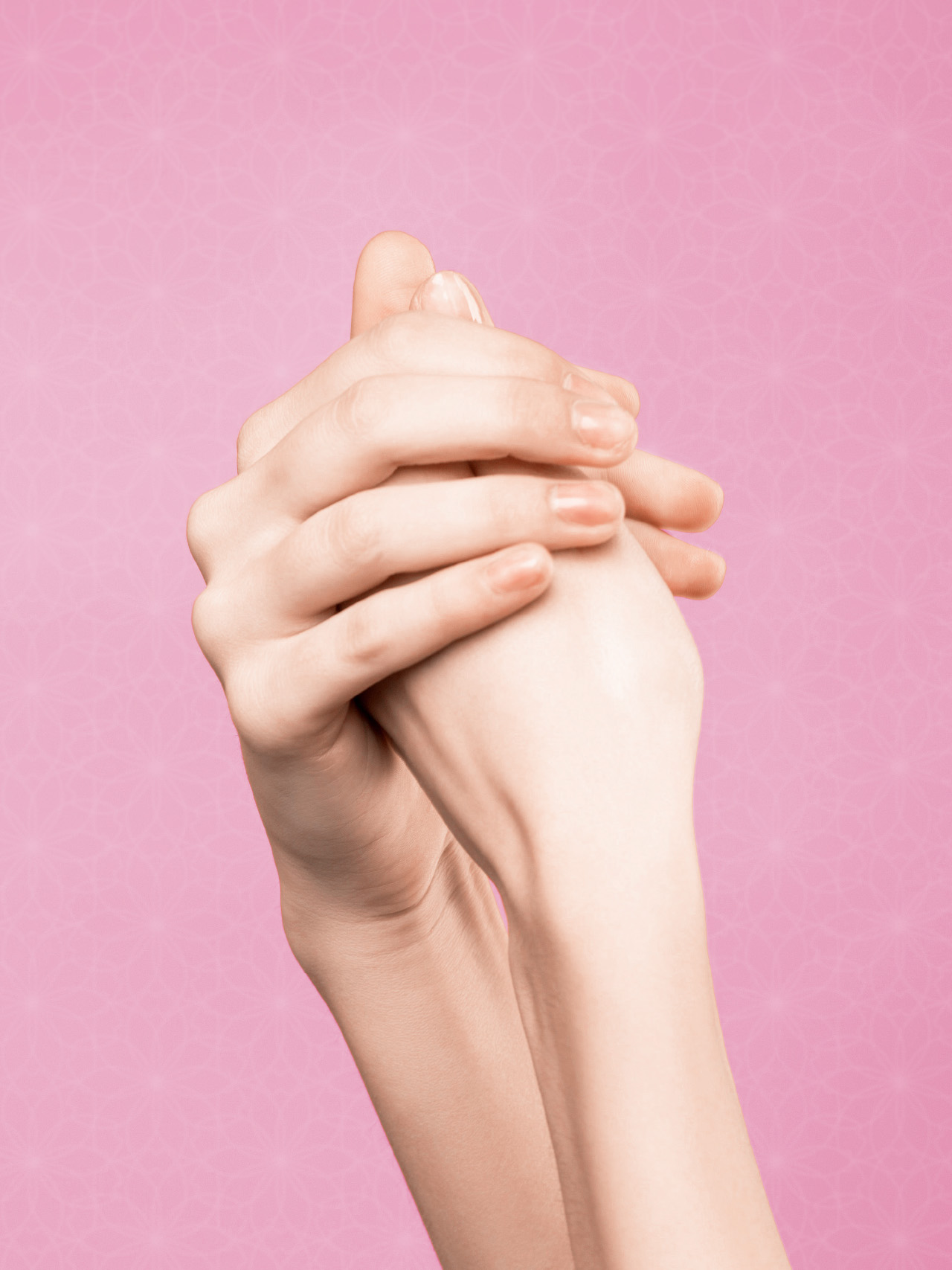
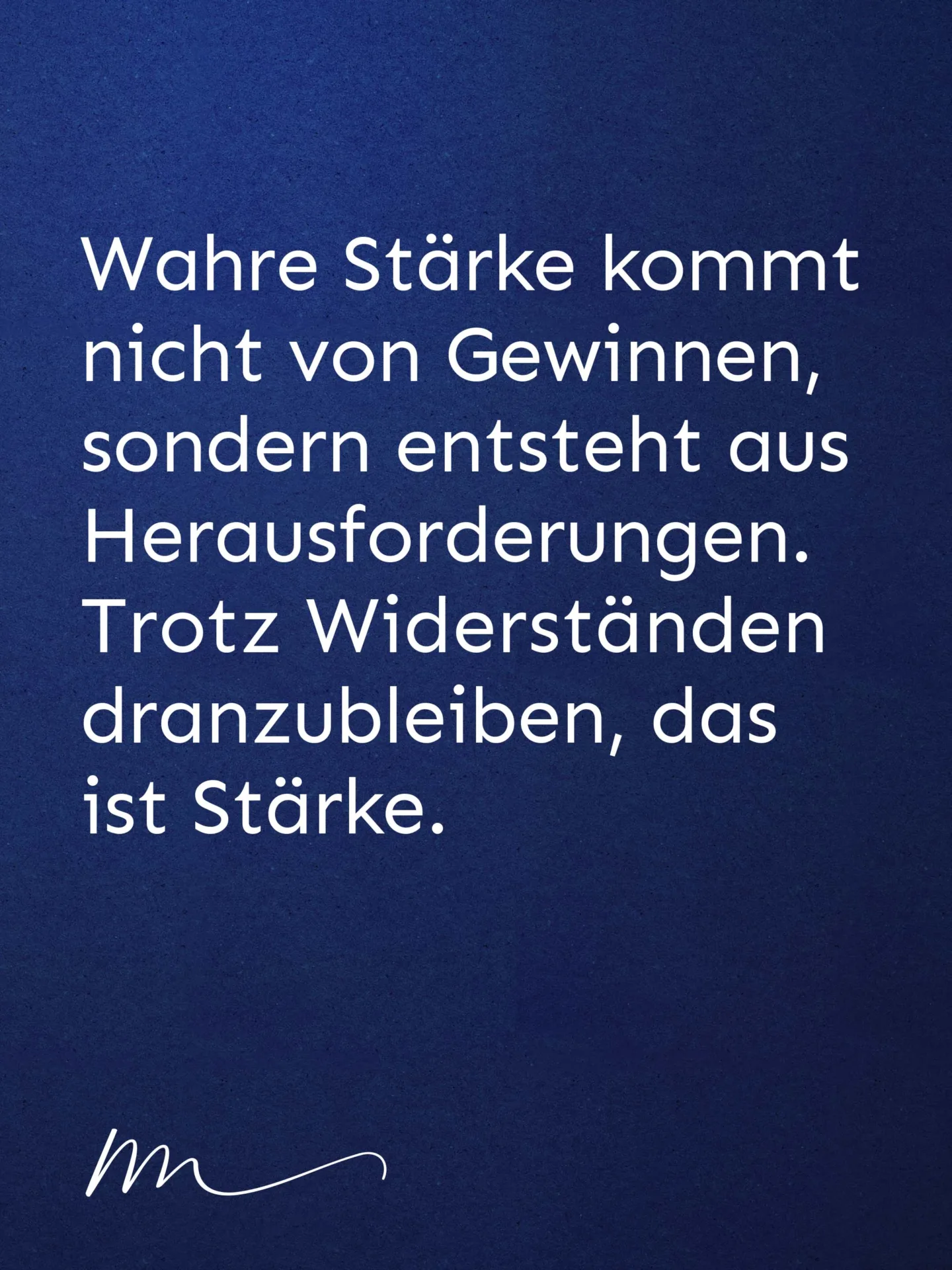
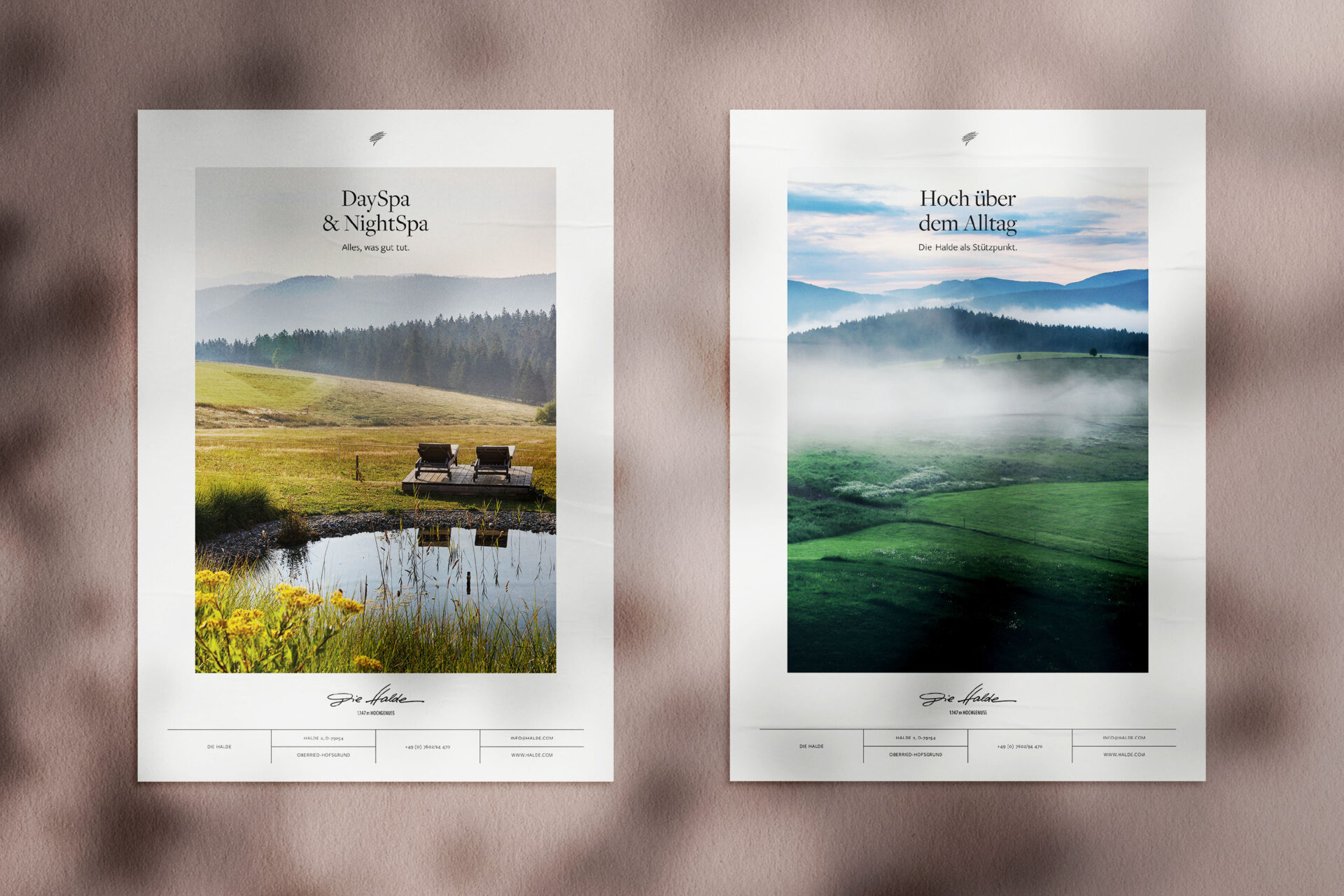
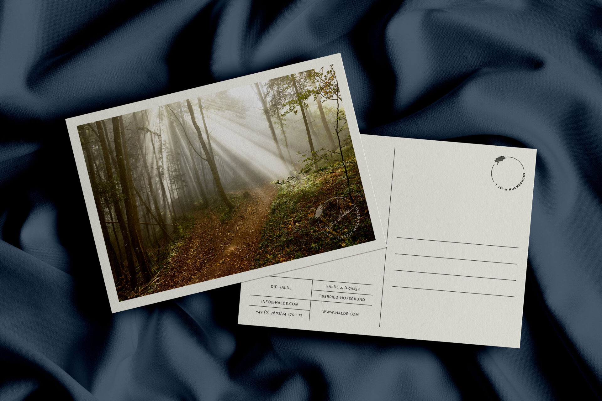
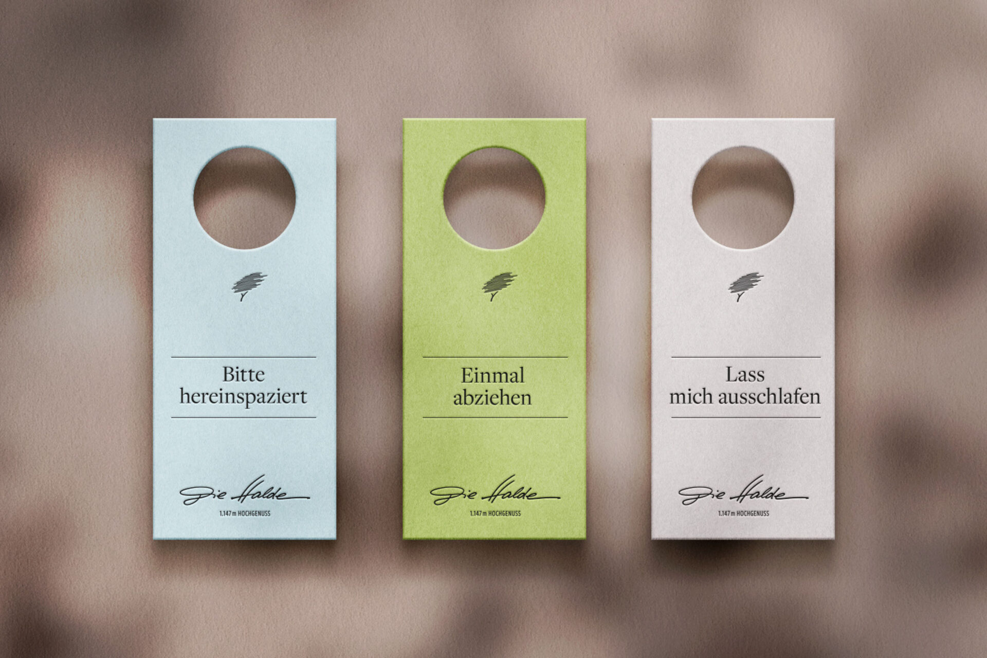
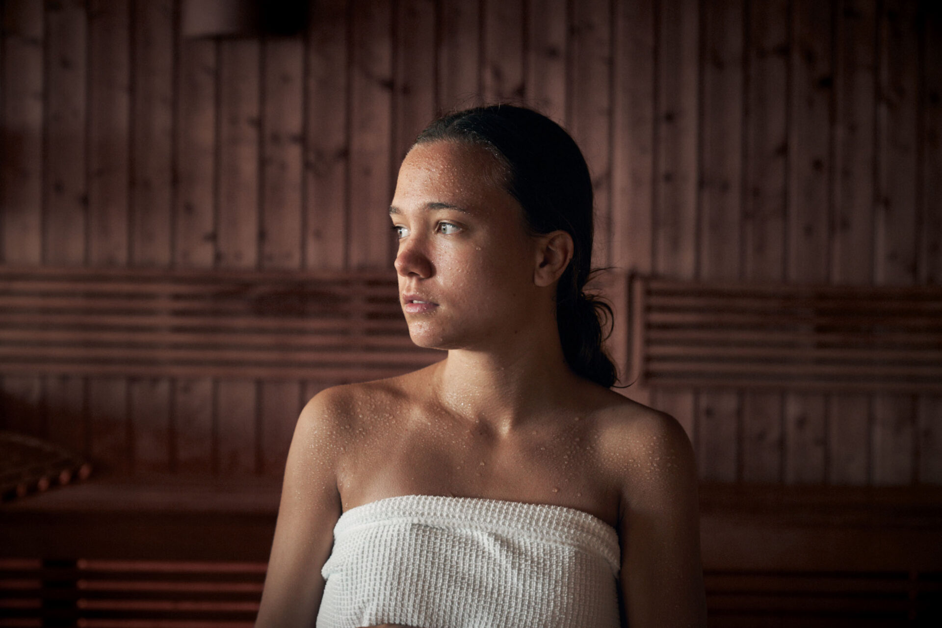
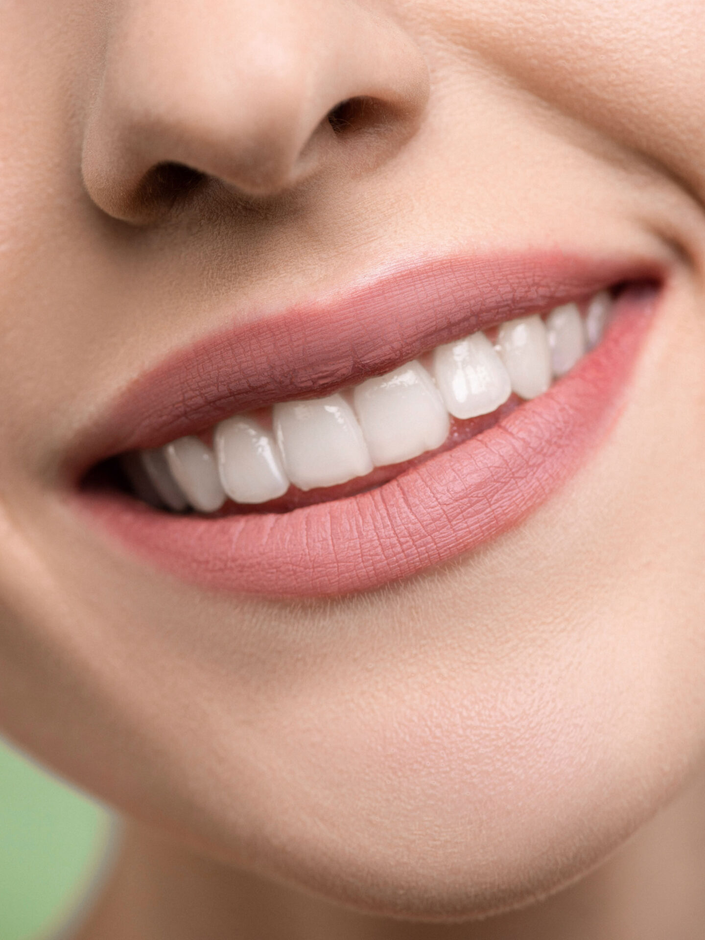
Nicole Mathis – sports psychologist Nicole Mathis is a certified sports psychologist. Her brand presentation reflects the breadth of her sports psychology experiences and her concept, which is based on resource enhancement and a solution-oriented approach.
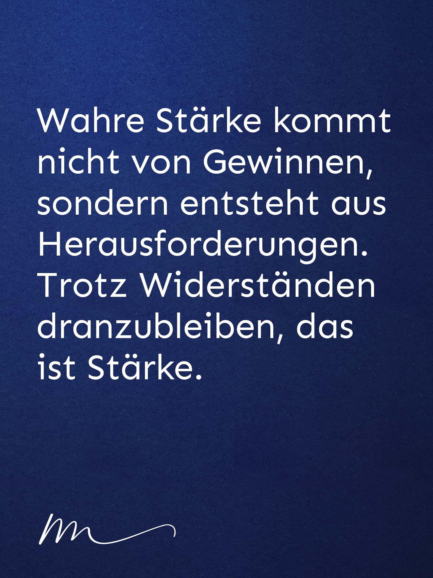
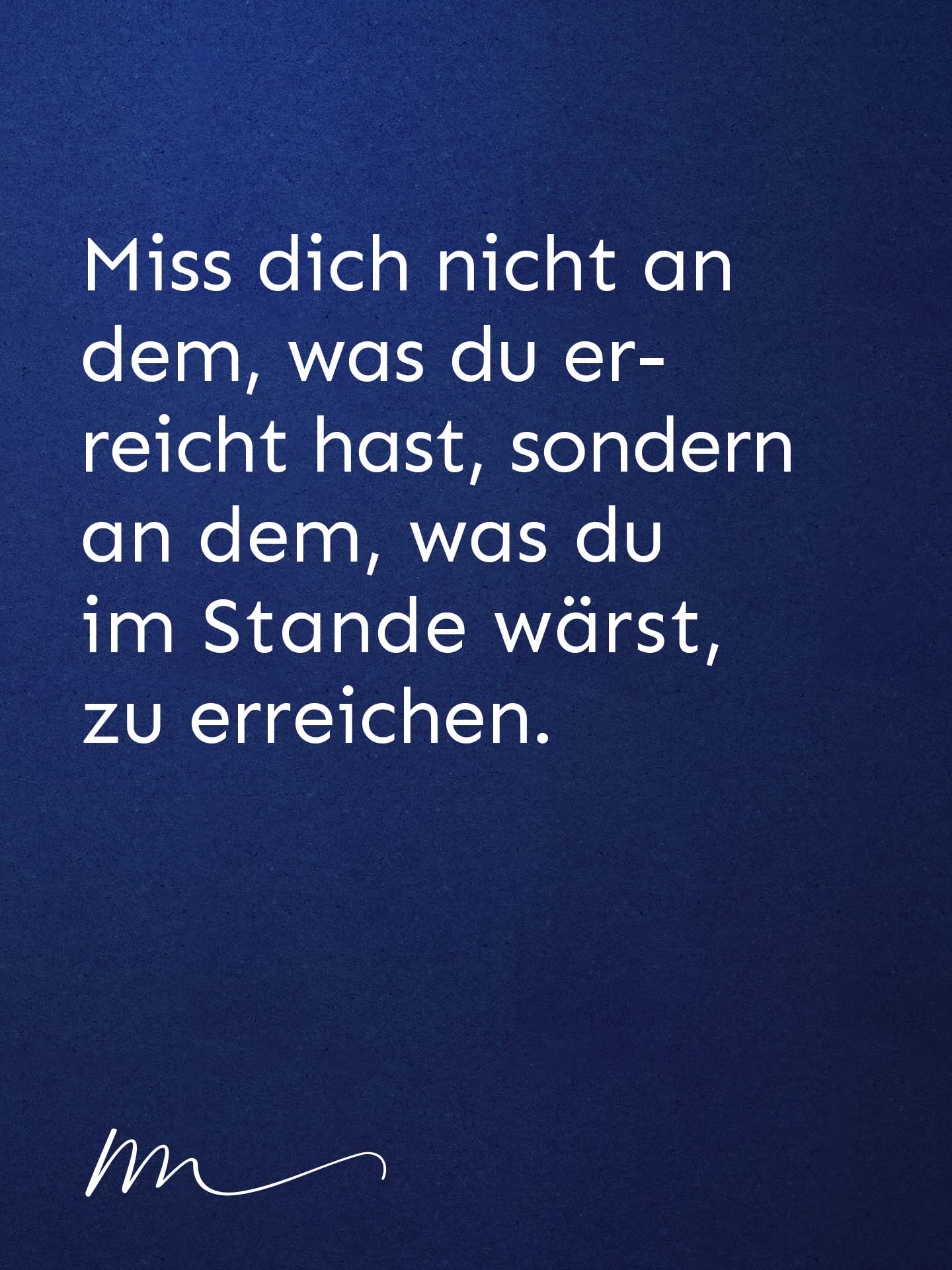
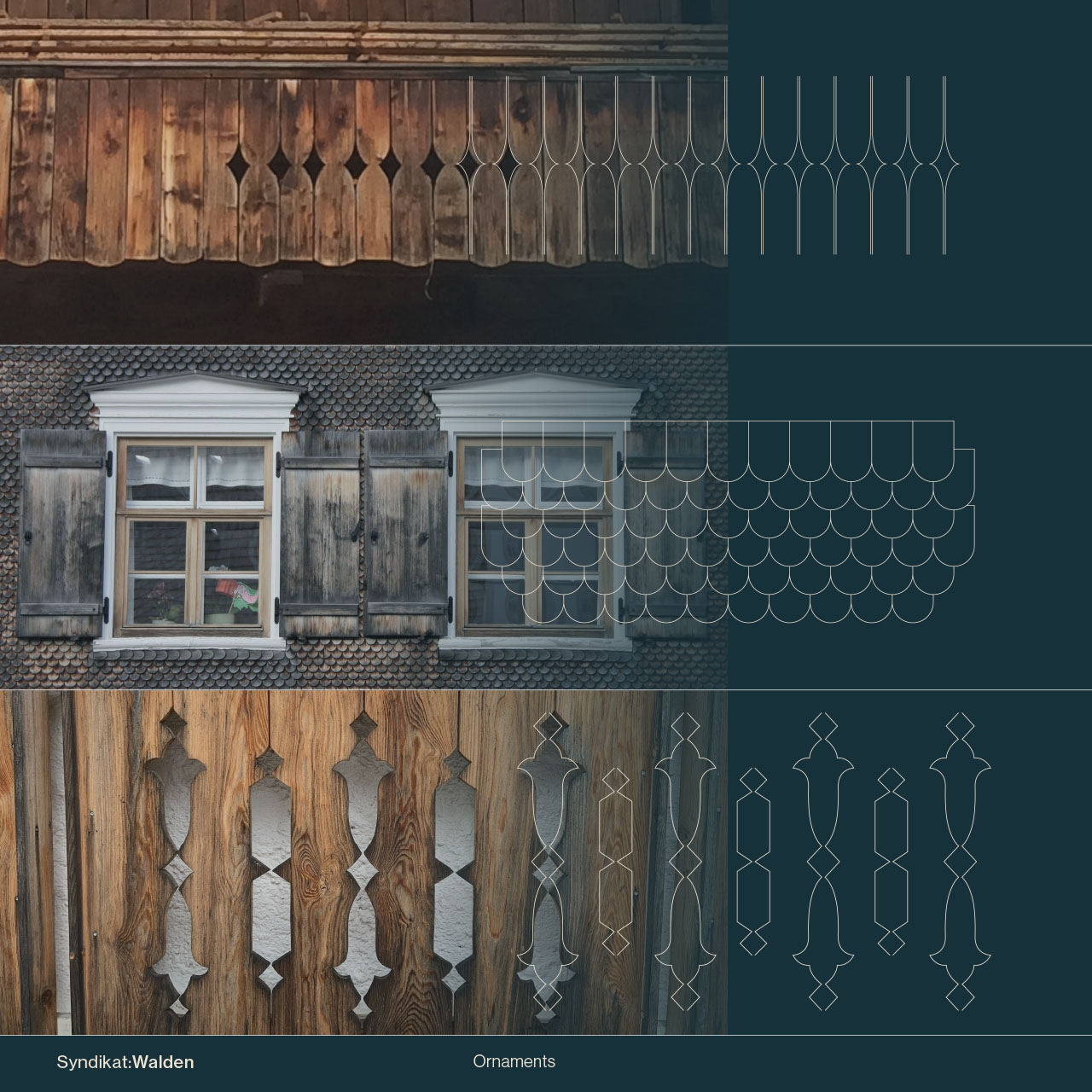
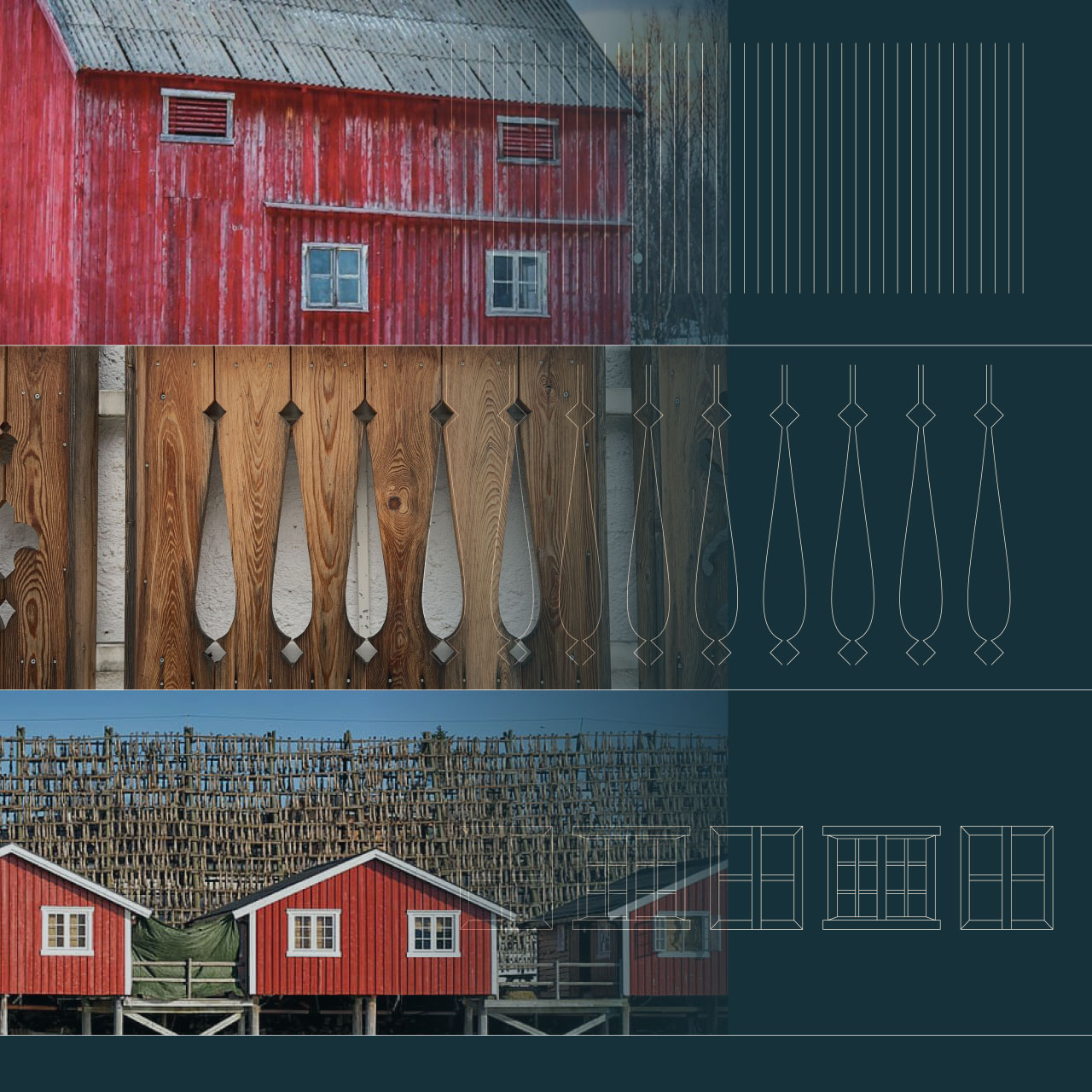
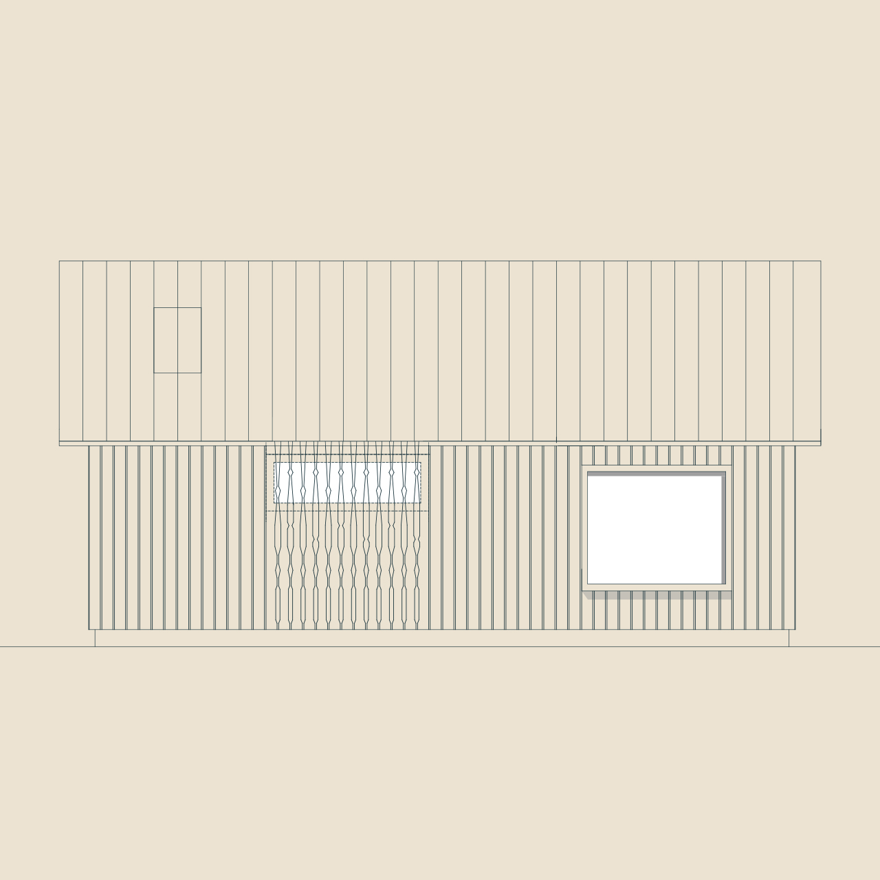
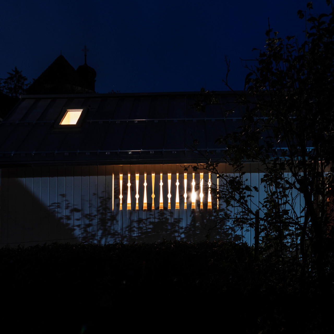
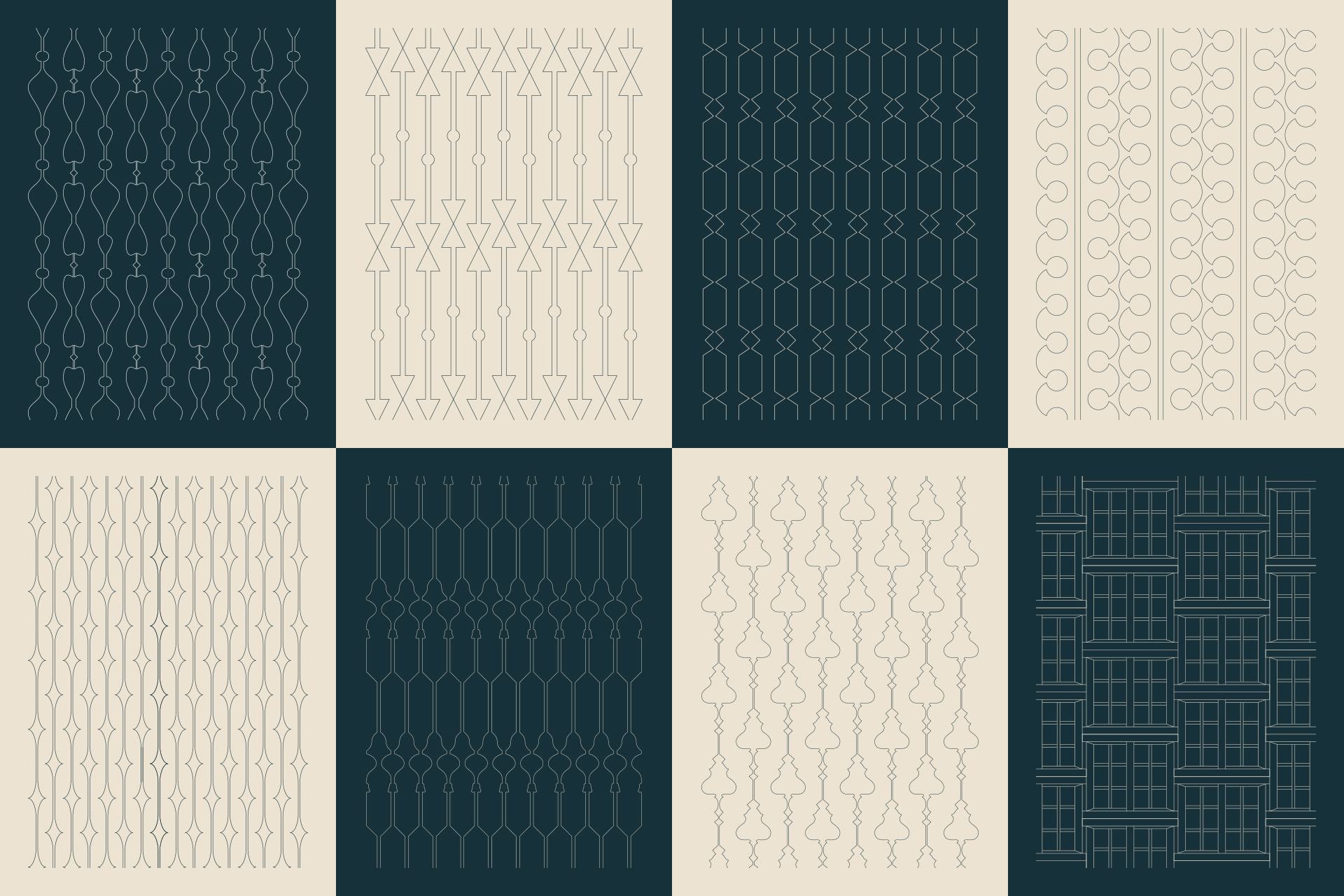
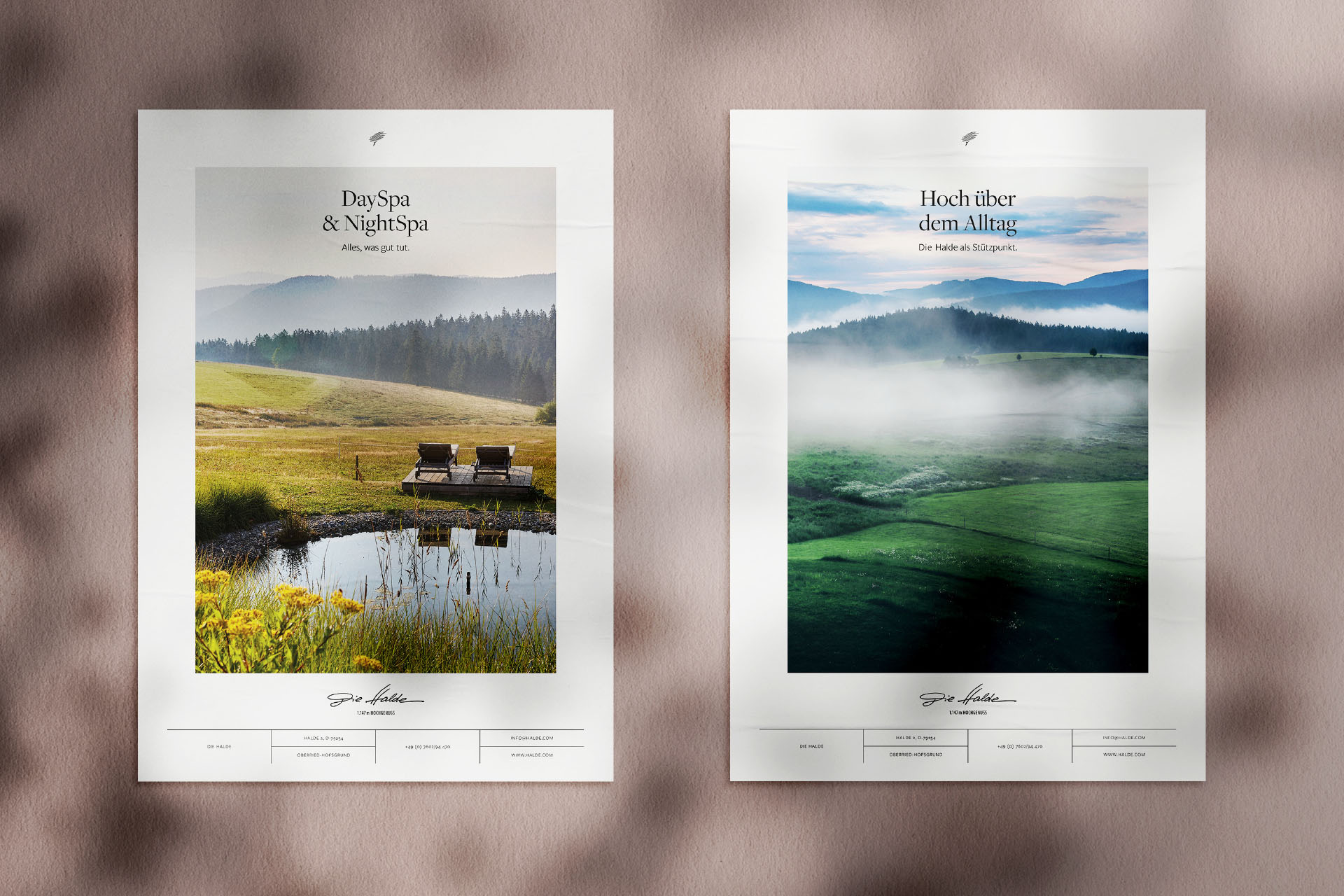
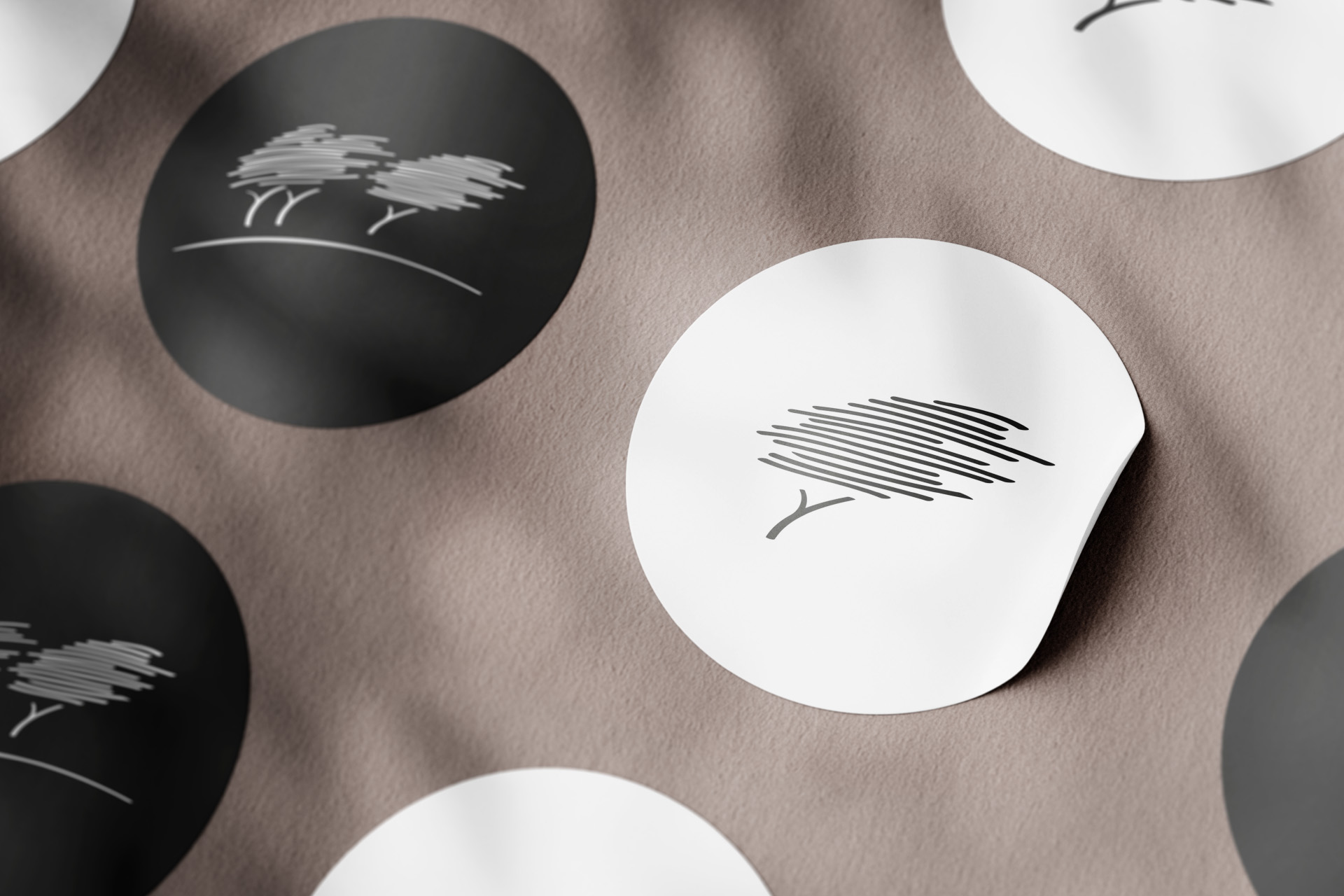
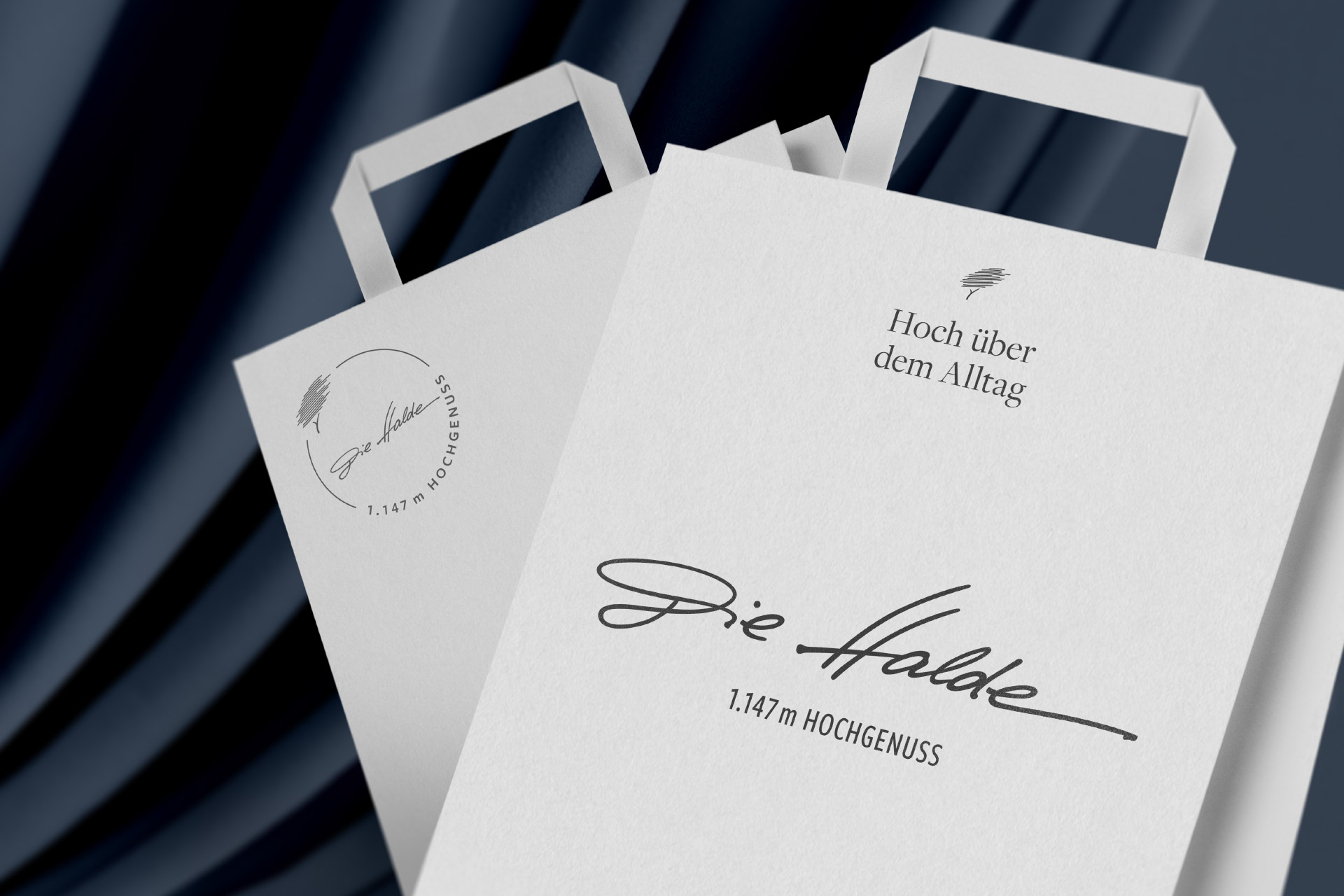
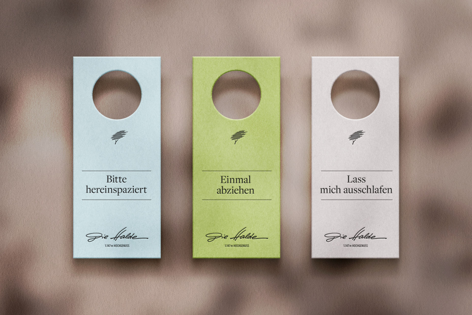
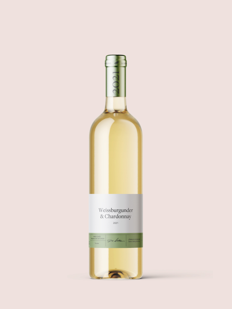
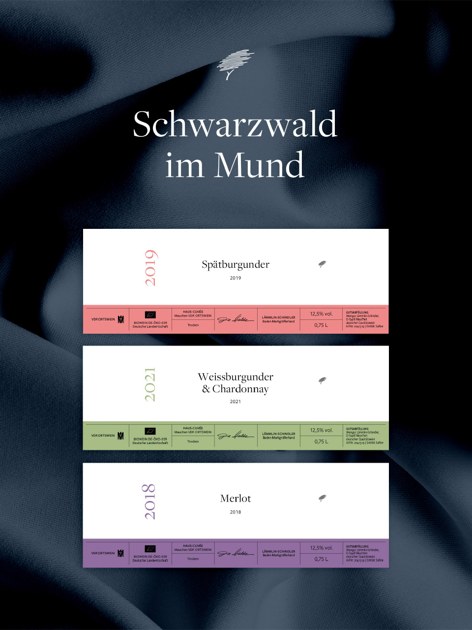
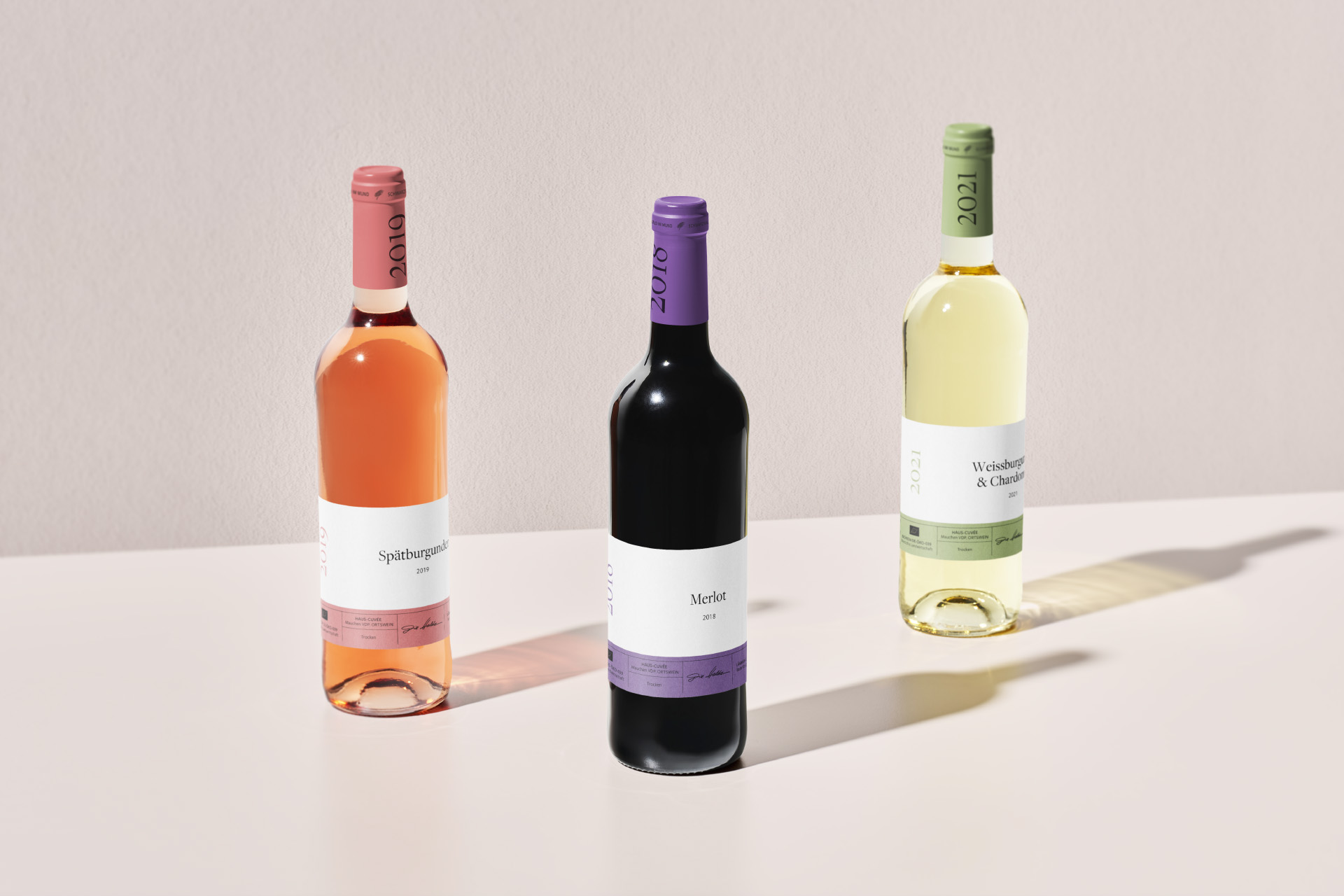
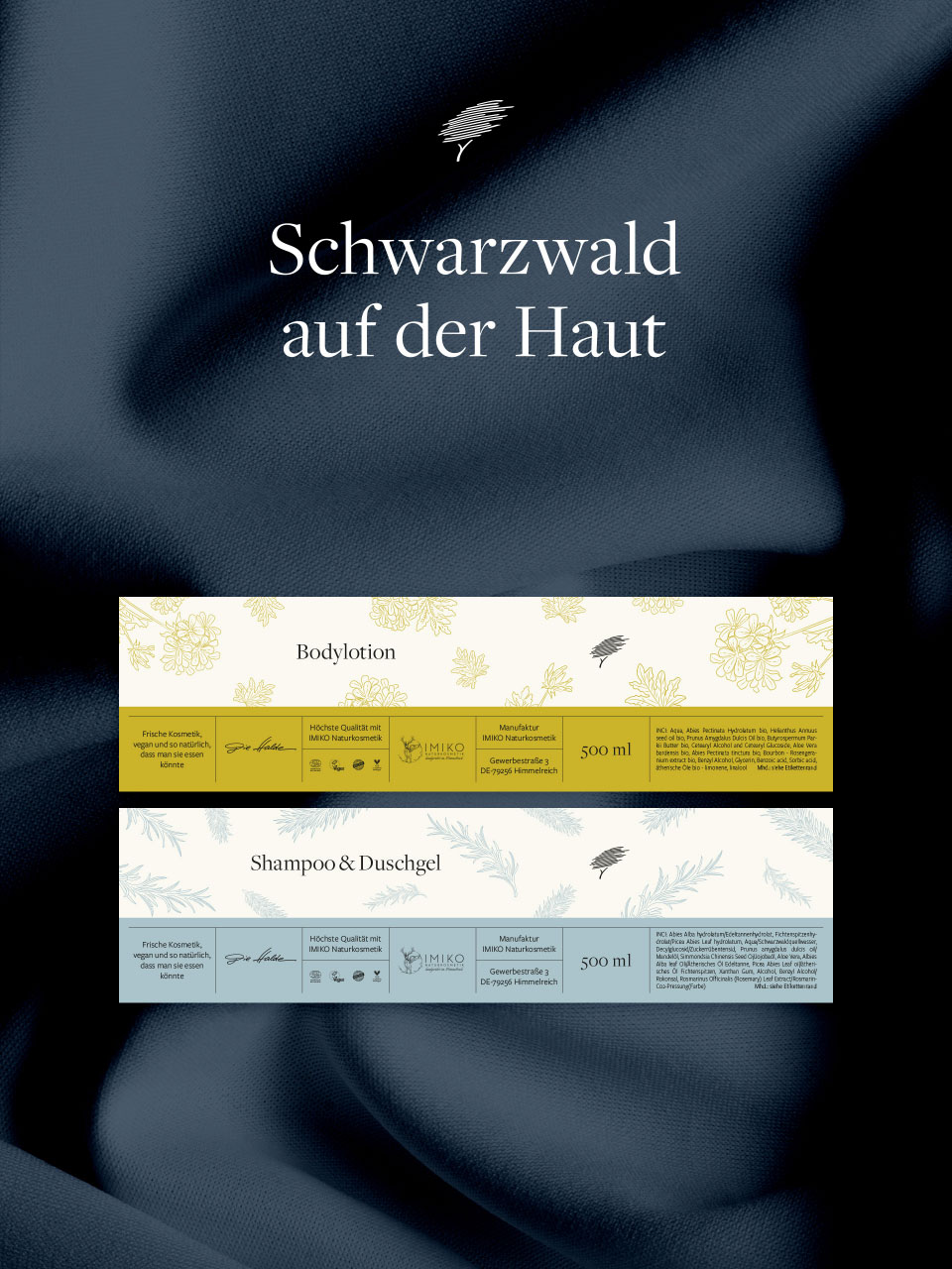
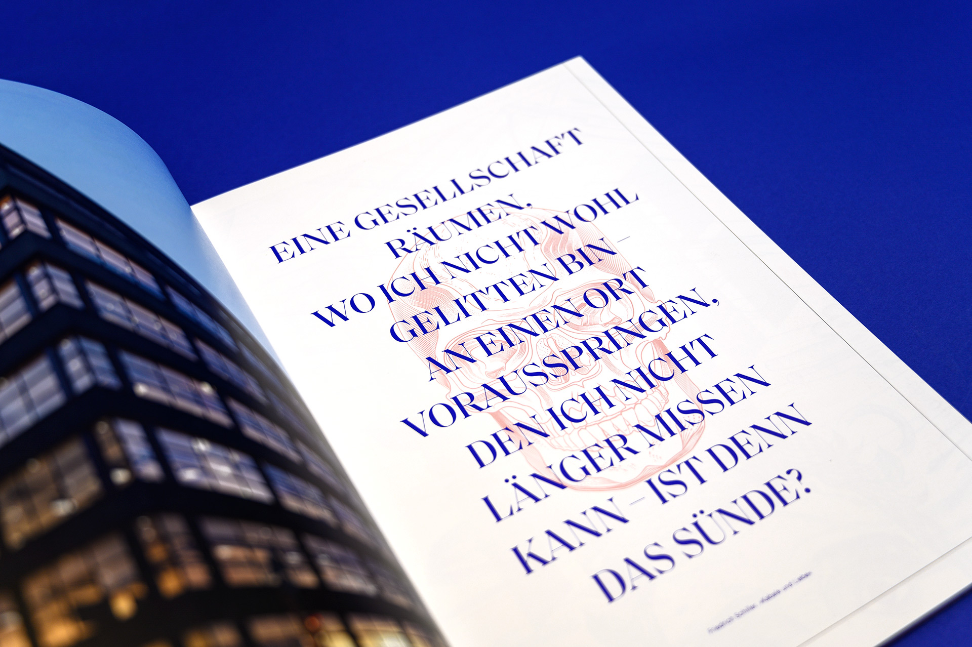
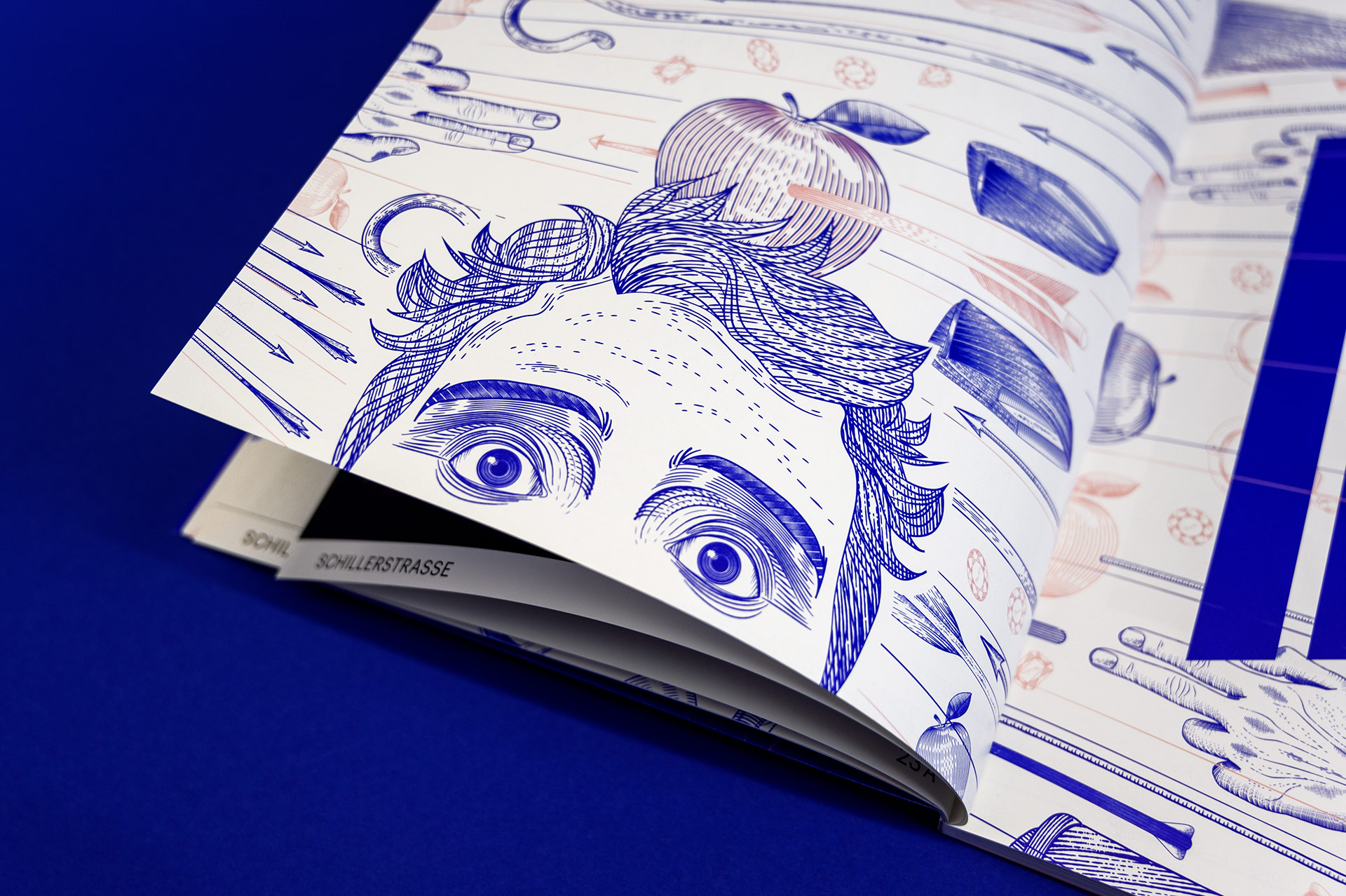
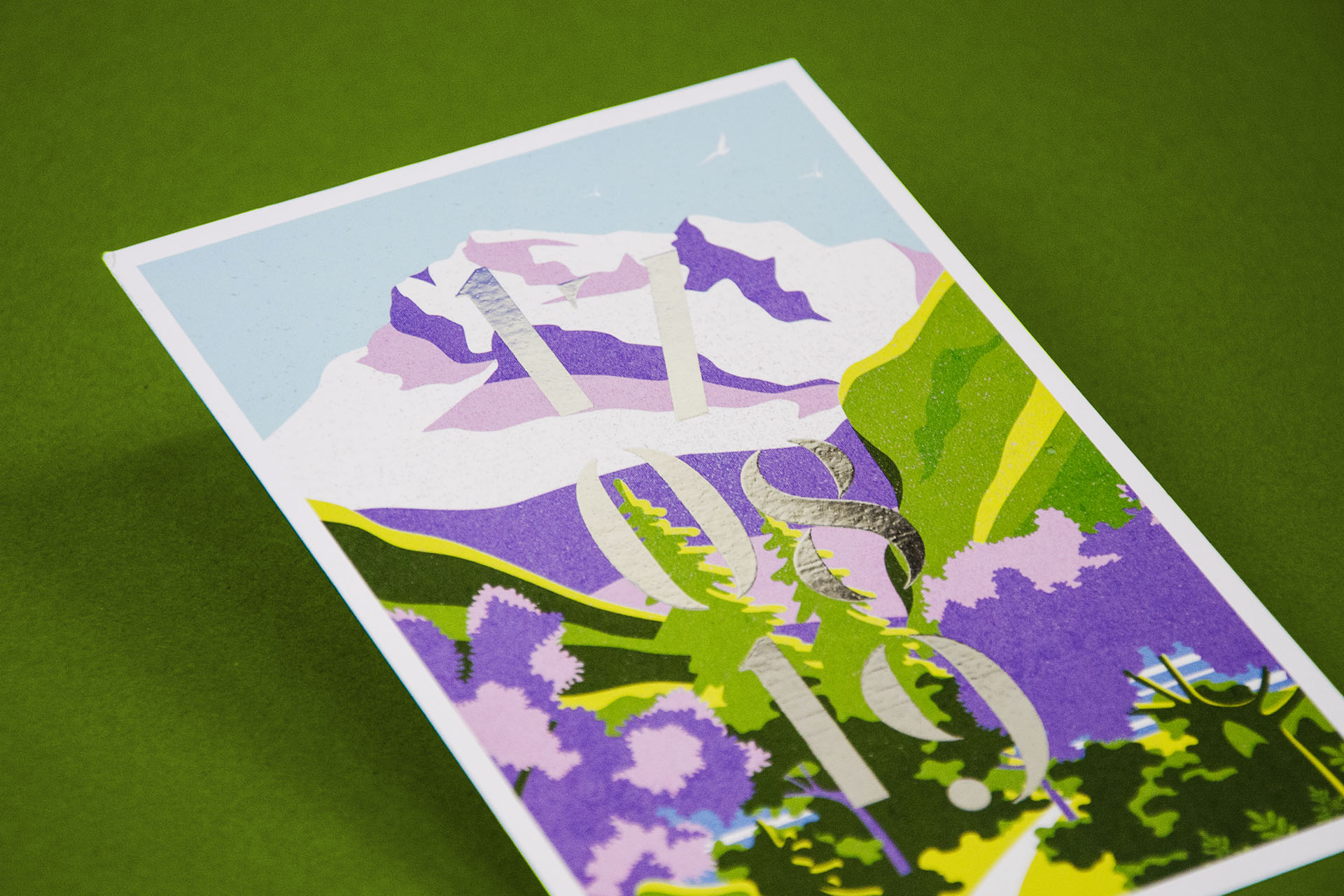
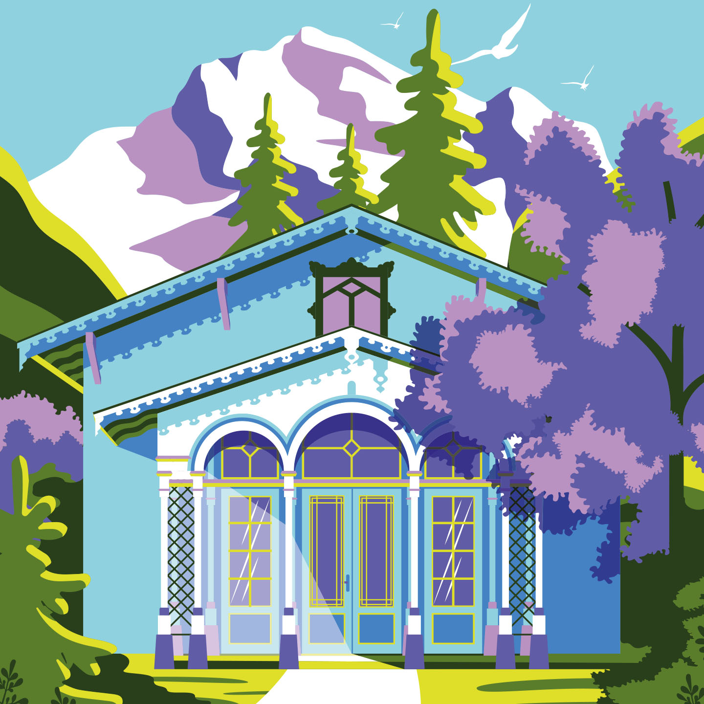
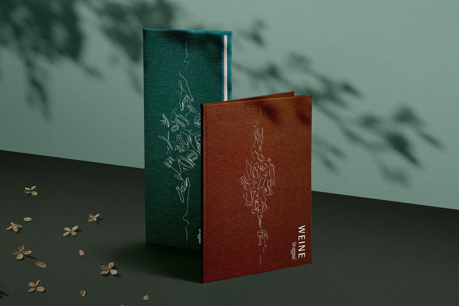
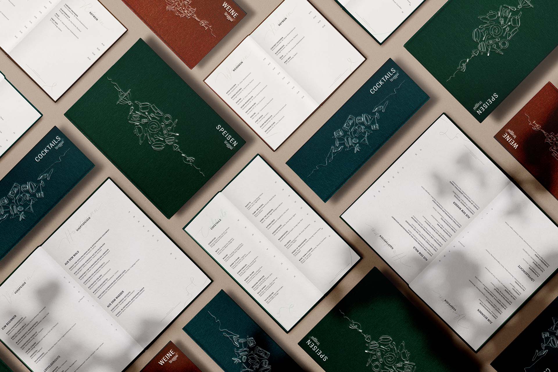
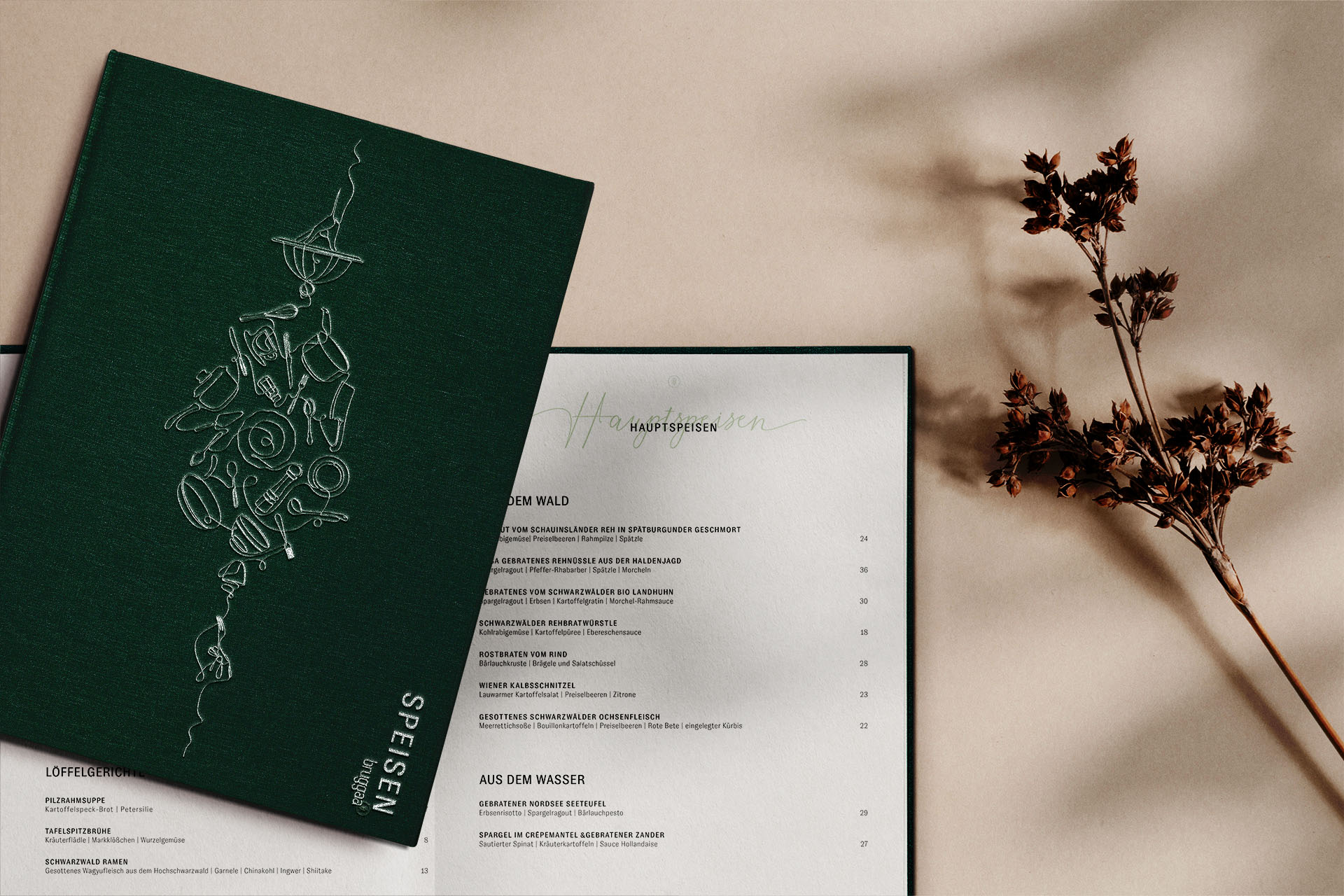
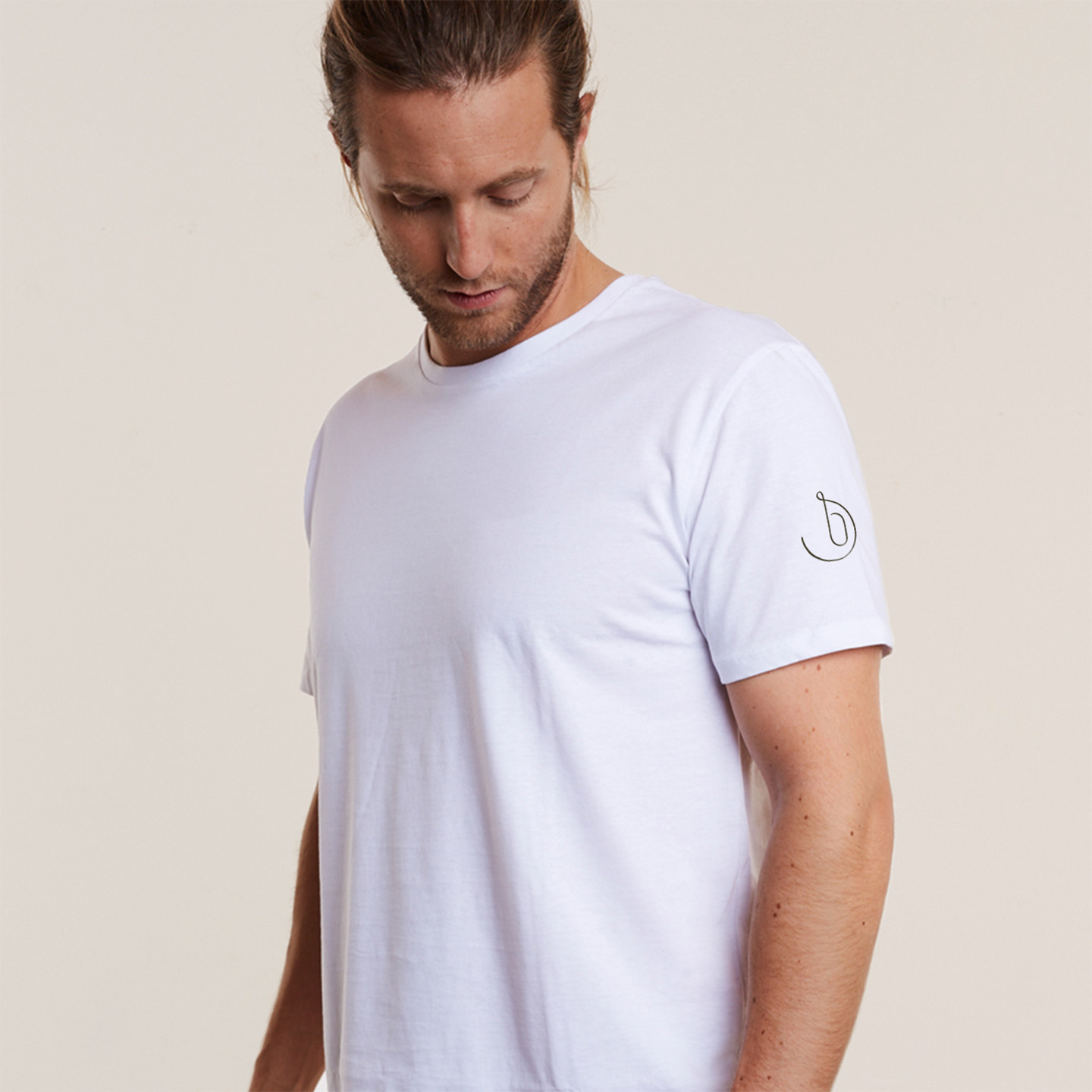
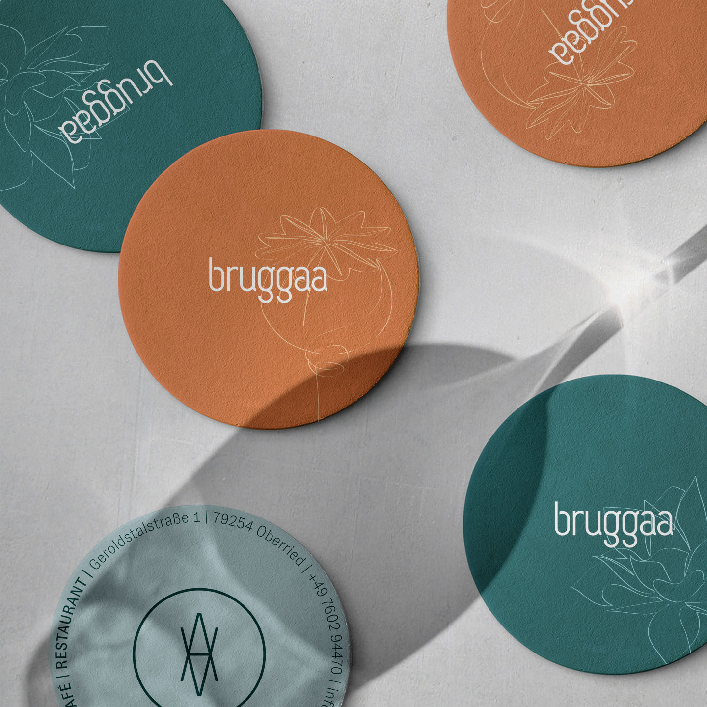
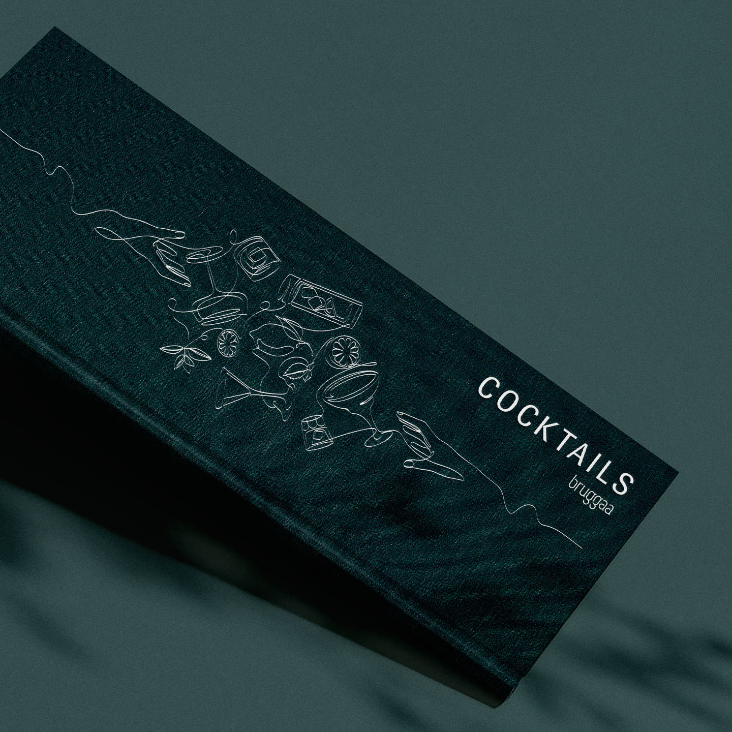
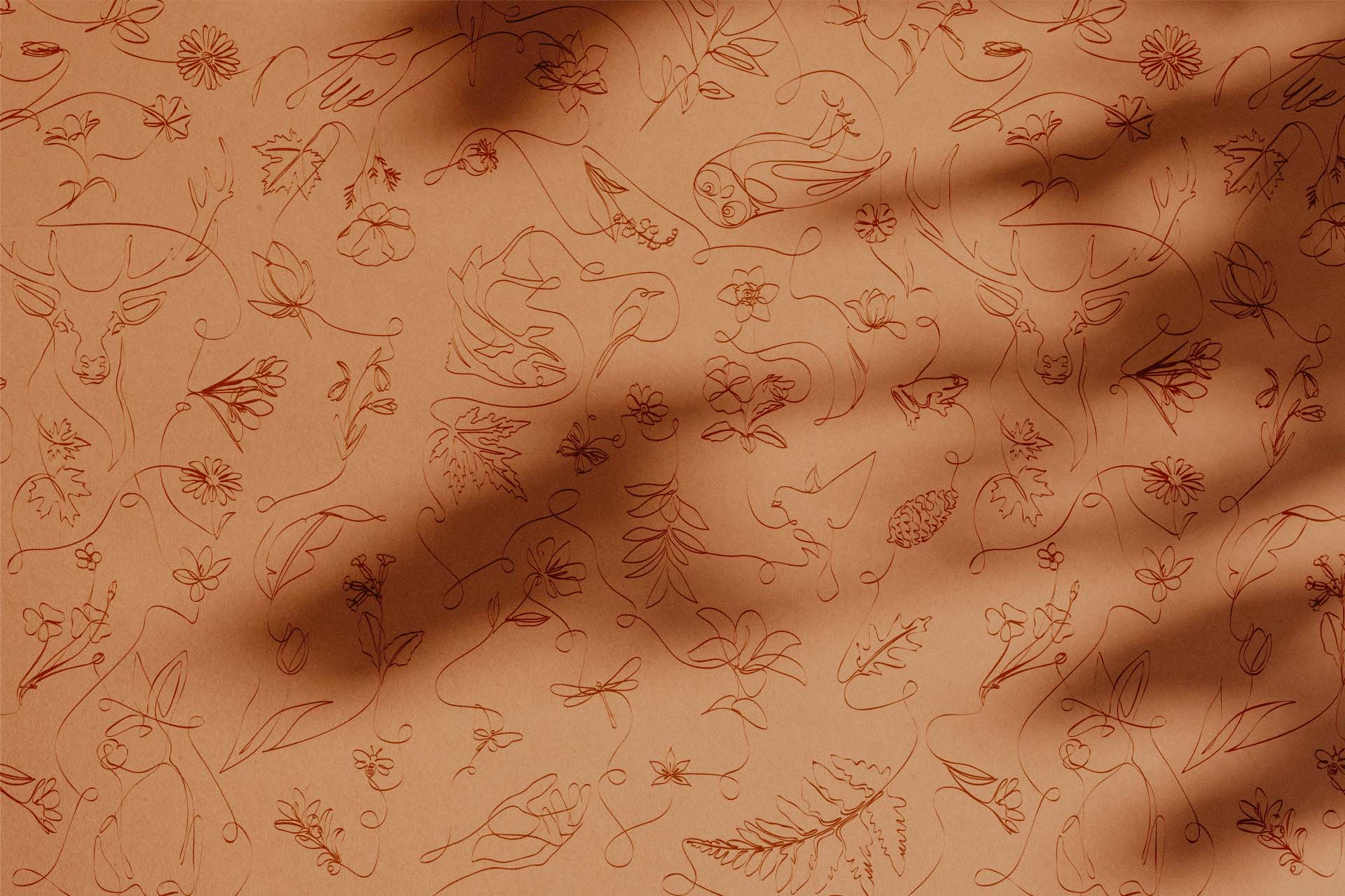
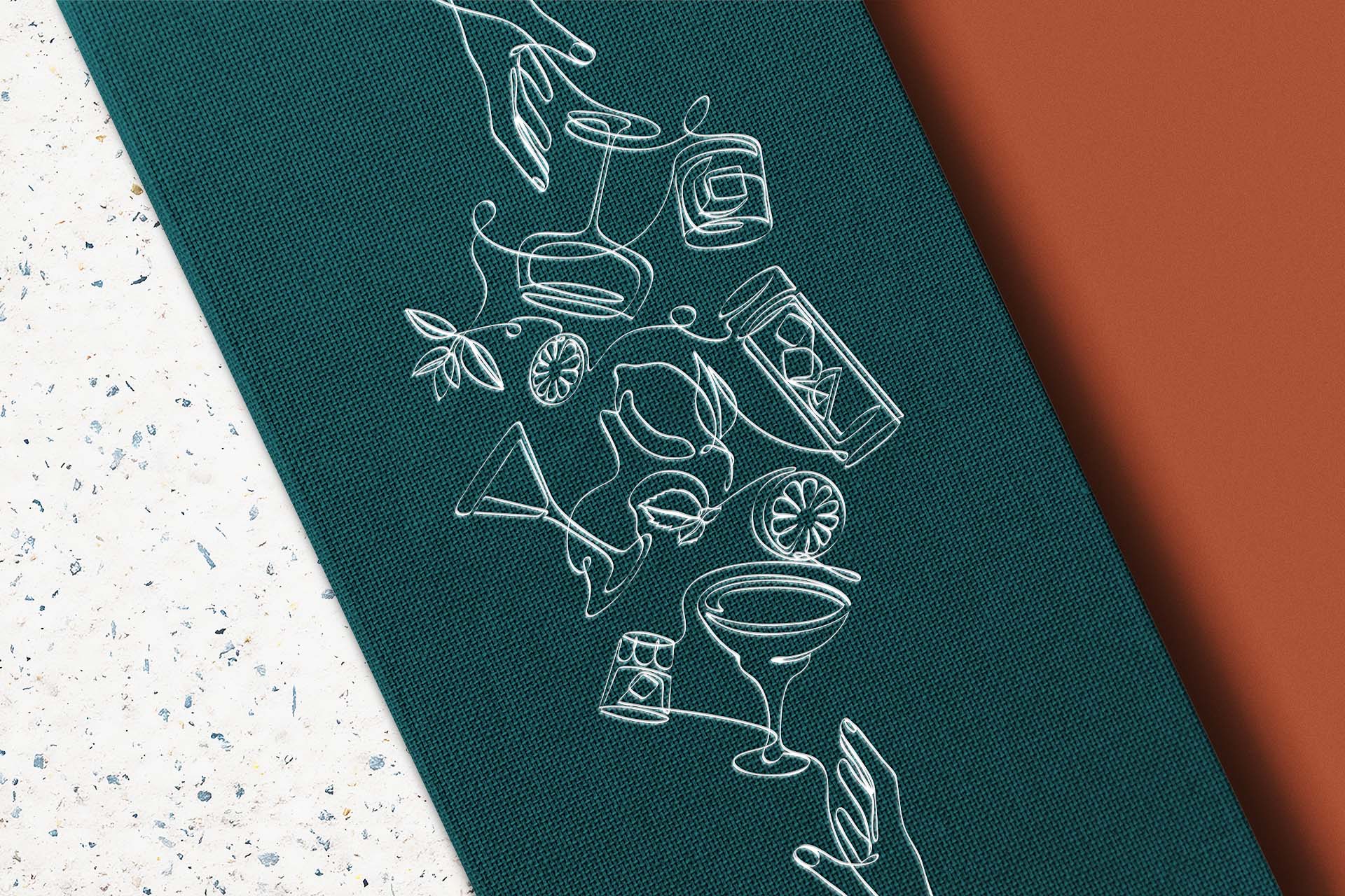
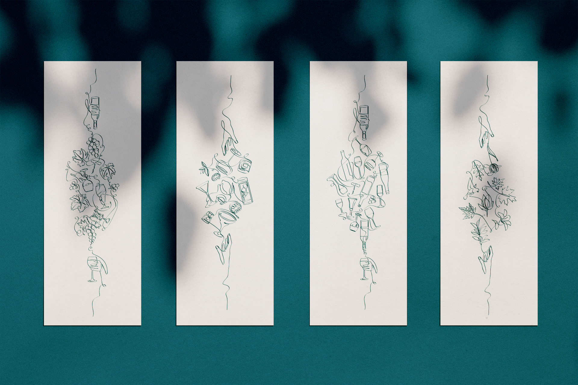
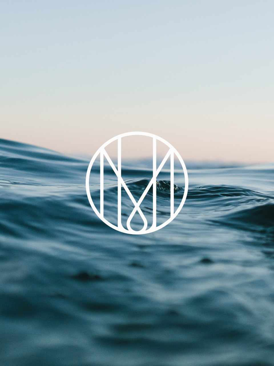
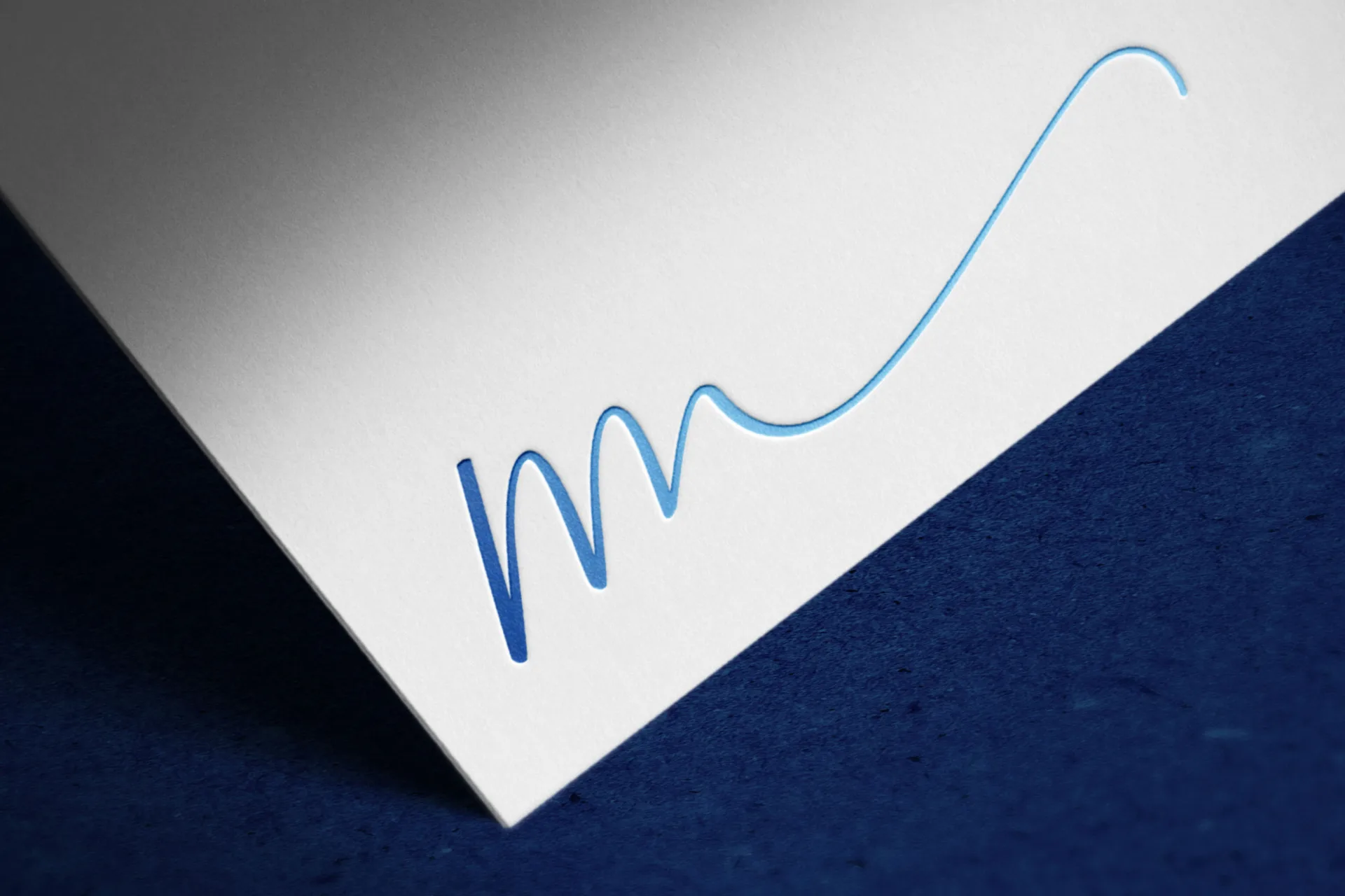
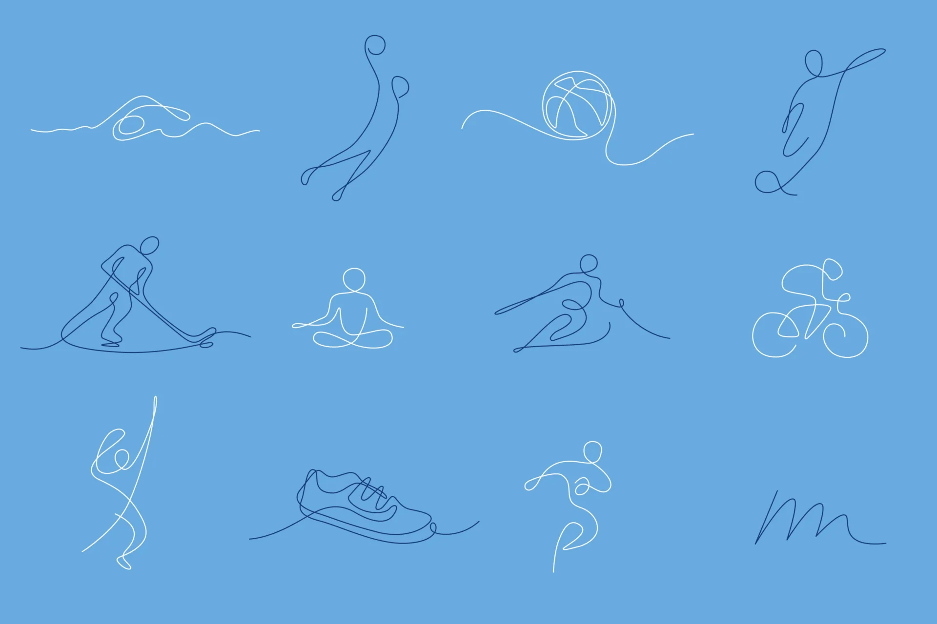
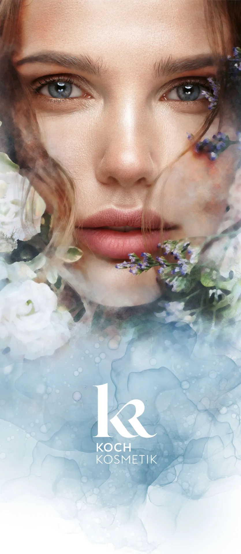
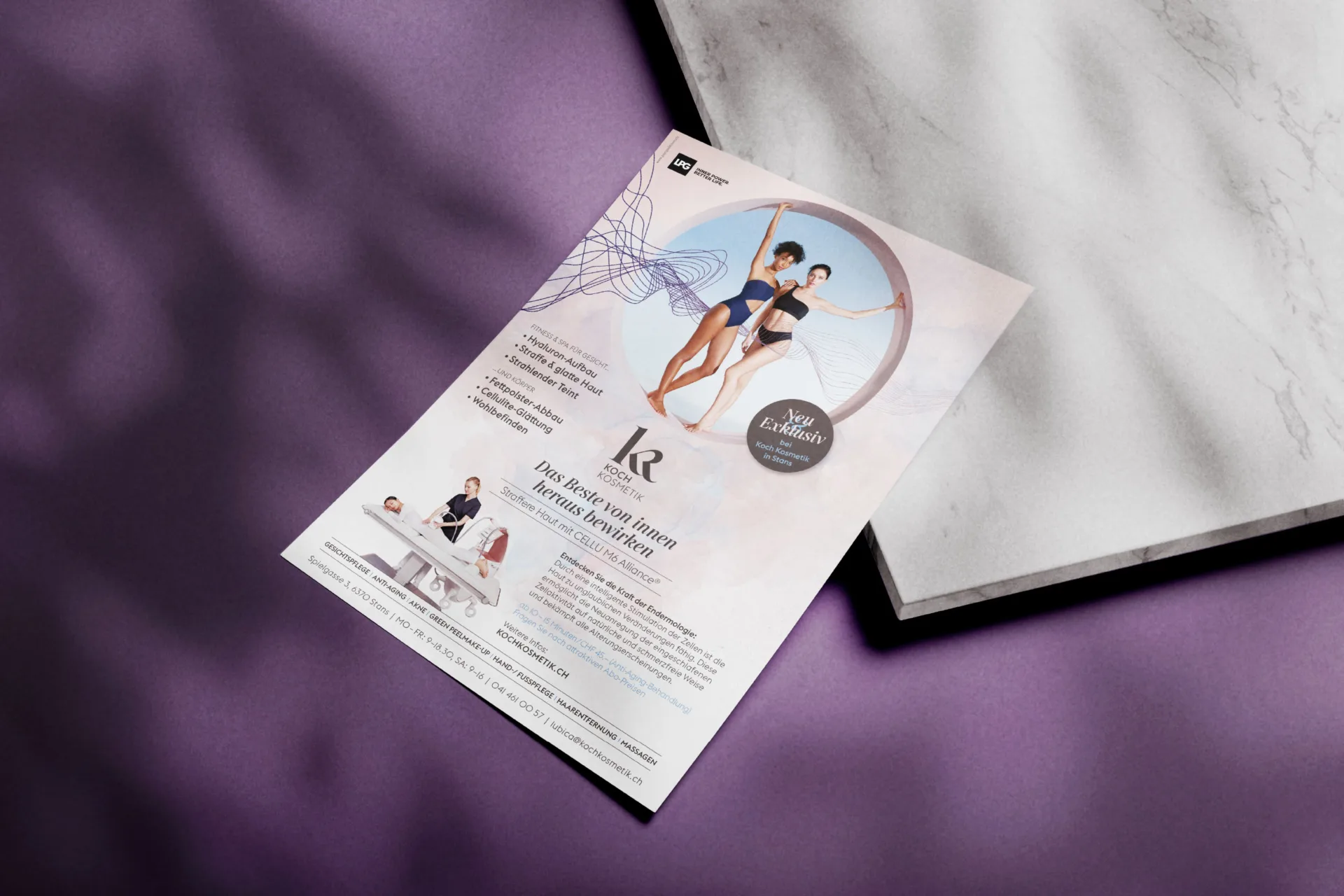
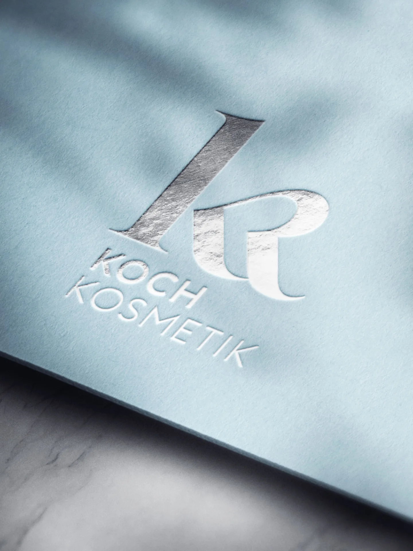
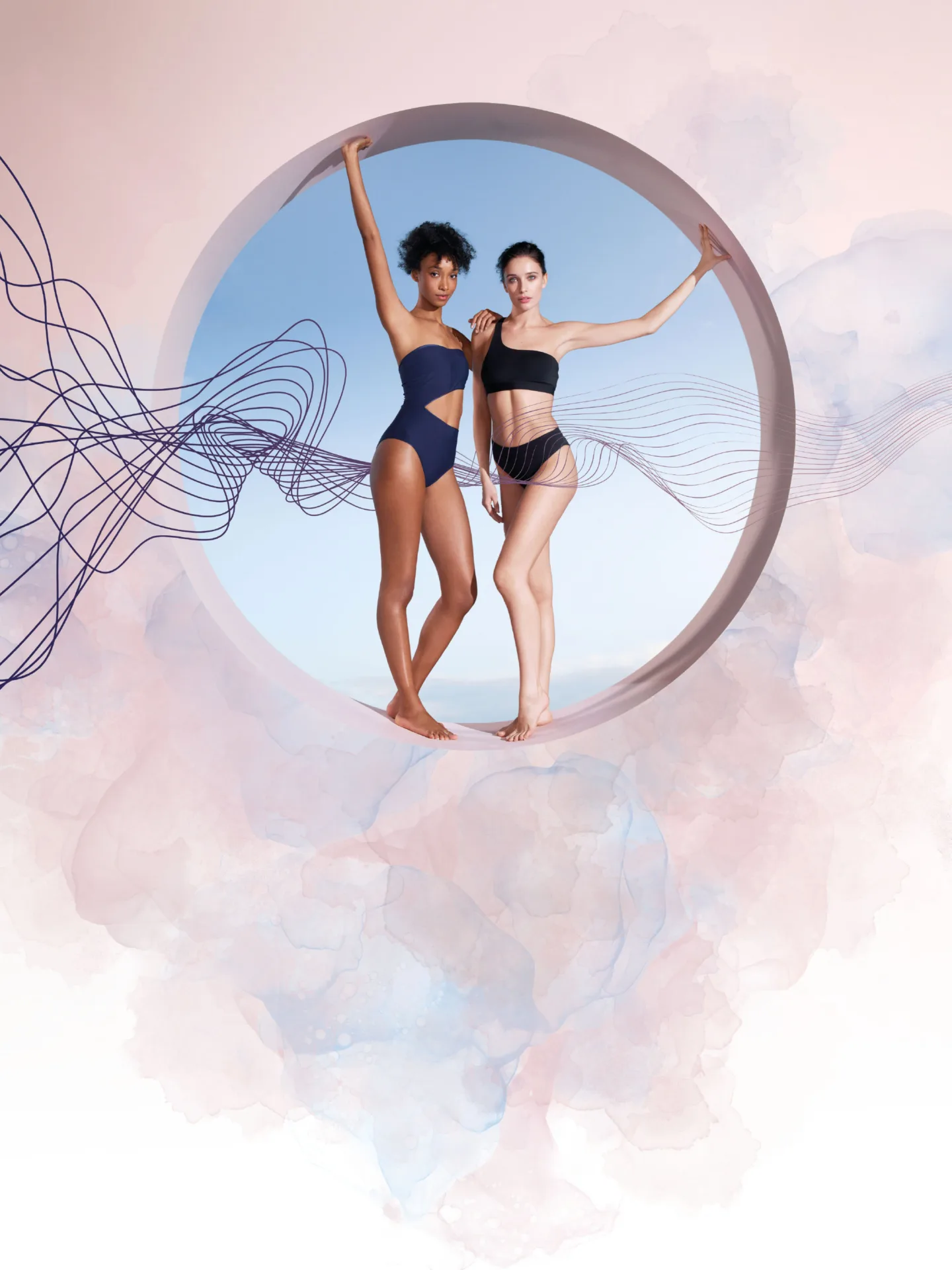
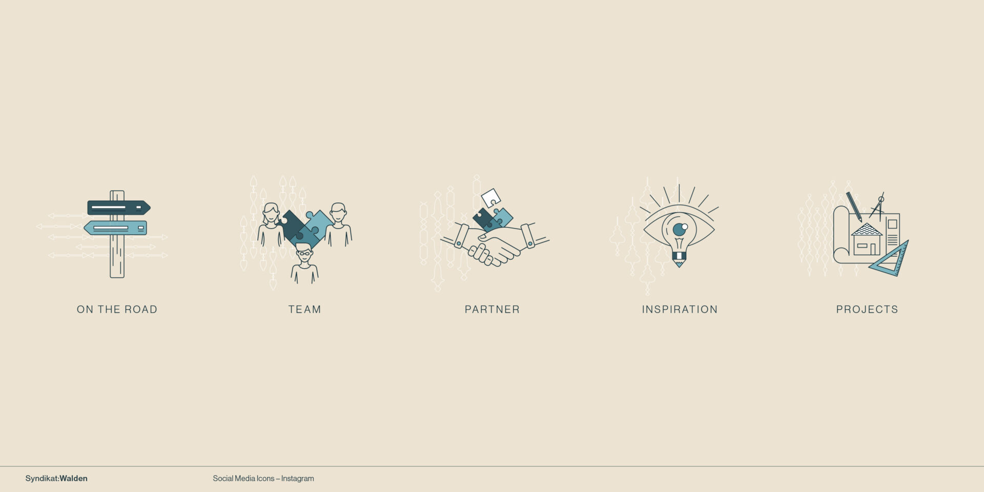
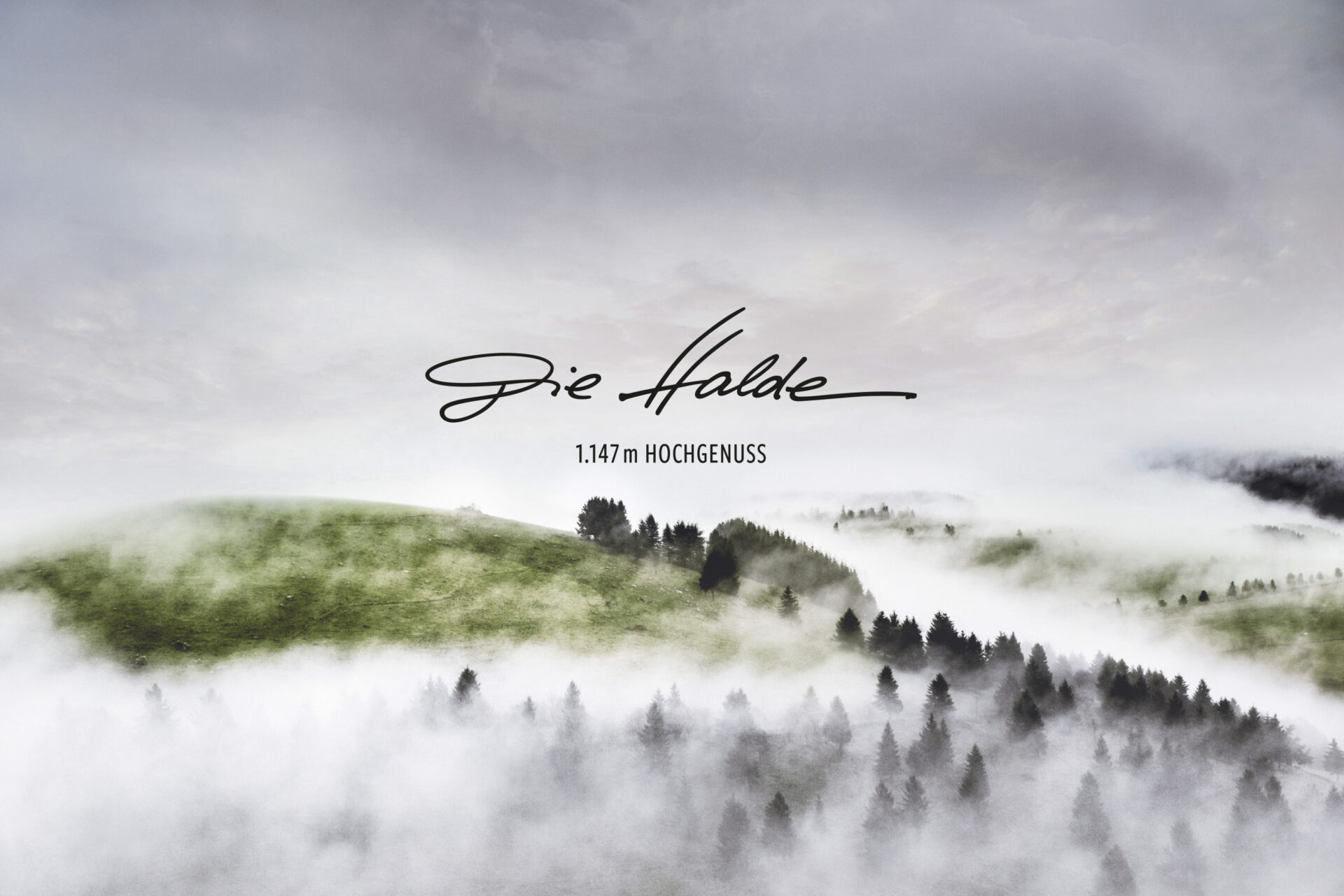
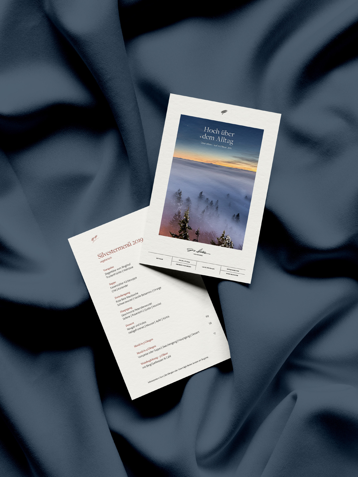
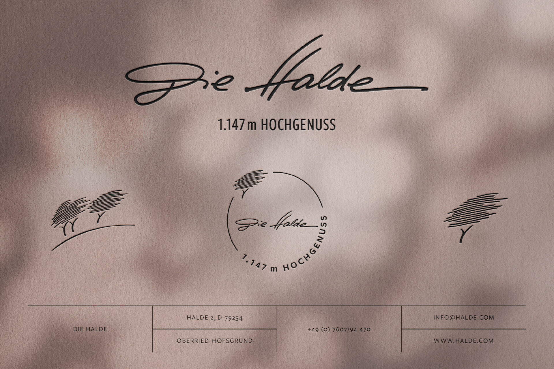
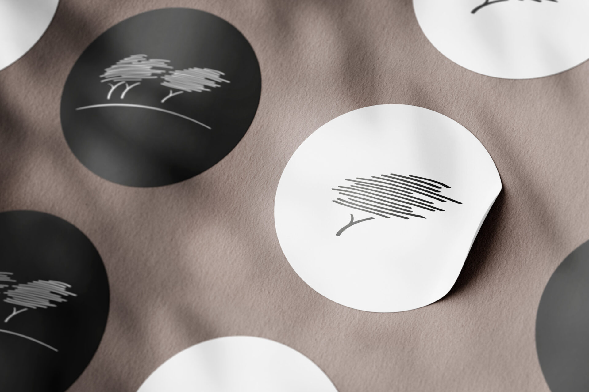
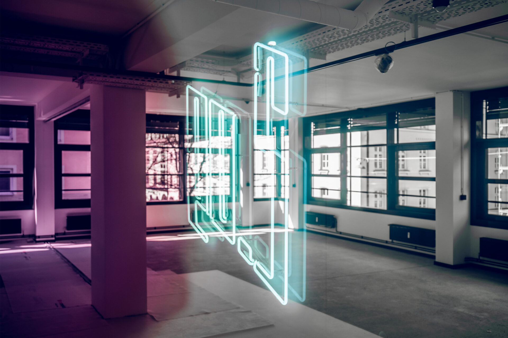
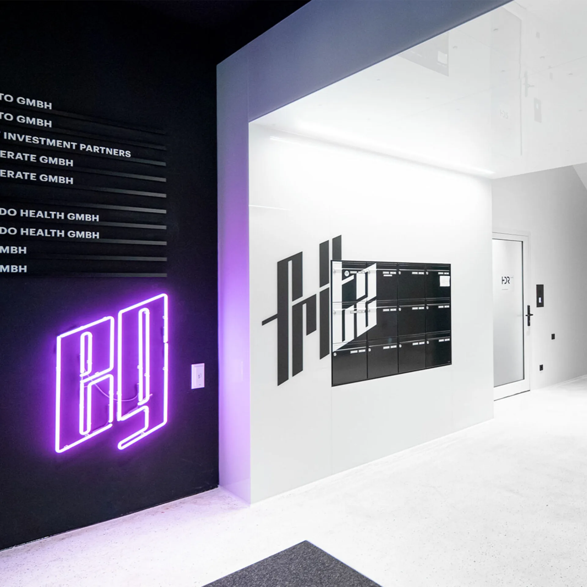
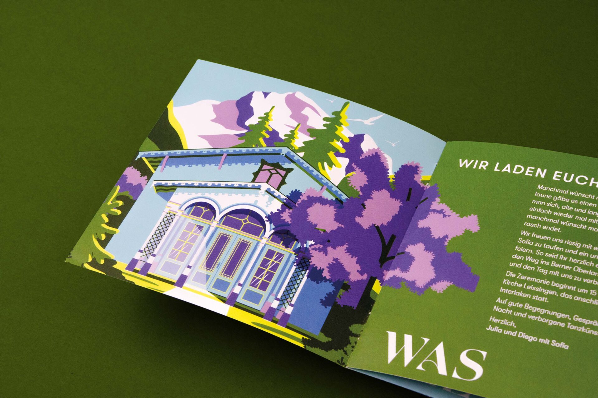
Handwritings emerge through movement and shaping on a sheet of paper, expressing one’s character. They provide insights into an individual’s personality. Accordingly, the new logo emerged in a handwriting-like motion, symbolically incorporating her initials as a design element. The illustrated sports icons also arose from these movements, conveying the unique character of her clients from the world of élite sports.


YEAR
2021
RESPONSABILITY
Concept, design and implementation
PARTNER
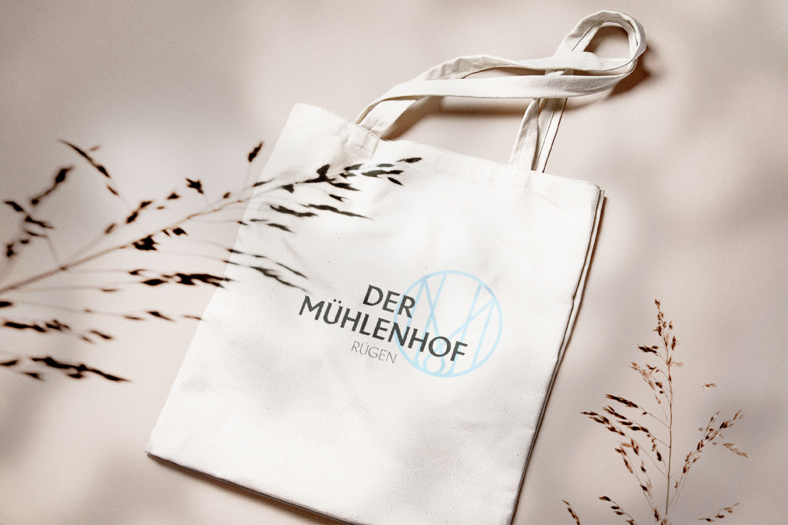
CLIENT
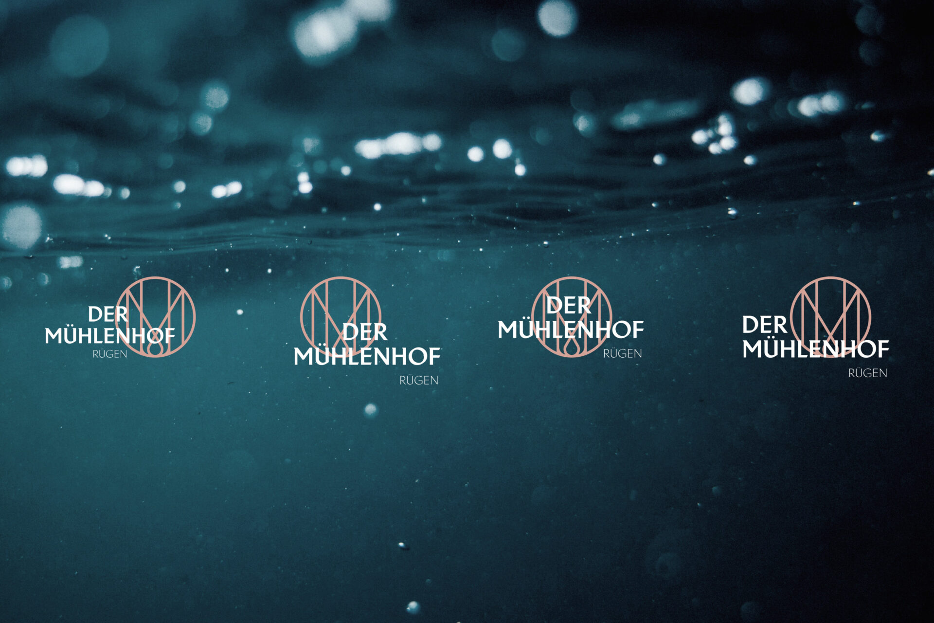
Nicole Mathis
SERVICES
Branding
FONTS IN USE


