Dr.Schier’s Swiss Premium Honey
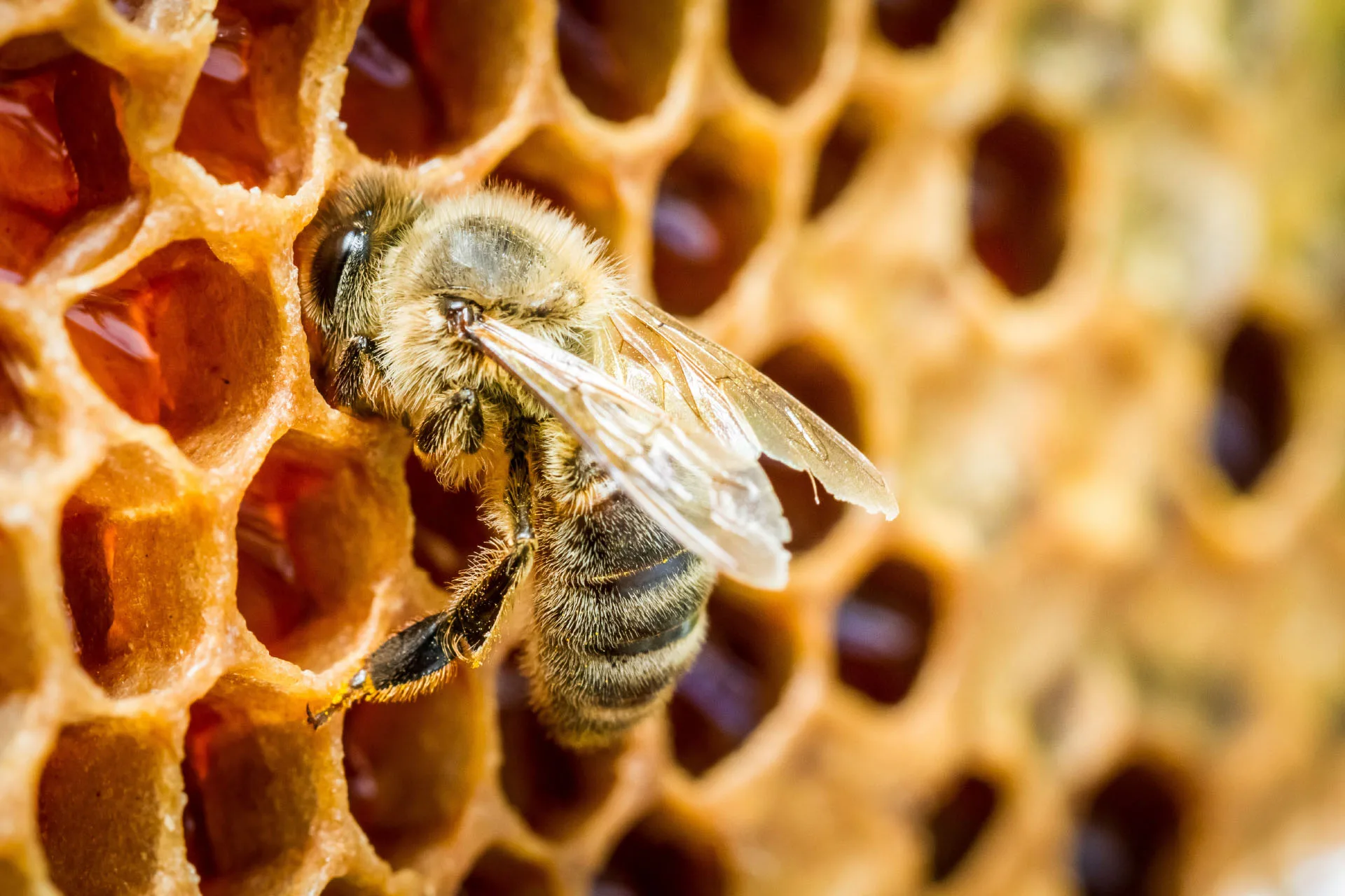
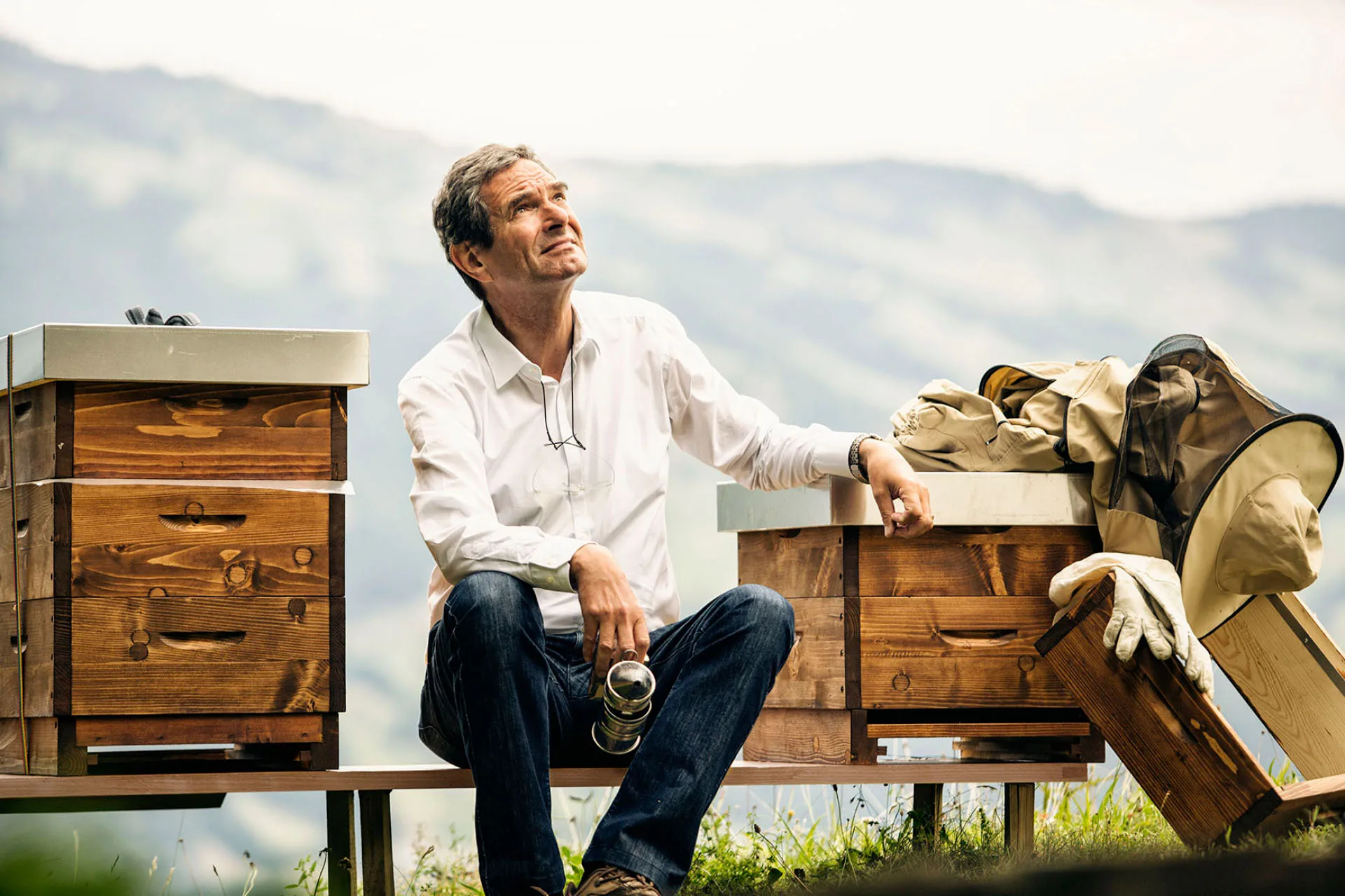
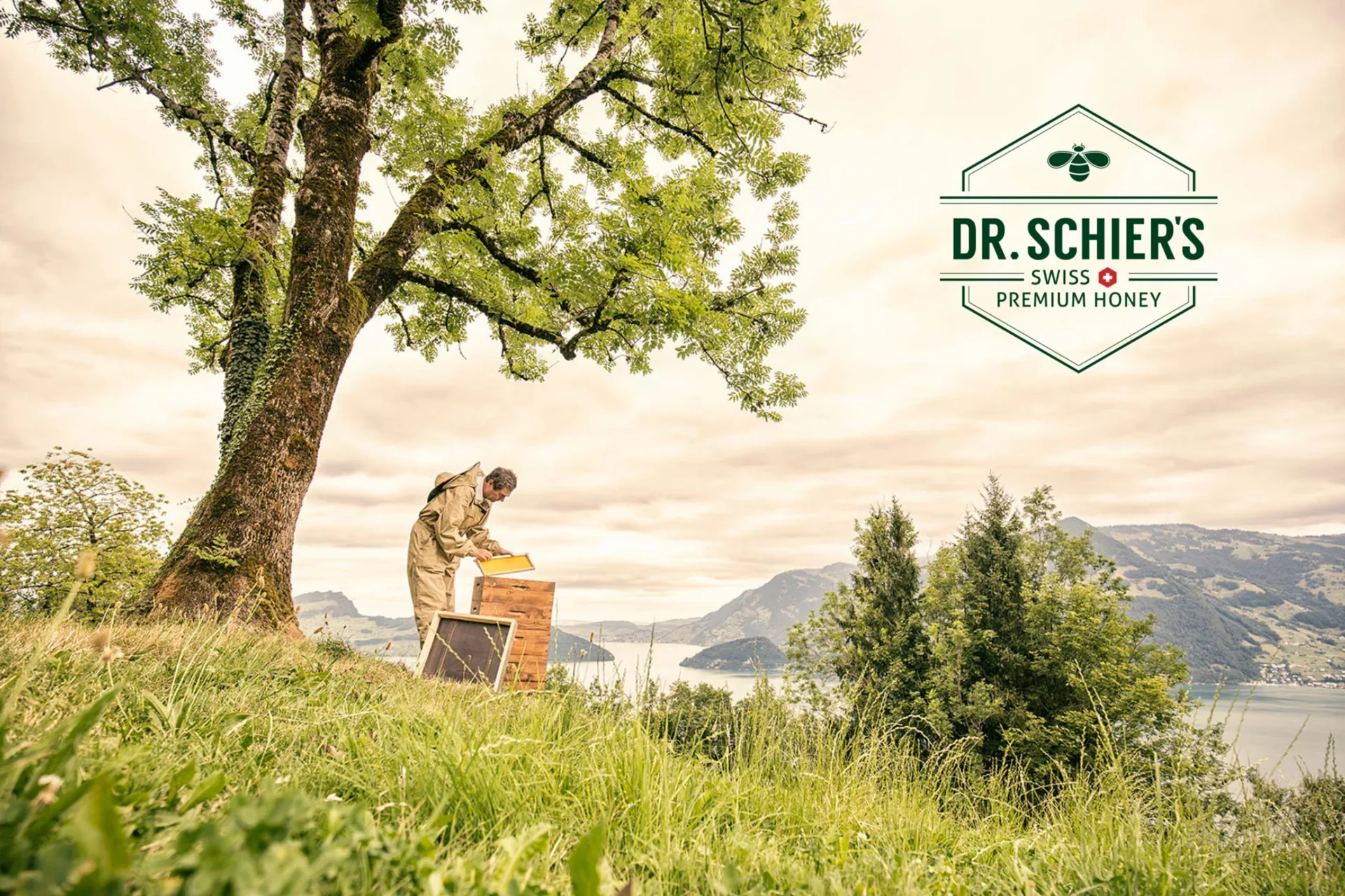
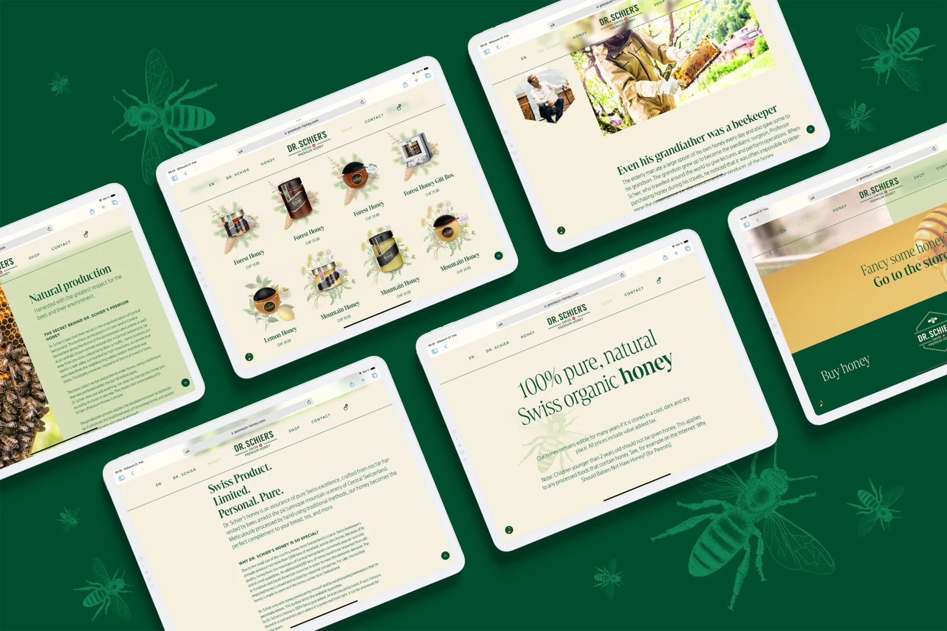
Dr.Schier’s – Swiss Premium Honey Every day, the old man took a large spoonful of his own honey. His grandson also got some. That grandson became Professor Dr. Felix Schier, a retired pediatric surgeon who today continues his grandfather’s tradition as a beekeeper.
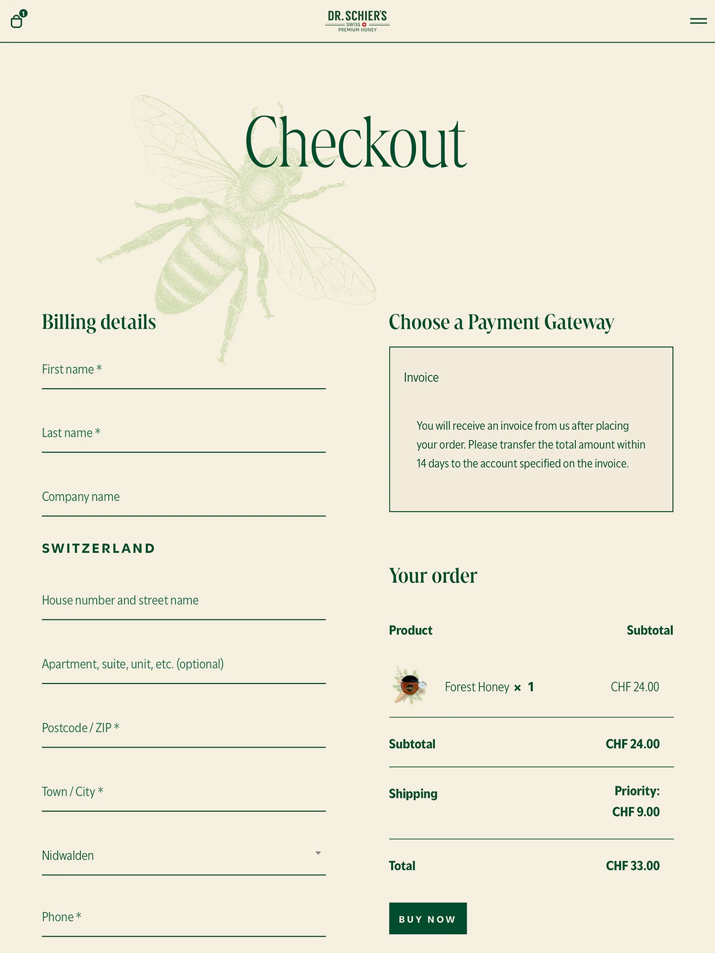
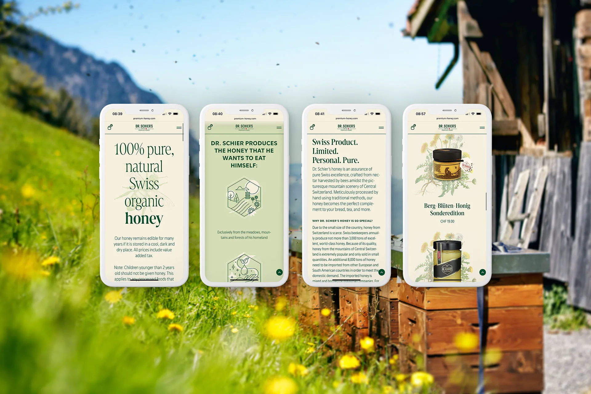
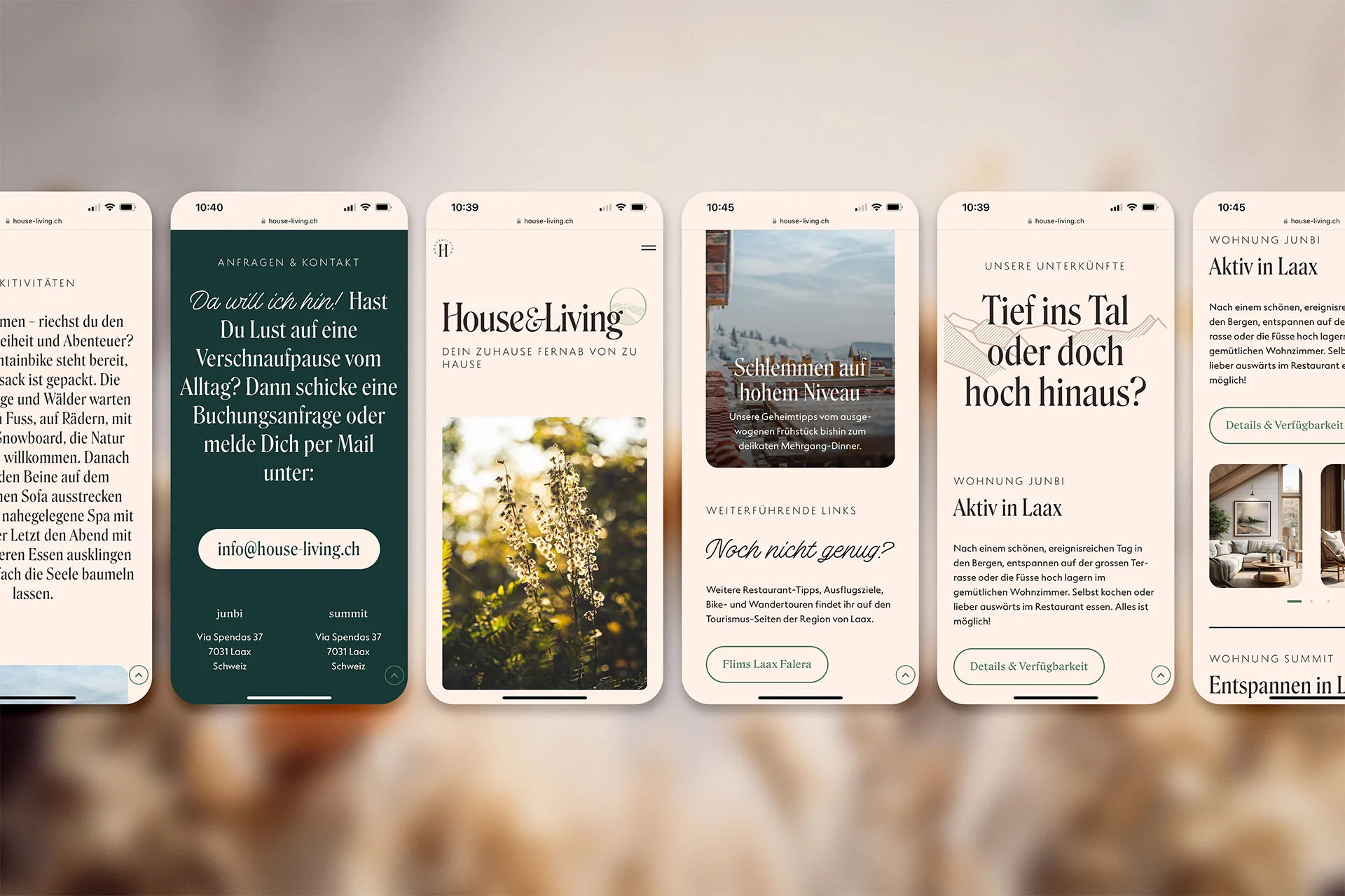
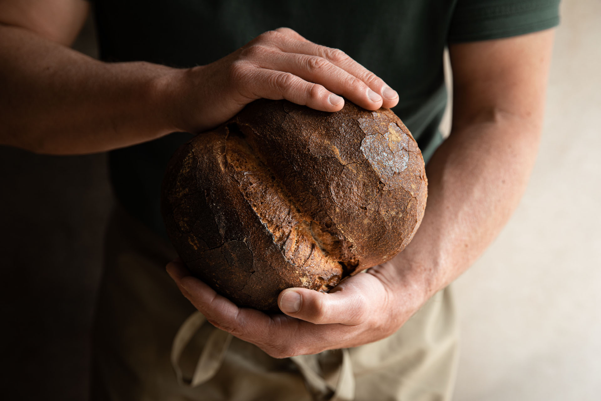
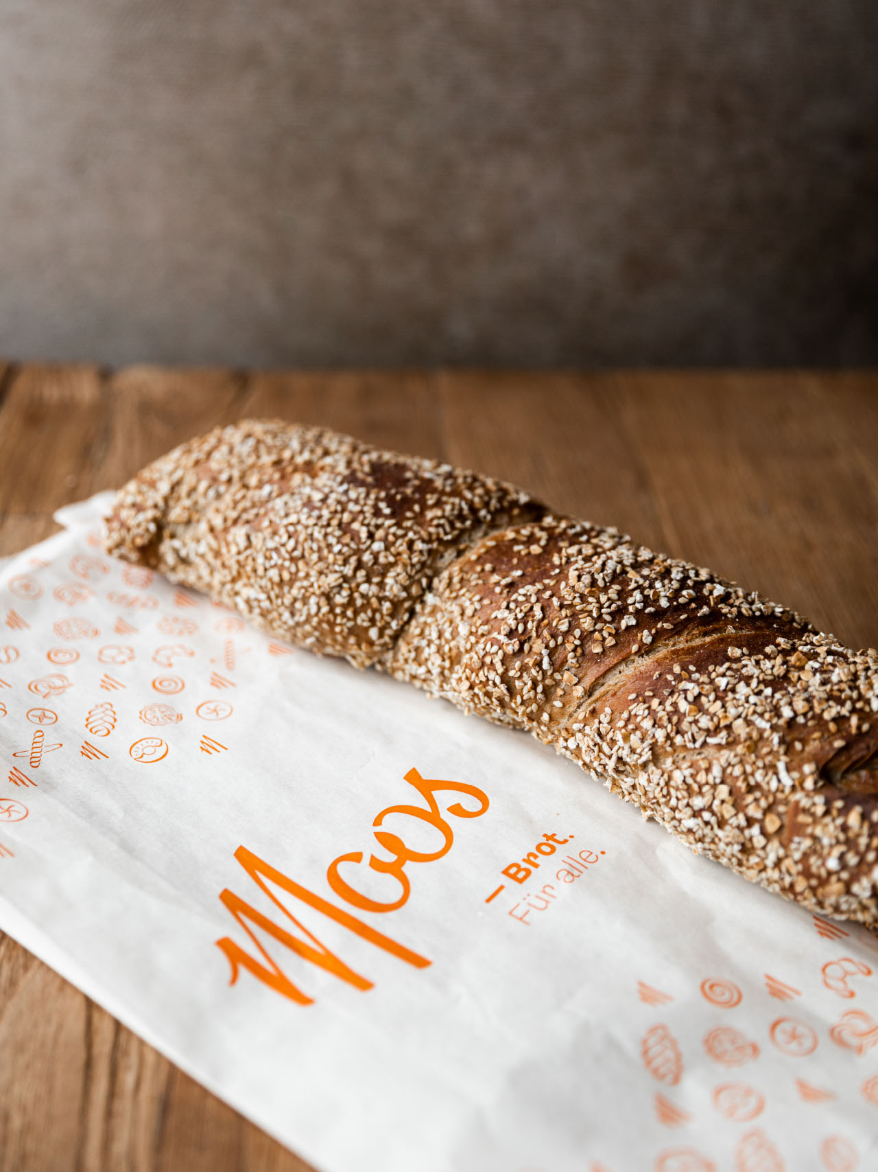
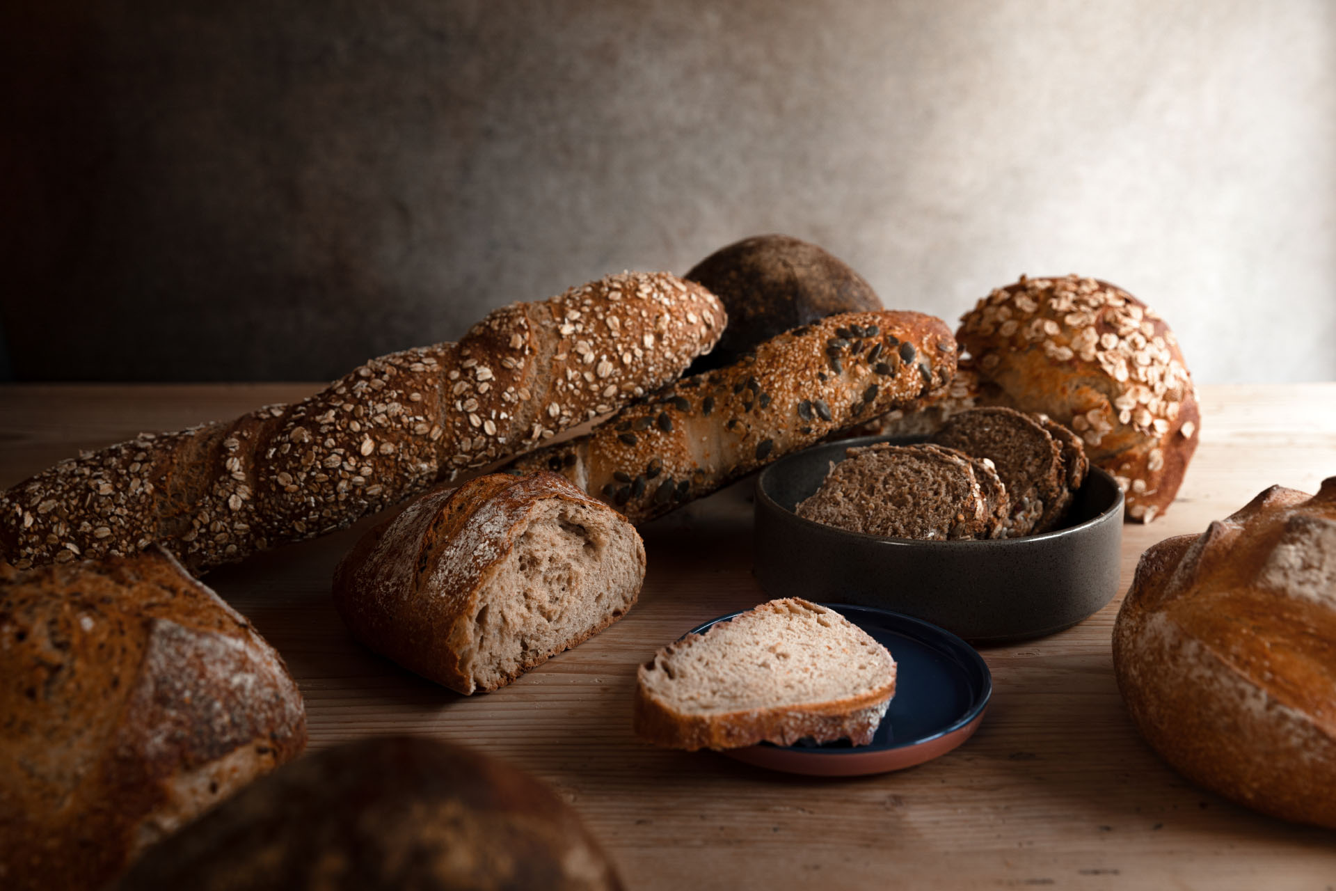
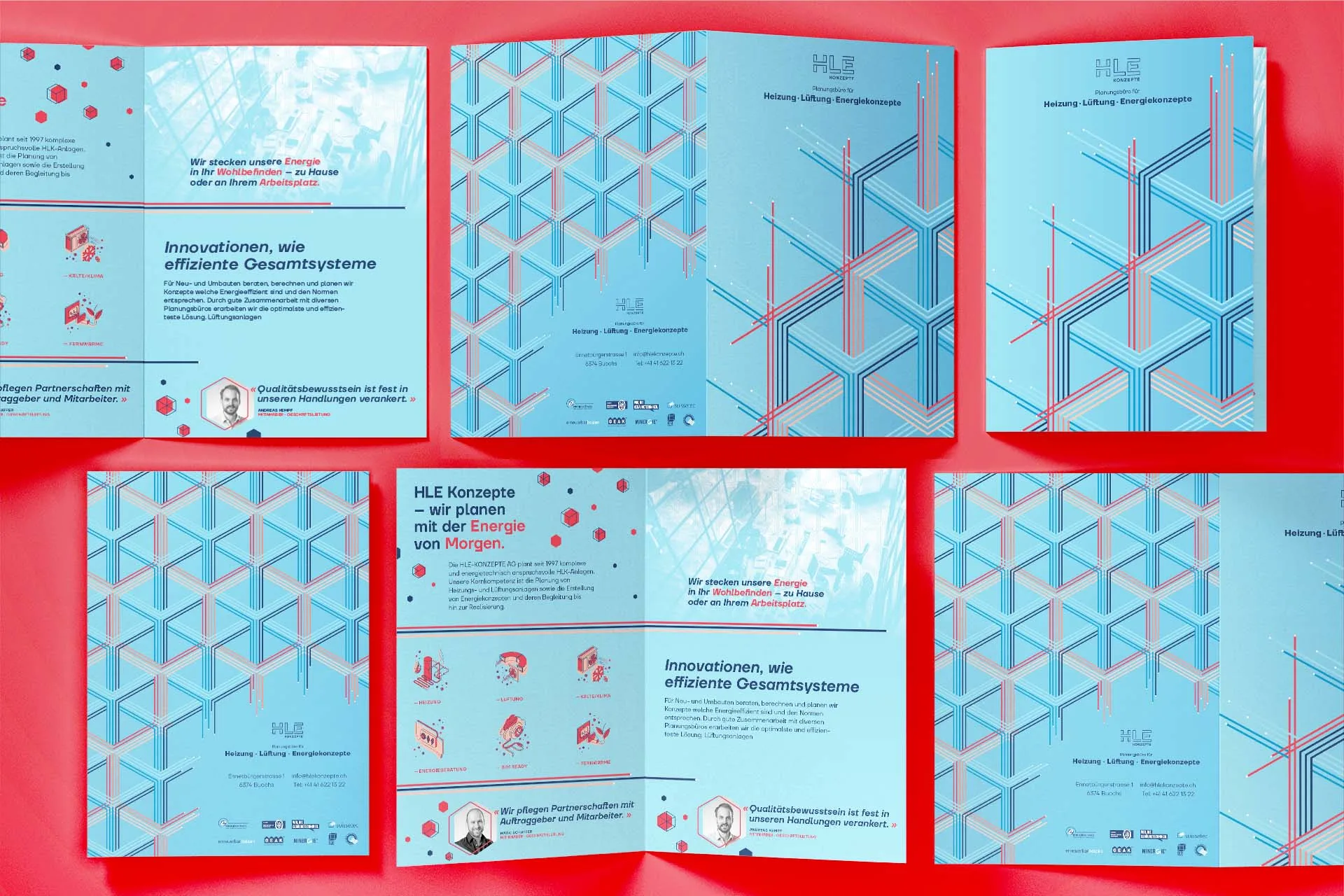
For Dr. Schier’s Swiss Premium Honey, I carried out a comprehensive website redesign to showcase its exceptional honey products and their profound connection to nature in a modern and inviting manner.
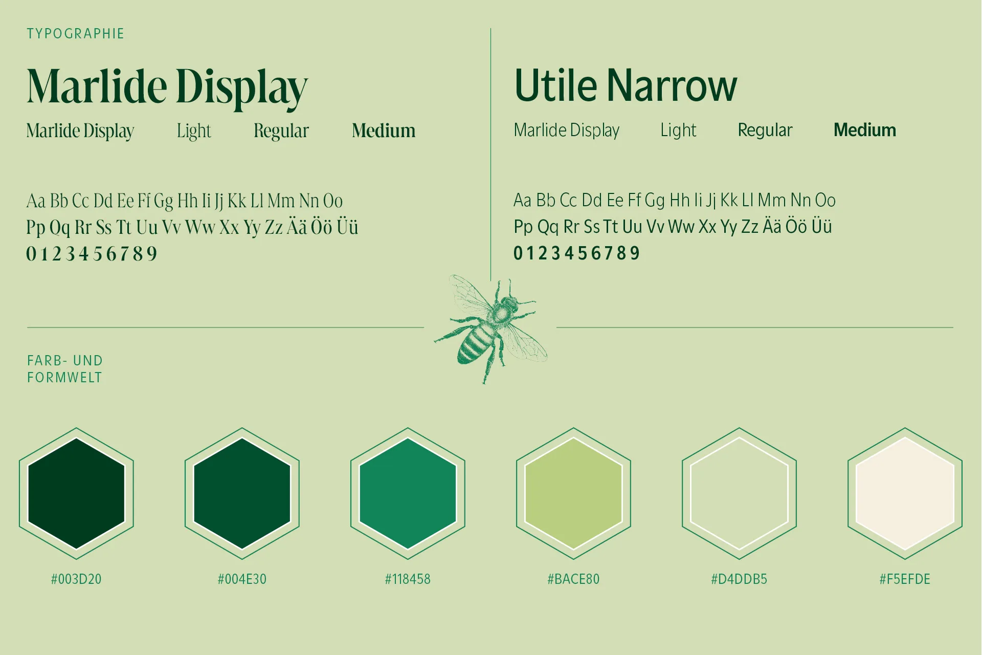
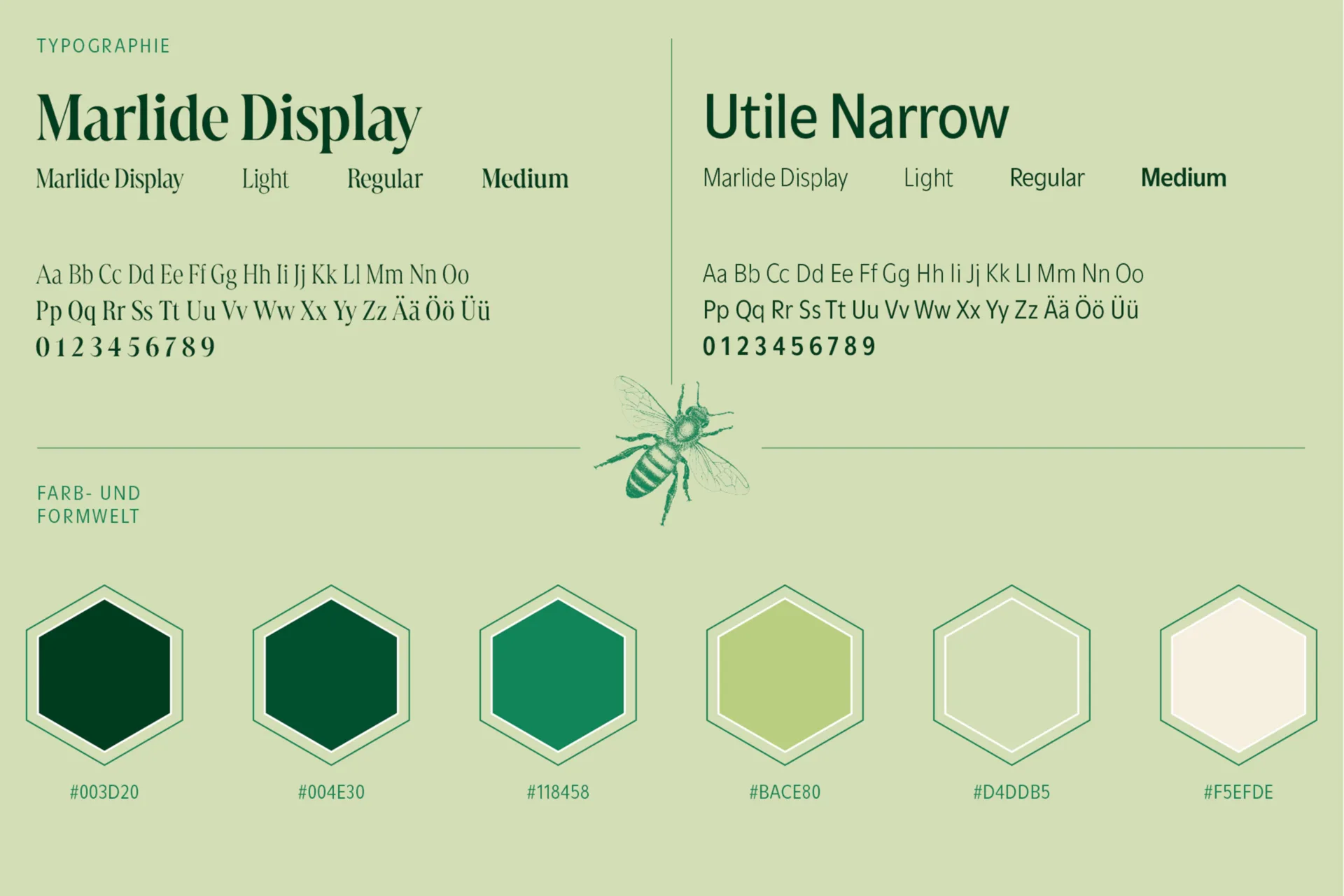
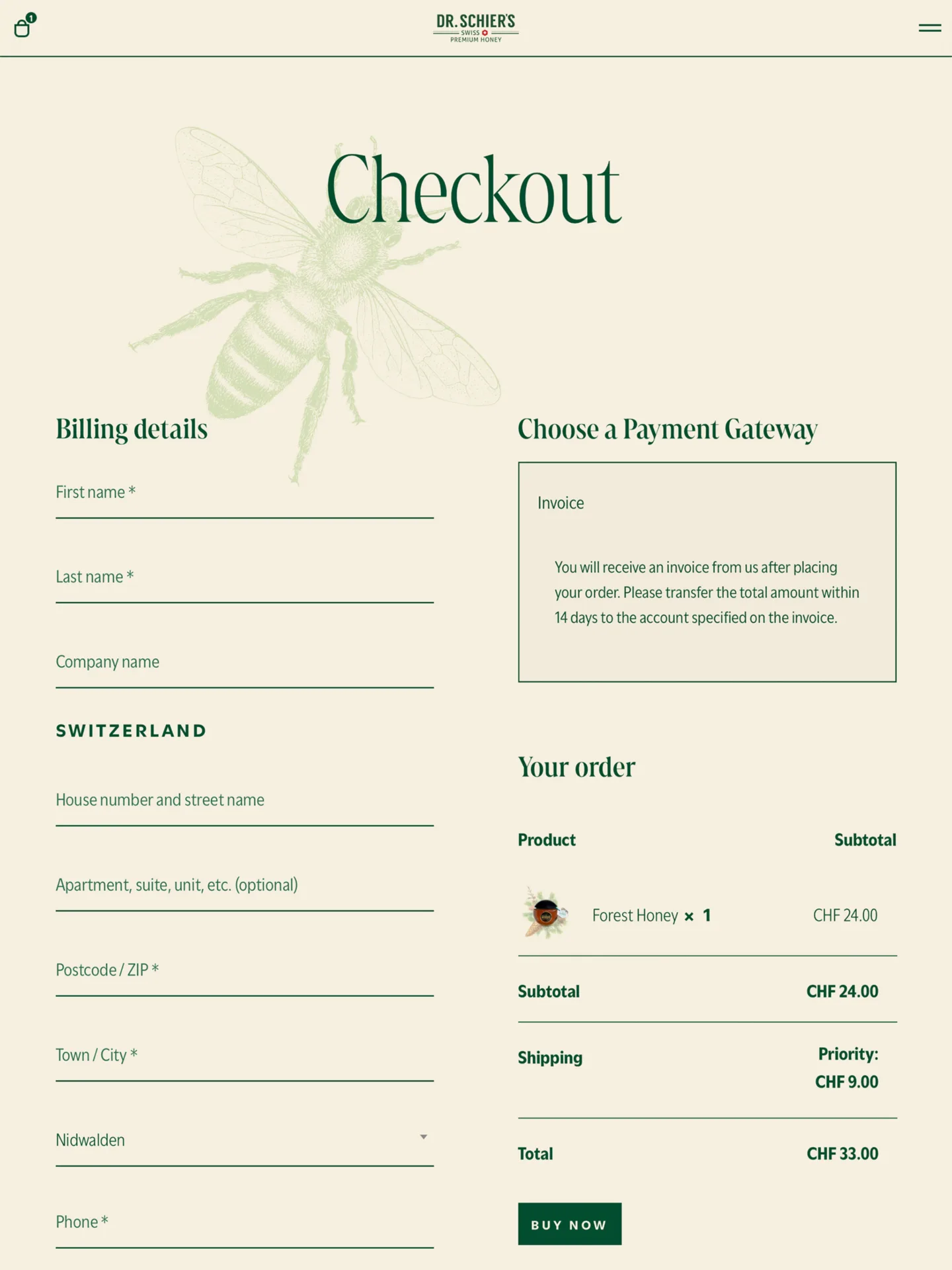
This redesign wasn’t just about updating the site structure and implementing a new content management system; it was about creating an experience. I carefully refined the typography, introducing Marlide Display to add depth and elegance to each headline, while subtly emphasizing the premium quality of Dr. Schier’s products.
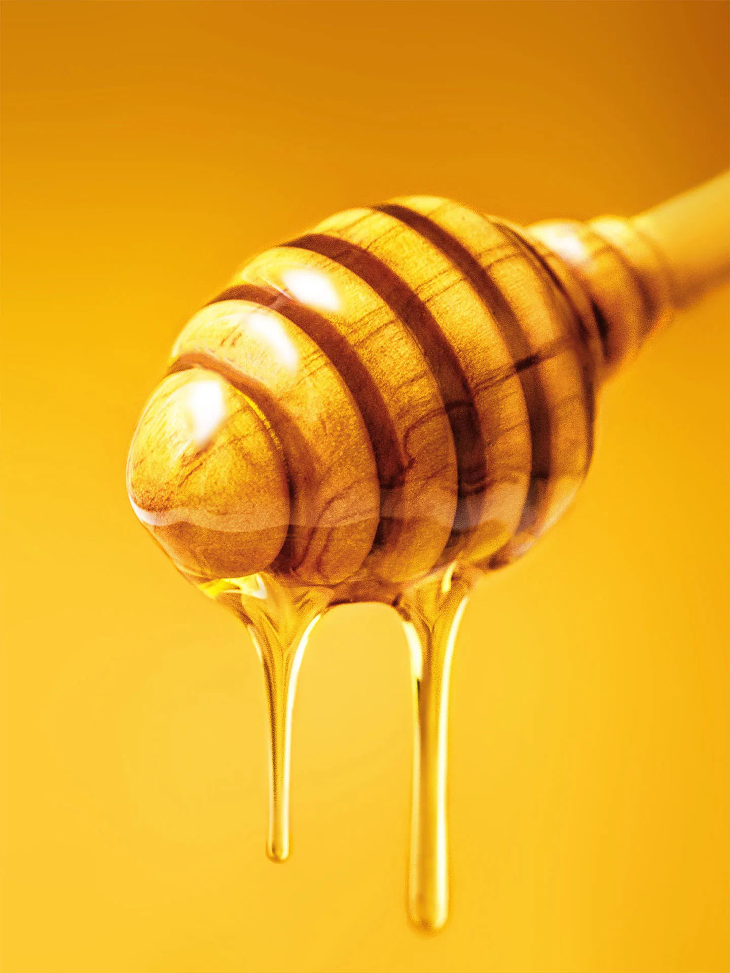
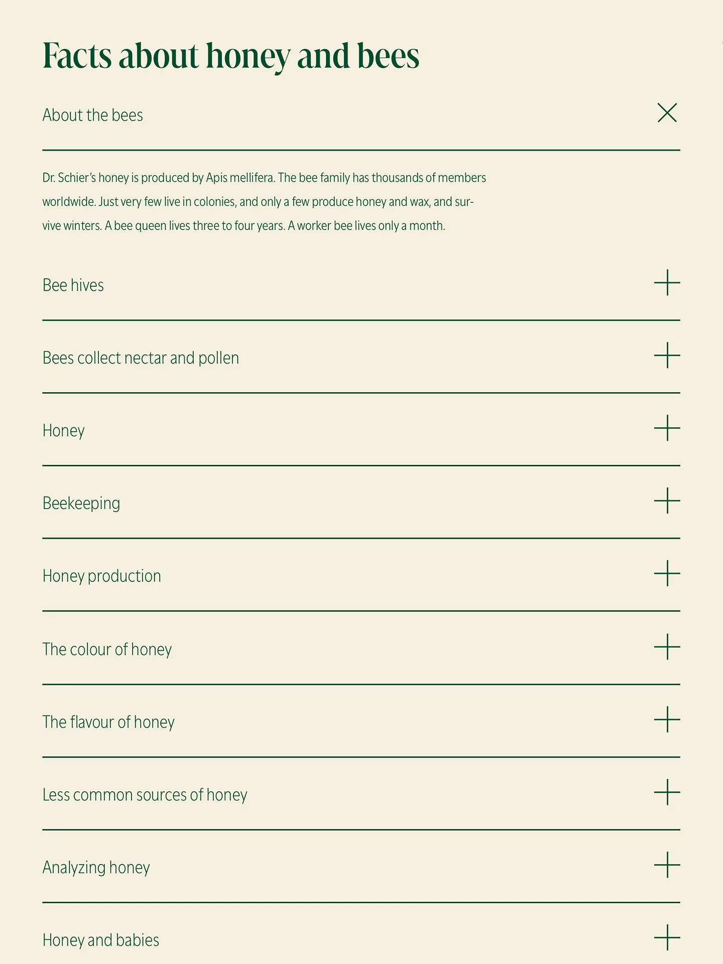
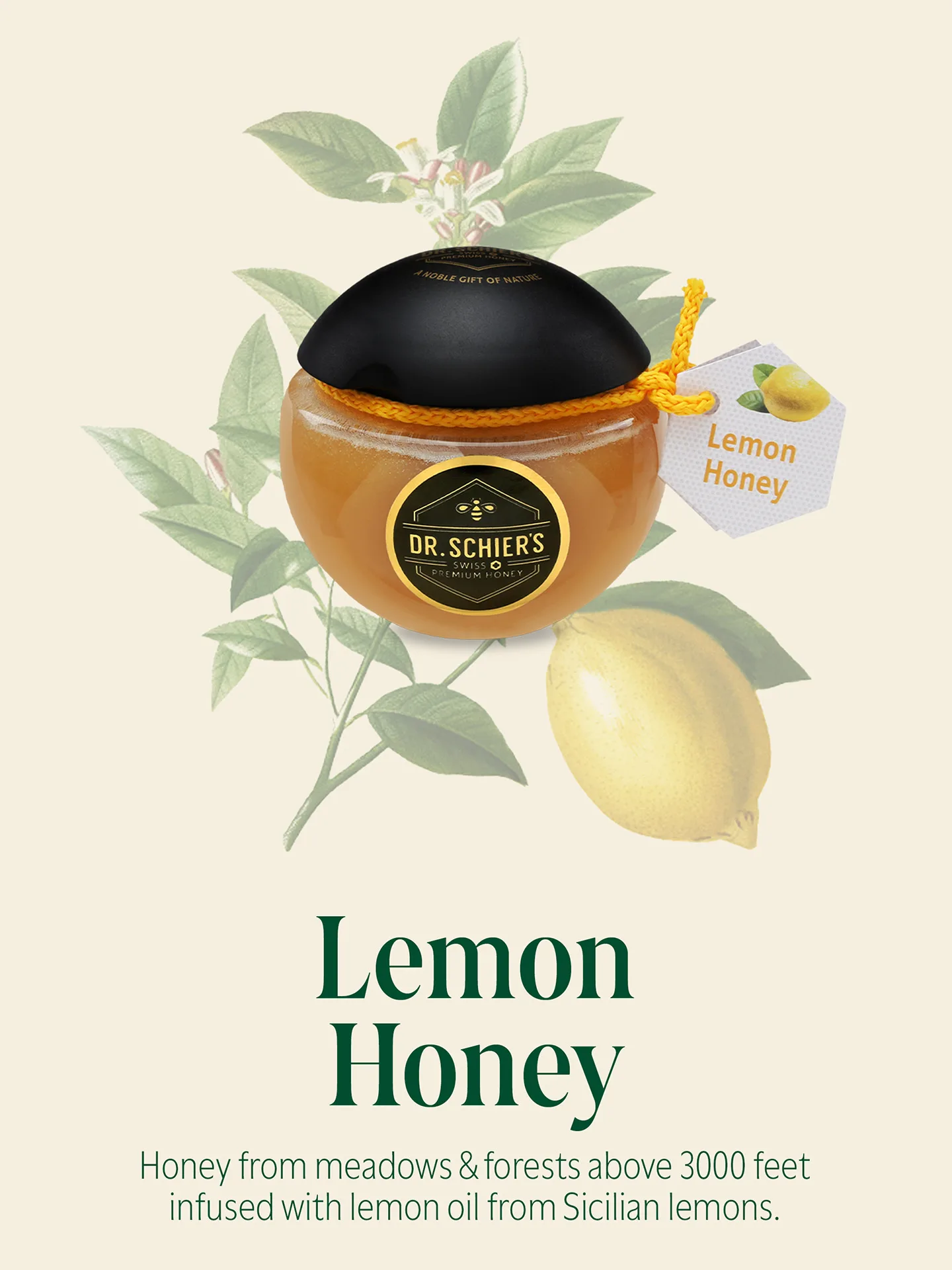
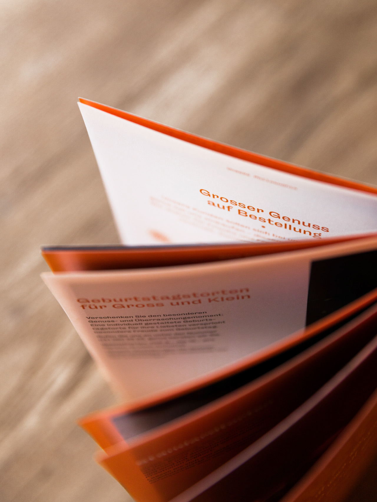
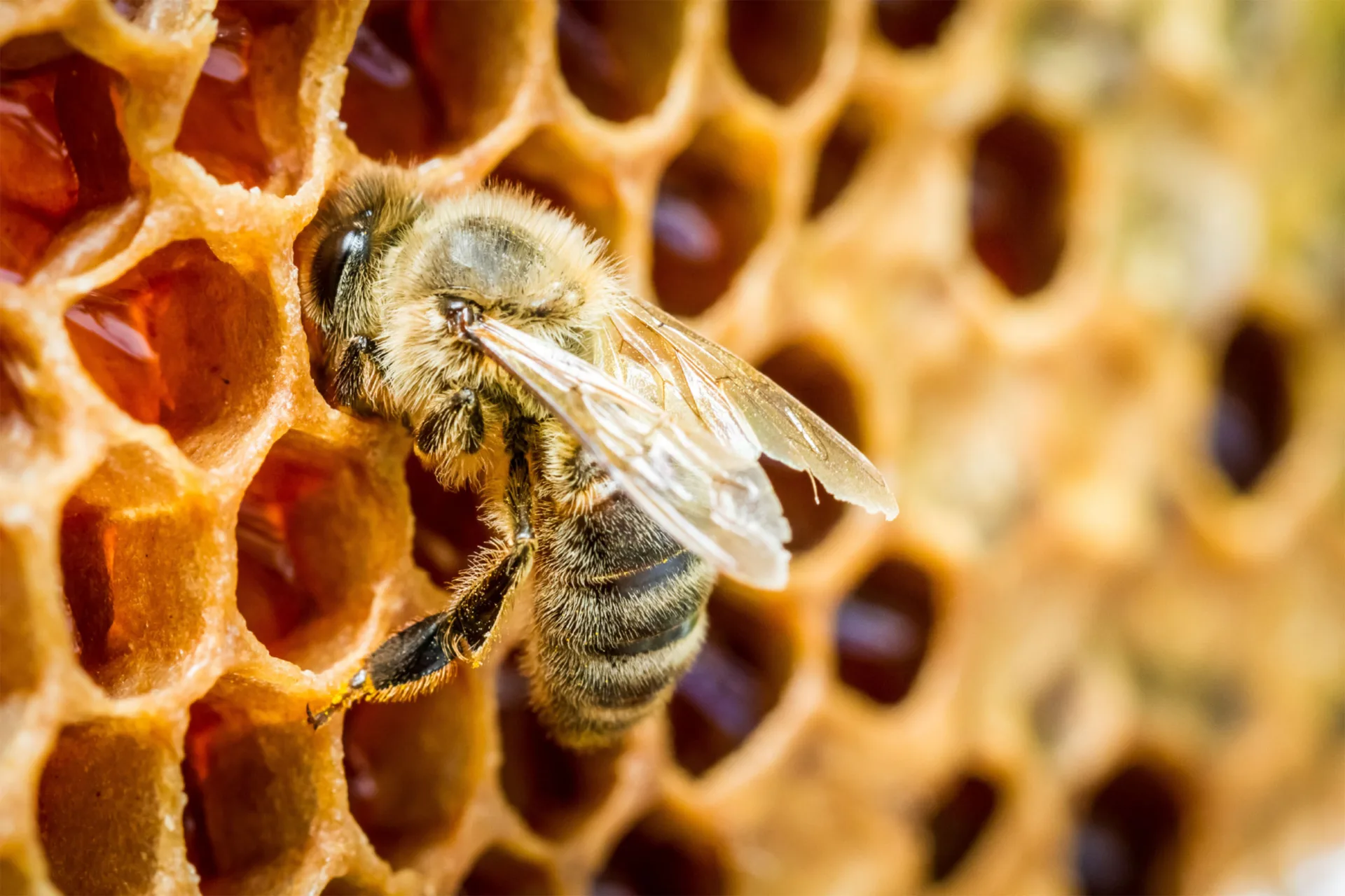
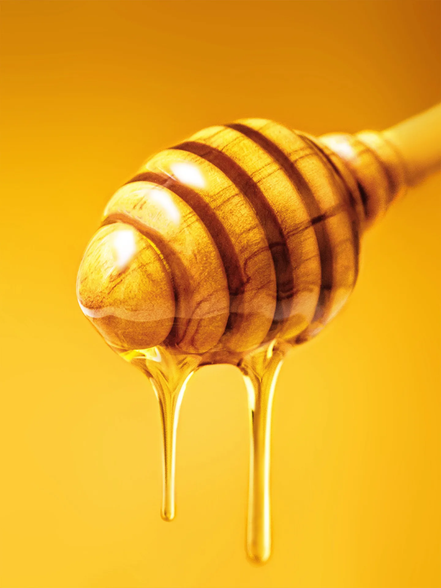
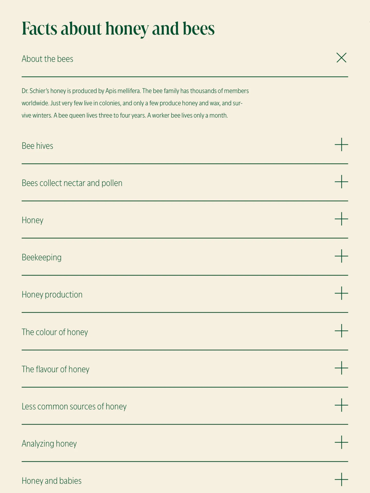
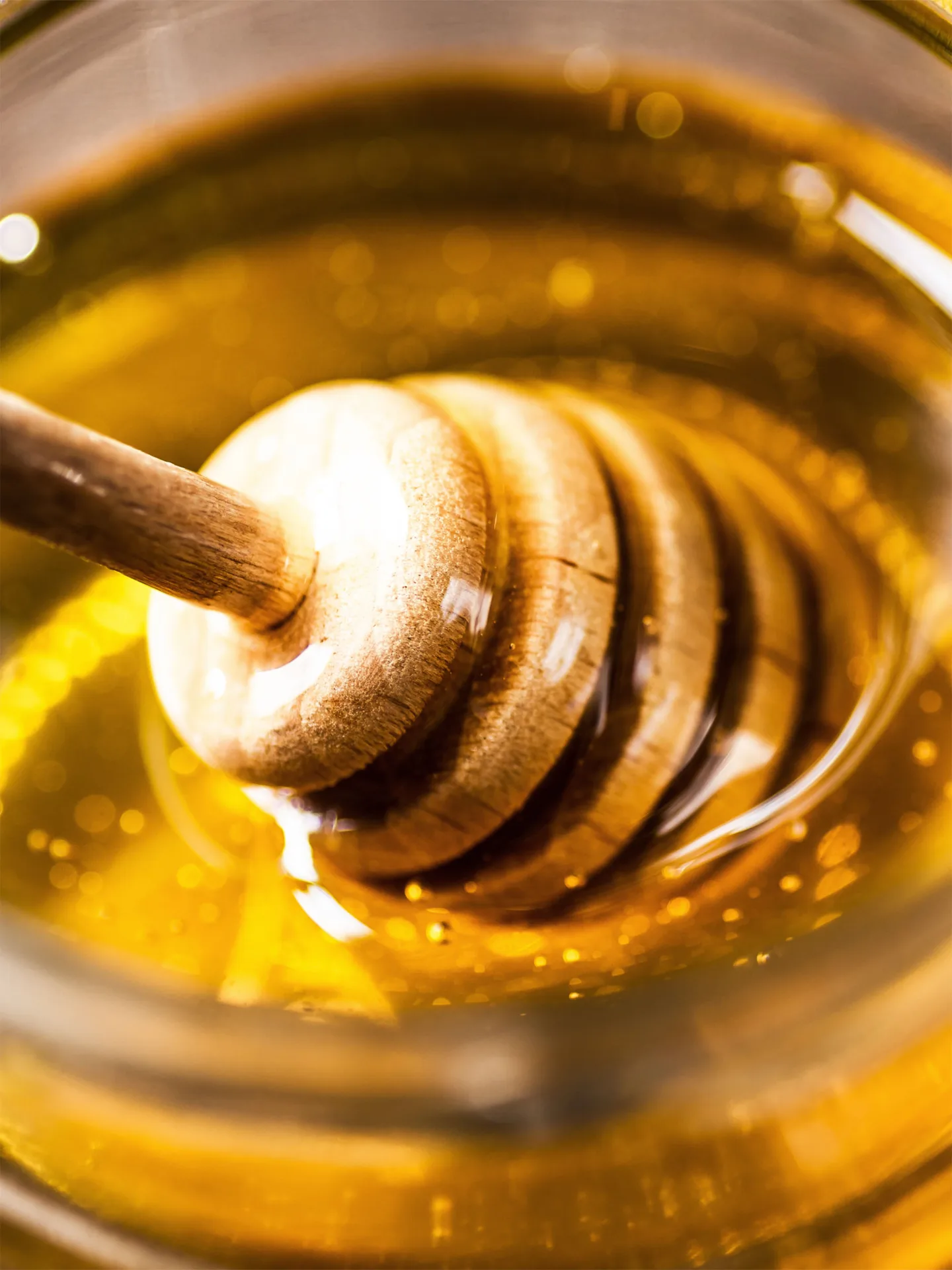
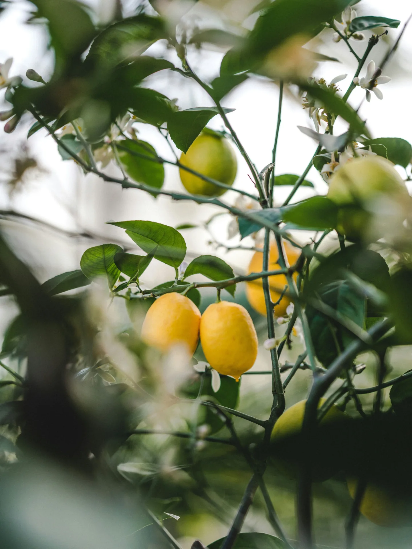
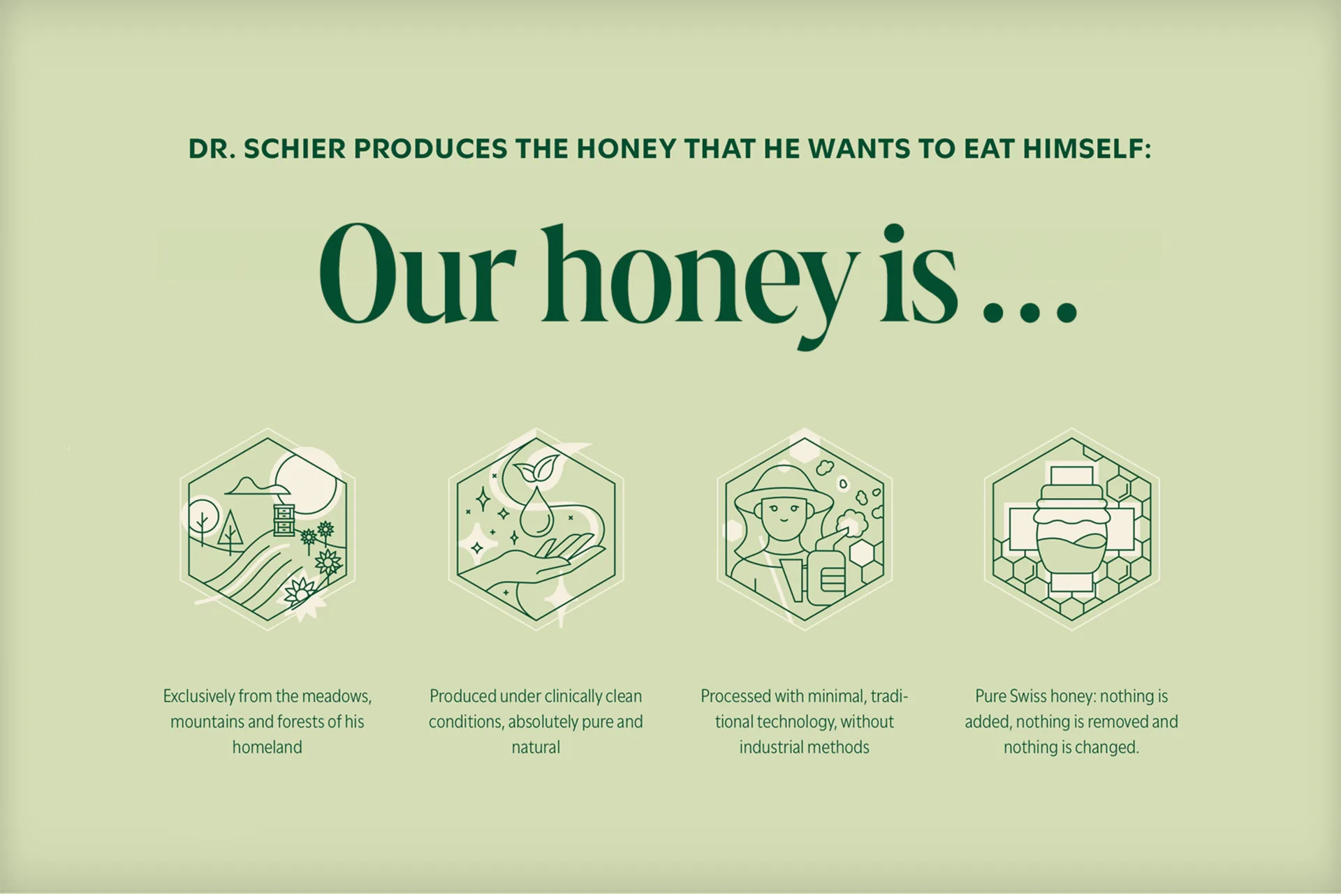
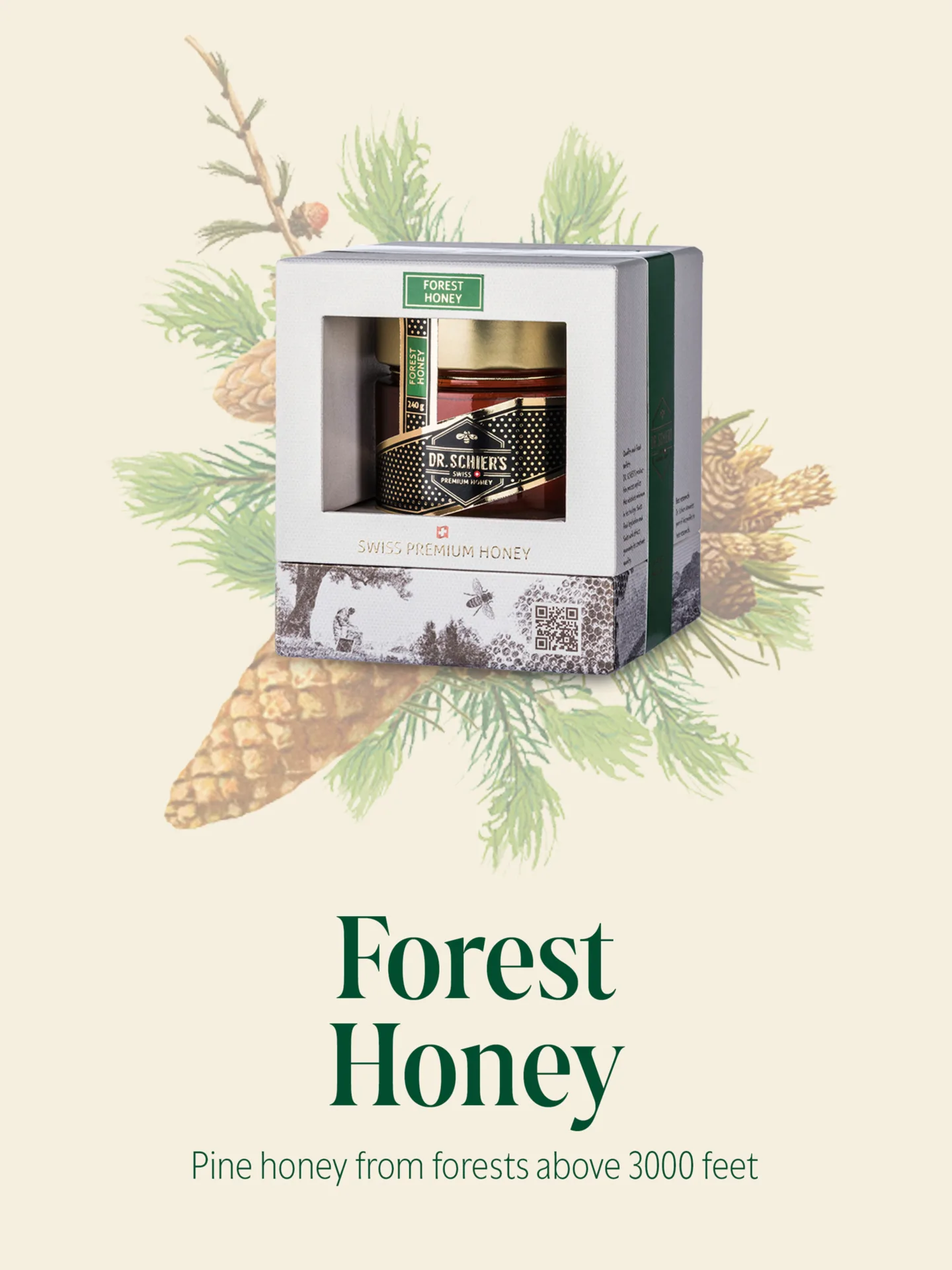
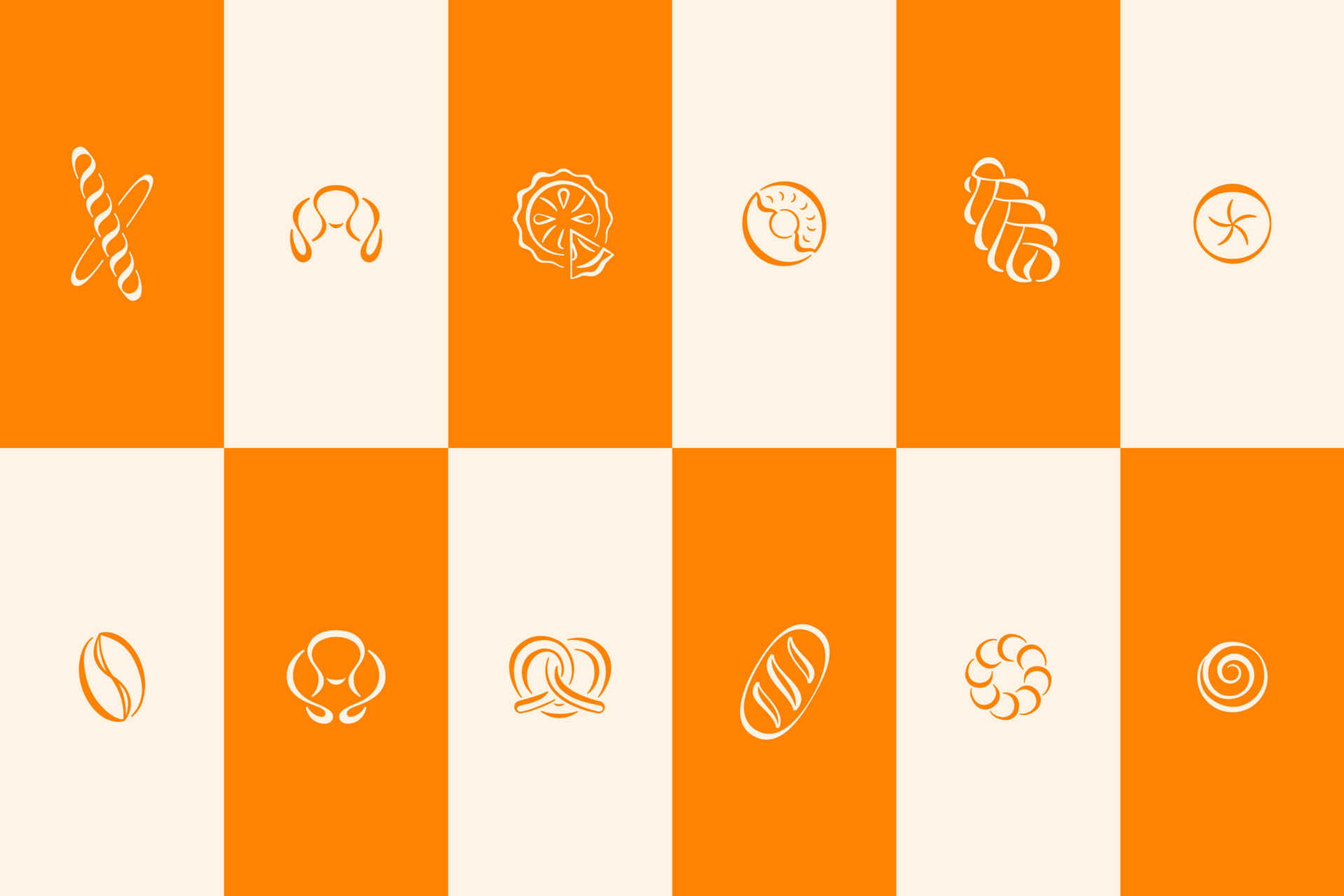
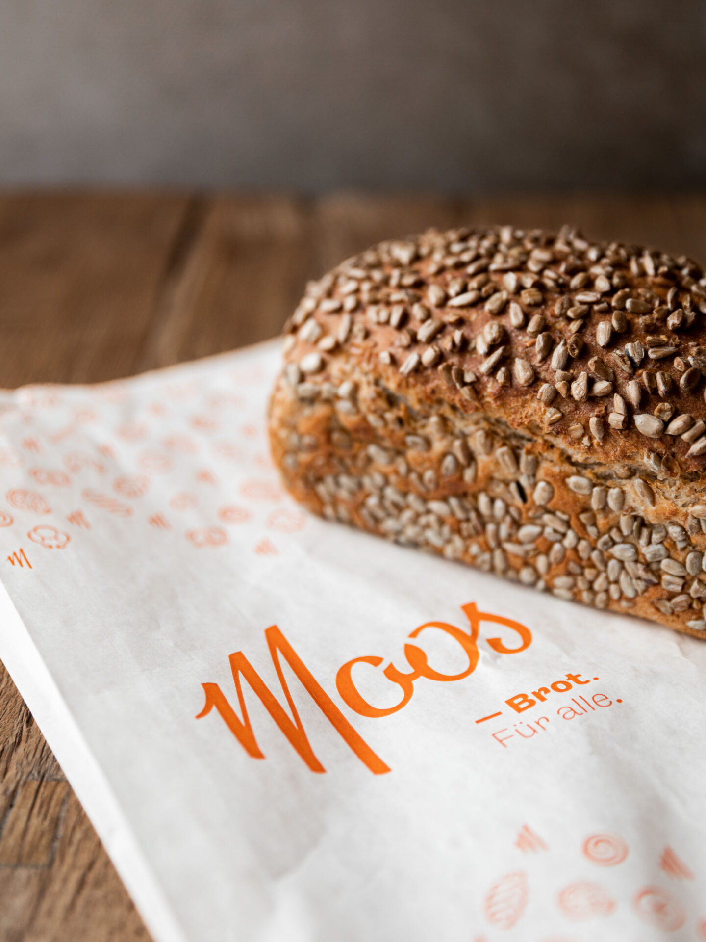
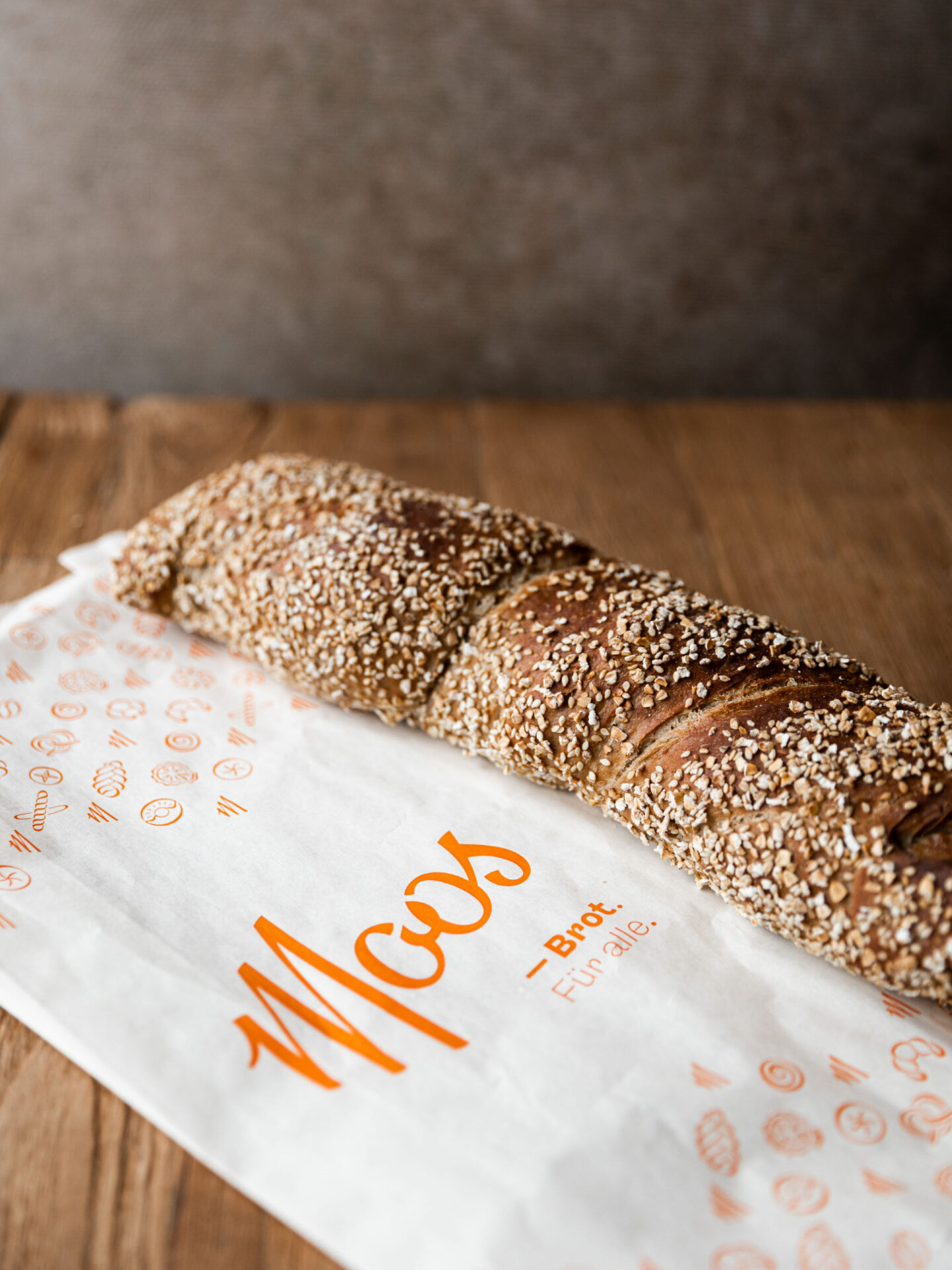
The website’s color scheme, inspired by nature and honey, is now a careful combination of soft green-yellow hues that create a calming and natural atmosphere. The product photography has been presented in a new light, adding a hedonistic aspect to the otherwise simple website, while informative icons illustrate the philosophy behind Dr. Schier’s work.


YEAR
2024
RESPONSABILITY
Concept, design and implementation
PARTNER
CLIENT
SERVICES
Brand Refresh, Webdesign
FONTS IN USE


