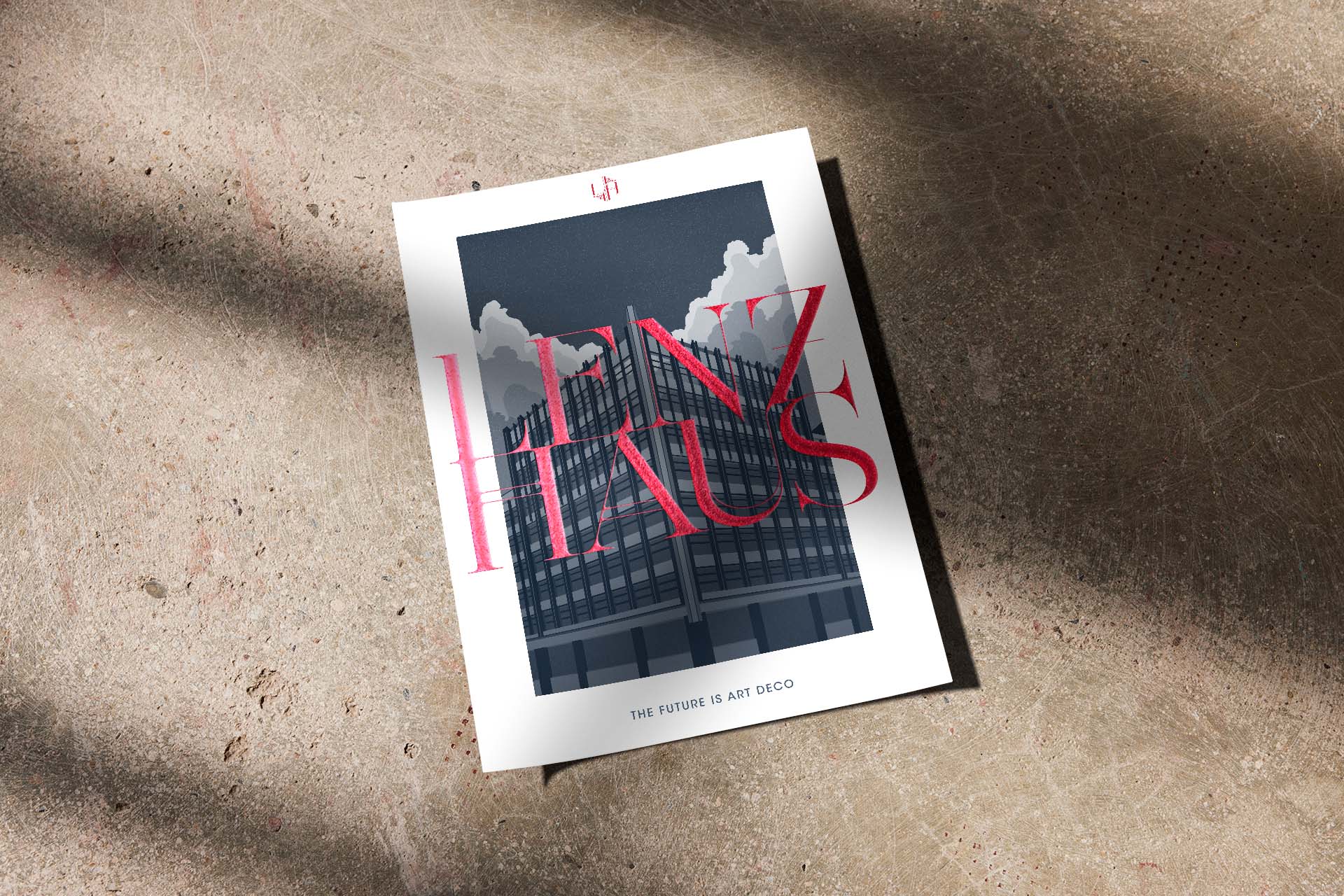
Lenzhaus – The Future is Art Deco. The branding concept for this architectural landmark of Berlin is an ode to the spirit of the Golden Age of Art Deco with its ornamental style.
The final design is a reinterpretation of common Art Deco motifs. The letterform in the monogram is derived from the cubature of the building. The typeface itself is a subtly changed, more decorative version of the Seingalt font by David Massara. With its newly added double lines in selected letters, it reflects the tradition of typical and striking Art Deco typefaces.
The look and feel of the cover illustration and the portrait of the architect himself also reflect on the style of typical Art Deco artworks and artists.


YEAR
2017
RESPONSABILITY
Concept, design and implementation (brand, illustrations, printed matter)
PARTNER
Agency: Room meets Freiland | 3D-Visualization: beyond | Photography: Ruediger Glatz
CLIENT
SERVICES
Branding, Editorial Design, Illustration, Marketing, Webdesign
FONTS IN USE