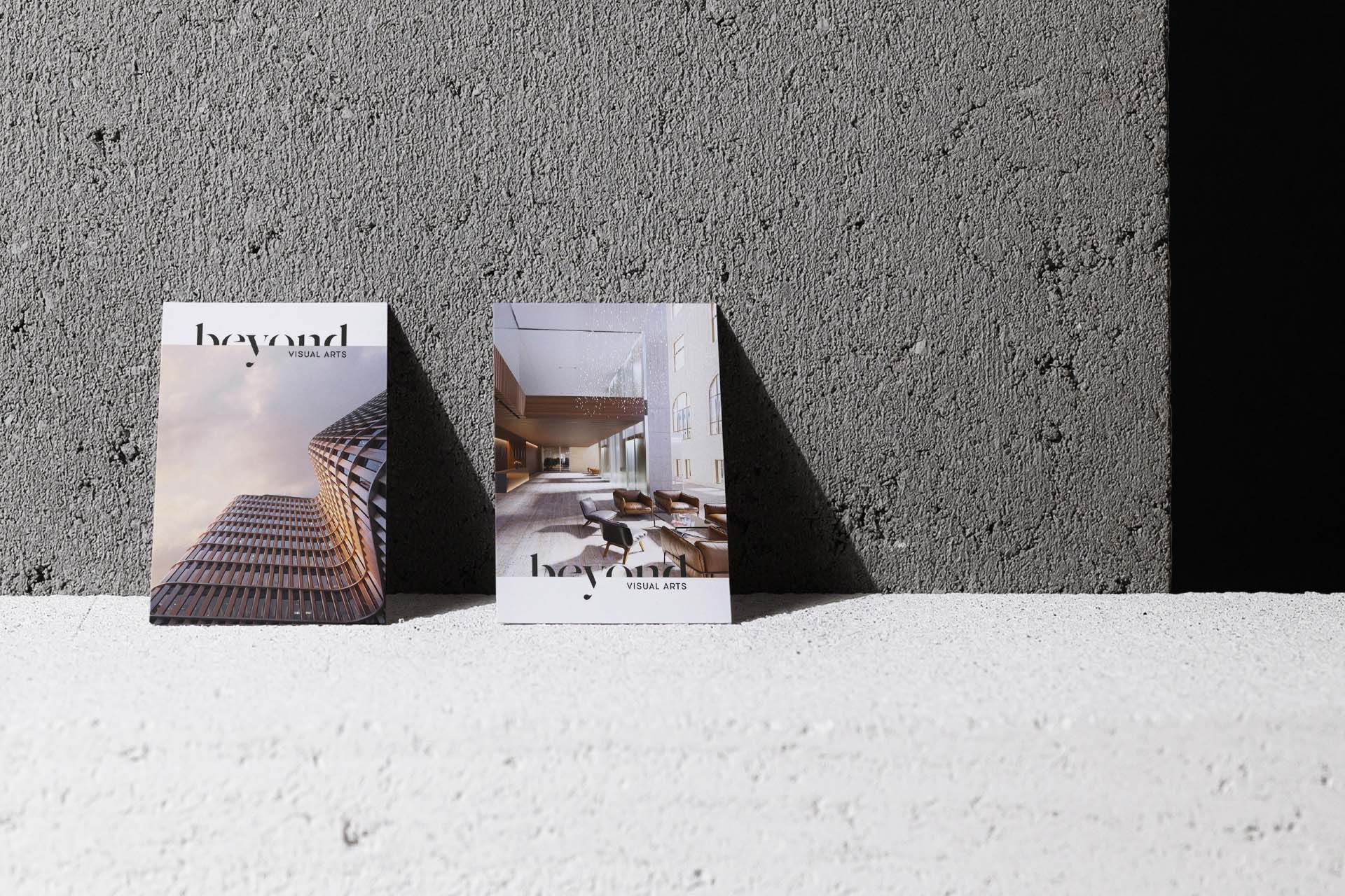
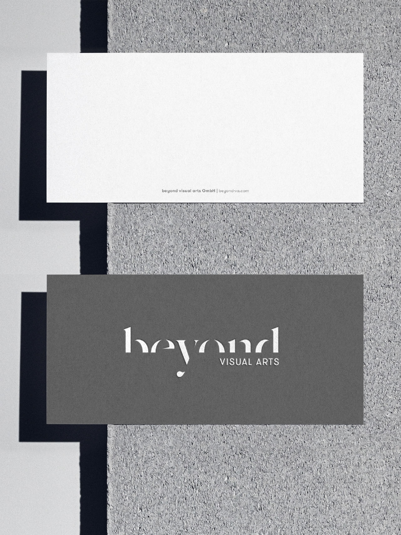
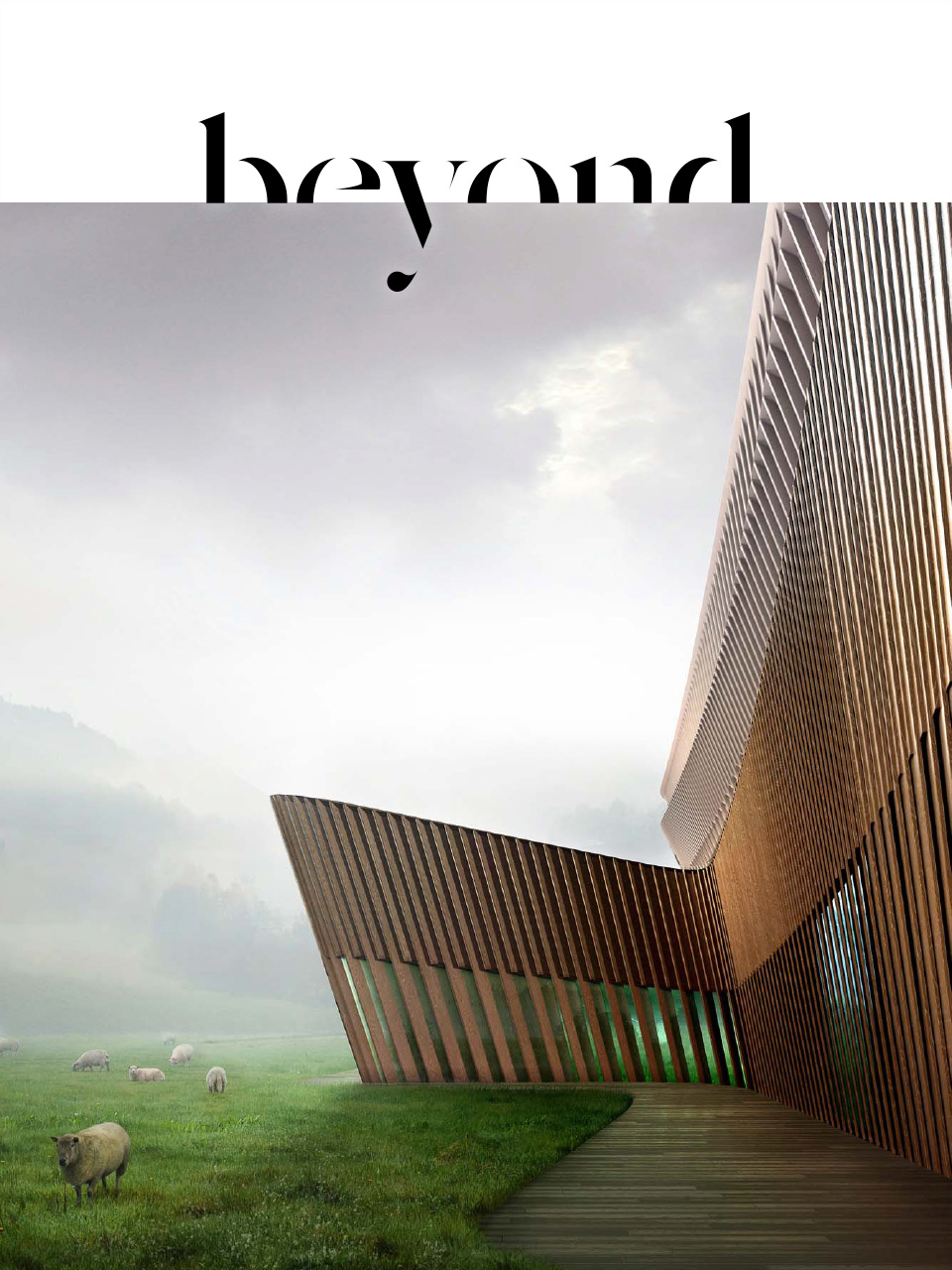
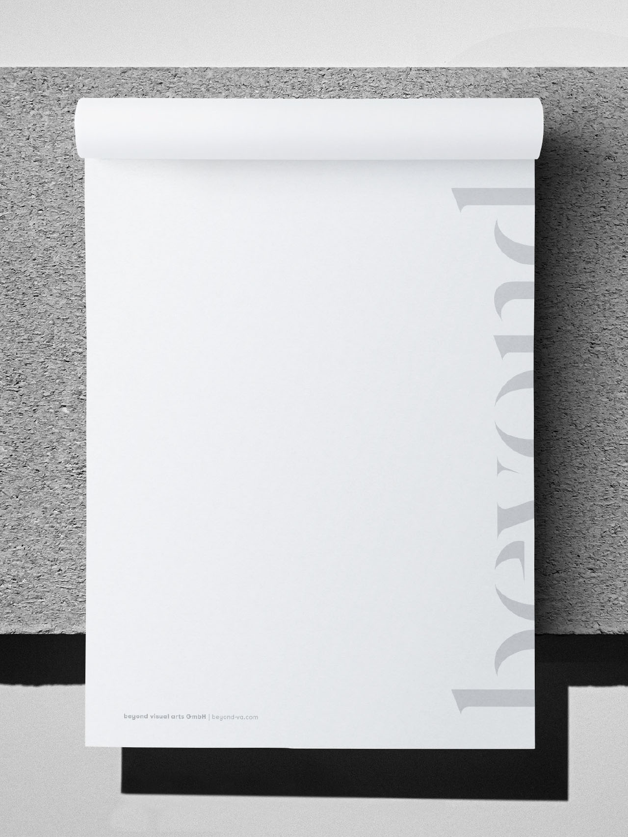
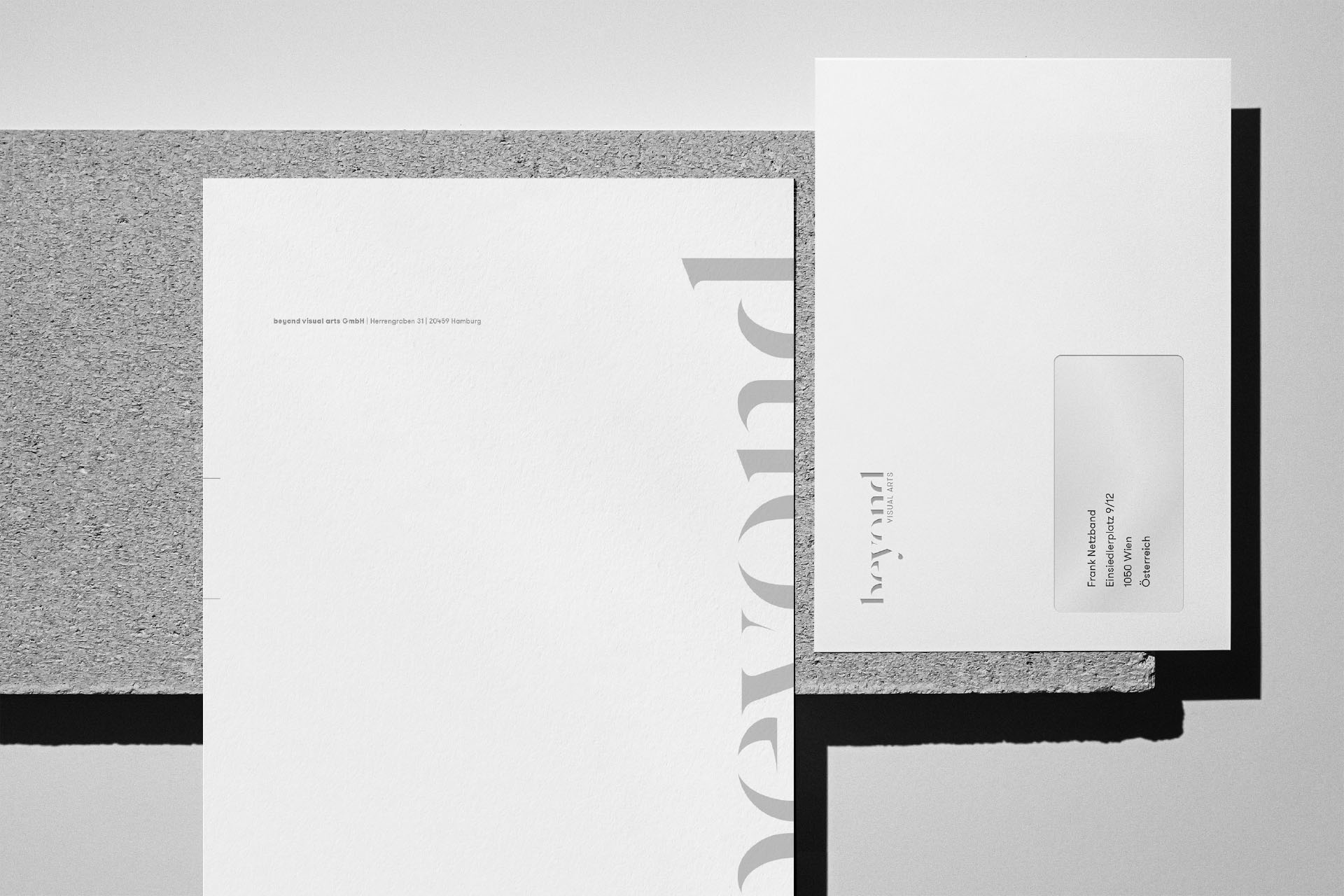
beyond – visual arts The challenge was to create a modern and sophisticated identity for a company that functions at the intersection between art and commerce – working in the fields of architecture, project development and real estate management.
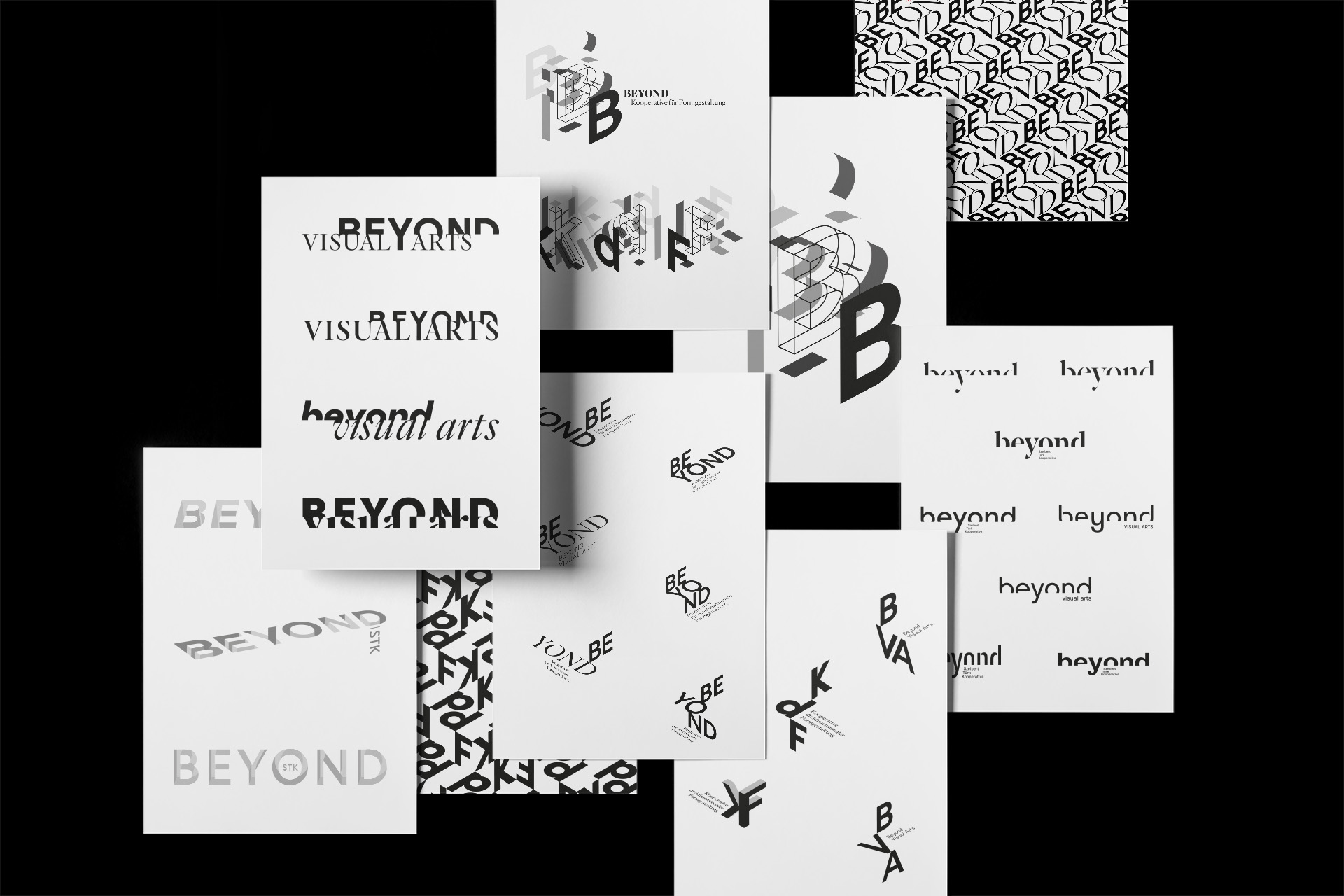
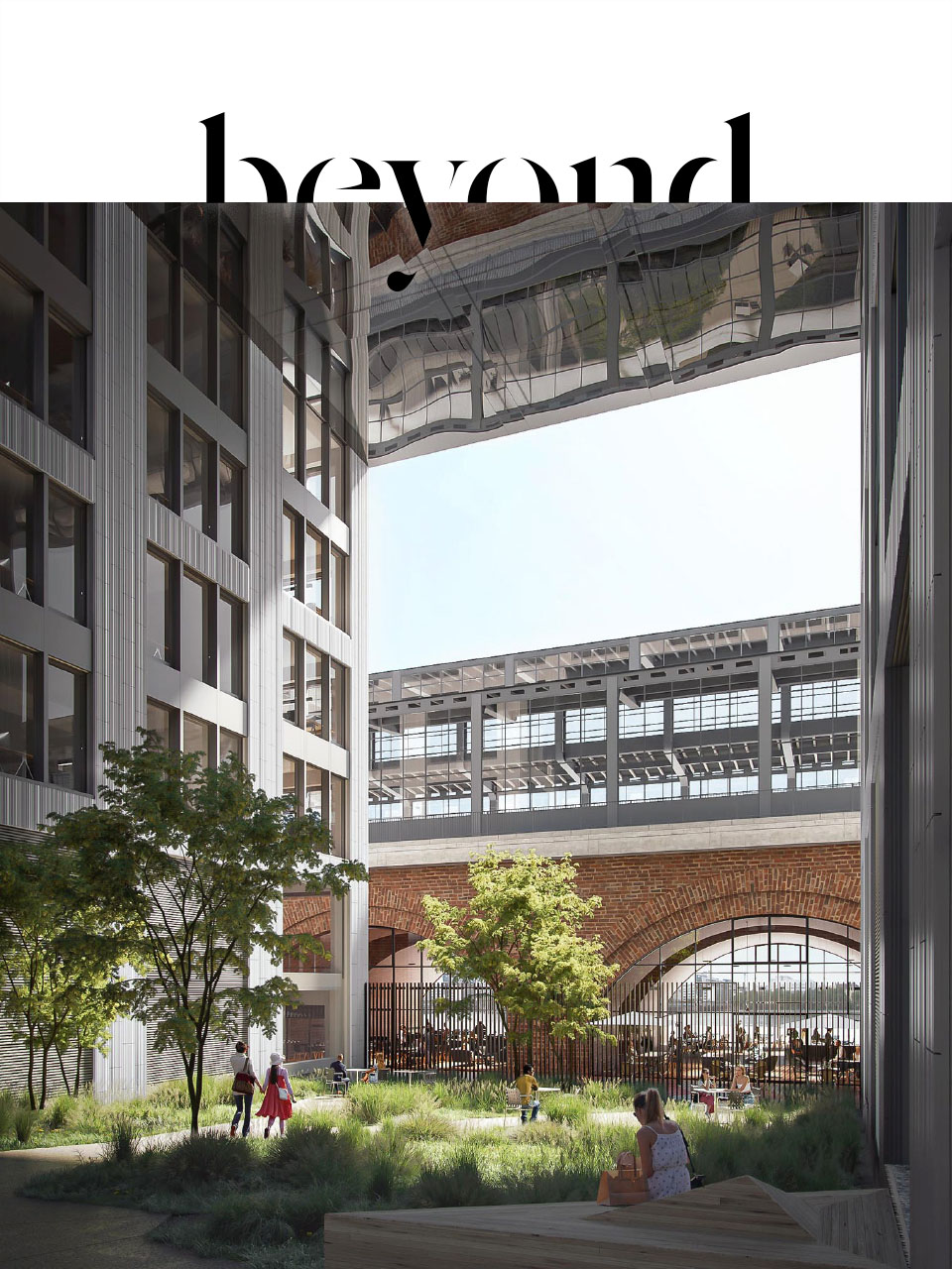
Beyond can describe a correlation between space and time, but is also used to emphasize the depth of an idea or its elusiveness. In German, the true meaning becomes even more uncertain; beyond may mean underneath, across or even above. What they all have in common though is their reference to something spatial – which is the mission of a rendering company, giving an architectural idea its third dimension, visualizing ideas that may be beyond others imagination.
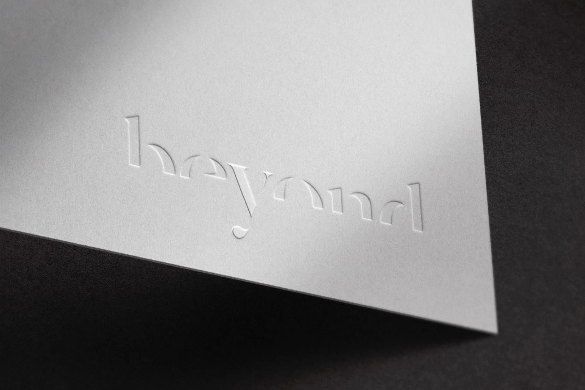
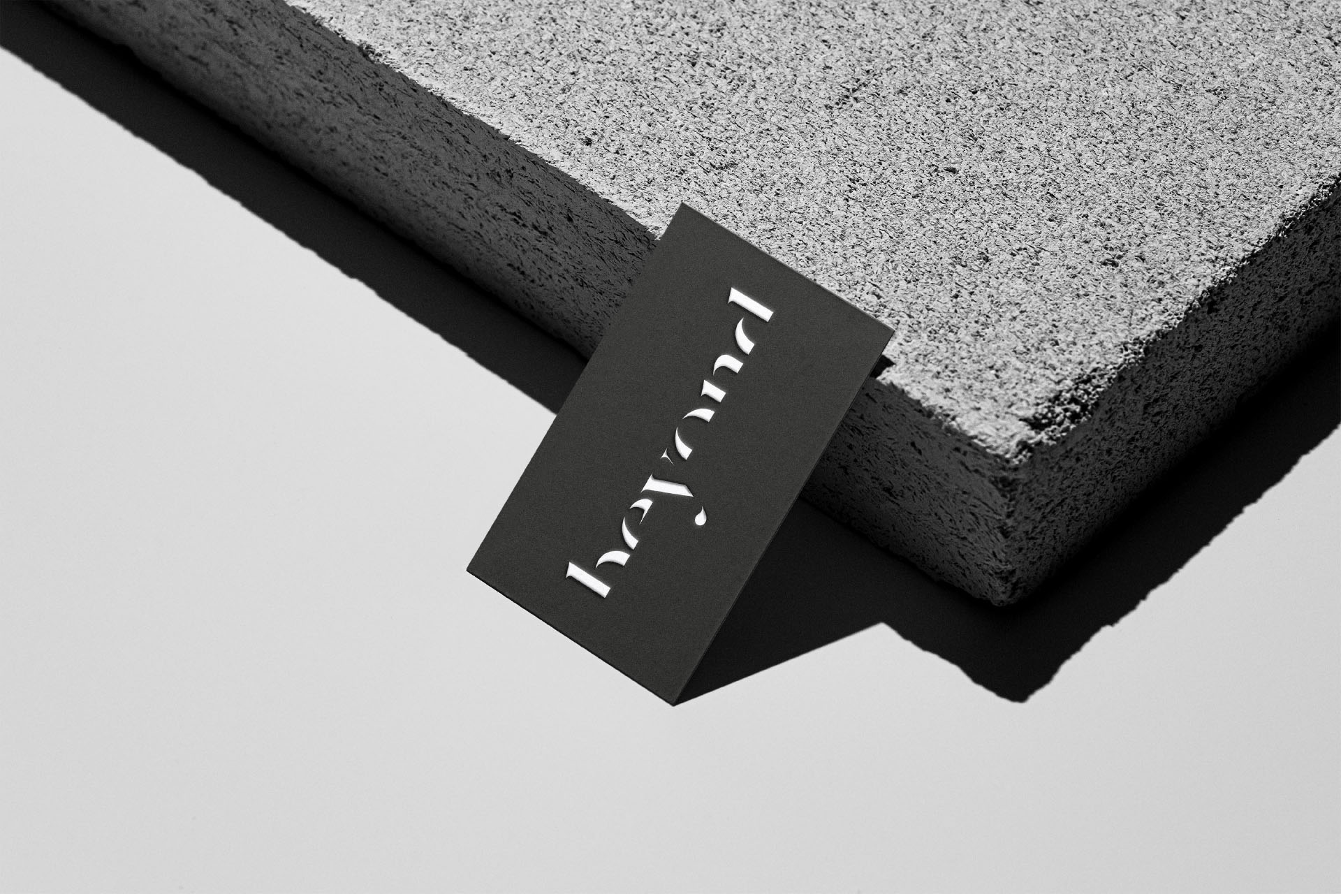
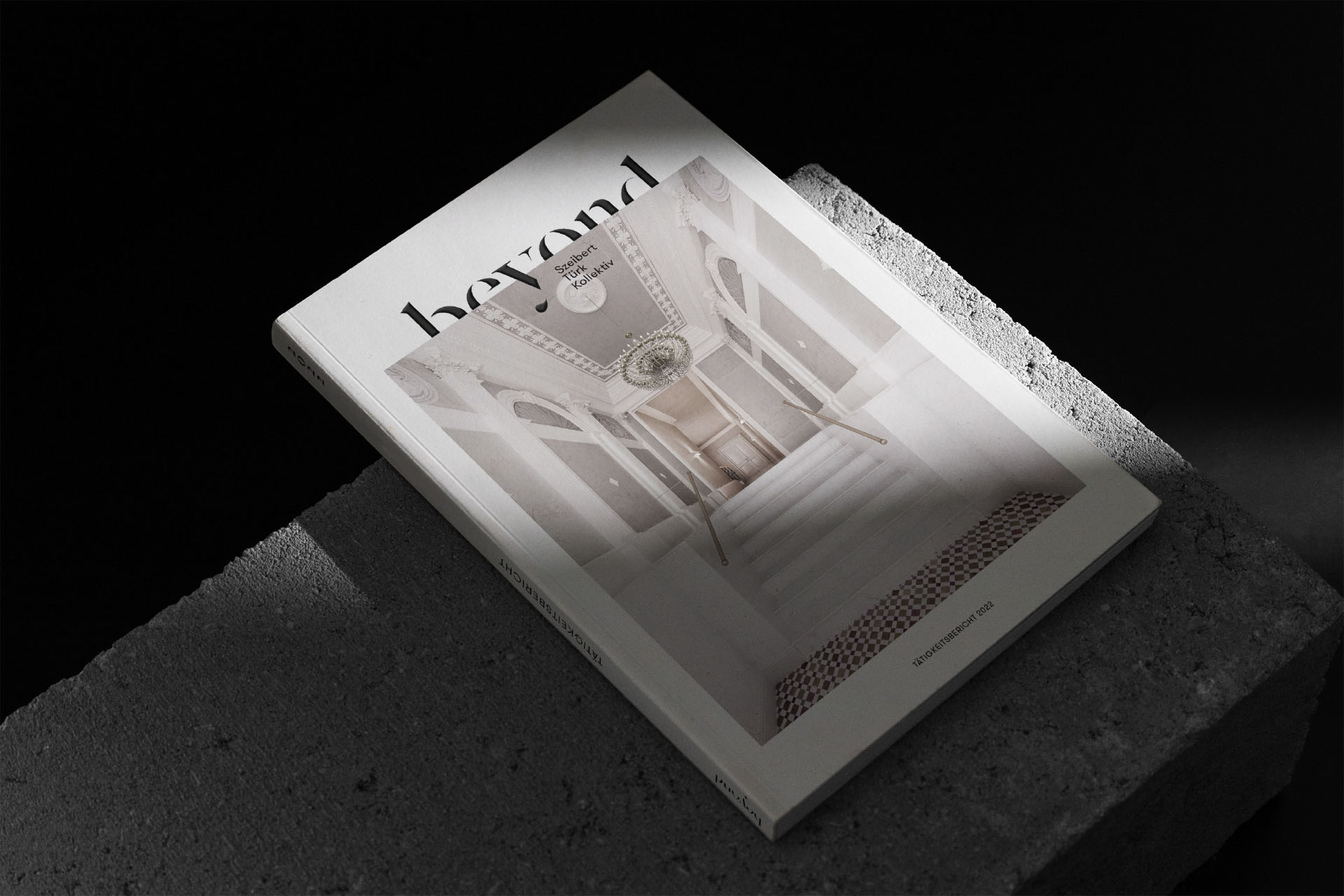
Based on the different spatial translations of beyond, we created a logo that also has spatial diversity. By placing it between two layers, combining them with the letter “y” it creates depth and three-dimensionality.
YEAR
2017
RESPONSABILITY
Concept, design and implementation (brand, printed matter, webdesign)
PARTNER
Agency: Room meets Freiland | 3D-Visualization: beyond
CLIENT
SERVICES
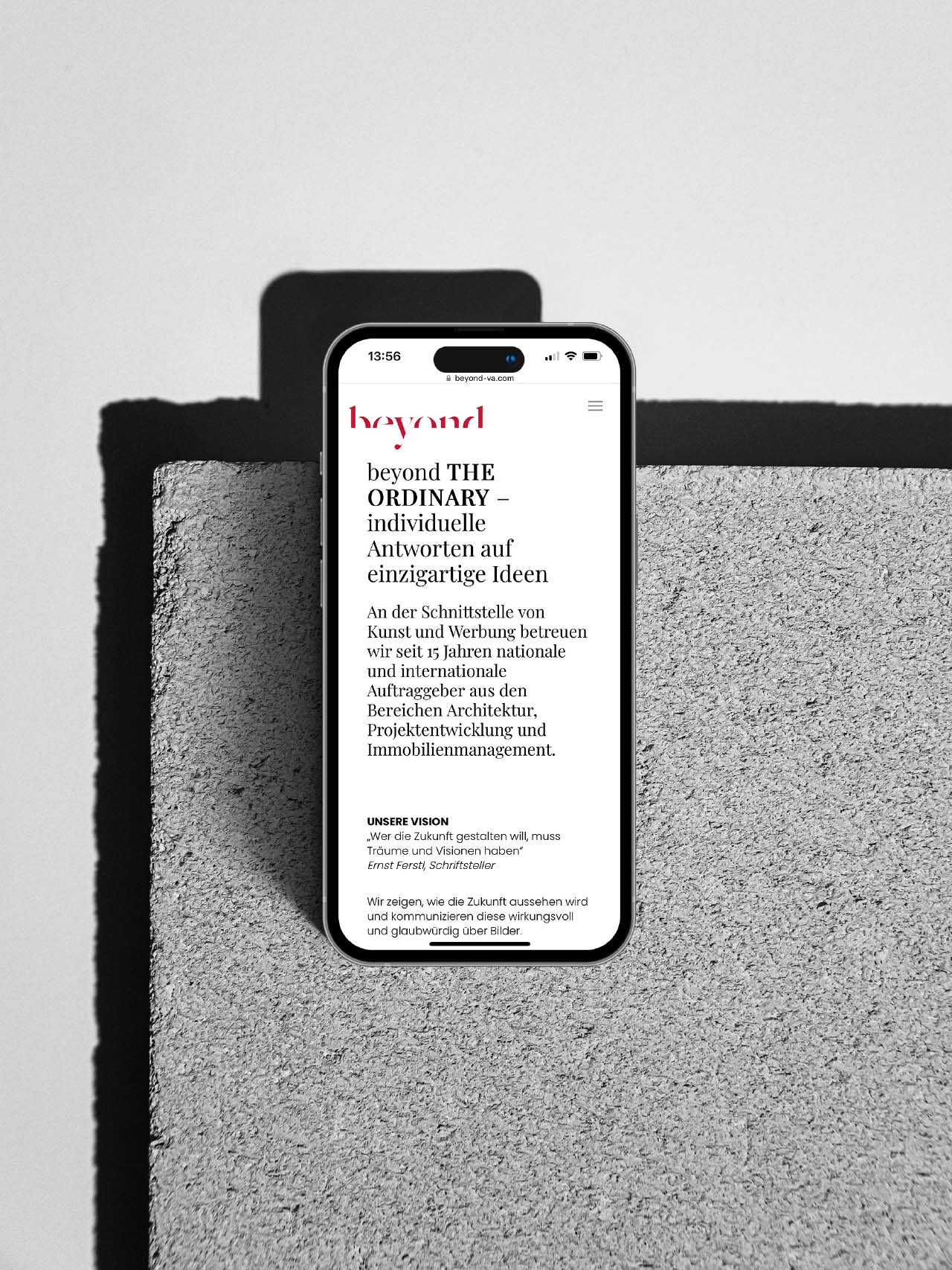
Branding, Webdesign, Corporate Publishing
FONTS IN USE
