Moos Photography
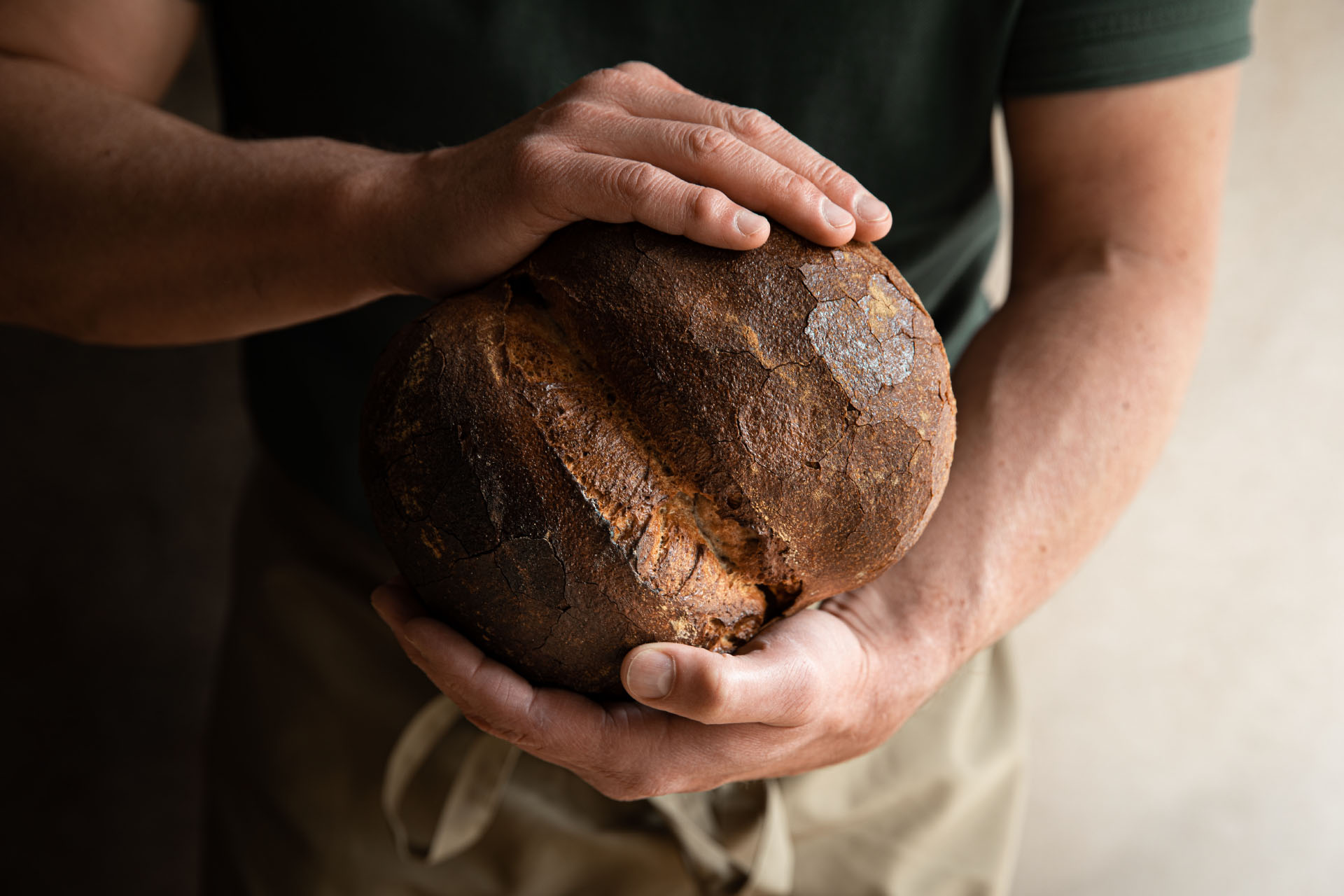
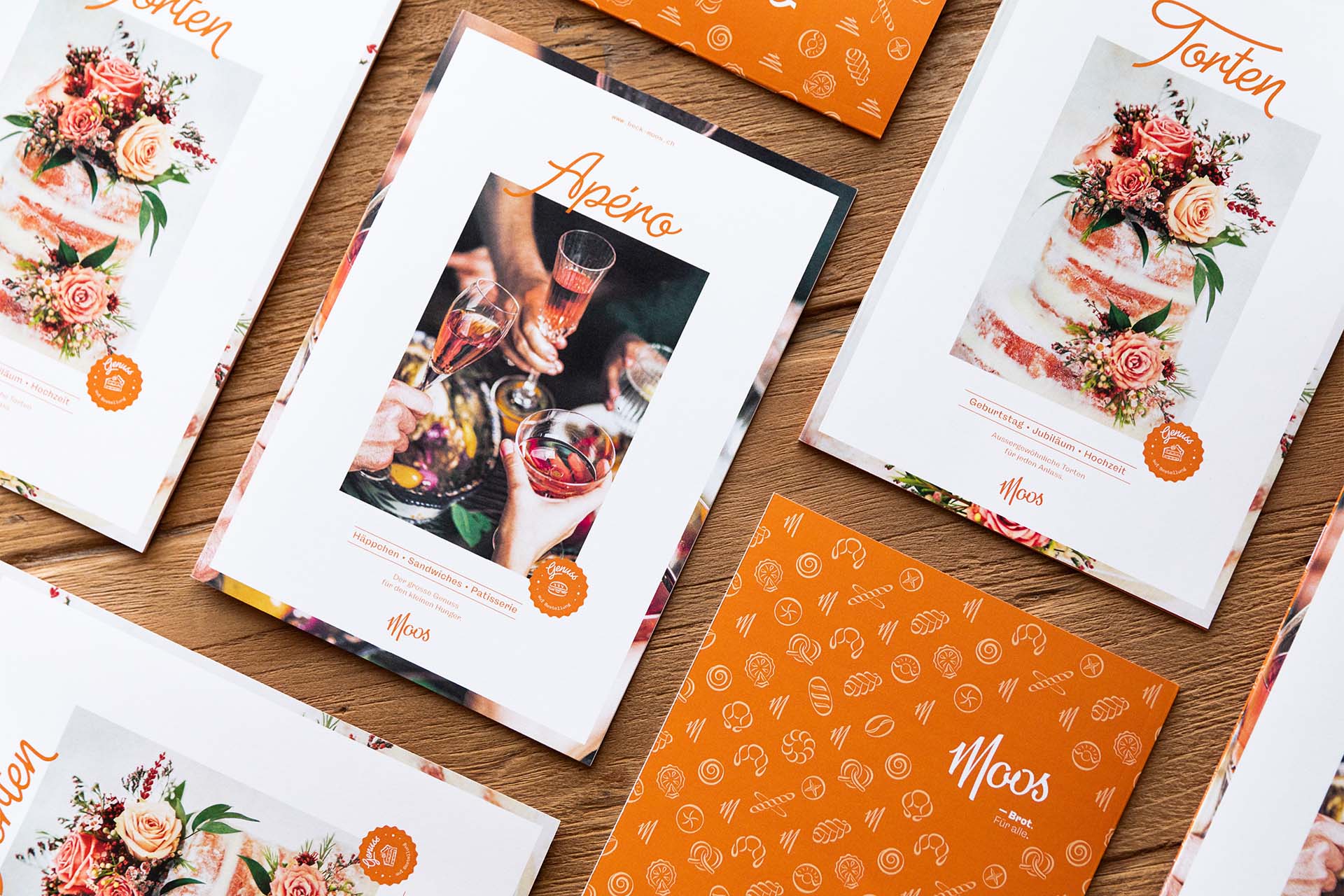
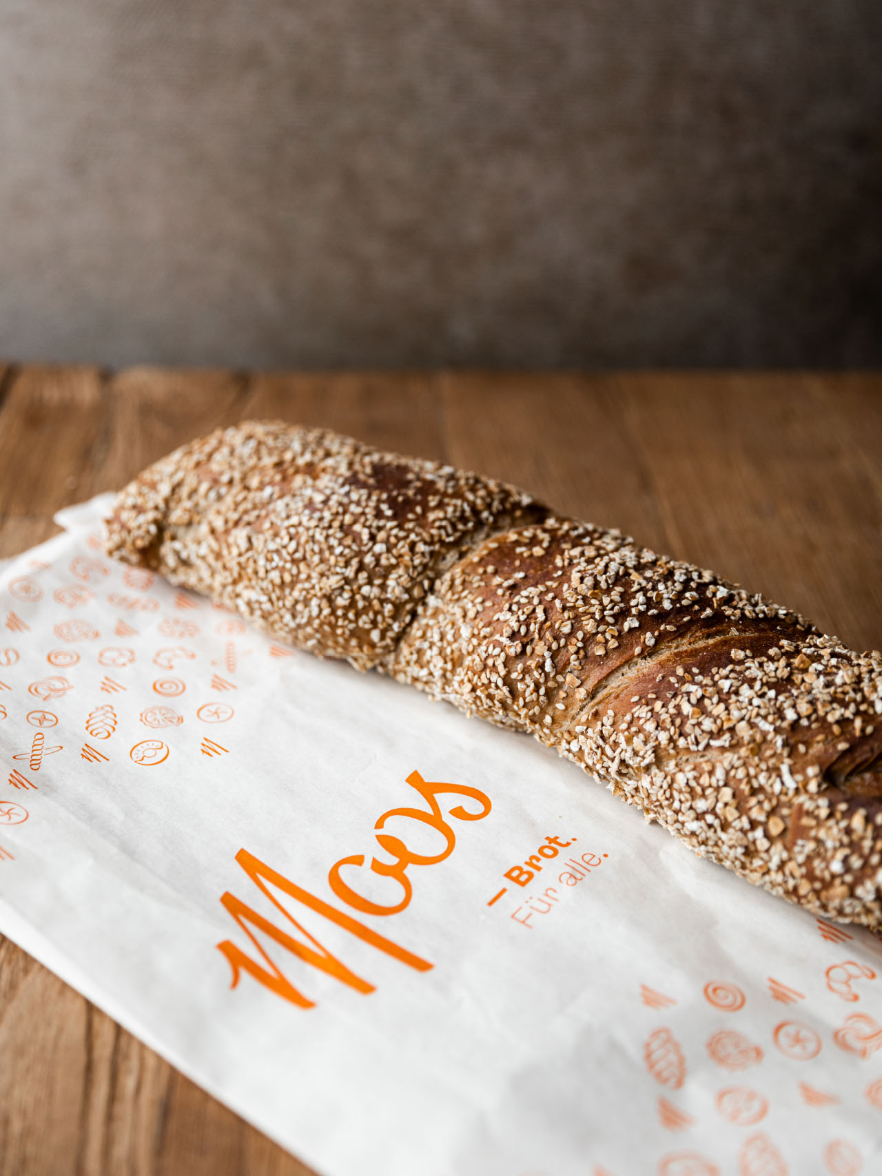
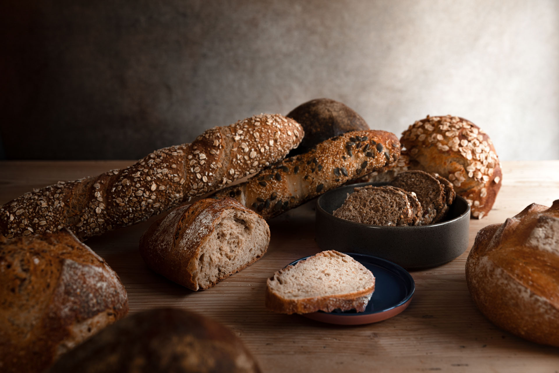
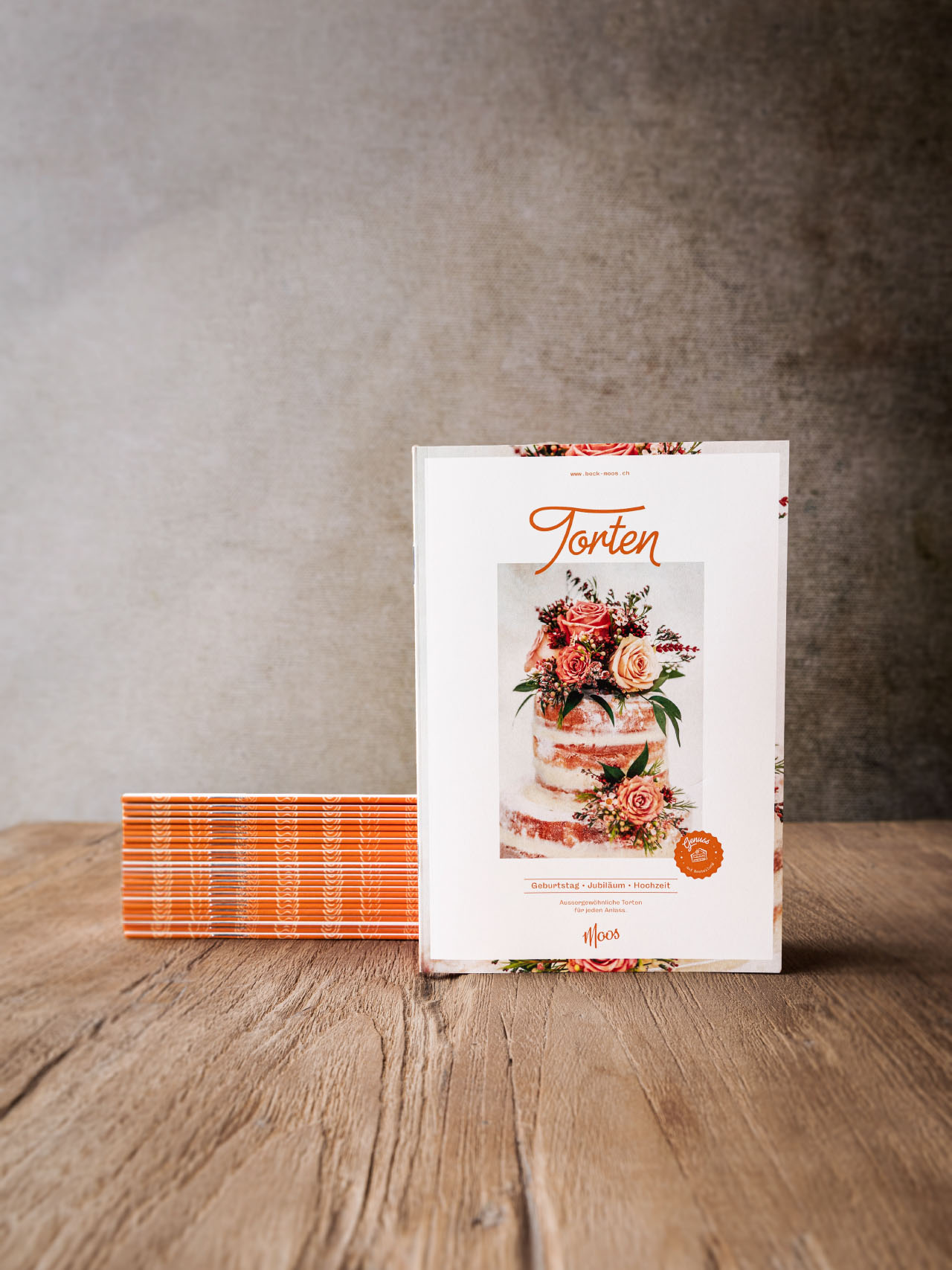
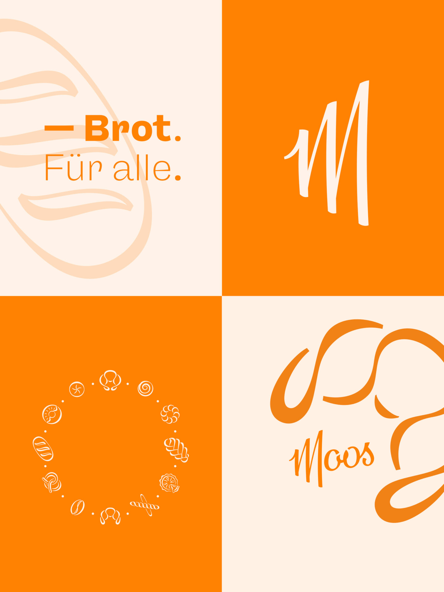
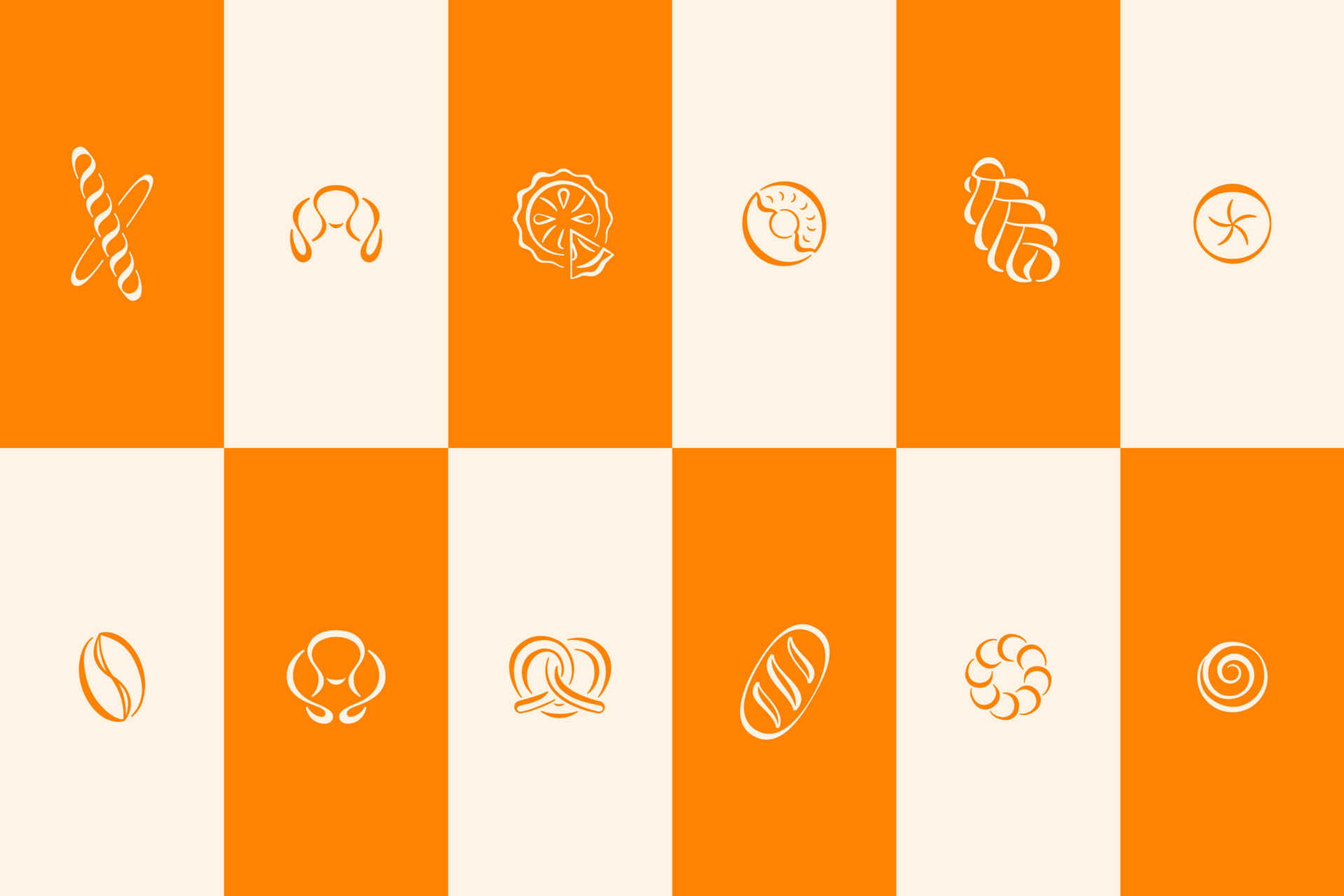
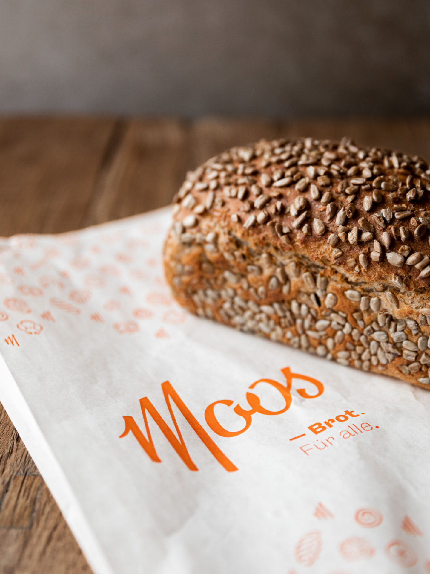
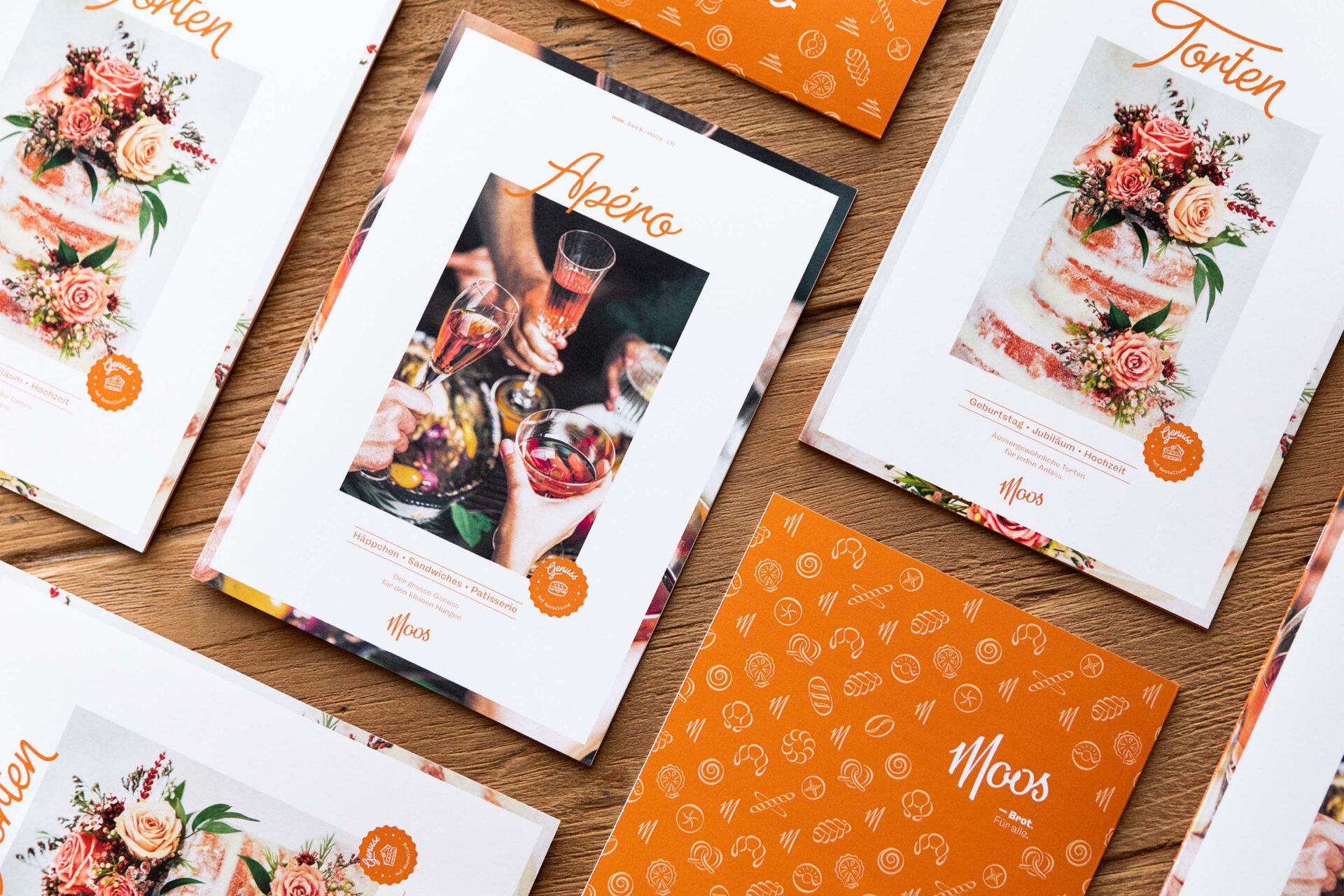
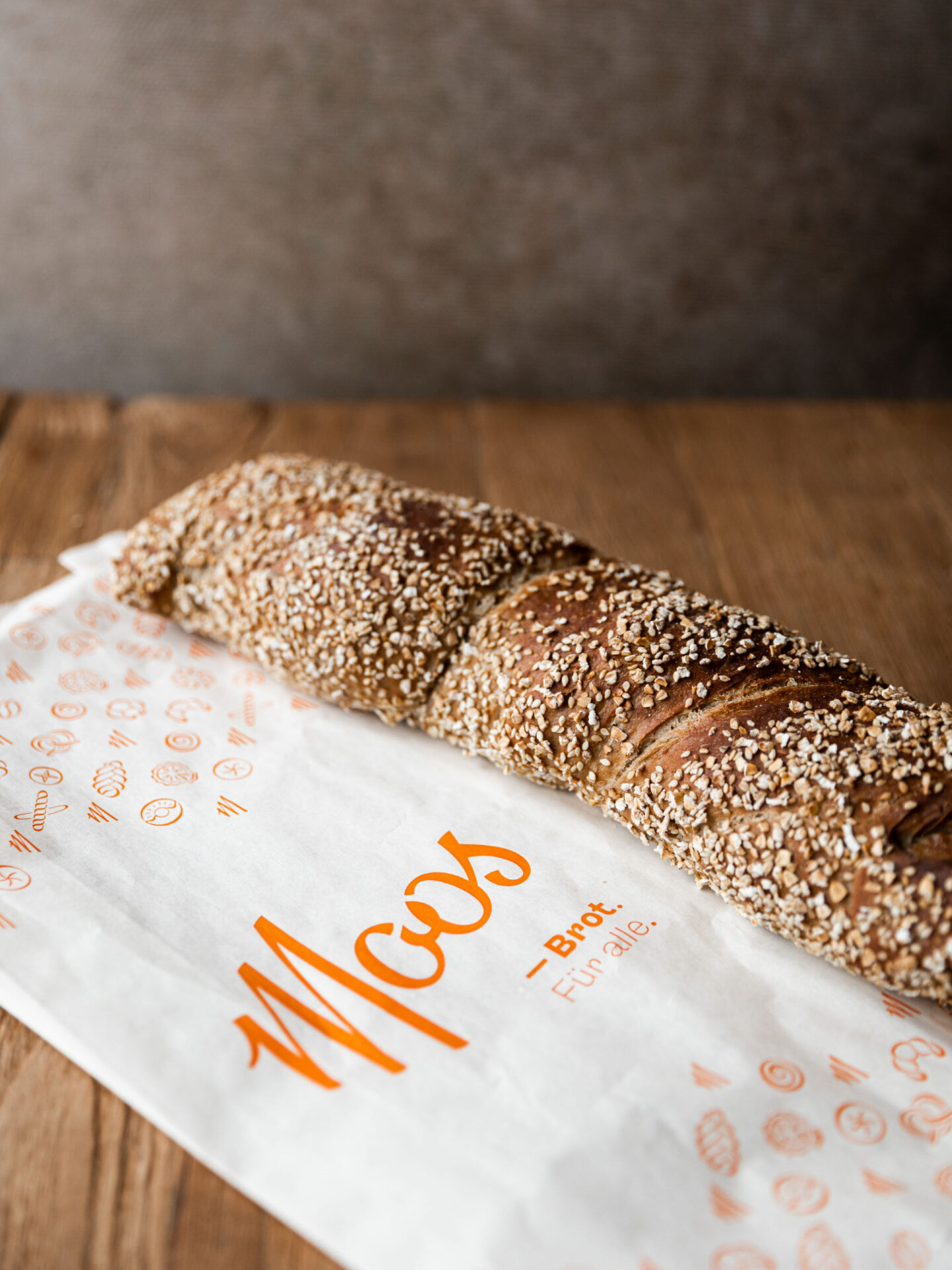
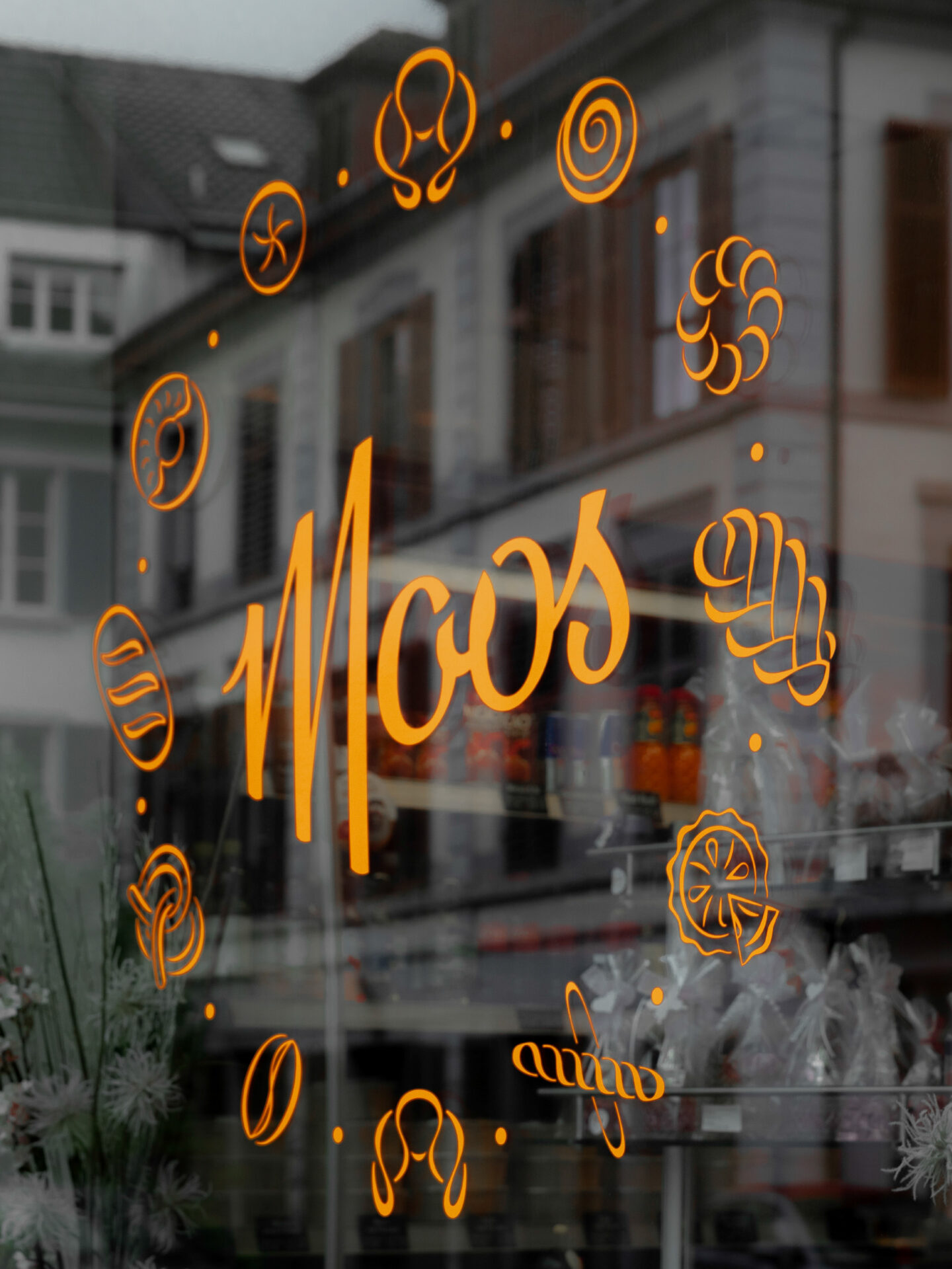
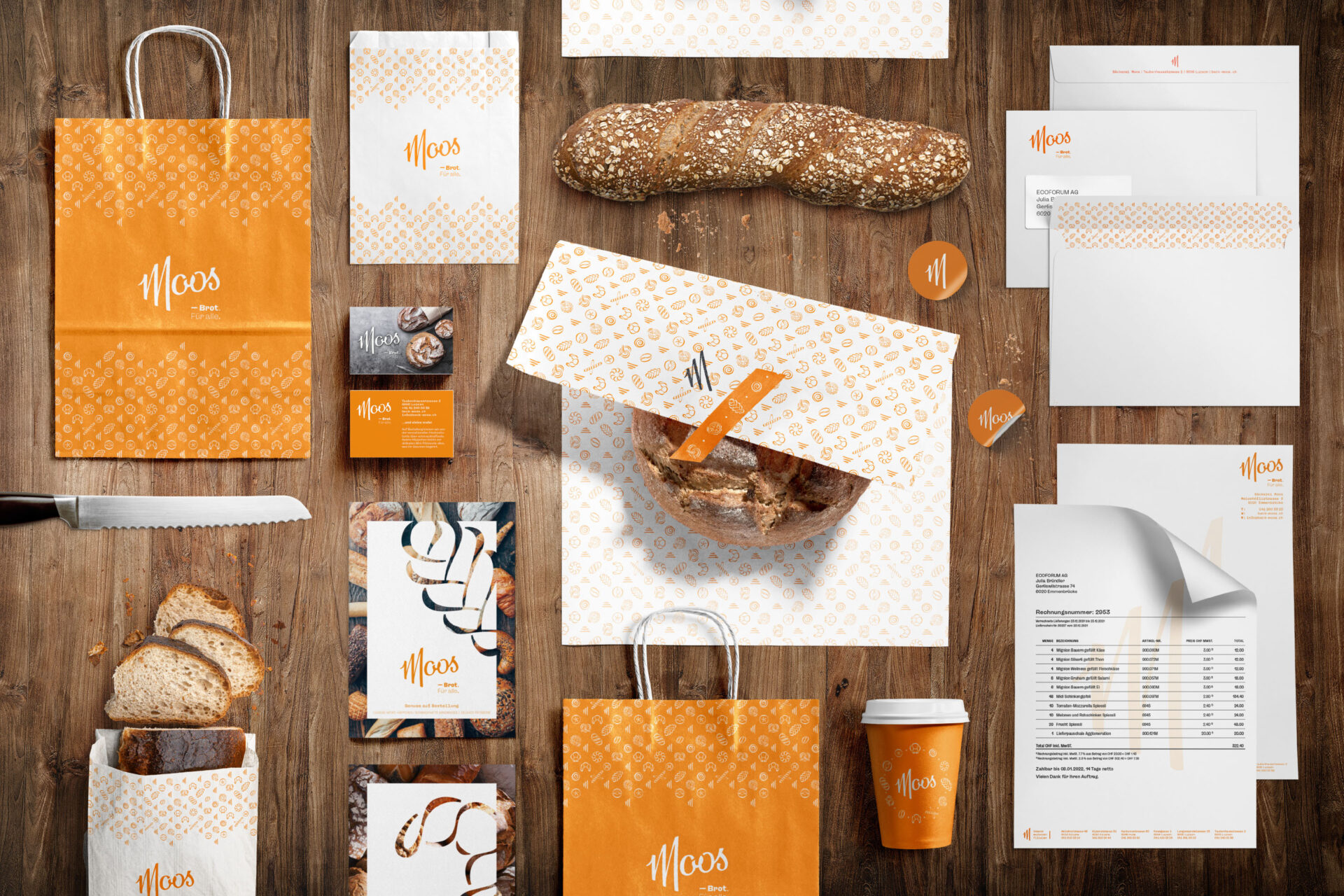
Bäckerei Moos – Brot für alle. In 1974, the bakery Moos was established by Otto Moos in the former Zur Spendmühle bakery. Today, it is run by Fabienne and Marco Mezzadri-Moos and consists of 6 branches in the canton of Lucerne. This family-owned bakery represents a sustainable and regional traditional craft with a focus on high quality and attention to detail.
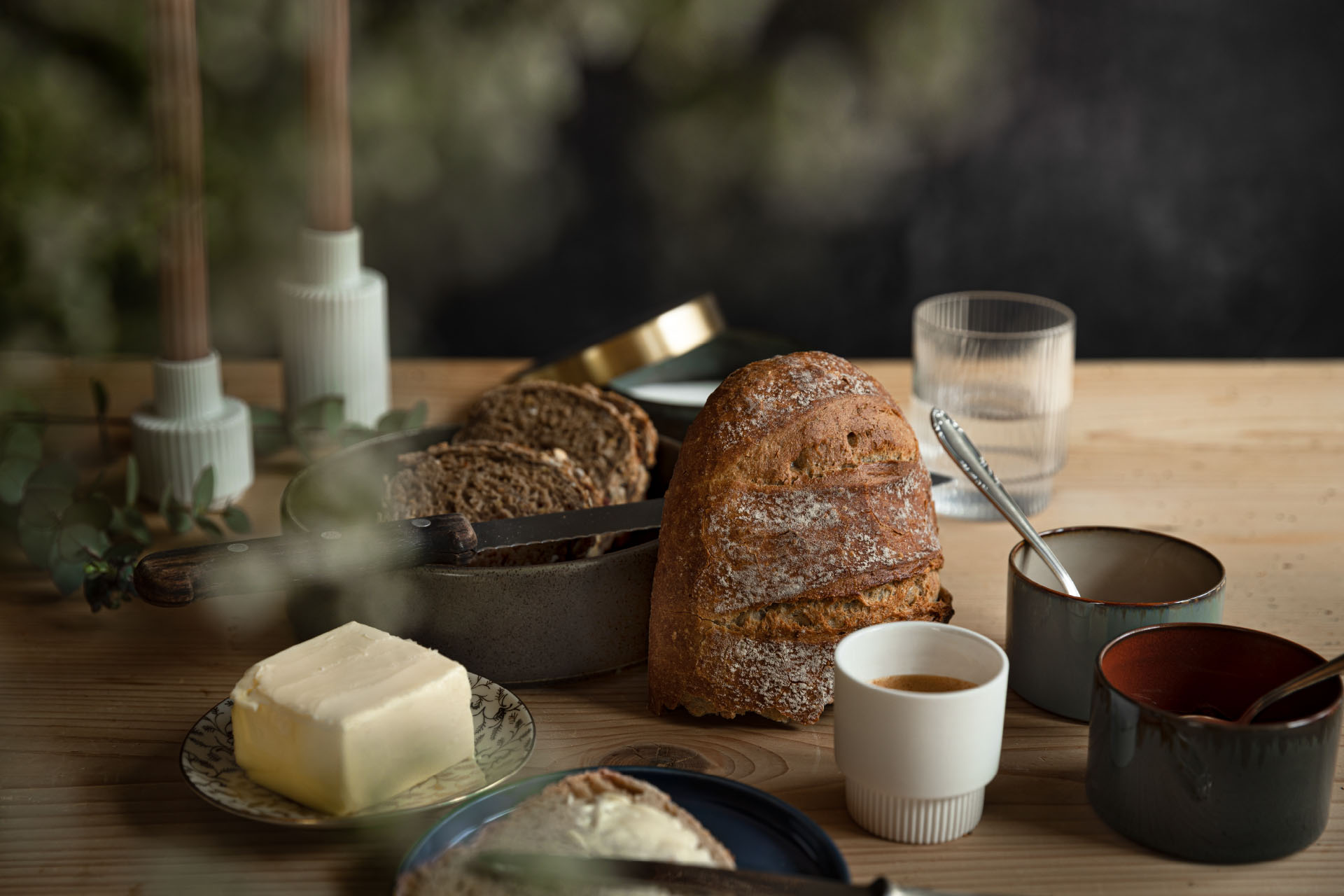
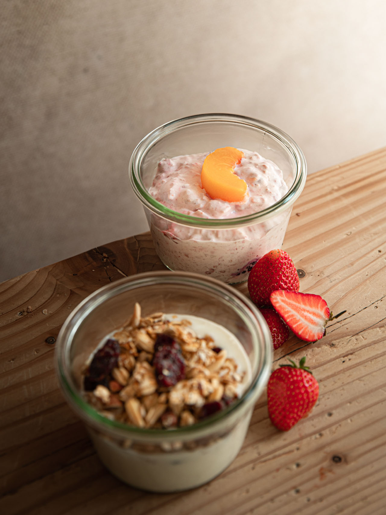
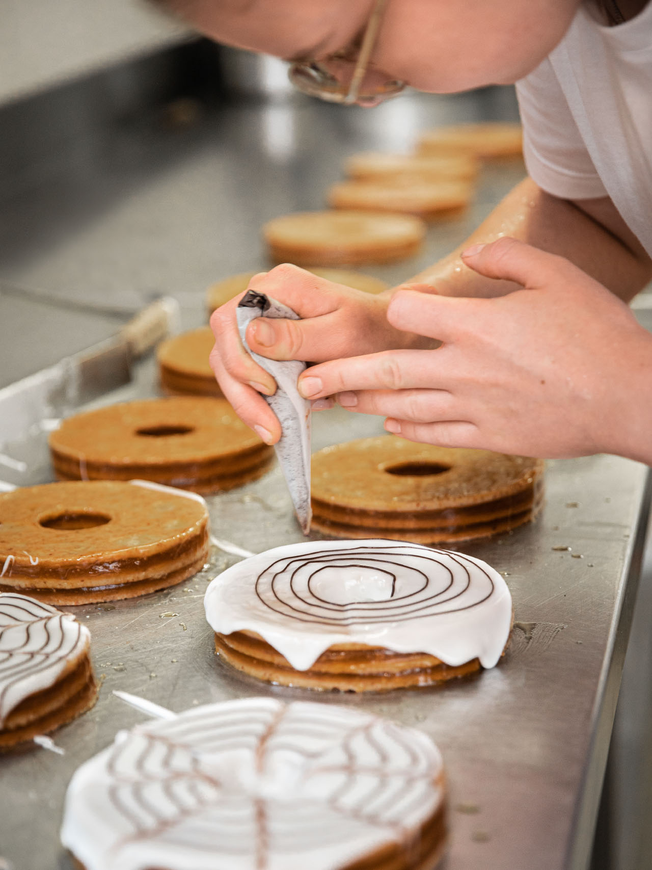
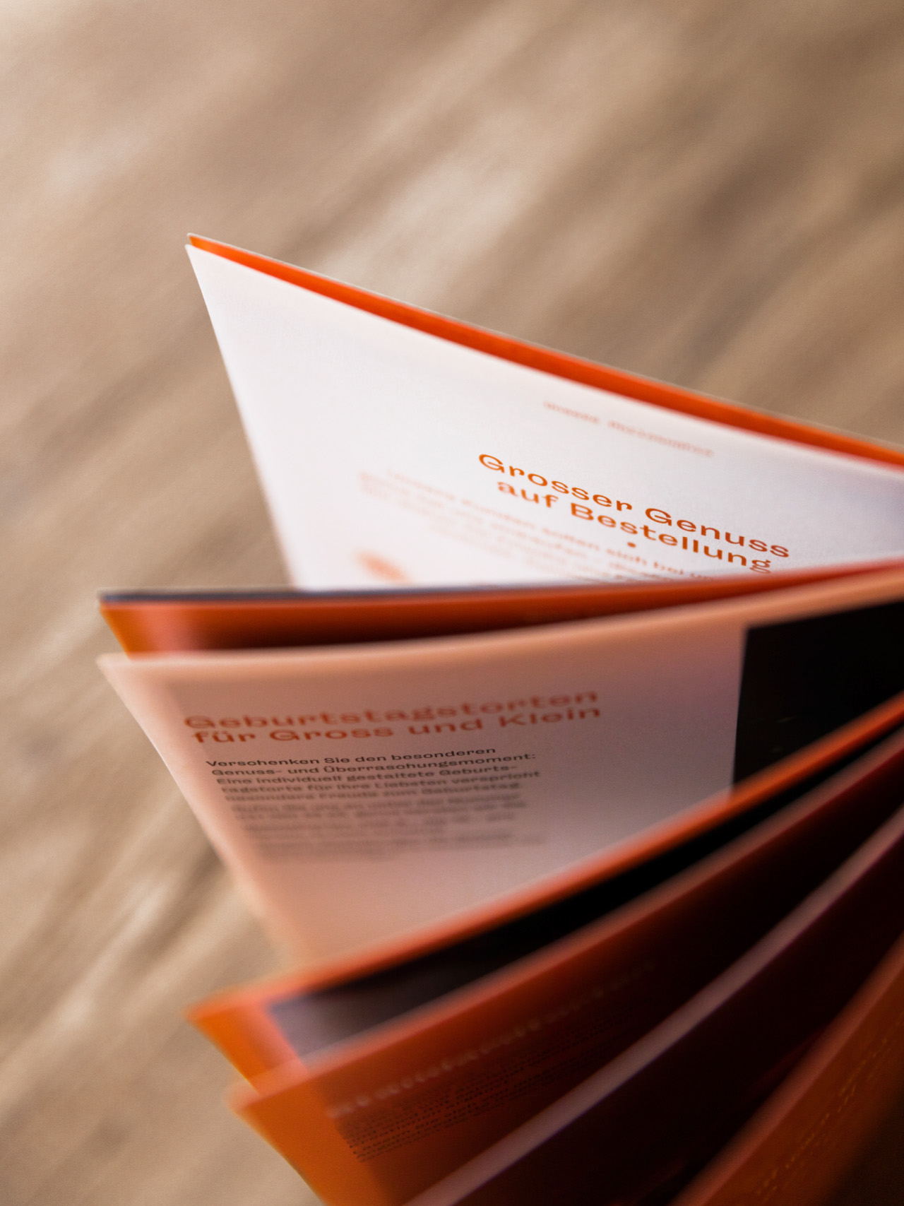
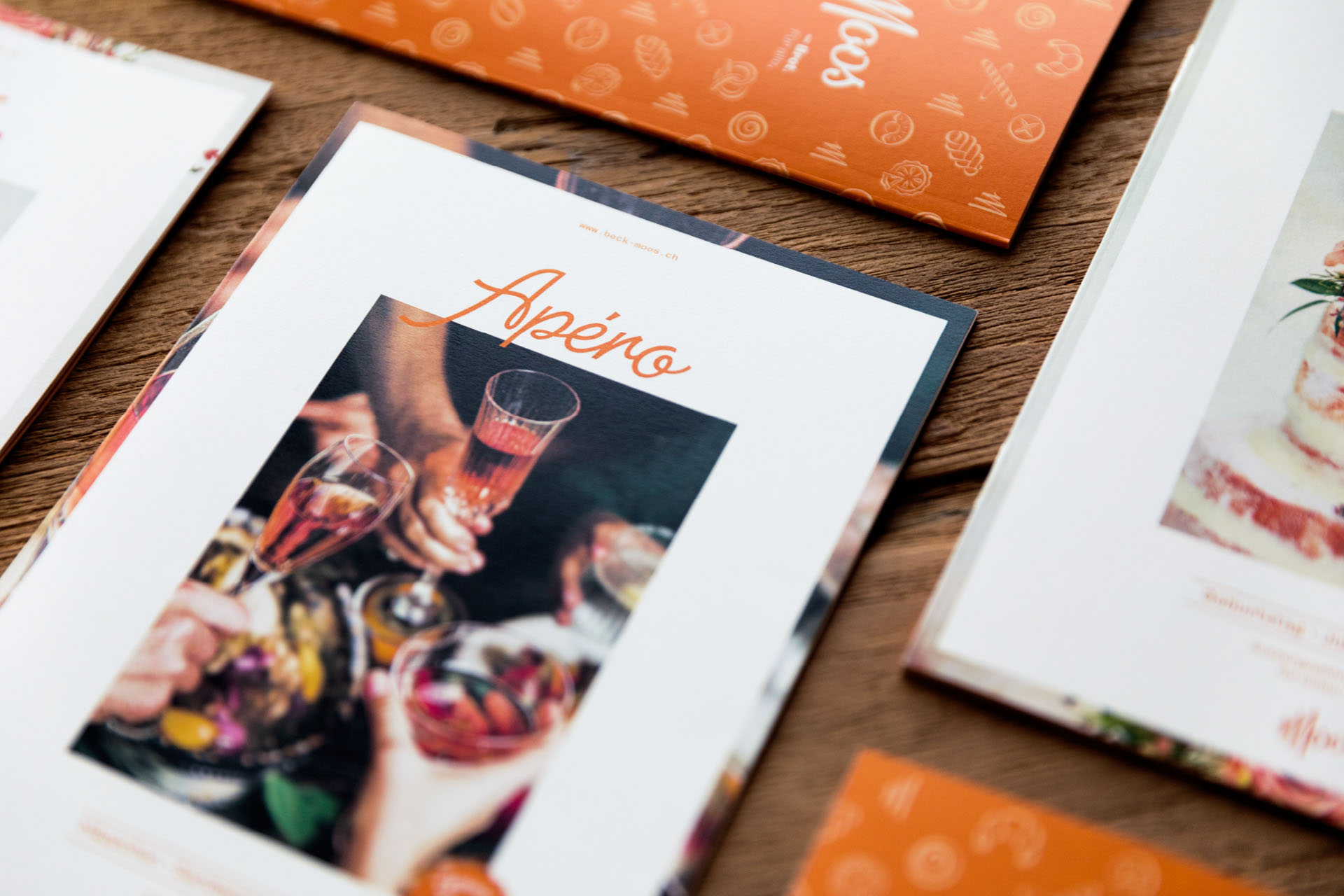
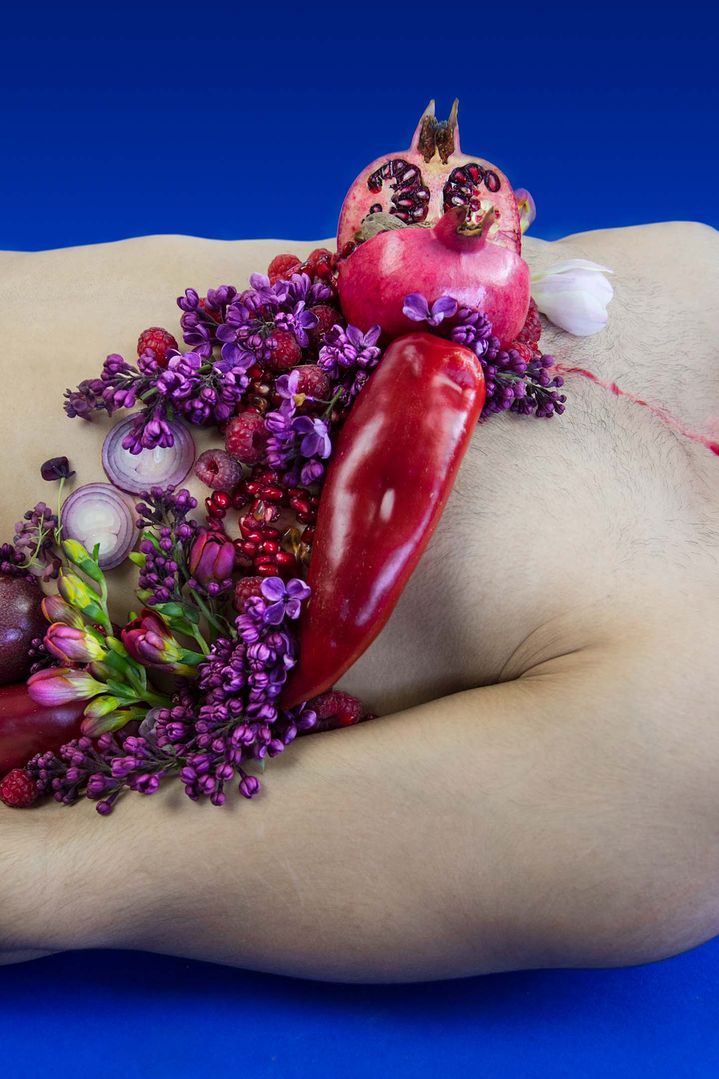
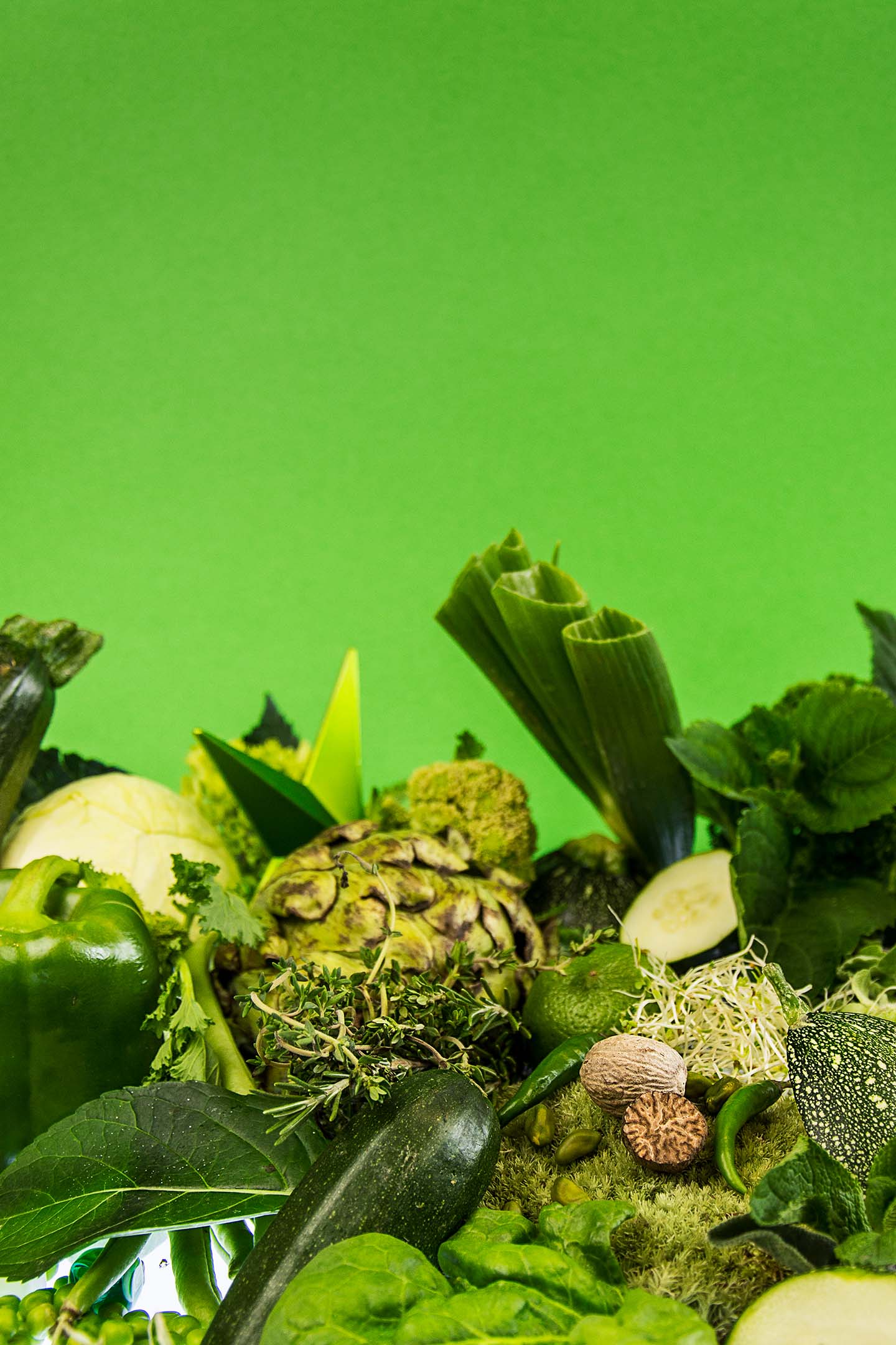
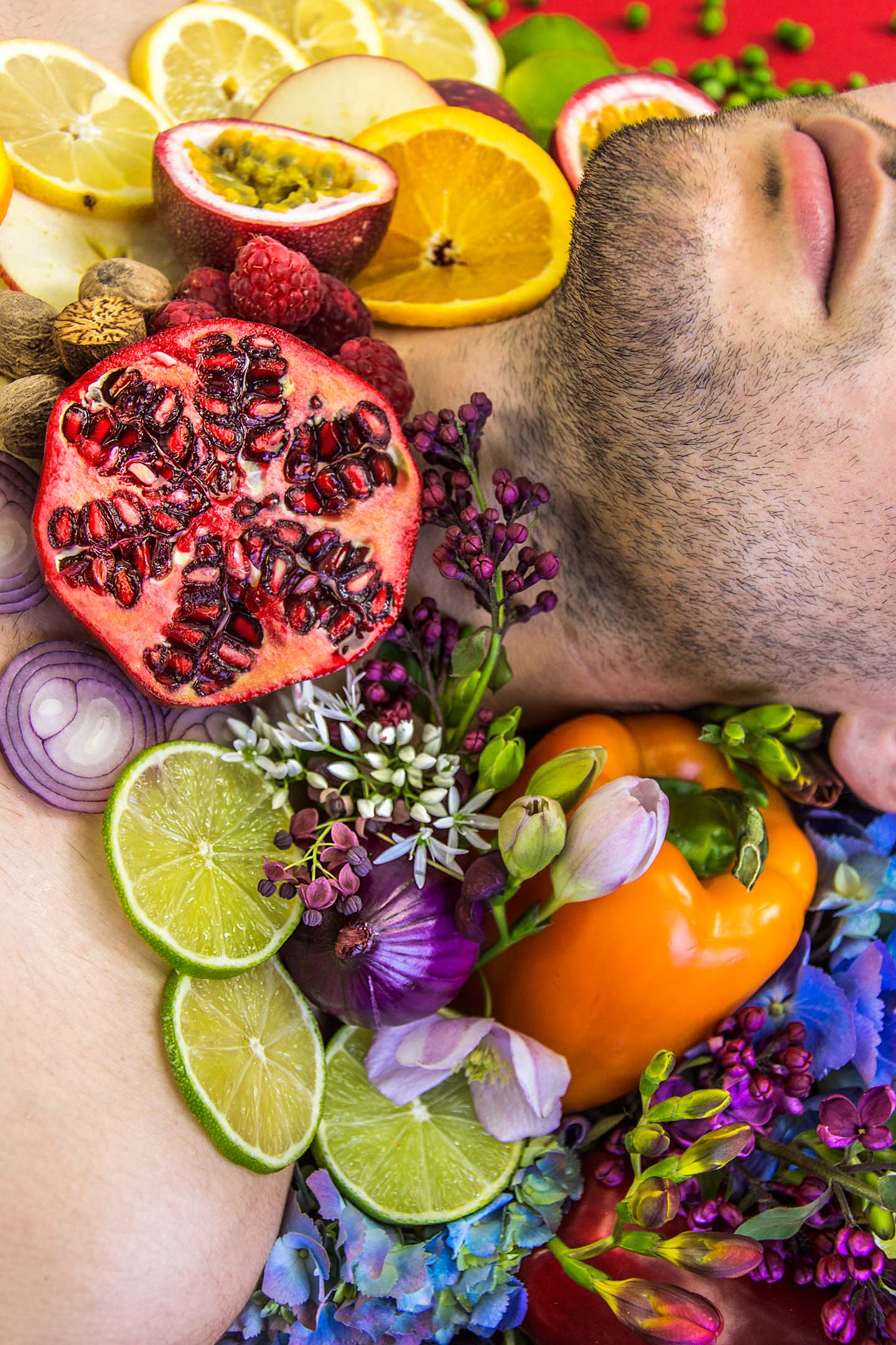
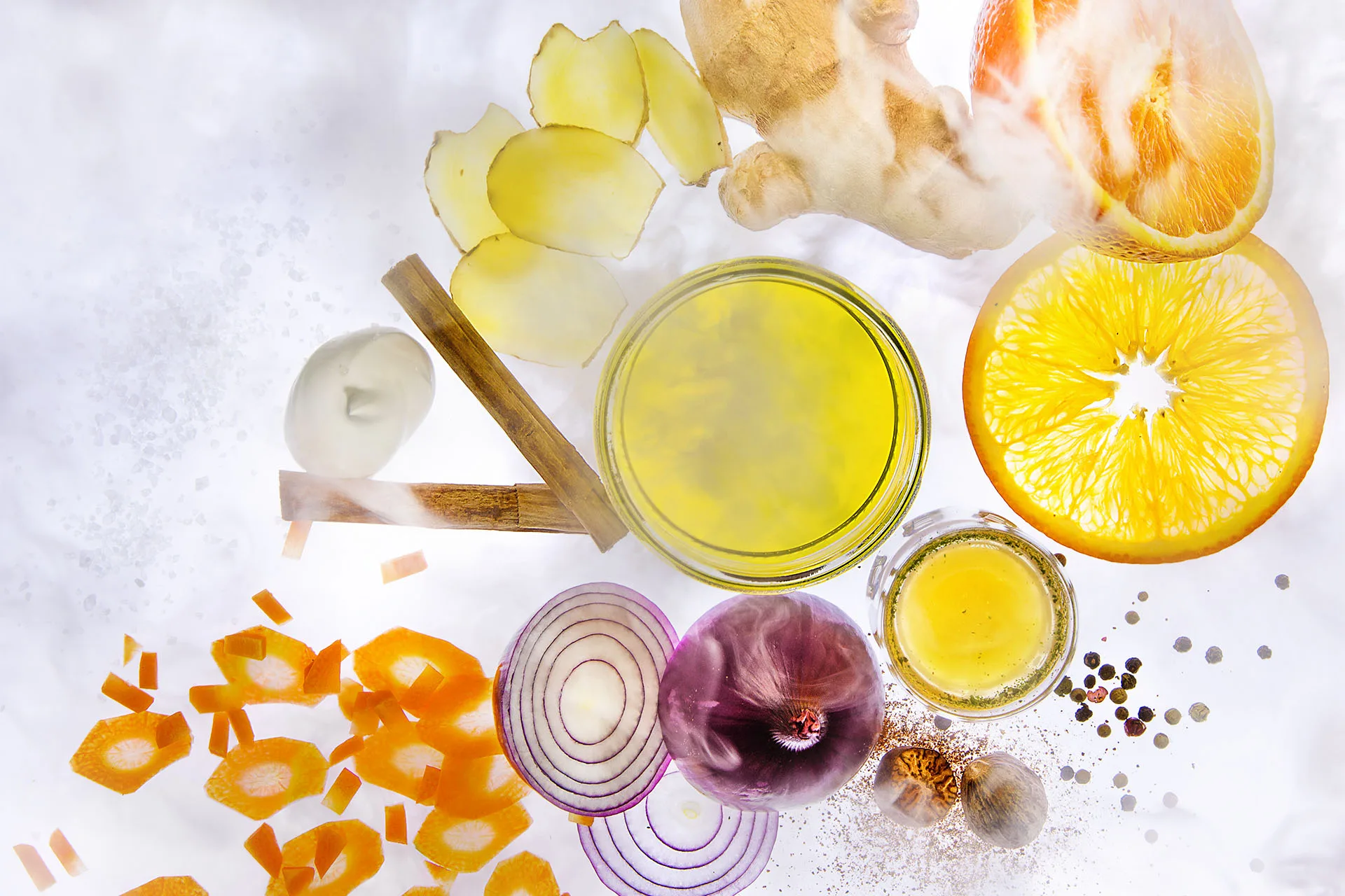
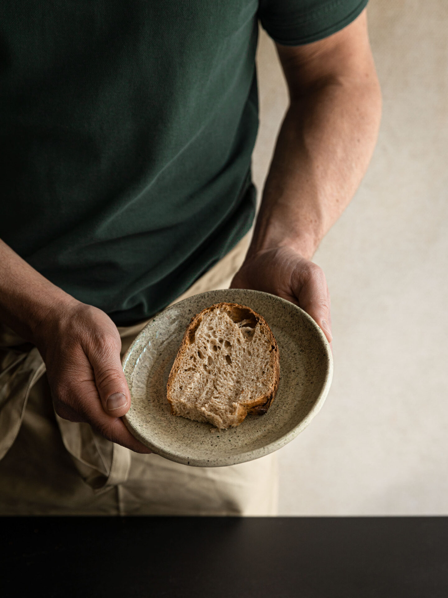
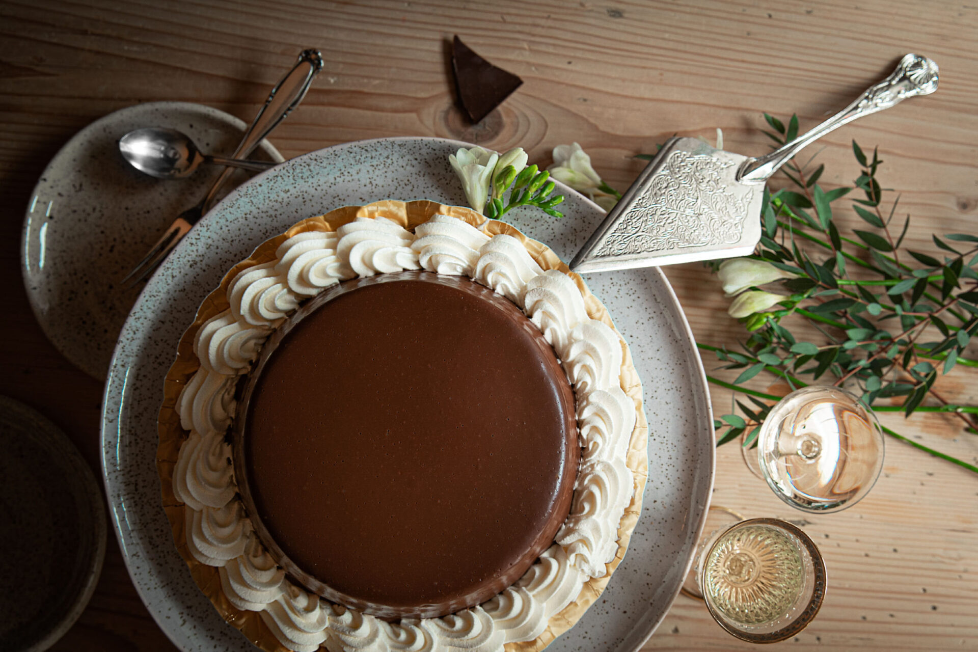
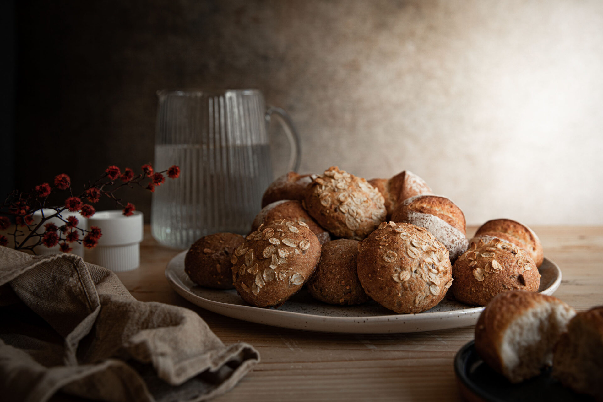
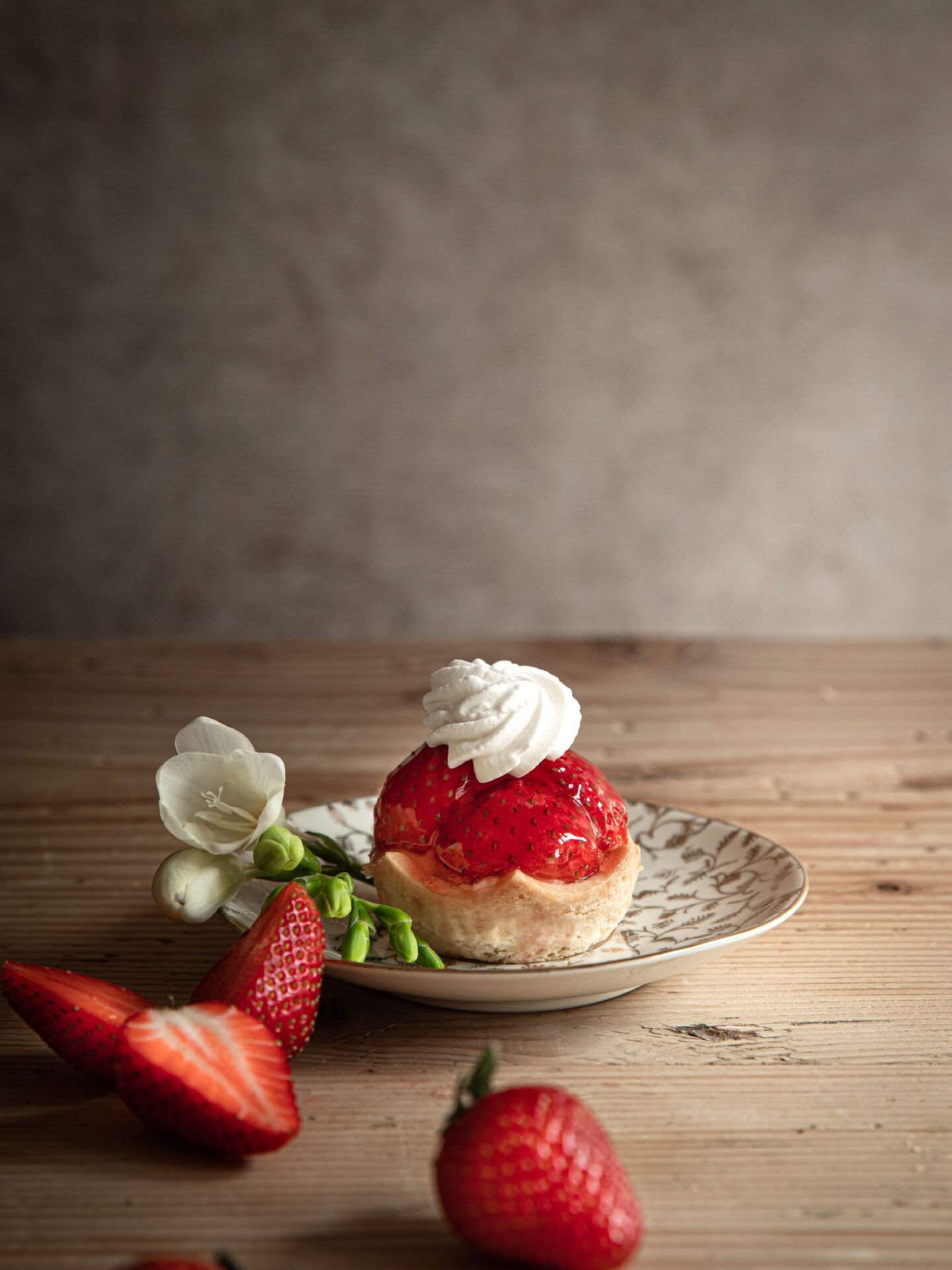
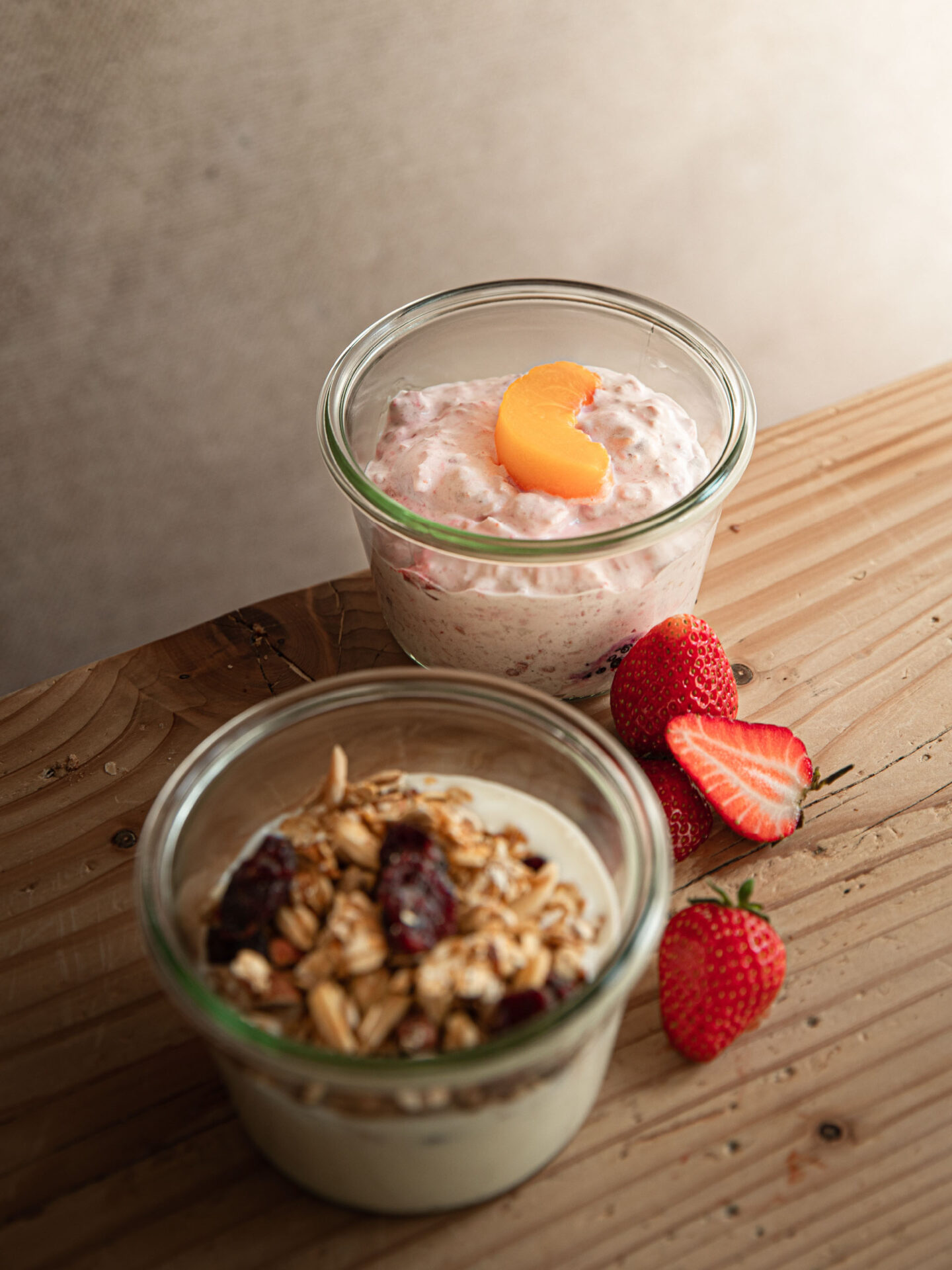
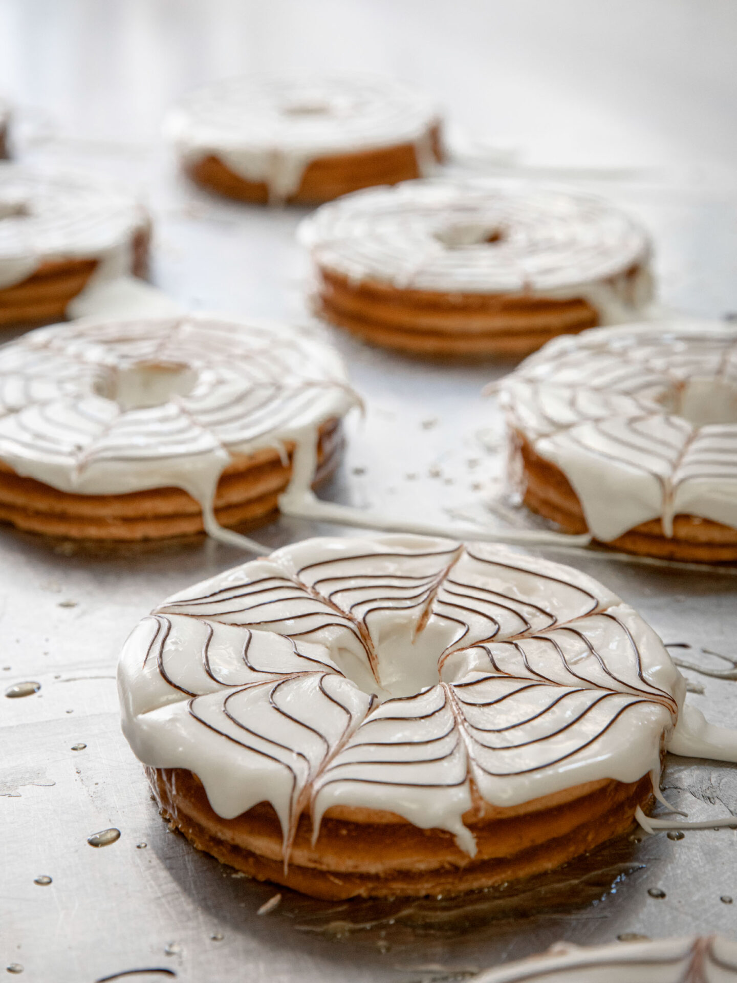
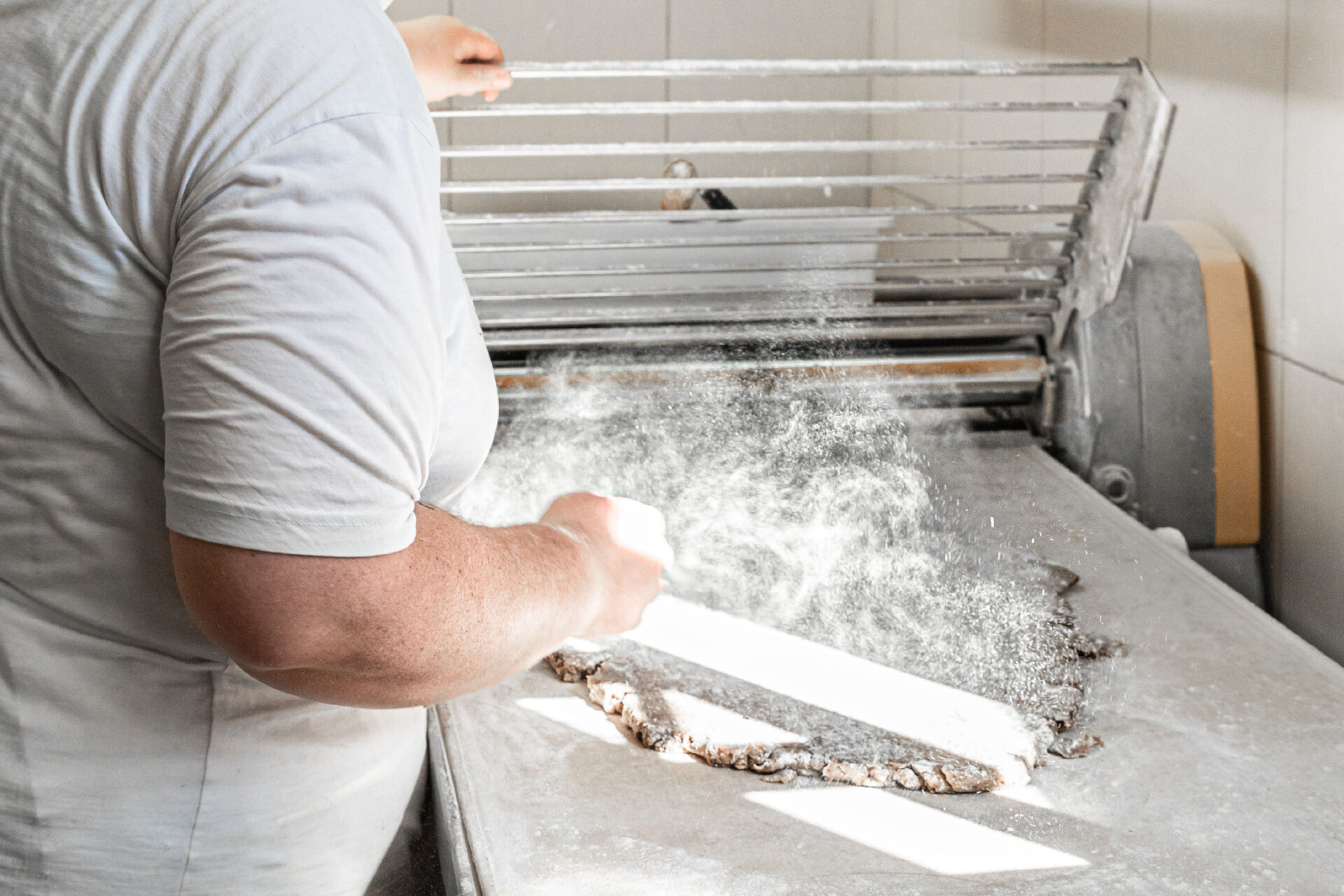
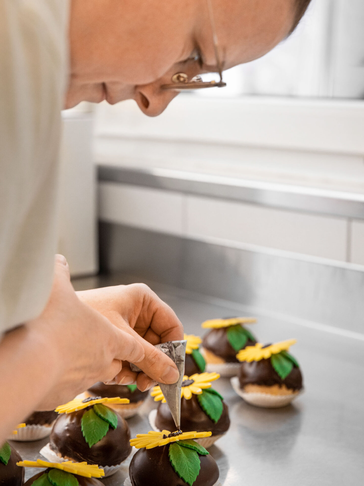
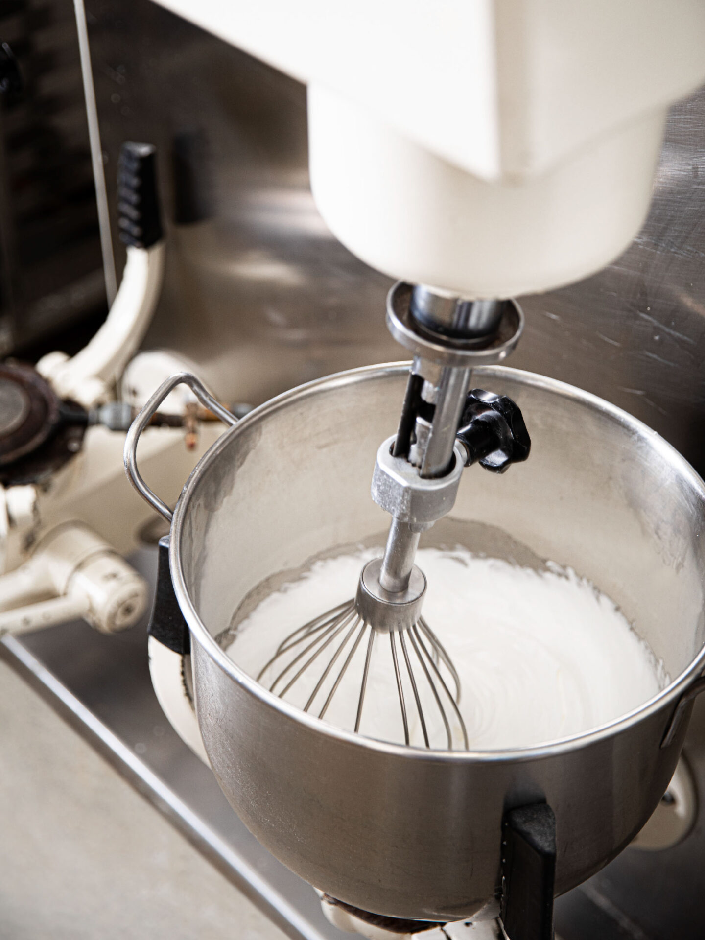
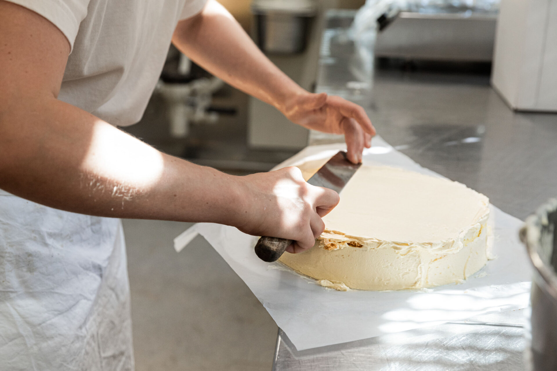
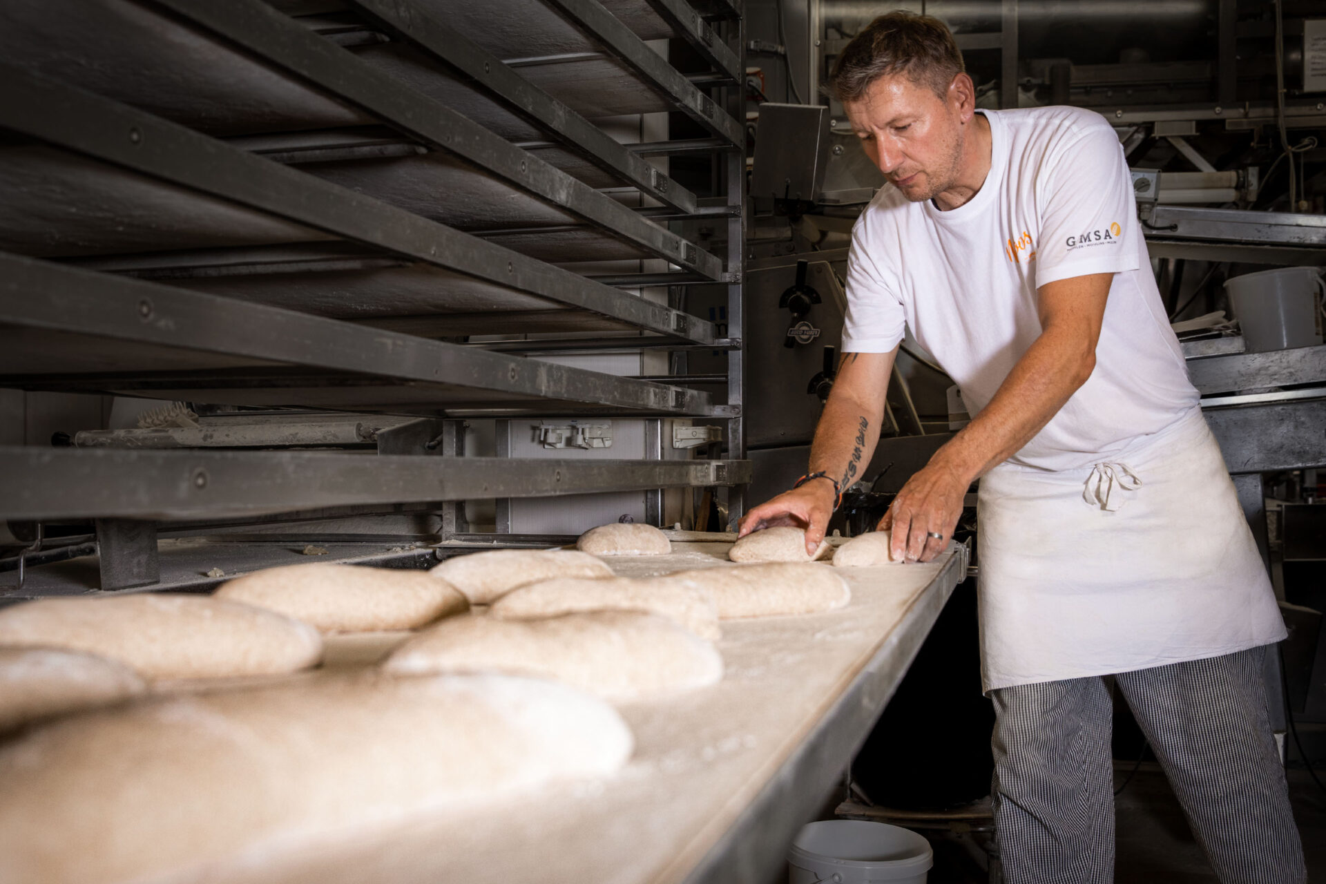
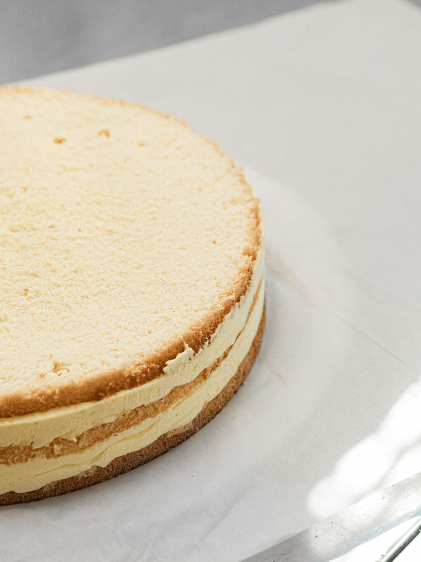
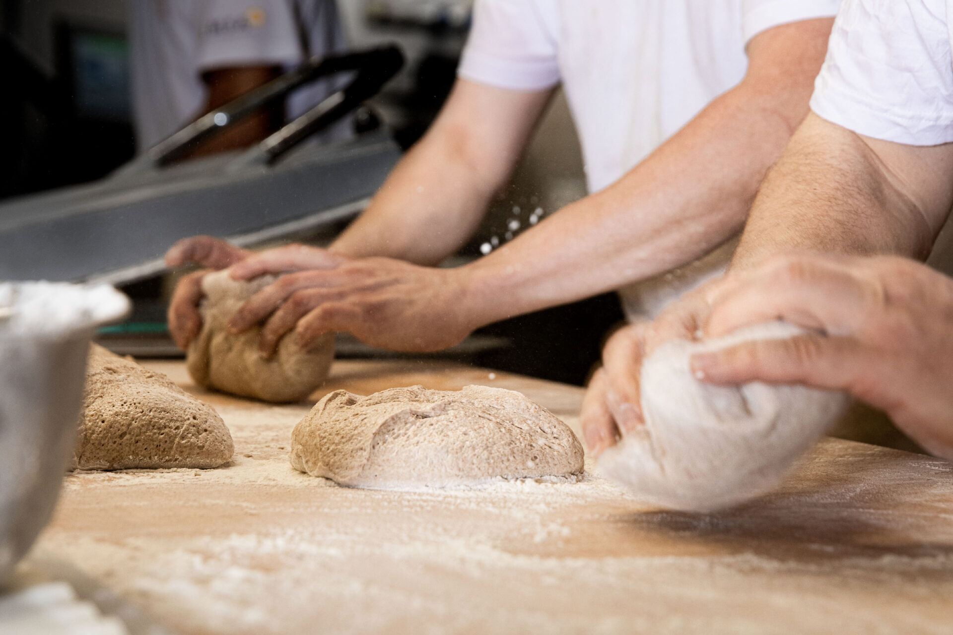
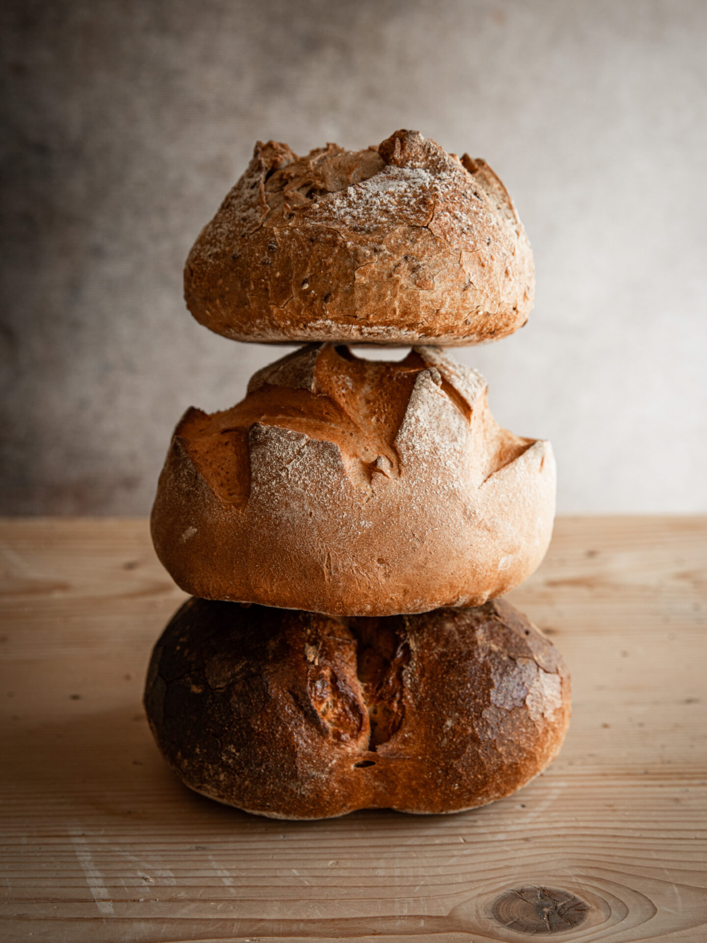
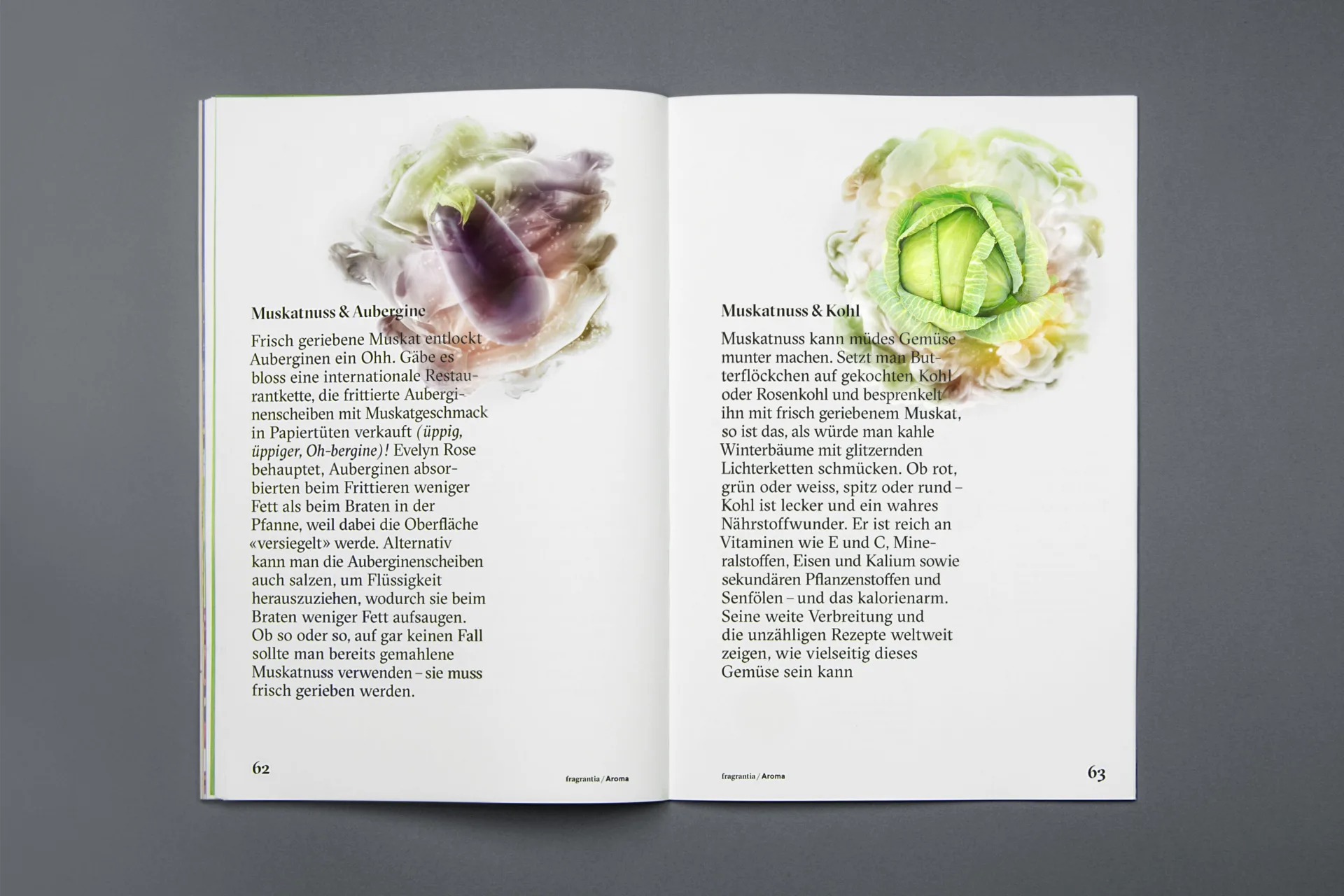
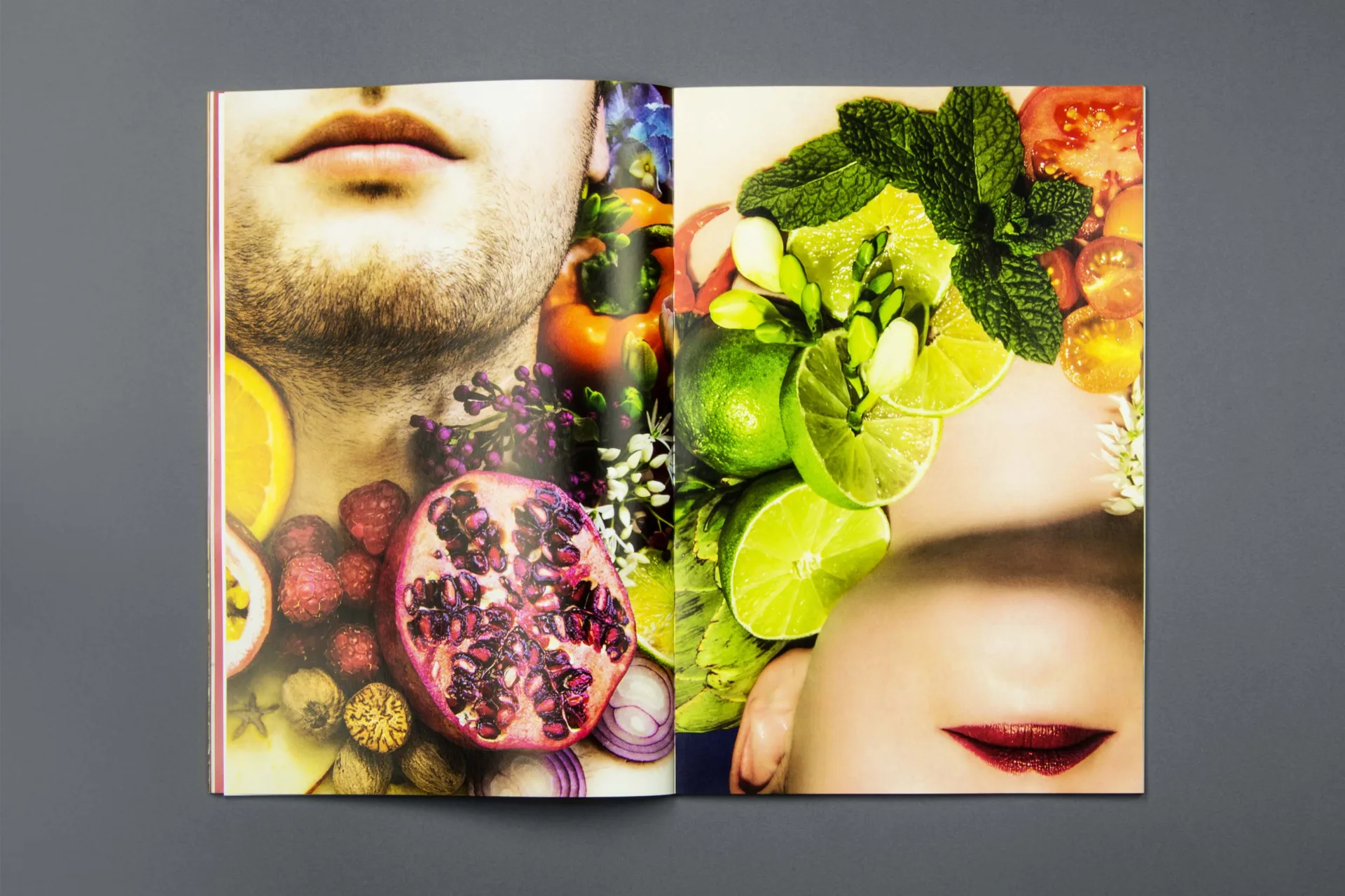
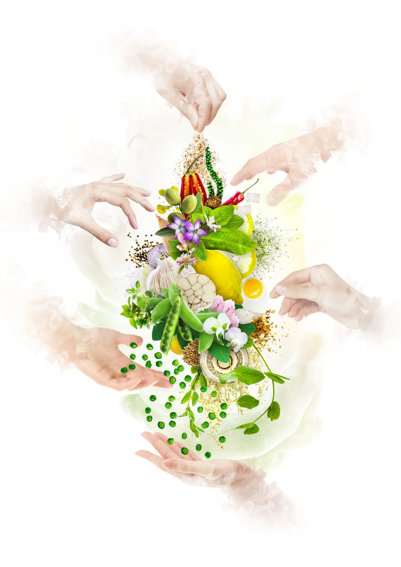
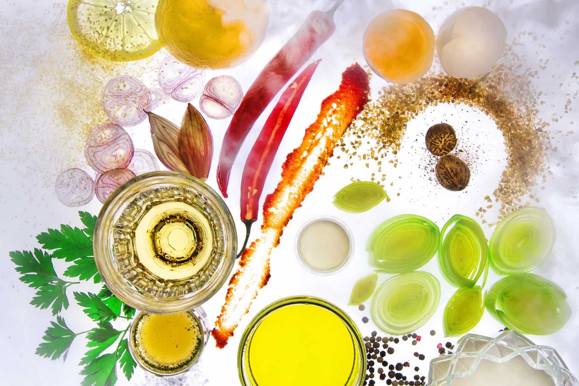
The specially crafted food photographs create a captivating showcase here. Drawing inspiration from the baroque still life paintings of the 17th century, the entire Moos product range, including small Mignon rolls and delectable Eugenie cakes, is beautifully captured in atmospheric images, complemented by vibrant shots from the bakery.


YEAR
2022
RESPONSABILITY
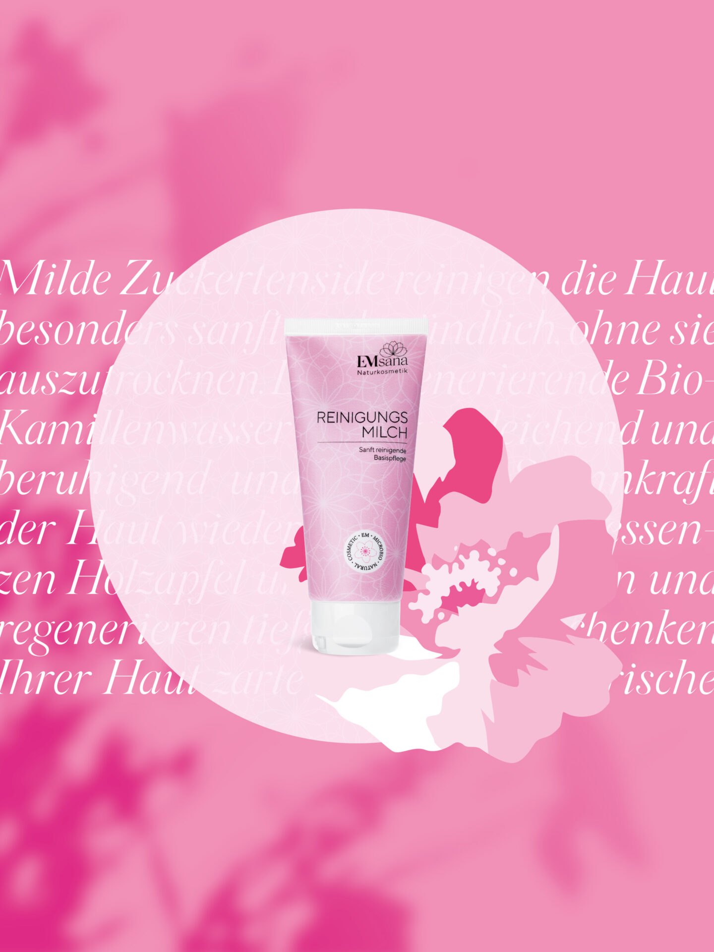
Food Photography
PARTNER
CLIENT
SERVICES
Photography
More Moos
https://joelburri.ch/wp-content/uploads/2023/03/jb-moos-baeckerei-webdesign-thumb.jpg
780
900
Joel Burri
Joel Burri
https://joelburri.ch/wp-content/uploads/2023/03/jb-moos-baeckerei-webdesign-thumb.jpg
https://joelburri.ch/wp-content/uploads/2022/11/jb-moos-baeckerei-thumb-jpg.webp
780
900
Joel Burri
Joel Burri
https://joelburri.ch/wp-content/uploads/2022/11/jb-moos-baeckerei-thumb-jpg.webp


