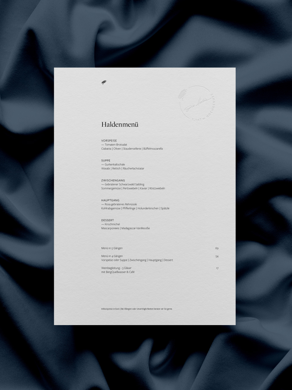
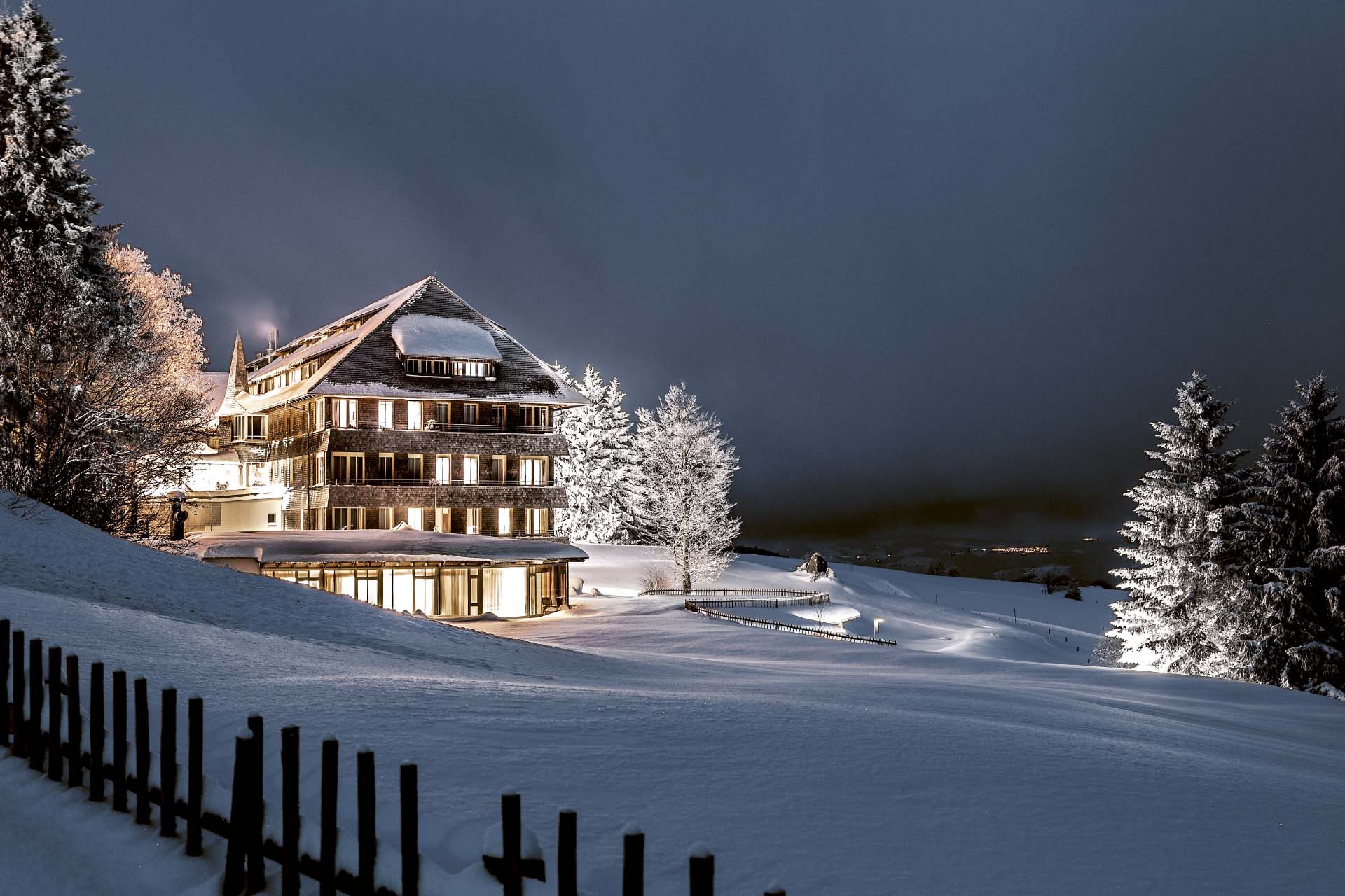
Bäckerei Moos
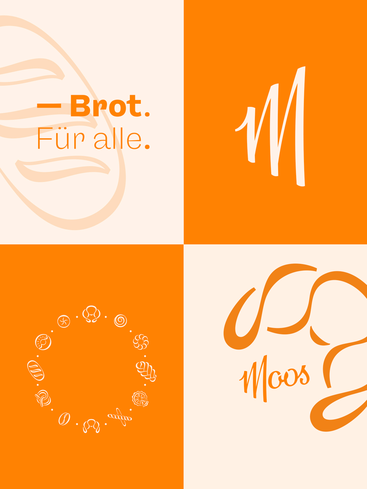
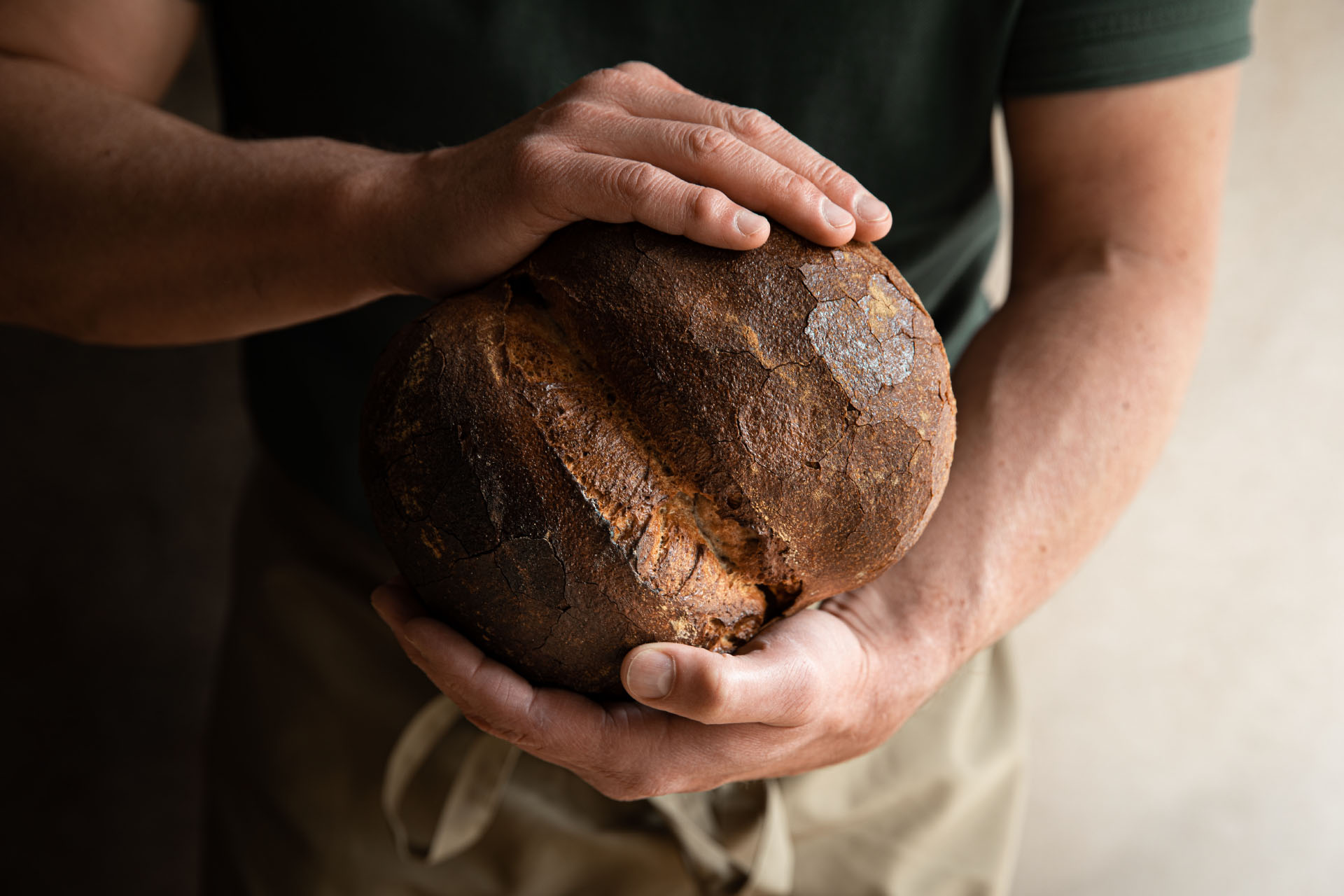
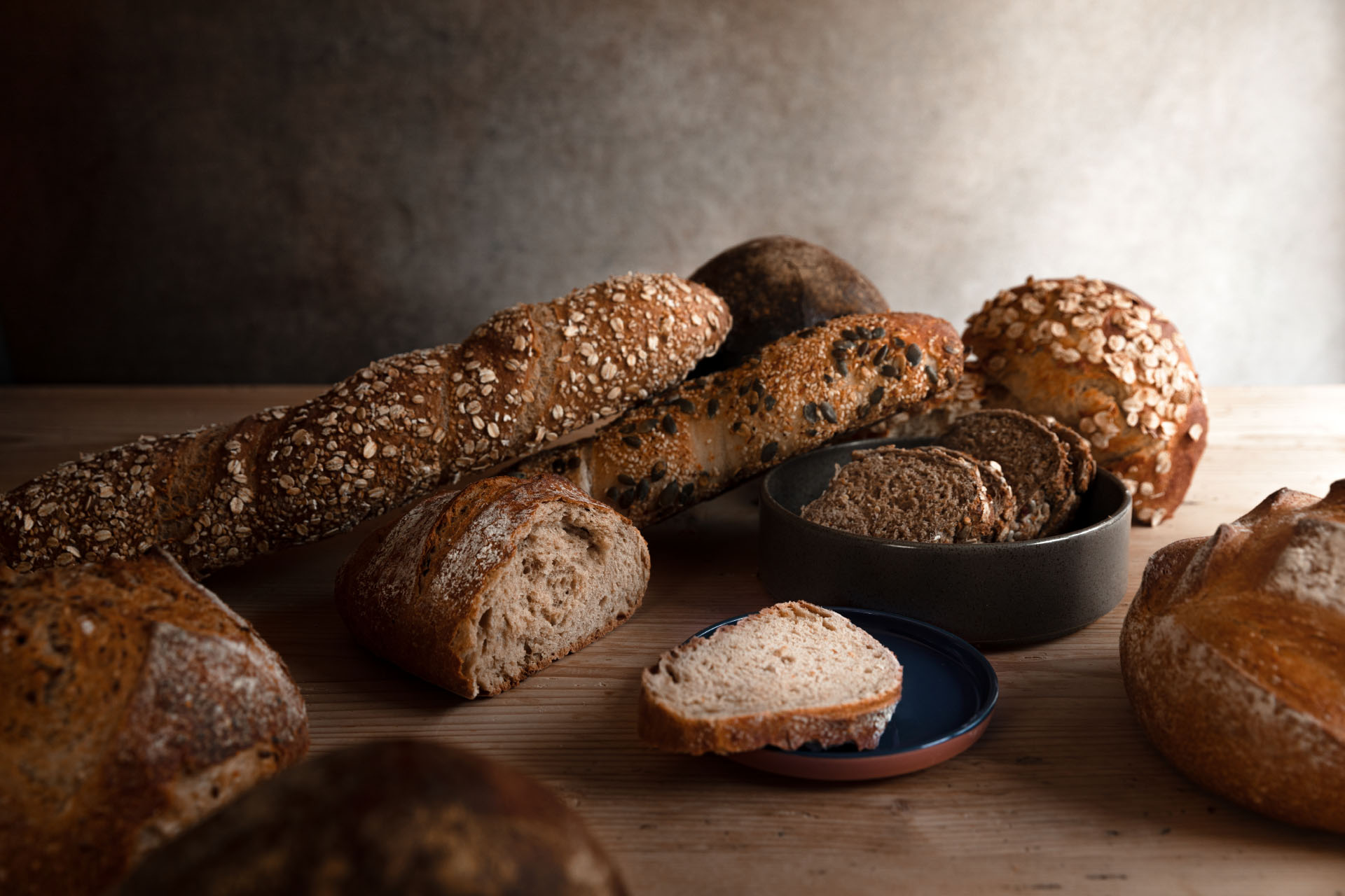
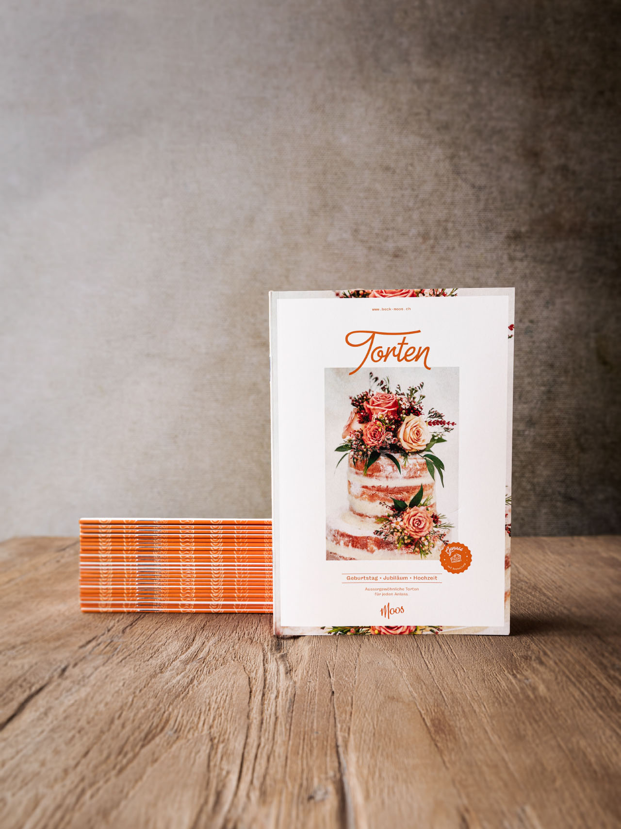
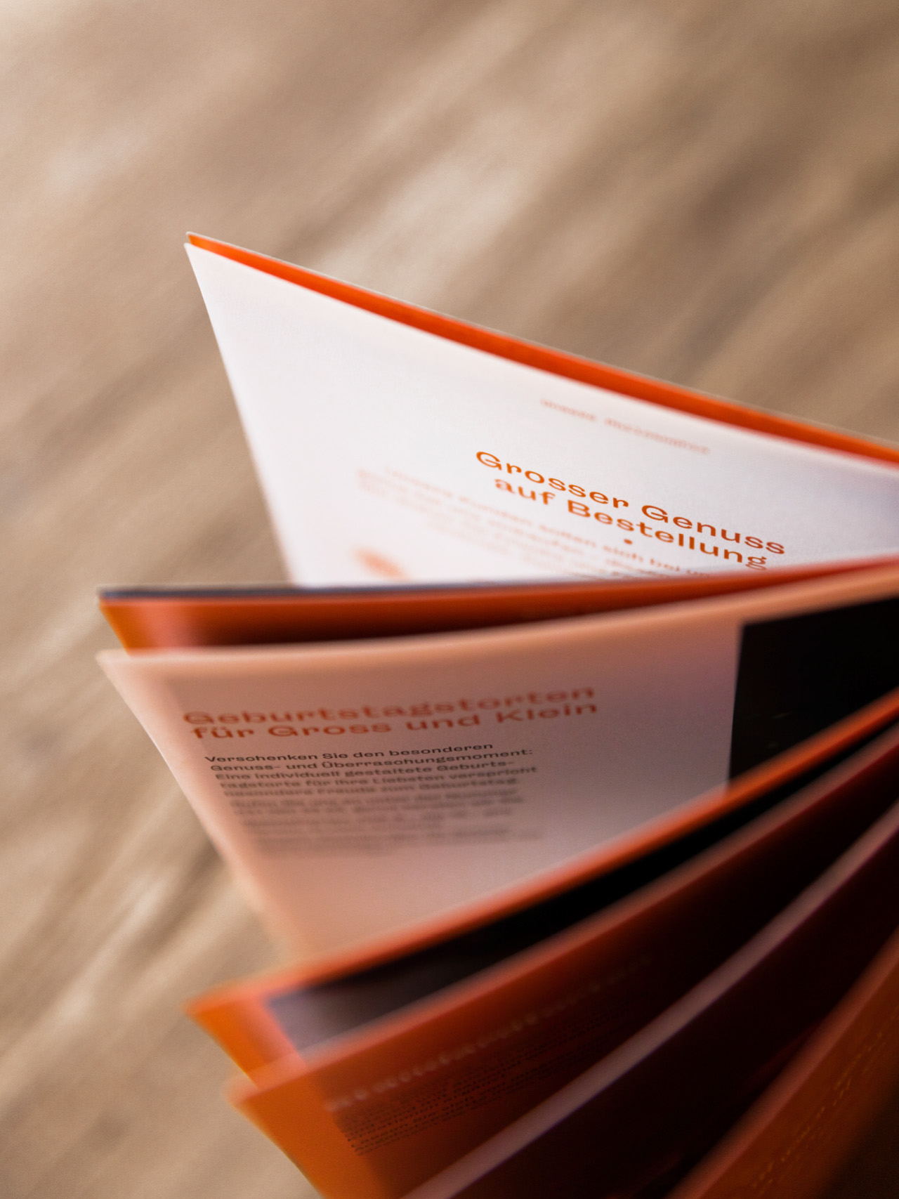
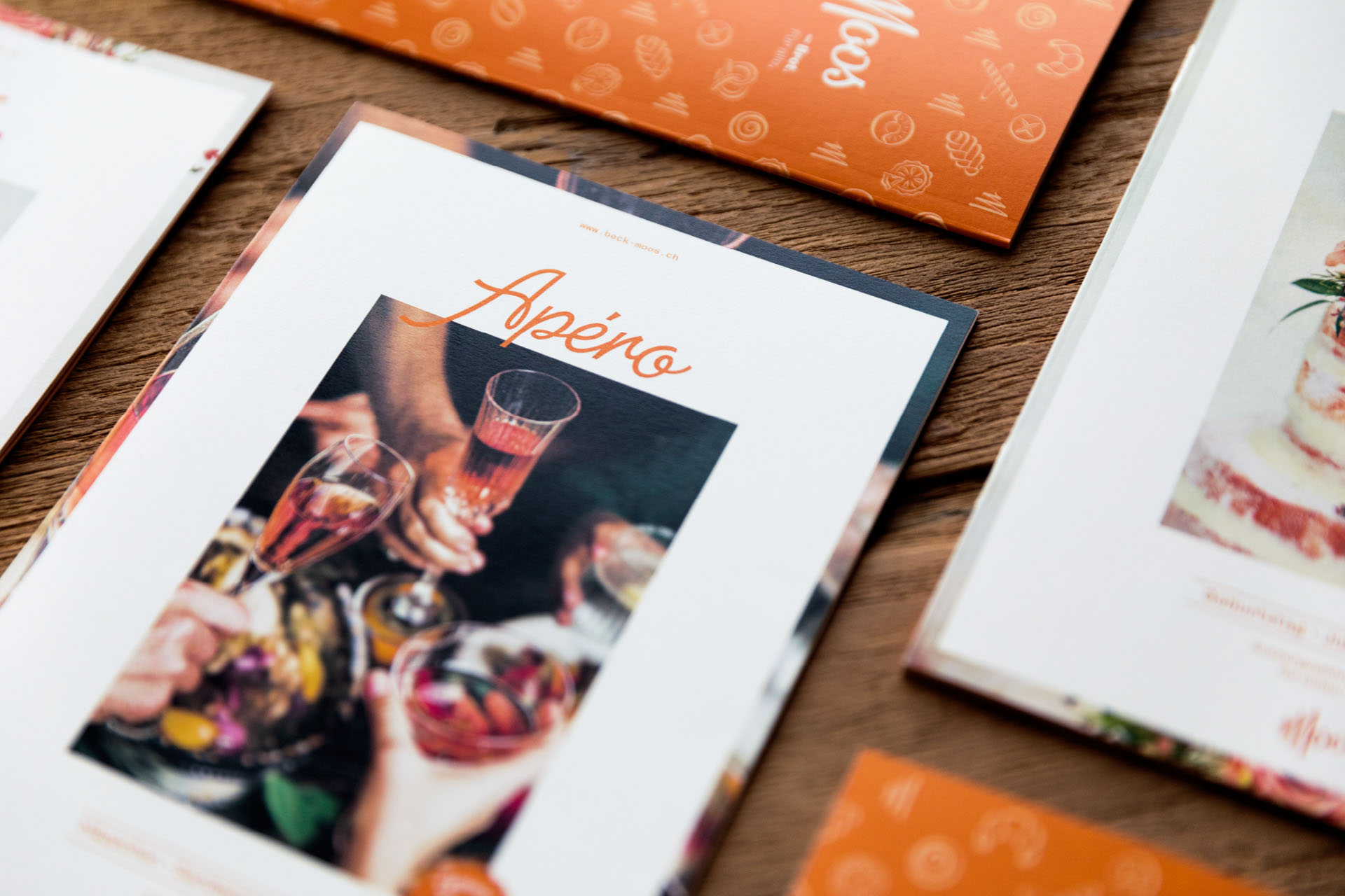
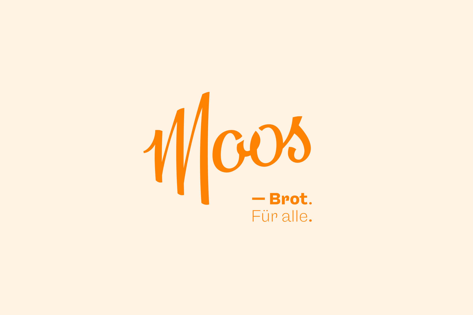
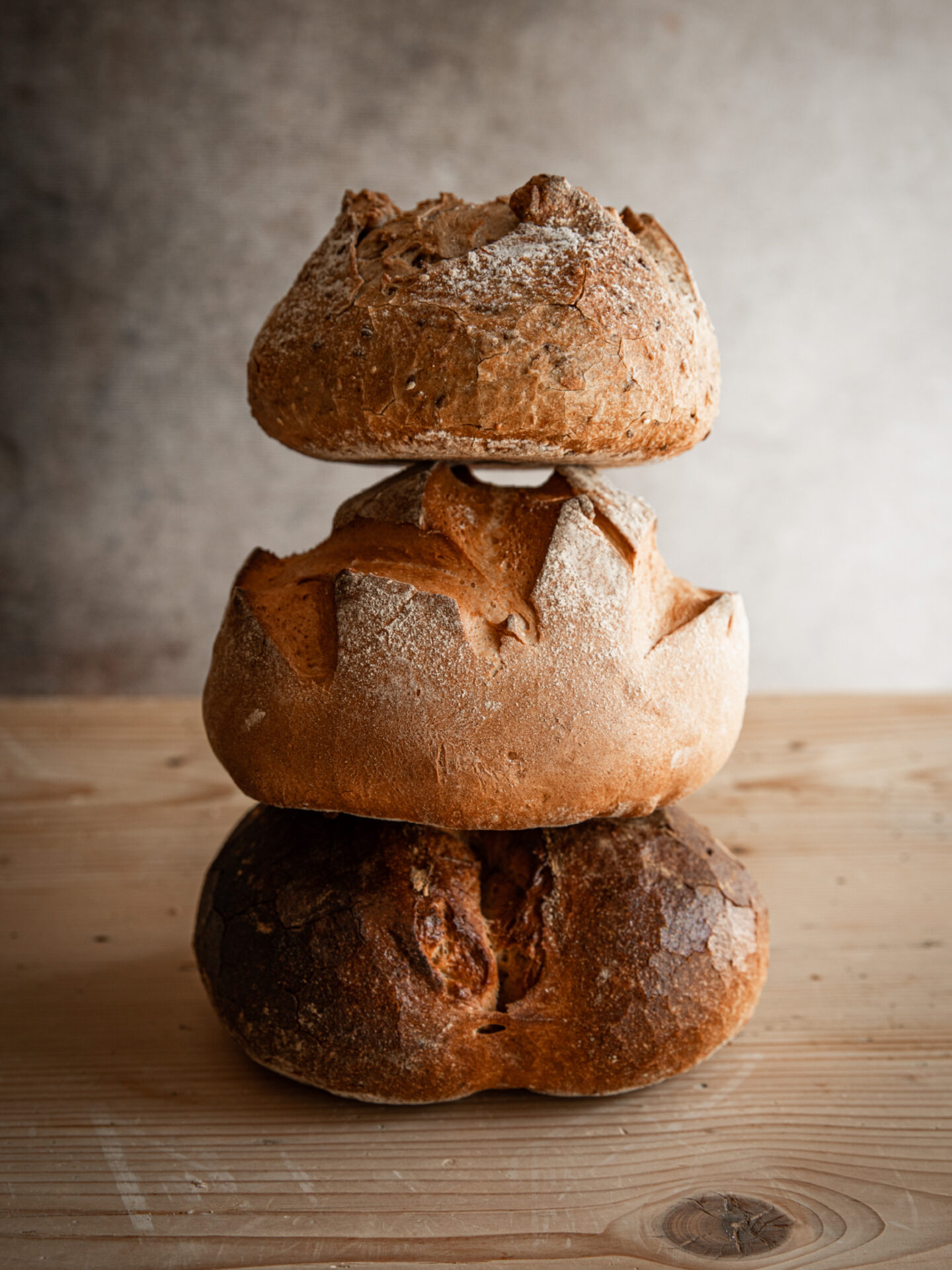
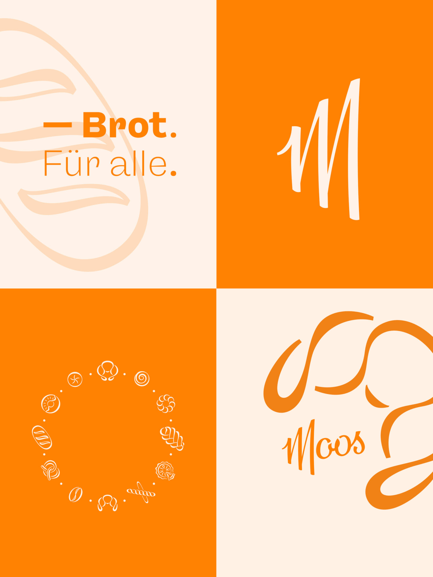
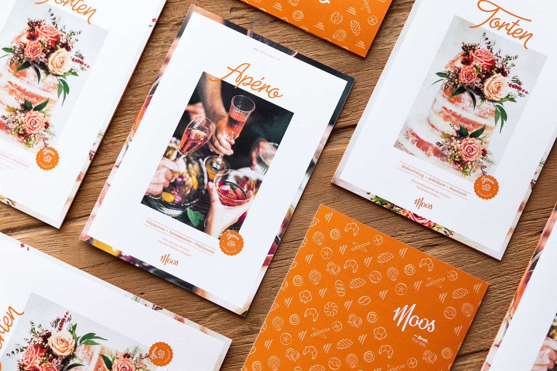
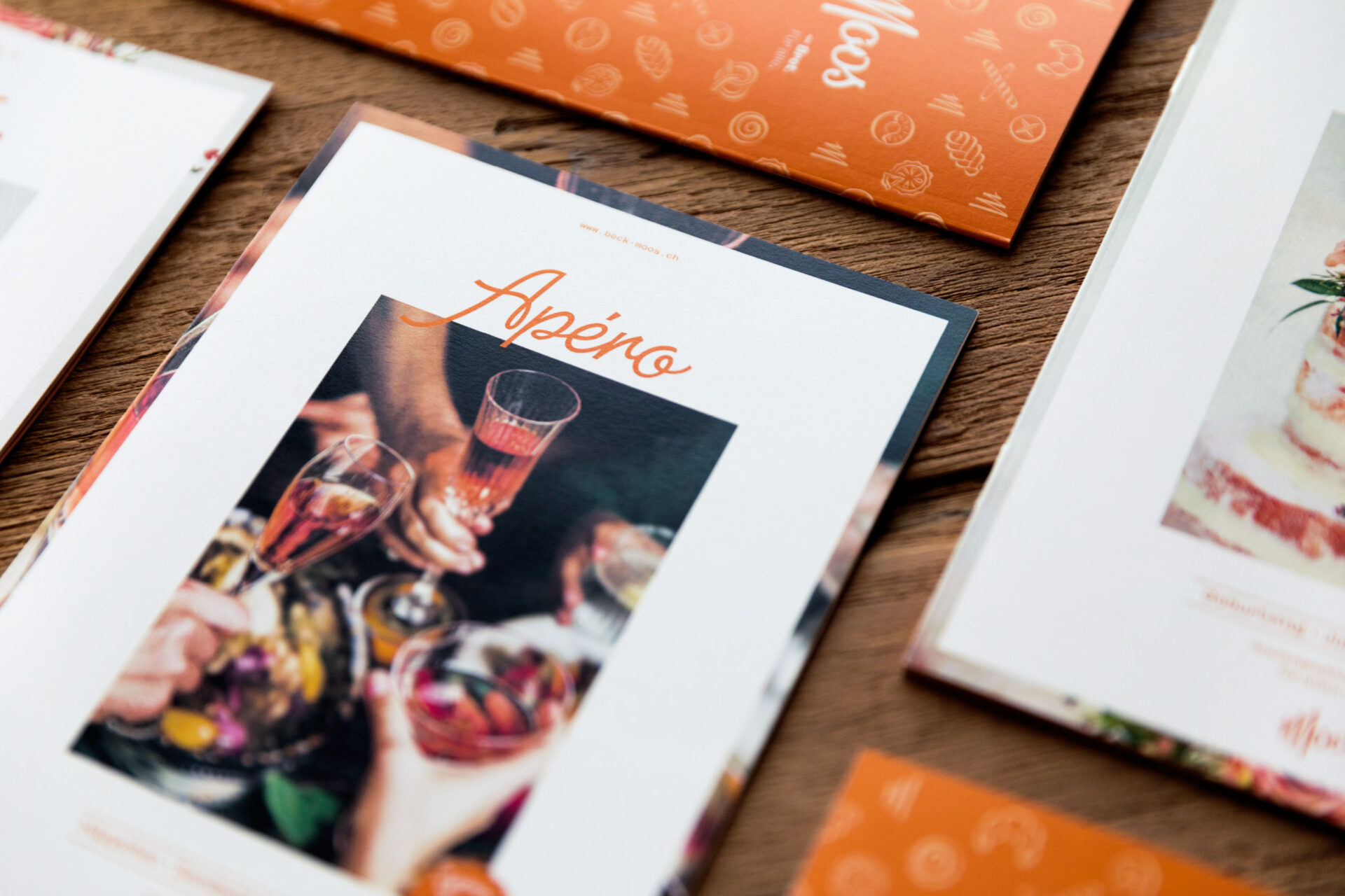
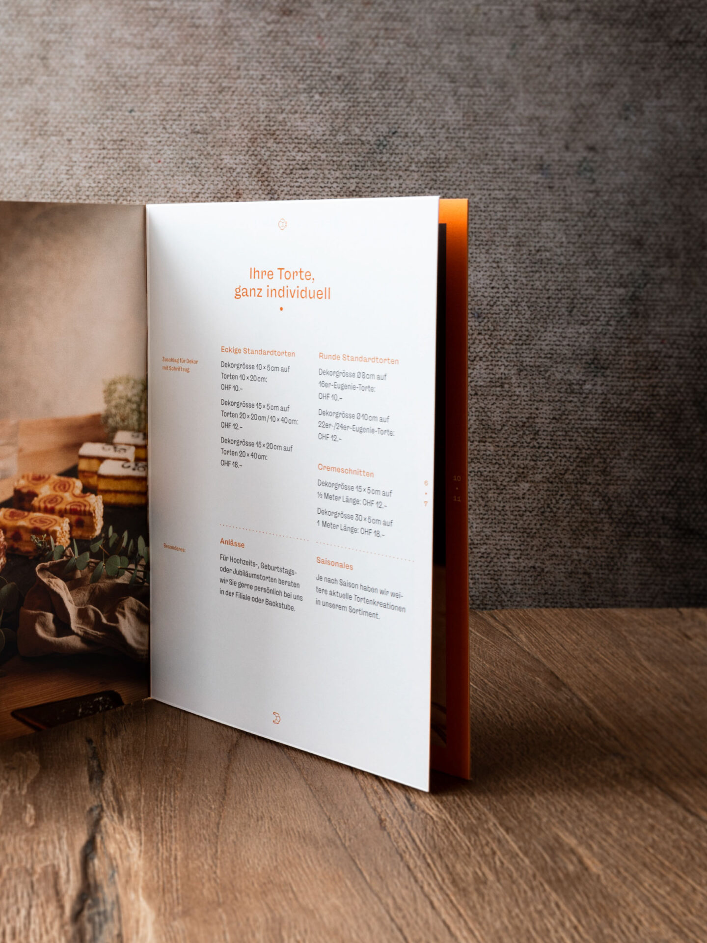
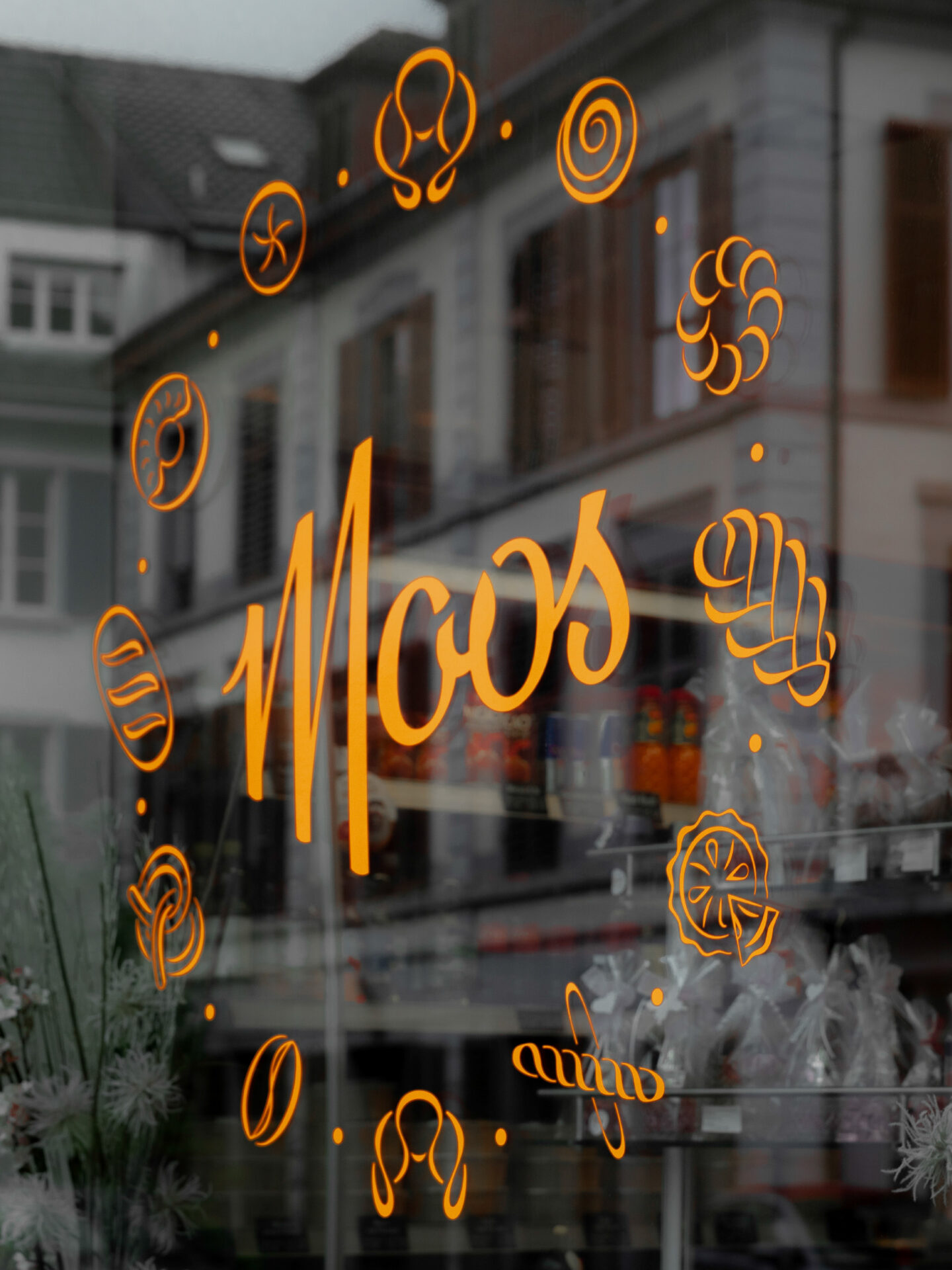
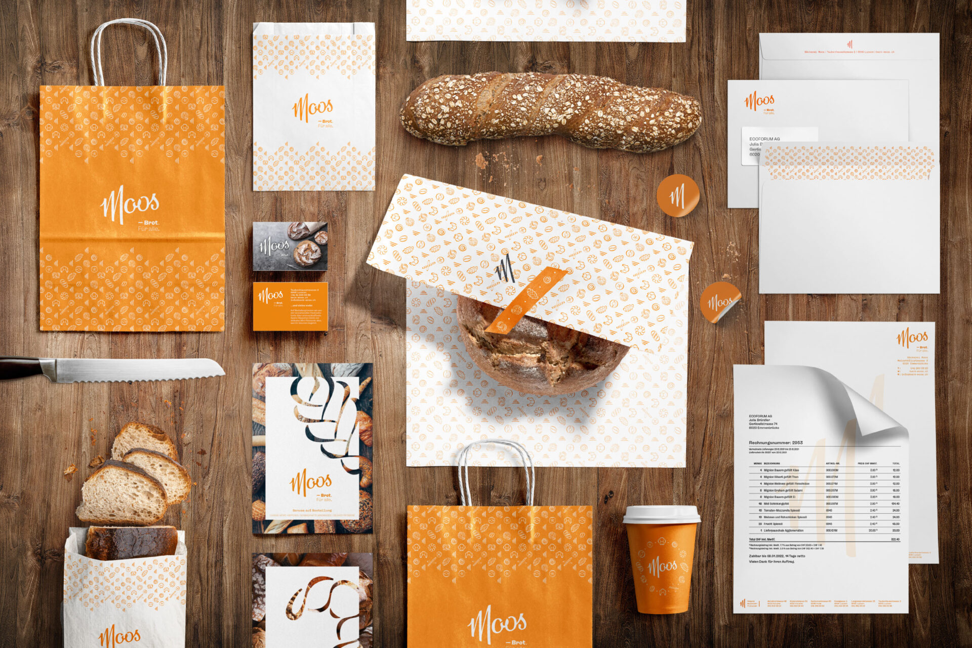
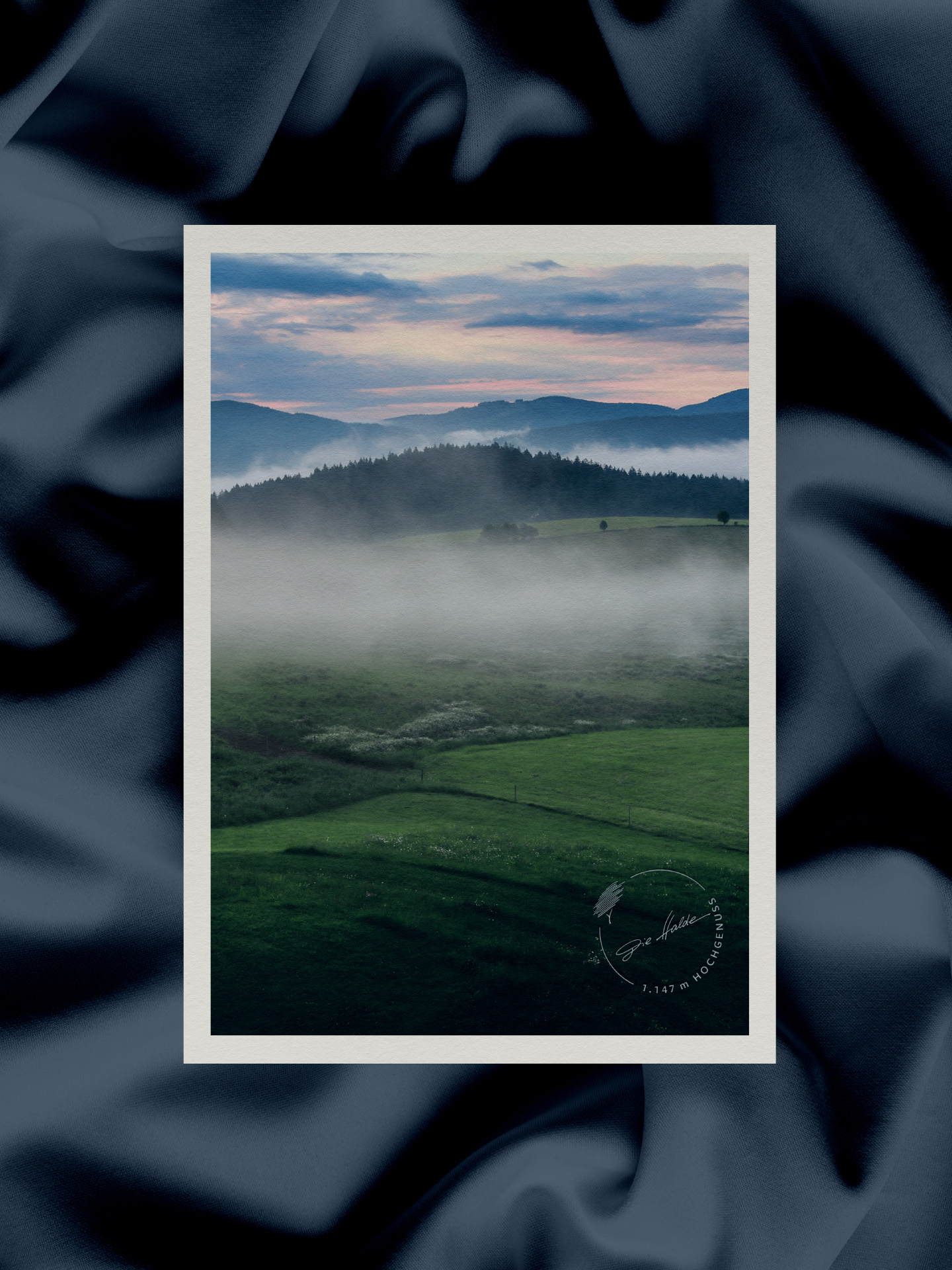
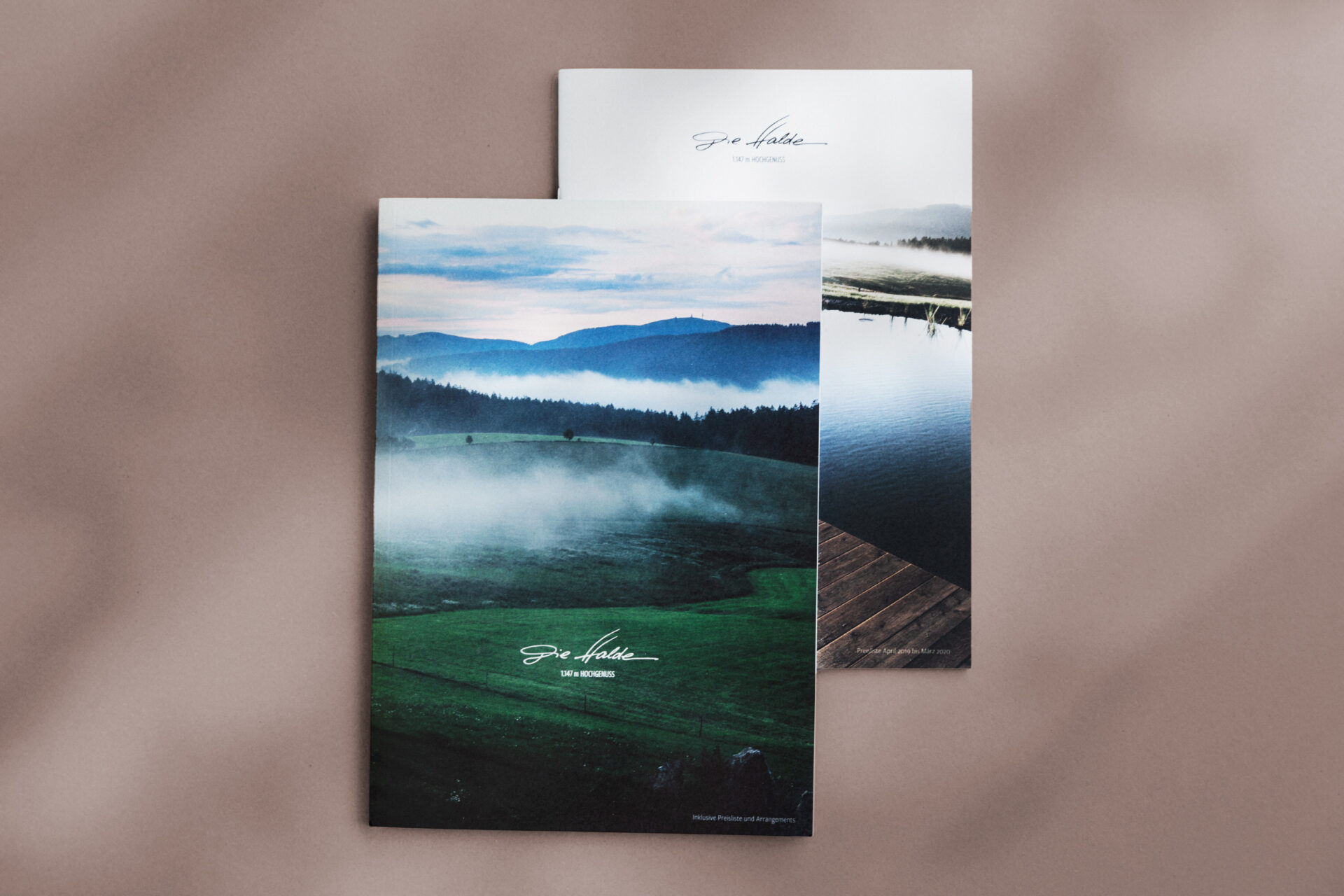
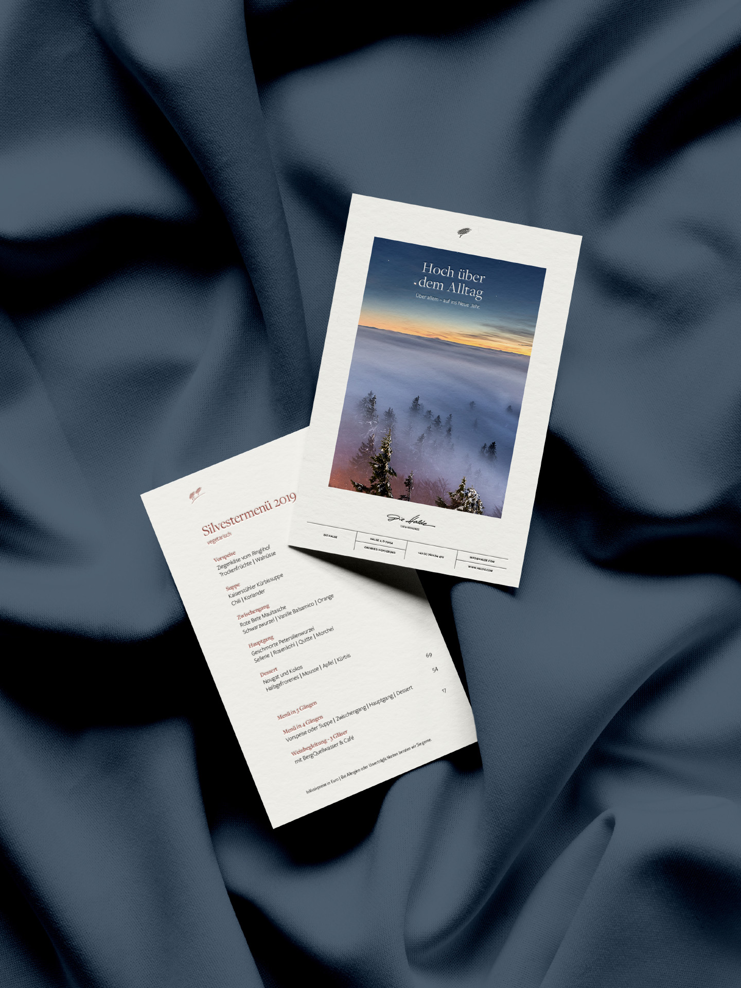
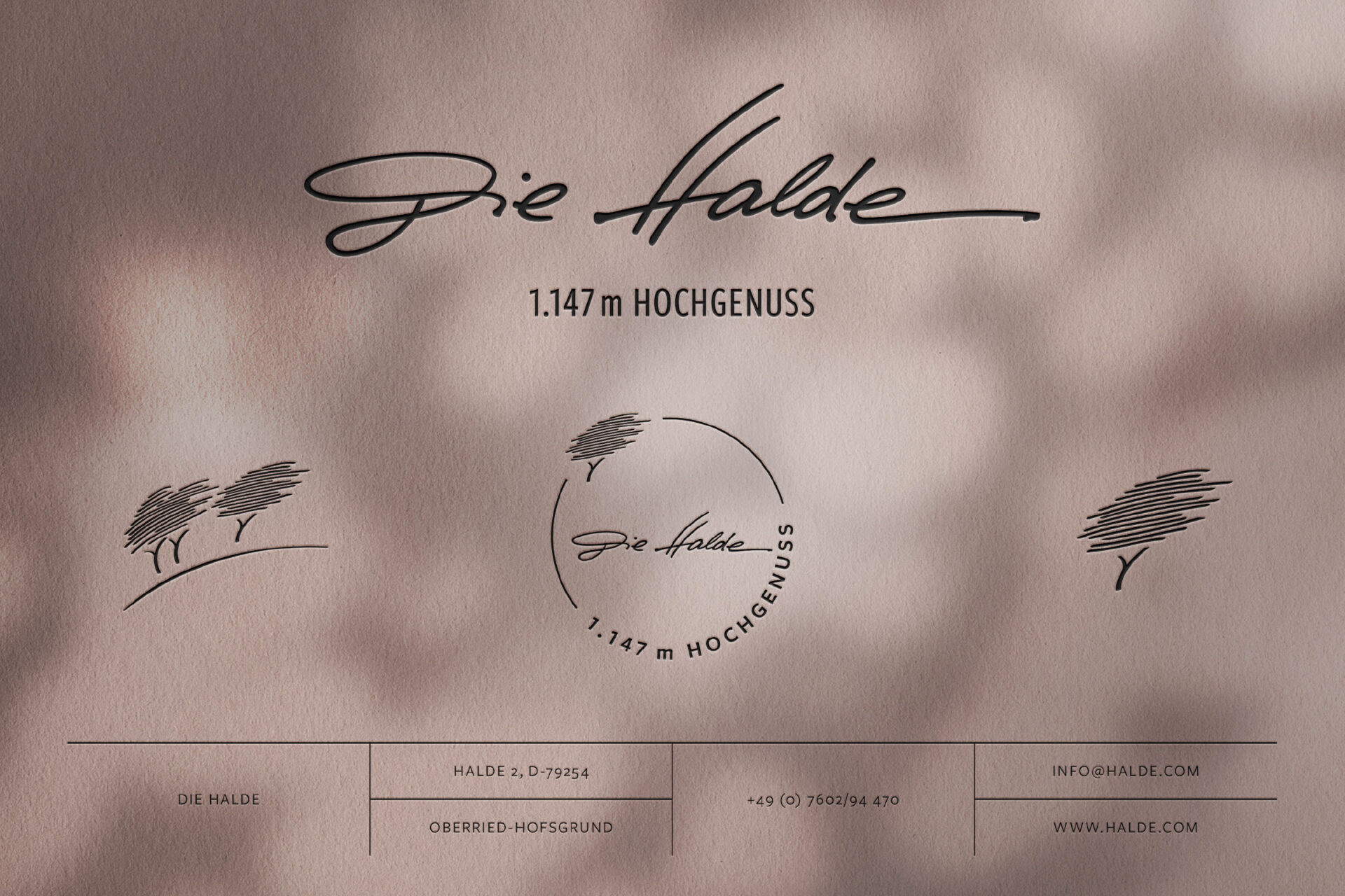
Bäckerei Moos – Brot für alle. In 1974, the bakery Moos was established by Otto Moos in the former Zur Spendmühle bakery. Today, it is run by Fabienne and Marco Mezzadri-Moos and consists of 6 branches in the canton of Lucerne. This family-owned bakery represents a sustainable and regional traditional craft with a focus on high quality and attention to detail. This is reflected in the new brand identity: Inspired by the color and design elements of the original logos, the new design features a dynamic script word mark full of character and uniqueness, infused with a touch of nostalgia.
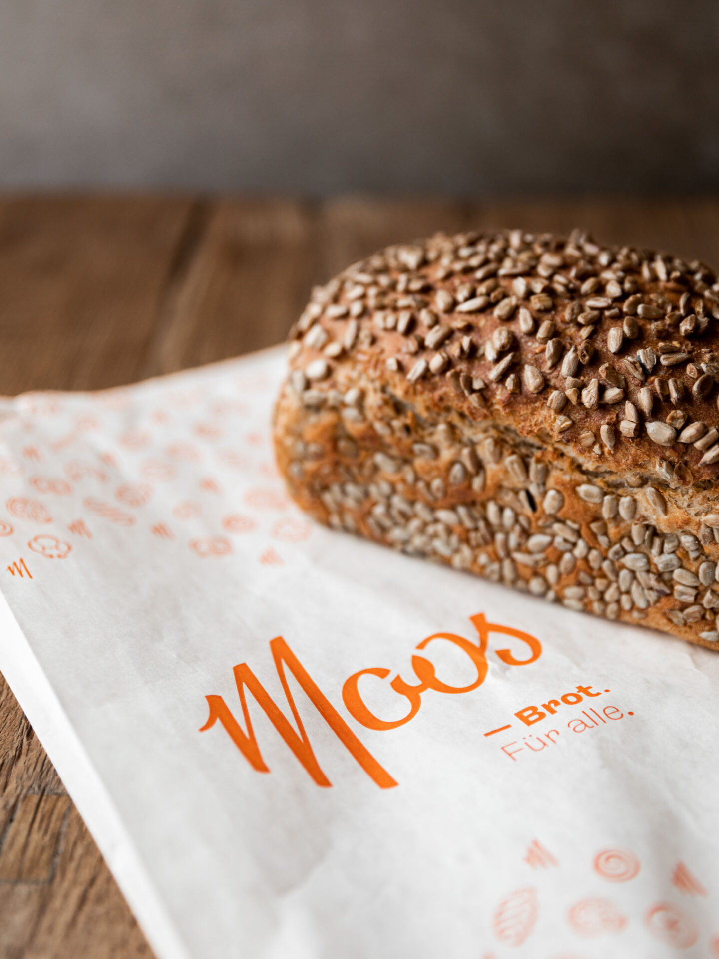
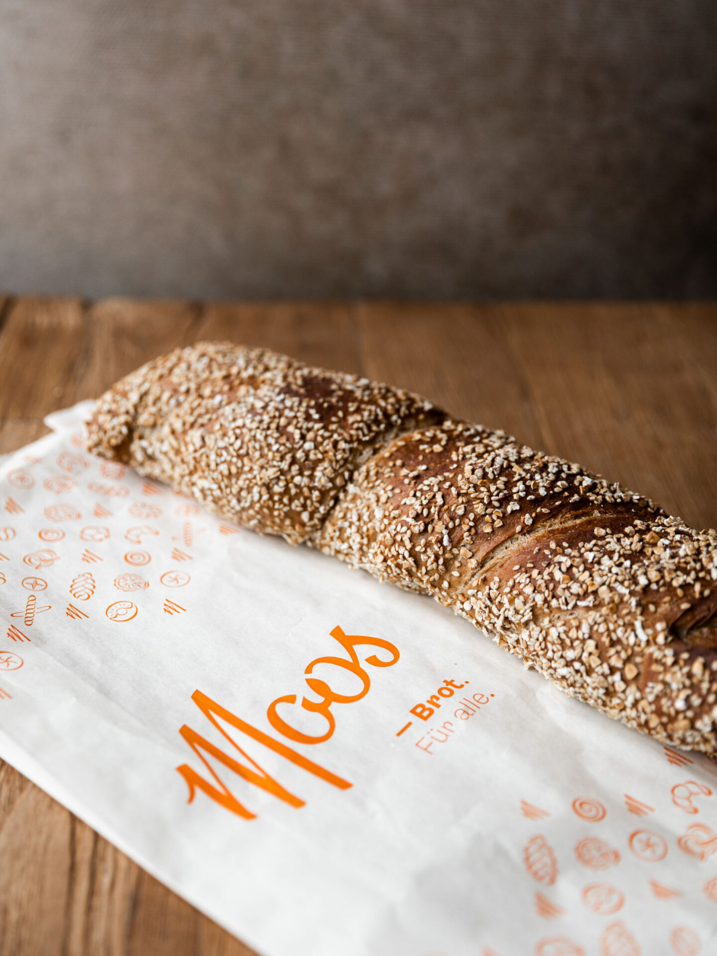
The new slogan, “Brot für alle”, harkens back to the signage “Zur Spendmühle” prominently displayed above the entrance of the branch on Taubenhausstrasse. In the first half of the 20th century, this was where the poor and unemployed received their “donation” in the form of bread and a warm place.
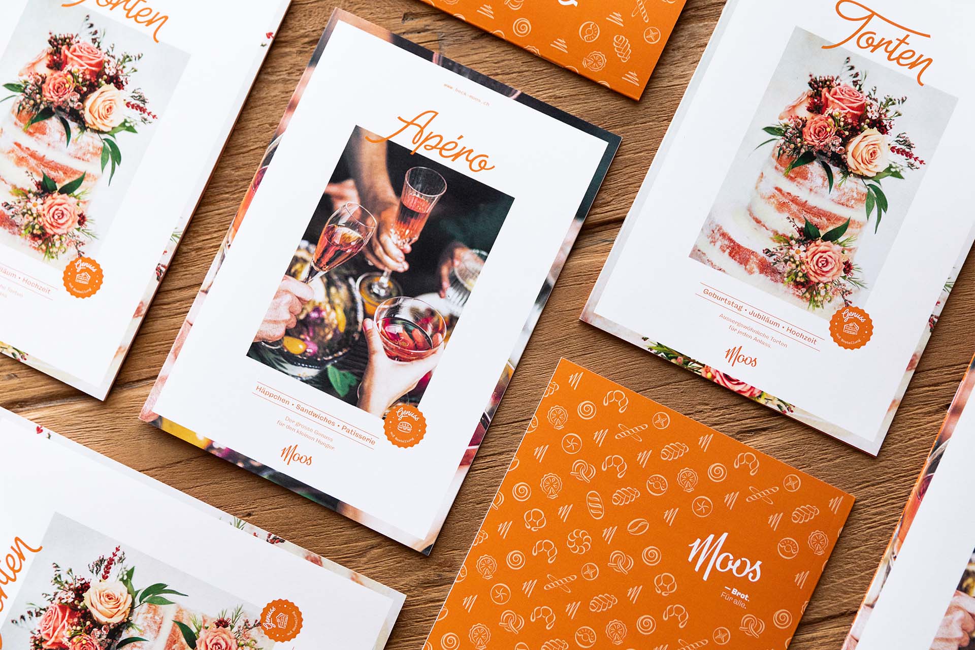
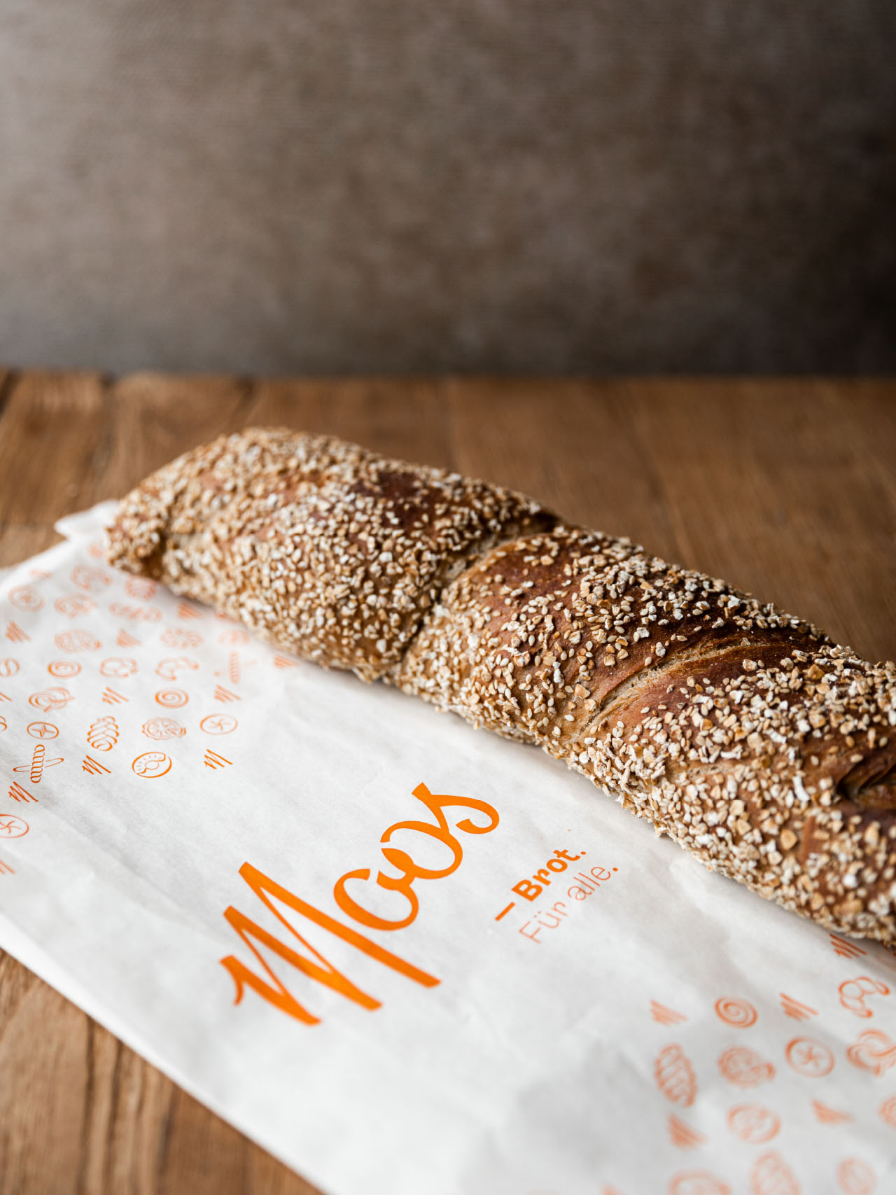
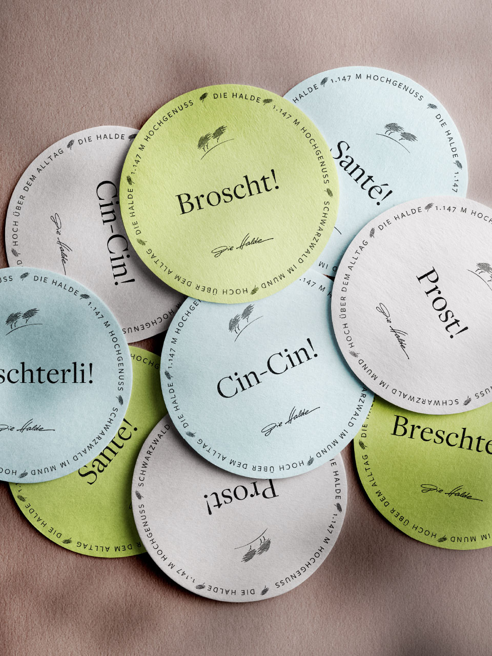
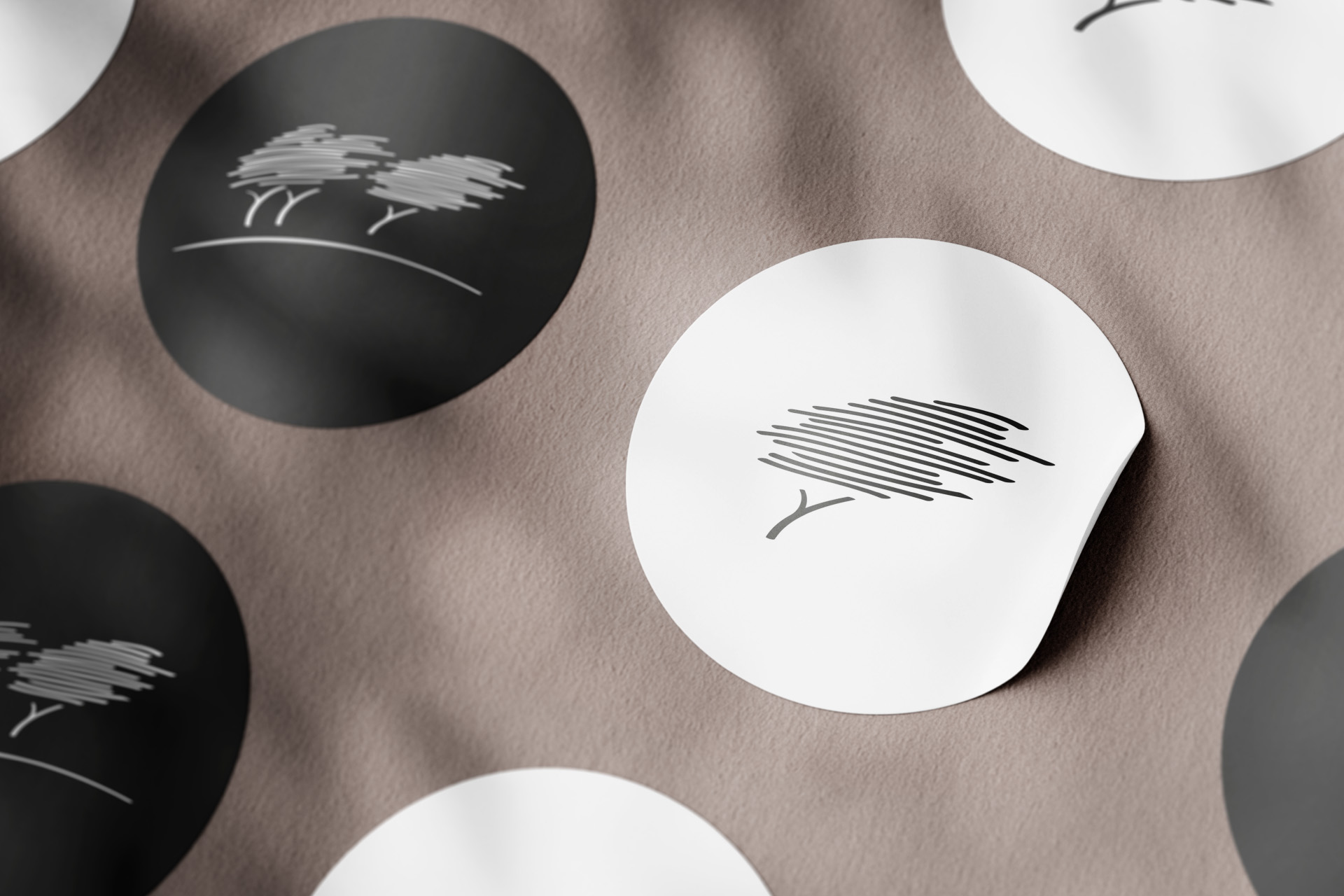
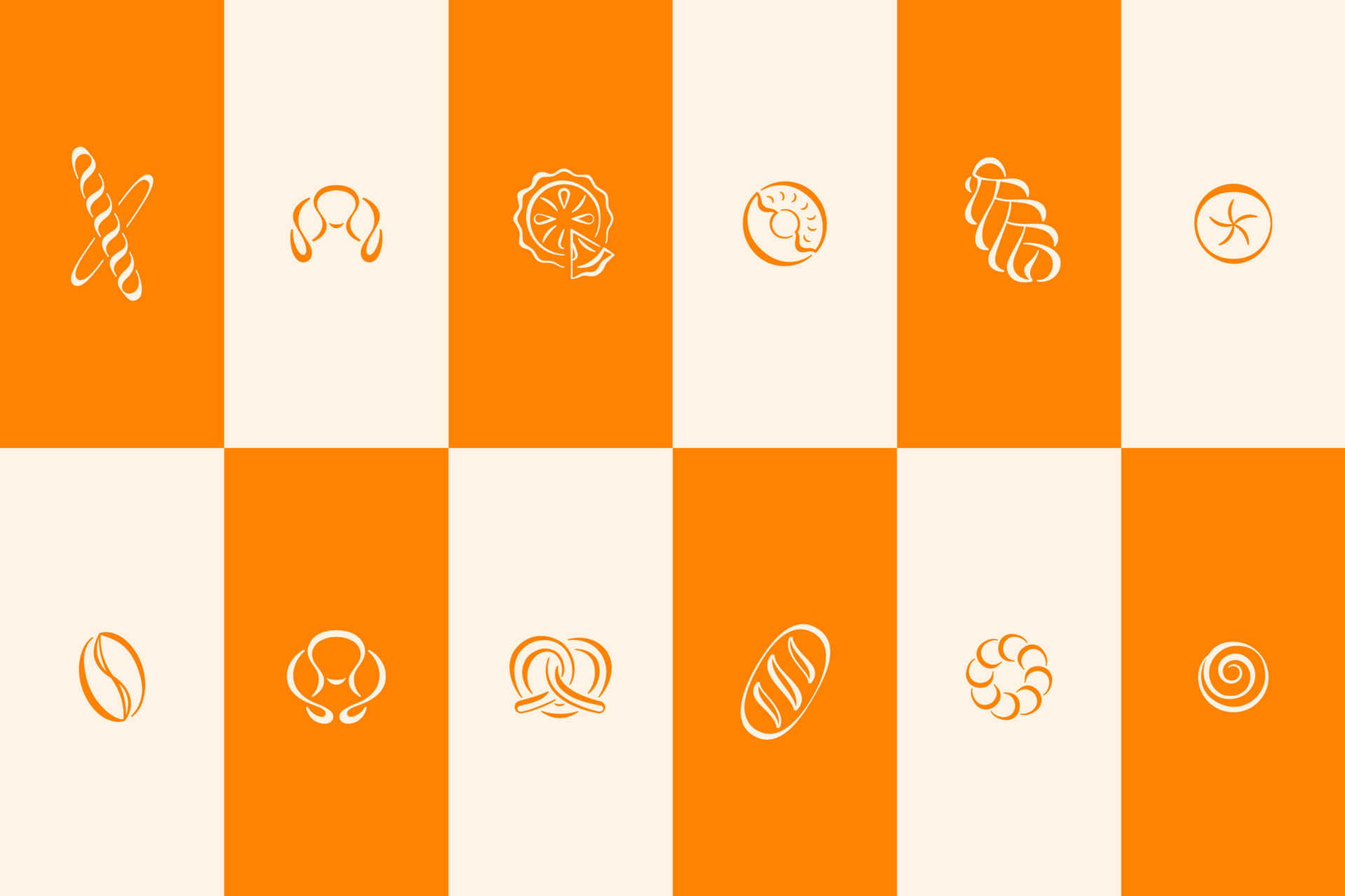
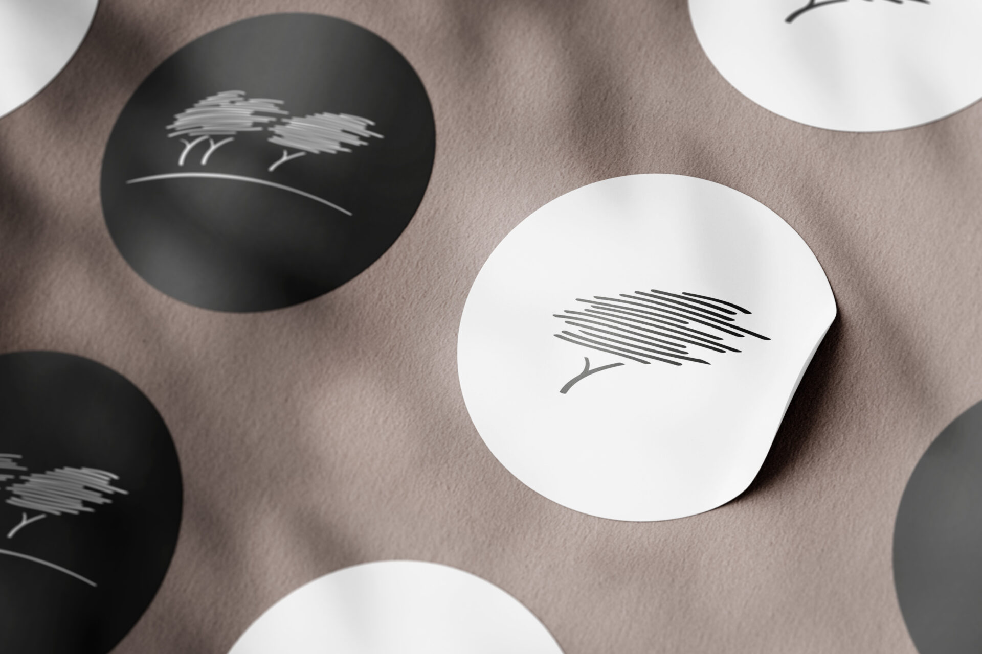
The design is completed and rounded off by hand-drawn bakery icons in the style of the word mark. These icons serve as the basis for the original packaging materials.


YEAR
2021/22
RESPONSABILITY
Concept, design and implementation (brand, printed matter, webdesign, photography)
PARTNER
CLIENT
SERVICES
Branding, Corporate Publishing, Photography, Webdesign
FONTS IN USE
More Moos
https://joelburri.ch/wp-content/uploads/2023/03/jb-moos-baeckerei-webdesign-thumb.jpg
780
900
Joel Burri
Joel Burri
https://joelburri.ch/wp-content/uploads/2023/03/jb-moos-baeckerei-webdesign-thumb.jpg
https://joelburri.ch/wp-content/uploads/2023/03/jb-moos-baeckerei-photo-thumb.jpg
780
900
Joel Burri
Joel Burri
https://joelburri.ch/wp-content/uploads/2023/03/jb-moos-baeckerei-photo-thumb.jpg


